
Common Report Item Properties
All the report items in ActiveReportsJS share common properties that have one of the following types.
Scalar
These are the most basic property types: String, Number, and Boolean. After you set the value of a scalar property at design time, it can't change at runtime.
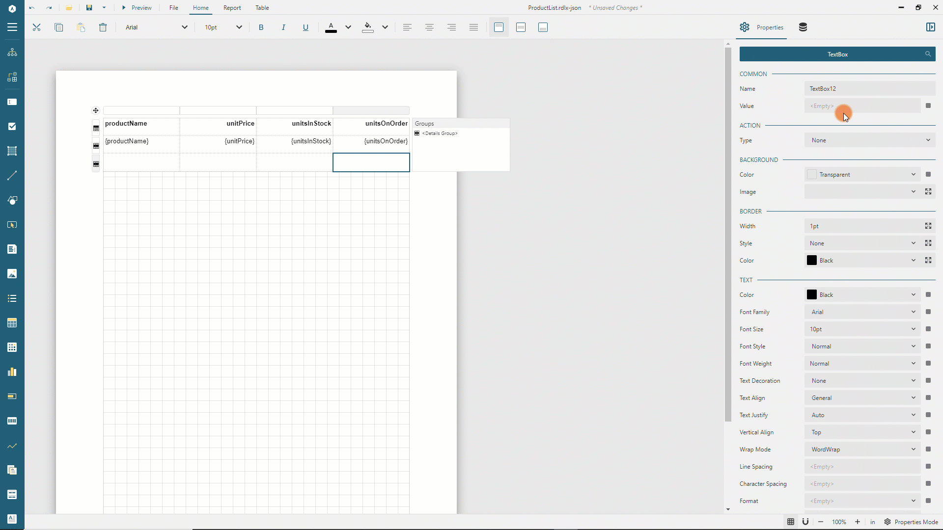
The Properties panel provides the text input for editing String values, the toggle switch for setting Boolean values, and the numeric up-down for setting Number values.
Enum
The Enum properties require you to choose a value from the pre-defined list. For example, the Page Orientation property of a report may be Portrait or Landscape. The editor of these properties is the drop-down list.
Length
The Length properties usually represent the size of some aspect of a report item, for instance, its dimensions. A Length value is a string consisting of two parts.
The
Valueis a decimal numberThe
Unitis one of the following units of measurept(points)pc(picas)in(inches)mm(millimeters)cm(centimeters)
Examples: 11in, 2cm, 0.25pt. The editor of these properties is the text editor.
Expression
An expression is a formula that composed using the expression language. The result of a formula is one of Scalar, Enum or Length types mentioned above. For example, when we say that a property is a string expression, this property's value should be an expression that evaluates to a string.
Static expressions do not change their value at runtime. Dynamic expressions can not be evaluated at design time and are used to set up conditional formatting or dynamic visibility.
The recommended way to modify expressions is to use the Expression Editor that can be invoked using the drop-down menu that appears if you click the box on the right boundary of a property editor.
Expand to watch using the Expression Editor in action
The same drop-down menu allows you to reset the property to its default value.
Collection
A Collection is a list containing one or more items of the same type. Items can, in turn, consist of several properties of different types. The Properties panel has the Add Item and Show Items buttons on the right boundary of a Collection property. The former adds a default item into the collection. The latter expands the list of items and allows to delete or edit them.
Expand to watch using the Collection Editor in action
Base properties
All the report items have the following set of properties.
The
Nameis the String that identifies a report item and is displayed in the Report ExplorerThe
TopandLeftin Length units determine the location of a report item relative to its parent container, such as a report body or Banded List section.The
WidthandHeightin Length units set a report item's size.The
Tooltipis the string expression that sets the text displayed when a report reader hovers over a report item at preview time.The
Bookmarkis the string expression that allows a report item to be the target of the Jump To Bookmark interactivity action.The
Labelis the string expression that determine the text associated with a report item that appears in the Report Map and Table of Contents.The
ZIndexis the number that specifices the report item's stack order in the output.The
Layer Nameproperty designates the specific Layer to which the report item is assigned.
Style properties
The
Background Coloris an expression that should evaluate either to a cross-browser color name or to a hexadecimal color code, such as#face0d. You can choose a color using the drop-down menu of theBackground Colorproperty at design time.The
Background Imageallows setting an image to be used as the background. The drop-down editor provides a quick way to choose the image.The
Sharedtab enumerates image files that reside in the same folder as the report templateThe
Embeddedtab contains the list of embedded imagesThe
Databasetab shows the fields from the report datasetsSelecting any of the items on these tabs automatically sets the following properties that you can also configure manually if you click the
expandicon on the right side of theBackground Imageproperty.The
Sourcespecifies where the image come fromExternal- URL or a file on the local file system.Embedded- embedded report images.Database- a data set field that contains the image data inBase64format
The
Valueexpression is an image Id, for instance theURLThe
MIME Typeexpression specifies the image type. Supported types arejpeg,pngandsvgThe
Repeatenum property sets the arrangement of the background image if its size is less than the one of a report item.Repeat- to repeat vertically and horizontally to fill the available sizeNoRepeat- to display the image only onceRepeatX- to repeat horizontally to fill the available widthRepeatY- to repeat vertically to fill the available height
The
Bordersection includes several properties that allow you to set the appearance of a report item's borderThe
Widthexpression in Length units sets the default border width.The
Styleexpression that should evaluate to one ofNone,Dotted,Dashed,Solid,Double,Groove,Ridge,Insetvalues sets the default border style.The
Colorexpression that should evaluate either to a cross-browser color name or to a hexadecimal color code sets the default border color.The default border
Width,Style, andColorapply to the left, top, right, and bottom boundaries of a report item. You can set the individual border properties for these sides by expanding corresponding editors using the icon on their right side.
The
Paddingexpression in Length units sets space around a report item's content. The default value applies to the left, top, right, and bottom boundaries of a report item. You can set the individual padding values for these sides by expanding thePaddingeditor using the icon on its right side.
Data Visualizers
In the Value property of the background image editor, you can choose the Data Visualizer... option that opens a popup dialog in which you can configure the following visual effects.
Icon Setdisplays one of the icons from the predefined list based on the expression evaluation result. For instance, if you select the3TrafficLightsset, the green light displays if theIcon 1 Valueexpression evaluates toTrue, the yellow light – if theIcon 2 Valueexpression evaluates toTrueand the red light – theIcon 3 Valueexpression evaluates toTrue.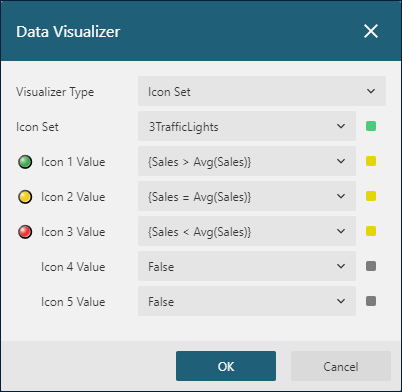
Range Bardisplays a bar of the selected color based on theMinimum,Maximum,Length, andStarting Valueproperties. TheMinimumandMaximumdetermine the range of data. The area between theLengthand theMaximumis transparent (or between theLengthand theMinimumin the case of a negative value). TheStarting Valuedetermines the zero point to the left of which negative data is rendered, and to the right of which positive data is rendered. You can also set an alternate color for values less than zero. An optional progress indicator displays the additional bar of the selected color based on theProgress Indicator Lengthproperty.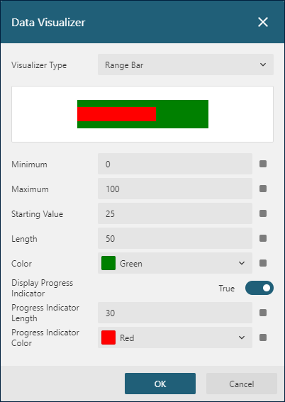
Data Bardisplays a bar of the selected color based on theMinimum,Maximum,Value, andZero Valueproperties. TheMinimumandMaximumdetermine the range of data. The area between theValueand theMaximumis transparent (or between theValueand theMinimumin the case of a negative value). TheZero Valuedetermines the zero point to the left of which negative data is rendered, and to the right of which positive data is rendered. You can also set an alternate color for values less than zero.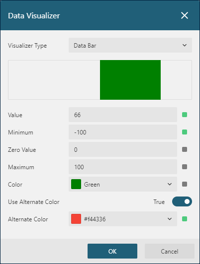
Line properties
These group of properties is available for various elements of a Chart report item.
The
Widthexpression in Length units sets the line thickness.The
Styleexpression that should evaluate to one ofNone,Dotted,Dashed,Solid,Double,Groove,Ridge,Insetvalues sets the line style.The
Colorexpression that should evaluate either to a cross-browser color name or to a hexadecimal color code sets the line color.
Page Break
The Page Break enum property is available for data regions and Container report item and has the following list of values.
None- no page breaks are addedStart- to add a page break before a report itemEnd- to add a page break after a report itemStartAndEnd- to add a page break before and after a report item
Visibility
All the report items determine their visibility at runtime using the following properties.
The
Hiddenboolean expression sets the report item's initial visibility. If theHiddenvalue isTrue, then a report item is not displayed. By default, theHiddenisFalseand a report item is displayed.The
ToggleItemis the name of a textbox that controls the visibility of a report item. If this property is set, then the specifiedtextboxdisplays theexpandorcollapseicon on its left boundary. If a report reader clicks this icon, a report re-renders, and a report item shows or hides. This property can be used to create Drill-Down reports.
Text Properties
Some report items or their parts display textual content whose appearance is determined by the following properties.
The
Colorexpression that should evaluate either to a cross-browser color name or to a hexadecimal color code sets the text color.The following properties are closely related to the Font Configuration.
The
Font Familystring expression specifies the font to use for text.The
Font Styleexpression that should evaluate toNormalorItalicspecifies the font style to use for text.The
Font Weightexpression that should evaluate to one of theLighter,Thin,ExtraLight,Light,Normal,Medium,SemiBold,Bold,HeavyorBoldervalues sets how thick or thin characters in text should be displayed.
The
Font Sizeexpression in Length units specifies the size of a font.The
Text Decorationexpression should evaluate one of theNone,Underline,DoubleUnderline,Overline, orLineThroughvalues and specifies the decoration added to the text.The
Text Alignexpression that should evaluate to one of the following values sets the alignment of textGeneral- aligns numbers and dates to the right and everything else to the leftLeft- aligns the text to the leftRight- aligns the text to the rightCenter- centers the textJustify- stretches the multiline text so that each line has equal width
The
Text Justifyexpression affects ifText AlignisJustifyand should evaluate to one of the following valuesAuto- changes the space between words, except for the last line.Distribute- the same asAuto.DistributeAllLines- changes the space between words for all lines.
The
Vertical Alignthat should evaluate to one of theTop,Middle, orBottomvalues sets the vertical alignment of text within its bounding box.The
Wrap Modeexpression that should evaluate to one of the following values specifies how words should break when reaching the end of a lineNoWrap- line breaks do not occurCharWrap- line breaks occur at any characterWordWrap- line breaks occur at the end of words
The
Line Spacingin Length units sets a text line's height. It is converted to the line height CSS style.The
Character Spacingin Length units sets the space between characters in a text.The
Directionexpression that should evaluate to one of the following values specifies the default direction of a textual content within a report item.LTR- text direction goes from left-to-rightRTL- text direction goes from right-to-left
The
Languagestring expression determines the default language to use for dates and number formatting within a report item.The
Writing Modeexpression that should evaluate to one of the following values sets whether the textual content within a report item is laid out horizontally or vertically as well as the direction in which text moves.lr-tb- if theDirectionisLTR, textual content flows horizontally from left to right. ForRTLdirection, content moves horizontally from right to left. The following horizontal line resides below the previous line.tb-rl- if theDirectionisLTR, textual content flows vertically from top to bottom, and the following vertical line resides to the left of the previous line. ForRTLdirection, content flows vertically from bottom to top, and the following vertical line resides to the right of the previous line.