
- Getting Started
- Developer Guides
- Report Author Guides
Column and Bar Plots
The Column and Bar plots are suitable for side-by-side comparison of multiple Data Values per Category, or comparing across categories. Both plot types have the same configuration, but they visualize it differently:
A
Columnplot arranges categories horizontally and encodes data values into vertical columns.A
Barplot arranges categories vertically and encodes data values into horizontal bars.
In addition, you can choose one of the following methods of placing data values within a containing category. The examples below emphasize Data Values with a bold font and Categories - with an italic font.
Clustered Column and Bar
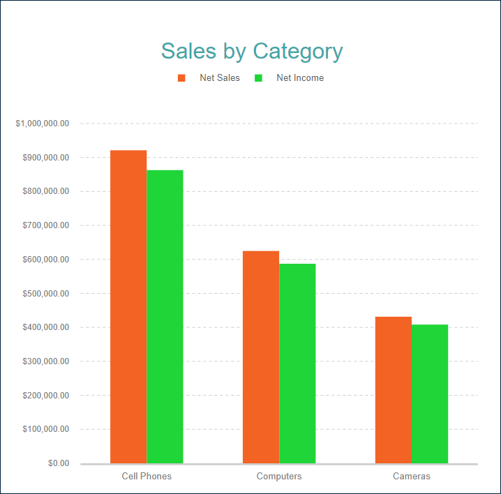
A clustered plot usually has multiple columns or bars, one for each data value, per containing category. For instance, the Clustered Column Demo shows the Net Sales and Net Income per Product Category.
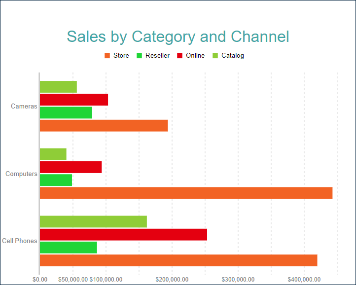
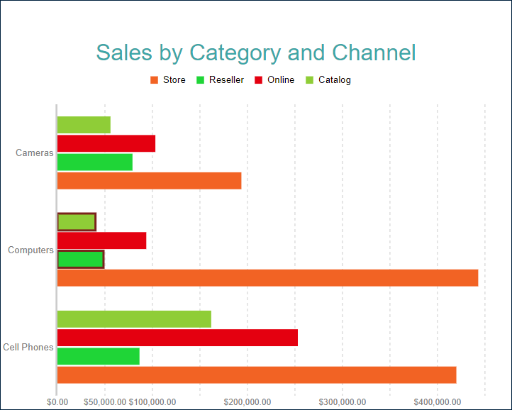
You could also use a clustered column or bar to break down data values into subcategories within the containing category. For example, the Clustered Bar Demo shows the Net Sales for each sales channel per Product Category.
Stacked Column and Bar
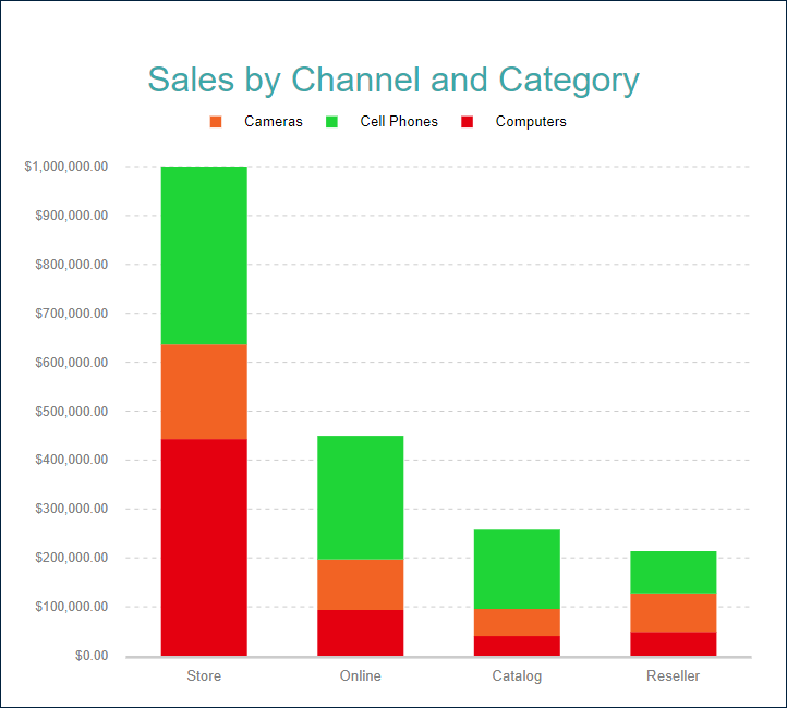
A stacked plot is another way to break down data values into subcategories by placing corresponding column or bar subsections on top of each other or next to each other within the containing category. The Stacked Column Demo shows the Net Sales for each product category per Sales Channel.
Percentage Stacked Column and Bar
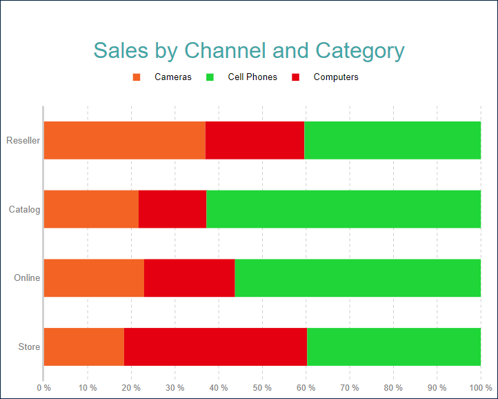
A percentage stacked plot combines the stacked plot and the Percentage axis scale. It indicates the contribution of each data values' sub-category to a containing category's total. For instance, the Percentage Stacked Bar Demo shows the percentage share of the product categories' Net Sales per Sales Channel.
You can configure all these types using the Column or Bar plot template and its properties that we described in the following sections. The Stacked Column/Bar and Percentage Stacked Column/Bar templates are just shortcuts to a specific configuration.
Range Column and Bar
Range Column and Range Bar plots are used to display the range or difference between two sets of values across categories or time periods. Both plot types consist of vertical or horizontal bars, with each bar representing the range between a pair of data points.
For example, the Range Column Demo displays the range of temperatures(in Celsius) over a year in a given location.
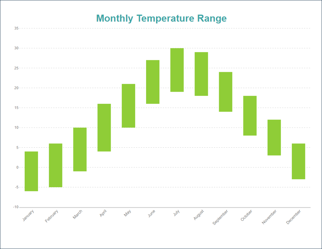
Range column and bar plots can display multiple ranges per category in a clustered manner, effectively comparing the ranges between different groups or data series within each category. . For example, they can be used to display the range of temperatures in several cities for each month, allowing for easy comparison of temperature fluctuations across different locations. However, it does not make much sense for range plots to display multiple ranges per category in a stacked manner because stacking the ranges would obscure the visual representation of the actual differences between the minimum and maximum values.
You can use the following demos to explore plot properties - open a link, toggle the Report explorer, select the Plot - Plot 1 node and use the Properties panel to modify the configuration.
You could also download the report files listed below and open them in the Standalone Report Designer.
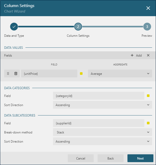
Chart Wizard
If you add a chart into a report, set the plot type to Column or Bar on the first page of the Chart Wizard, and click the Next button, the wizard shows the Column Settings or Bar Settings page that looks like the following:
For the Range Column and Range Bar plots, the Chart Wizard settings look slightly different:
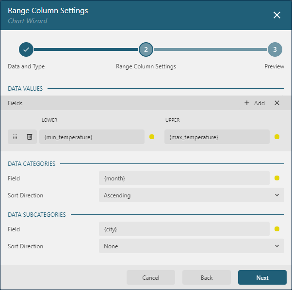
The Data Values section allows you to add one or more Data Values.
The Data Categories section allows you to set the Category Encoding.
The Data Subcategories section allows you to configure the Details Encoding.
Data Values
The Column and Bar plots are the best for comparing items, such as the net sales or the average rainfall. The plot's Values collection determine these items. The Chart Wizard displays the Values collection as Fields in the Data Values section. Collection items consist of two properties:
The
Valueis usually a bound field reference. The Properties Panel displays theValueas the collection, butBarandColumnplots take the first item only. The Chart Wizard displays theValueasField. InRange BarandRange Columnplots, a value consists of the lower and upper bounds of a range to be displayed, representing the minimum and maximum data points within each category.The
Aggregateis an optional function, such asCountorAverage, that reduces many field values into a single one. If a Bound DataSet contains aggregated values, then you can set this property toNone.
Multiple data values generate a clustered plot, as in the Clustered Column Demo. You can switch the Show Values Names In Legend flag to supply the plot with a legend that displays the match between columns or bars background and the corresponding data value names. You can set the displayed name by using the Caption property of a data value item.
Category Encoding
The Category Encoding of the Column and Bar plots is a set of properties that determine the range of Category Values for which the plot generates columns or bars that represent those above Data Values.
The
Categoryis usually one or more bound field references. Bound DataSet Records with the same values of these fields fall into the same category. For instance, the Clustered Column Demo Chart is bound to theSales DataSetcontaining several fields per data record including theProductCategory. The plot'sCategorylist contains the{ProductCategory}reference. Therefore the plot goes through theSales DataSetand places distinctProductCategoryfield values along the horizontal axis.The
Category Sortingconfiguration determines the order of the category values appearance. For instance, the plot in theClustered Column Demohas the following settings to sort the product categories by the sum of sales in descending order.Category Sort Expression = {[Net Sales]}Category Sorting Aggregate = SumCategory Sorting Direction = Descending
The Chart Wizard offers the simplified editor of the Categories Encoding in the Data Categories section:
A single
Category Expressiondisplayed asFieldis available.The
Sortingconfiguration of theCategory Encodingdisplays theSort directionproperty only. TheSort Expressionis automatically set to the same value as theFieldproperty has.
Details Encoding
The Details Encoding allows you to break down those above Data Values into subcategories within the containing category for more granular comparison.
The Details property of the Column and Bar plots is the collection of items that define these subcategories. Each item includes several properties:
The
Valuesis usually one or more bound field references. Bound DataSet Records with the same values of these fields fall into the same subcategory. For instance, in the Stacked Column Demo the plotDetailsvalue is{ProductCategory}. Consequently, theNet Salescolumns break down into multiple subsections corresponding to distinct product categories.The
Exclude Nullsflag indicates whether DataSet Records with an undefinedDetails Valueshould be excluded from the visualization.The
Groupproperty determines how the plot arranges columns or bars divided into subsections.Stack- a bar plot places subsections next to each other; a column plot places them on top of each other. You can use this value to configure aStacked ColumnorStacked Barplot. Note that this value is not applicable forRange ColumnandRange Barplots.Cluster- subsections are clustered into groups. The Clustered Bar Demo uses this value for the plot details.None- equals the default value.
The
Sortingconfiguration determines the order of the subsections appearance.
The Chart Wizard offers the simplified editor of the Details Encoding in the Data Subcategories section:
A single
Details Encodingitem is available.A single
Valueitem displayed asFieldis available.The
Groupproperty of the Detail Encoding is displayed asBreak-down method.The
Sortingconfiguration of the Details Encoding displays theSort directionproperty only. TheSort Expressionis automatically set to theFieldvalue.
Colors Encoding
The Colors Encoding enables the color legend of the Category Encoding or Details Encoding and includes the Color expression and the optional Color Aggregate function that reduces many Color values into a single one.
If the Details Encoding is empty, Column and Bar plots calculate distinct Color Encoding results for the categories produced by the Category Encoding, convert them to the background color of the corresponding columns or bars, and display the match in the legend.
Otherwise, Column and Bar plots calculate distinct Color Encoding results for the subcategories produced by the Details Encoding, convert them to the background color of the corresponding columns or bars subsections and display the match in the legend.
In both cases, plots pick up colors from the Chart Palette.
For instance, the colors encoding in the Stacked Column Demo is set to the {ProductCategory} expression. Consequently, the report output shows the legend that matches Product Categories with corresponding column subsections background.
In most cases, you will use the same configuration for both Details Encoding and Colors Encoding to enable a visual map of data values breakdown.
Note: The Color property is the collection, but the Bar and Column plots take the first item only.
Column and Bar look-and-feel
The following properties allow you to fine-tune the outfit of rectangular shapes that form the Column and Bar plots. You can see their effect in action by modifying the configuration of any column or bar demo.
The Opacity is a Number in percentage that determines the opacity of bars and columns. 100% means they are opaque, and 0% means that they are completely transparent.
The Bar settings is the combination of numbers in percentage that you can use to change the dimensions and form of columns and bars.
Note: To configure the Bar Settings, select the root Chart node in the Report Explorer
The
Widthproperty sets the column width or bar height relative to the size that the plot allocates for the containing category along the horizontal or vertical axis. This value is55%by default. Try setting it to90%for theStacked Column Demoplot to see the difference.The
Overlapproperty sets the gap between adjacent columns or bars relative to the containing category's size.The
Neck Heightproperty breaks down the containing column or bar into two parts that may have different width or height that you can set using theTop Widthand theBottom Widthproperties. This combination allows you to set a bullet-like shape for columns or bars. For instance, try settingNeck Height=60%, Bottom Width=85%, Top Width=0%for the Clustered Column Demo plot.
The Bar Lines flag, a Boolean attribute, controls the visibility of lines connecting columns and bars belonging to the same Detail or Category (provided that the Details Encoding is unoccupied). You can locate the Line properties beneath the Bar Lines flag, providing an option to customize the color, width, and style of these lines.
The Offset is a Number in percentage, relative to a single column width or a single bar height, that translates the column and bar plots to the right or the bottom side respectively.
The Clipping Mode indicates the manner that the plot area draws the translated plot:
Fitvalue means that the plot area should use all the available space to fit the shifted columns and barsClipvalue means that the plot area cuts off shifted columns and bars on the edge of its right or bottom paddingNonevalue equals toFit
The Background Color Expression overwrites any other columns and bars background settings, including the Color Encoding that we described earlier.
The Style section has the line properties that allow you to set up the color, style, and width of the columns and bars border.
Customizing Tooltips and Labels
The Text Encoding collection offers a way to configure columns and bar plots to display customized labels and tooltips. Each item within this collection has the following properties:
Values: This is an expression that can reference the values of the bound fields.Aggregate: This optional function, such asCountorAverage, can condense multiple field values into a single value, evaluated within the current detail or category context.Template Key: A string used within the Labels or Tooltip template to represent the text encoding item.Target: This property specifies whether the text encoding item is meant for the plot's labels or tooltips.
Adding items to the Text Encoding collection allows automatic display of configured values in Labels or Tooltips, based on the Target value of each item. To further customize the text of the labels and tooltips, you can employ the Tooltip Template and Label Text Template expressions.
Apart from Text Encoding items referenced by their keys, you can utilize the following pre-defined values:
{valueField.name}: Represents the field name bound to a Data Value.{valueField.value}: Represents the current Data Value within the containing Category or Details.{PercentageDetail}: Represents the percentage share of the current Data Value among all values within the same Details.{PercentageCategory}: Represents the percentage share of the current Data Value among all values within the same Category.{categoryField.name}: Represents the field name bound to the Category Encoding.{categoryField.value}: Represents the current Category Encoding value.{detailFields.name}: Represents the field name bound to the Details Encoding.{detailFields.value}: Represents the current Details Encoding value.{colorField.name}: Represents the field name bound to the Color Encoding.{colorField.value}: Represents the current Color Encoding value.
These values can be combined and formatted using the interpolation syntax and supported format strings that are also used for the TextBox Report Item. For example, the plot in the Stacked Column Demo uses an advanced tooltip configuration:
The
Text Encodingcontains theItemsSoldelement that displays the number of sold items:Aggregate=SumValue={SalesQuantity}Target=TooltipTemplateKey=SalesQuantity
The
Tooltip Templateis configured with the following expression:
{detailFields.value} via {categoryField.value}
Quantity: {SalesQuantity}
Amount: {valueField.value:C2}
Labels Appearance
A subset of text properties in the Label Text section and the line properties in the Label Border section allow you to set up the corresponding visual parameters of the plot labels.
The Label Position and an optional Offset in pixels determine the location of labels relative to the containing column or bar:
Inside- on the inner edgeOutside- on the outer edgeCenter- on the centerAuto- equals toOutside
The Overlapping Labels property indicates the handling of overlapping labels. Possible values are:
Auto- hides some labels to prevent the overlappingShow- shows all labels even if the overlapping persists
The line properties in the Label Line section allows you to add the connecting lines between labels and the edge of columns or bars. The Label Line Position determines the connection point of a label's bounding box and the line:
Auto- selected automaticallyCenter- on the center of the bounding box side
Dynamic Rules
The Rules configuration allows you to create if this then that rules based on one or more data conditions to apply to the plot appearance. A condition is an expression that may refer to one of the following values:
Chart!CurrentData- the currentData ValueChart!PreviousData- the previousData ValueChart!NextData- the nextData ValueChart!CurrentCategory- the currentCategory EncodingvalueChart!PreviousCategory- the previousCategory EncodingvalueChart!NextCategory- the nextCategory EncodingvalueChart!CurrentDetail- the currentDetails EncodingvalueChart!PreviousDetail- the previousDetails EncodingvalueChart!NextDetail- the nextDetails Encodingvalue
A condition expression can also include references to report parameters and standard operators. The easiest way to build a condition is to use the expression editor that you can open by click on the box on the right side of the Condition property.
The following visual properties of Bar and Column plots can be applied when a condition is met:
The background color of a bar or column
The color of the bar or column border
The width of the bar or column border
The style of the bar or column border
The tooltip and label template
For instance, you can set the following rules for the plot in the Clustered Bar Demo to emphasize the Net Sales values that are lower than $50000:
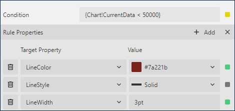
As a result, the output of the chart will be like this:
Action
This group of properties determine the Interactive Action that occurs when a report reader clicks a column or bar. You can use bound field references to pass parameters in a drill-through report or configure a dynamic bookmark or URL. The field value is evaluated in the scope of the current detail or category. Visit the Drill-Through Reports Walkthrough for more information.