
- Getting Started
- Developer Guides
- Report Author Guides
Radar Area Plot
Radar Area plots are useful to display ordinal measurements of a variable across a range of categories. A radar area plot arranges categories on a circle and connects the corresponding points with straight lines. Data values are represented by points laid out along radial lines and connected with straight or curved lines. The resulting shape is filled with a color.
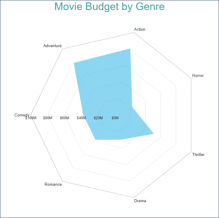
Radar Area Plot with Single Value
A single value radar area plot visualizes measurements of a single variable.
For instance, the Radar Area Plot with Single Value Demo displays the average budget for several movie genres.
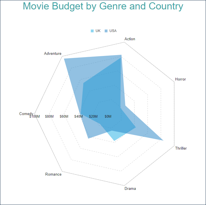
Radar Area Plot with Multiple Areas
A multiple-area radar plot allows you to split data values into subcategories for more granular analysis. For instance, the Radar Area Plot with Multiple Areas Demo displays the average movie budget per country for several movie genres.
You can configure all these types using the Radar Area plot template and its properties described in the following sections.
You can use the following demos to explore plot properties - open a link, toggle the Report explorer, select the Plot - Plot 1 node and use the Properties panel to modify the configuration.
You could also download the report files listed below and open them in the Standalone Report Designer.
Chart Wizard
If you add a chart into a report, set the plot type to Radar Area on the first page of the Chart Wizard, and click the Next button, the wizard shows the Radar Area Settings page that looks like the following:
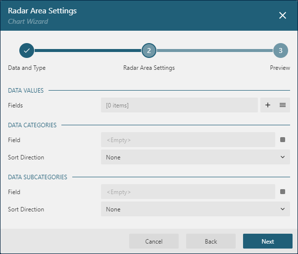
The Data Values section allows you to add one or more Data Values.
The Data Categories section allows you to set the Category Encoding.
The Data Subcategories section allows you to configure the Details Encoding.
Data Values
The Radar Area plot's Values collection determines data values that are displayed by data points connected by lines. The collection items consist of two properties:
The
Valueis usually a bound field reference. The Properties Panel displays theValueas the collection, butRadar Areaplots take the first item only. The Chart Wizard displays theValueasField.The
Aggregateis an optional function, such asCountorSum, that reduces many field values into a single one.
For instance, all the demos listed above have the Value={Budget}, Aggregate=Average Data Value.
Category Encoding
The Category Encoding of a Radar Area plot is a set of properties that determine categories for which the plot generates connected data points representing those above Data Values.
The
Categoryis usually a bound field reference. Bound DataSet Records with the same value of that field fall into the same category. For instance, the Radar Area Plot with Single Value Demo is bound to theRatingsDataSet containing several fields, including theGenrefield, for each data record. The plot'sCategoryis set to{Genre}expression. Therefore the plot goes through theRatingsDataSet finds the distinctGenrevalues and generates one category per genre. If you preview the demo output, you can see seven genres.The
Category Sortingconfiguration determines the order of the category values appearance.
The Chart Wizard offers the simplified editor of the Category Encoding in the Data Categories section:
A single
Category Expressiondisplayed asFieldis available.The
Sortingconfiguration of theCategory Encodingdisplays theSort directionproperty only.The Sort Expressionis automatically set to theFieldvalue.
Details Encoding
The Details Encoding allows you to break down those above Data Values into subcategories for more granular analysis of changes.
The Details property of a Radar Area plot is the collection of items that determine these subcategories. Each item includes several properties:
The
Valuesis usually one or more bound field references. Bound DataSet Records with the same values of these fields fall into the same subcategory. For instance, in the Radar Area Plot with Multiple Areas Demo theDetailsvalue is{Country}. Consequently, theAverage Budgetof each genre splits into theUSAandUKsubcategories that generate a data point.The
Exclude Nullsflag indicates whether DataSet Records with an undefinedDetails Valueshould be excluded from the visualization.The
Sortingconfiguration determines the order of subcategories' appearance.
The Chart Wizard offers the simplified editor of the Details Encoding in the Data Subcategories section:
A single
Details Encodingitem is available.A single
Valueitem displayed asFieldis available.The
Sortingconfiguration of theDetails Encodingdisplays theSort directionproperty only. TheSort Expressionis automatically set to theFieldvalue.
Colors Encoding
The Colors Encoding enables the color legend of the Details Encoding and includes the Color expression and the optional Color Aggregate function that reduces many Color values into a single one.
The plot calculates distinct Color Encoding results for the subcategories produced by the Details Encoding, converts them to fill colors of corresponding areas, and displays the match between colors and encoding results in the legend. Colors come from the Chart Palette.
For instance, the Radar Area Plot with Multiple Areas Demo uses the {Country} expression for the Colors Encoding. Consequently, the report output shows the colors legend that matches countries with the fill color of corresponding areas.
Note: The Color property is the collection, but the Radar Area plot takes the first item only.
Plot look-and-feel
The following properties allow you to fine-tune the outfit of shapes that form the Radar Area plot. You can see their effect in action by modifying the configuration of any area demo.
The Opacity is a number in percentage that determine the opacity of areas filled with color. 100% means they are opaque, and 0% means that they are entirely transparent.
The Line Aspect property determines the style of the line that connects data points.
Defaultmeans the straight lineSplinemeans the bezier curveStep Center,Step LeftandStep Rightare not applicable for a Radar Area plot.
The Show Nulls property indicates the arrangement of data points for Null values.
Gapsmeans that the plot will not draw a line between a null data point and its previous and next pointsZeromeans that null data points will be considered to have0valueConnectedmeans that the plot will connect the previous and the next points of a null point
The Clipping Mode indicates the manner that the plot area draws a plot:
Fitvalue means that the plot area should use all the available space to fit the plotClipvalue means that the plot area cuts off the plot on the edge of its right or bottom paddingNonevalue equals toFit
The line properties in the Style section determine the appearance of lines that connect data points.
The color expression in the Background section sets the fill color of areas and overwrites the Color Encoding described earlier.
The Start Angle is a number in arcdegree that defines the rotation of the plot clockwise. Full rotation is 360 degrees.
Customizing Tooltips and Labels
The Text Encoding collection offers a way to configure radar area plots to display customized labels and tooltips on the data point. Each item within this collection has the following properties:
Values: This is an expression that can reference the values of the bound fields.Aggregate: This optional function, such asCountorAverage, can condense multiple field values into a single value, evaluated within the current detail or category context.Template Key: A string used within the Labels or Tooltip template to represent the text encoding item.Target: This property specifies whether the text encoding item is meant for the plot's labels or tooltips.
Adding items to the Text Encoding collection allows automatic display of configured values in Labels or Tooltips, based on the Target value of each item. To further customize the text of the labels and tooltips, you can employ the Tooltip Template and Label Text Template expressions.
Apart from Text Encoding items referenced by their keys, you can utilize the following pre-defined values:
{valueField.name}: Represents the field name bound to a Data Value.{valueField.value}: Represents the current Data Value within the containing Category or Details.{PercentageDetail}: Represents the percentage share of the current Data Value among all values within the same Details.{PercentageCategory}: Represents the percentage share of the current Data Value among all values within the same Category.{categoryField.name}: Represents the field name bound to the Category Encoding.{categoryField.value}: Represents the current Category Encoding value.{detailFields.name}: Represents the field name bound to the Details Encoding.{detailFields.value}: Represents the current Details Encoding value.{colorField.name}: Represents the field name bound to the Color Encoding.{colorField.value}: Represents the current Color Encoding value.
These values can be combined and formatted using the interpolation syntax and supported format strings that are also used for the TextBox Report Item.
For example, the plot in the Radar Area Plot with Single Value Demo uses an advanced tooltip configuration:
The
Text Encodingcontains theSalesQuantityelement that displays the number of sold items:Aggregate=AvgValue={RottenTomatoesRating}Target=TooltipTemplateKey=AvgRating
The
Tooltip Templateis configured with the following expression:
{categoryField.value}
Average Budget: {valueField.value:C2}
Average Rating: {AvgRating:N2}
Labels Appearance
A subset of text properties in the Label Text section and the line properties in the Label Border section allow you to set up the corresponding visual parameters of the plot labels.
The Label Position and an optional Offset in pixels determine the location of labels relative to a parent data point symbol:
Inside- inside the area filled with colorOutside- outside of the area filled with colorCenter- near the data pointAuto- equals toOutside
The Overlapping Labels property indicates the handling of overlapping labels. Possible values are:
Auto- hides some labels to prevent the overlappingShow- shows all labels even if the overlapping persists
The line properties in the Label Line section allows you to add the connecting lines between labels and their parent data points. The Label Line Position determines the connection point of a label's bounding box and the line:
Auto- selected automaticallyCenter- on the center of the bounding box side
Action
This group of properties determine the Interactive Action when a report reader clicks inside a filled area. You can use bound field references to pass parameters in a drill-through report or configure a dynamic bookmark or URL. The field value is evaluated in the scope of the current detail. Visit the Drill-Through Reports Walkthrough for more information. It explains how to set up the drill-through column plot, but the same technique applies to a radar area plot.