
- Getting Started
- Developer Guides
- Report Author Guides
Scatter and Bubble Plots
Scatter and Bubble plots are suitable to visualize relationships between data values. Both plots arrange data values along the horizontal and vertical axes and display points called Symbols on the intersections. The Bubble plot encodes an additional data value into the size of a symbol.
Simple Scatter plot
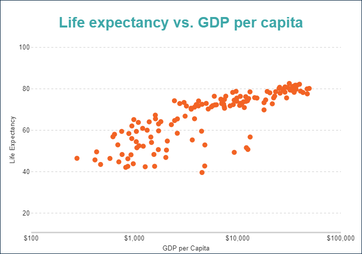
In its simplest form, a scatter plot visualizes relationships between two variables. For instance, the simple scatter demo displays the correlation between the GDP per capita and life expectancy.
Simple Bubble plot
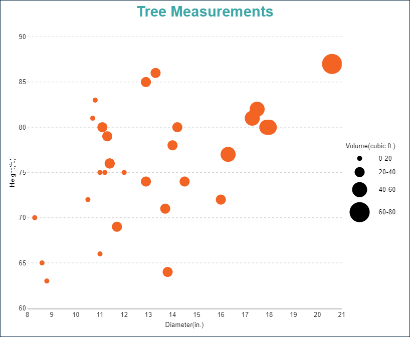
A bubble plot adds the third variable into visualization by encoding it into the size of displayed symbols. For instance, the simple bubble demo displays the correlation between the diameter of a tree, its height and its volume.
Multi-category Scatter and Bubble plots
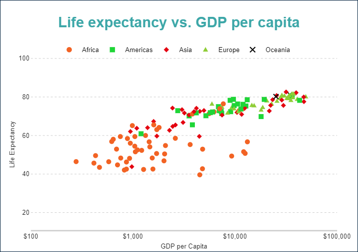
You can configure Scatter and Bubble plots to split data values into categories and visualize them using symbols' colors, shapes, or both. For instance, the multi-category scatter demo displays the correlation between the GDP per capita and life expectancy categorized by the continent.
You can configure all these types using the Scatter and Bubble plot templates and their properties described in the following sections.
You can use the following demos to explore plot properties - open a link, toggle the Report explorer, select the Plot - Plot 1 node and use the Properties panel to modify the configuration.
You could also download the report files listed below and open them in the Standalone Report Designer.
Chart Wizard
If you add a chart into a report, set the plot type to Scatter or Bubble on the first page of the Chart Wizard, and click the Next button, the wizard shows the Column Settings or Bar Settings page that looks like the following:
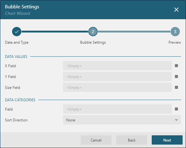
The Data Values section allows you to configure Data Values.
The Size Field editor allows to set the Size Encoding for a Bubble plot.
Data Values
The Values collection of Scatter and Bubble plots determines the data values whose relationships you want to visualize. The collection items include the Value property that should be a pair of bound field references or more advanced expressions. Values of the first expression are arranged along the horizontal axis, values of the second expression - along the vertical axis.
The Chart Wizard represents the first value as X-Field and the second value as Y-Field.
For instance, the Simple Scatter Plot Demo has the {gdpPercap}, {lifeExp} Data Value.
Color Encoding
The Color Encoding enables the color legend and includes the Color expression and the optional Color Aggregate function that reduces many Color values into a single one.
Scatter and Bubble plots calculate distinct Color Encoding results for items produced by the Data Values collections, convert them to fill color of corresponding data points, and displays the match between colors and encoding results in the legend. Colors come from the Chart Palette.
For instance, the Multi-category Scatter Plot Demo uses the {continent} expression for the Color Encoding. Consequently, the report output shows the color legend that matches continents with the corresponding data points' fill color.
Note: The Color property is the collection, but the Scatter and Bubble plots take the first item only.
Shape Encoding
The Shape Encoding enables the shape legend and includes the Shape expression and the optional Shape Aggregate function that reduces many Shape values into a single one.
A Scatter plot calculates distinct Shape Encoding results for items produced by the Data Values collections, convert them to the symbol of corresponding data points, and displays the match between symbols and encoding results in the legend. Supported shapes are Dot, Box, Diamond, Triangle, Cross, Dash, Plus.
For instance, the Multi-category Scatter Plot Demo uses the {continent} expression for the Shape Encoding. Consequently, the report output shows the shape legend that matches continents with the corresponding data points' symbols.
Note: The Shape property is the collection, but a Scatter plot take the first item only.
If the Color Encoding and the Shape Encoding use the same value, then the shape legend and the color legend are merged into the single one, as in the Multi-category Scatter Plot Demo.
Size Encoding
The Size Encoding of a Bubble plot enables the size legend and includes the Size expression and the optional Size Aggregate function that reduces many Size values into a single one. The Size Encoding works only with numeric values and breaks them down into ranges that determine the size of symbols. It allows you to encode additional information in a bubble plot.
For instance, the Simple Bubble Plot Demo has the size encoding is set to {Volume} expression. Thus, the plot uses the range of symbol sizes derived from distinct values of the Volume field.
Note: The Size property is the collection, but the Bubble plot takes the first item only.
The Chart Wizard allows configuring Size encoding in the Size Field editor of the Data Values section.
Symbols look-and-feel
The following properties allow you to fine-tune the outfit of symbols that form Scatter and Bubble plots. You can see their effect in action by modifying the configuration of any demos referenced above.
The Symbol Opacity is a number in percentage that determines the opacity of symbols. 100% means they are opaque, and 0% means that they are entirely transparent.
The line properties, the Background Color expression, and the Symbol Shape allow you to set up the appearance of symbols. If the Symbol Shape is Auto, then the plot either picks the default value or applies the Shape Encoding that we described earlier.
Customizing Tooltips and Labels
The Text Encoding collection offers a way to configure scatter and bubble plots to display customized labels and tooltips on the data point symbols. Each item within this collection has the following properties:
Values: This is an expression that can reference the values of the bound fields.Aggregate: This optional function, such asCountorAverage, can condense multiple field values into a single value, evaluated within the current detail or category context.Template Key: A string used within the Labels or Tooltip template to represent the text encoding item.Target: This property specifies whether the text encoding item is meant for the plot's labels or tooltips.
Adding items to the Text Encoding collection allows automatic display of configured values in Labels or Tooltips, based on the Target value of each item. To further customize the text of the labels and tooltips, you can employ the Tooltip Template and Label Text Template expressions.
Apart from Text Encoding items referenced by their keys, you can utilize the following pre-defined values:
{valueField.name}: Represents the field name to which the second item of theData Valueis bound.{valueField.value}: Represents the current value of the second item of theData Value.{colorField.name}: Represents the field name bound to the Color Encoding.{colorField.value}: Represents the current Color Encoding value.{shapeField.name}Represents the field name bound to the Shape Encoding.{shapeField.value}Represents the current Shape Encoding value.{sizeField.name}Represents the field name bound to the Size Encoding.{sizeField.name}Represents the current Size Encoding value.
These values can be combined and formatted using the interpolation syntax and supported format strings that are also used for the TextBox Report Item.
For example, the plot in the Simple Scatter Plot Demo uses an advanced tooltip configuration:
The
Text Encodingcontains theCountryelement that displays the country of the data point:Aggregate=NoneValue={country}Target=TooltipTemplateKey=Country
The
Tooltip Templateis configured with the following expression:
{Country}
{valueField.value} years
Labels Appearance
A subset of text properties in the Label Text section and the line properties in the Label Border section allow you to set up the corresponding visual parameters of the plot labels.
The Label Position and an optional Offset in pixels determine the location of labels relative to a parent data point symbol:
Inside- insideOutside- on the topCenter- on the centerAuto- equals toOutside
The Overlapping Labels property indicates the handling of overlapping labels. Possible values are:
Auto- hides some labels to prevent the overlappingShow- shows all labels even if the overlapping persists
The line properties in the Label Line section allow you to add the connecting lines between labels and their parent data points. The Label Line Position determines the connection point of a label's bounding box and the line:
Auto- selected automaticallyCenter- on the center of the bounding box side
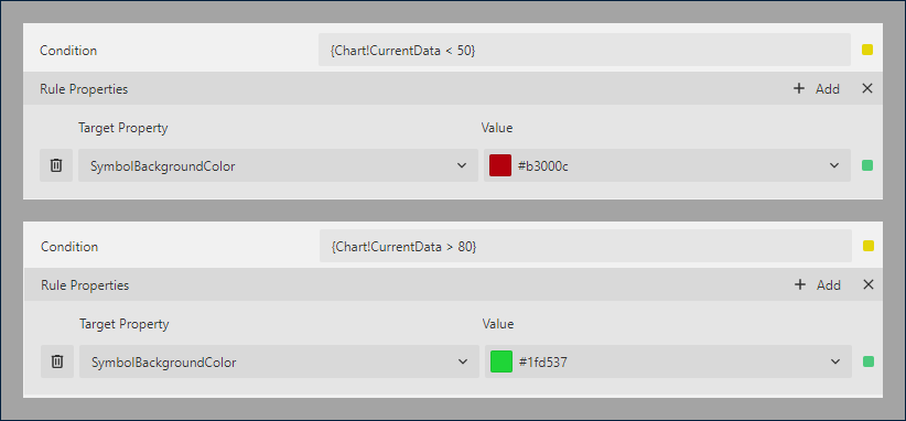
Dynamic Rules
The Rules configuration allows you to create if this then that rules based on one or more data conditions to apply to the plot appearance. A condition is an expression that may refer to one of the following values:
Chart!CurrentData- the currentData ValueChart!PreviousData- the previousData ValueChart!NextData- the nextData ValueChart!CurrentCategory- the currentCategory EncodingvalueChart!PreviousCategory- the previousCategory EncodingvalueChart!NextCategory- the nextCategory EncodingvalueChart!CurrentDetail- the currentDetails EncodingvalueChart!PreviousDetail- the previousDetails EncodingvalueChart!NextDetail- the nextDetails Encodingvalue
A condition expression can also include references to report parameters and standard operators. The easiest way to build a condition is to use the expression editor that you can open by click on the box on the right side of the Condition property.
The following visual properties of Scatter and Bubble plots can be applied when a condition is met:
The background color of a data point symbol
The border color of a data point symbol
The border width of a data point symbol
The border style of a data point symbol
The tooltip and label template
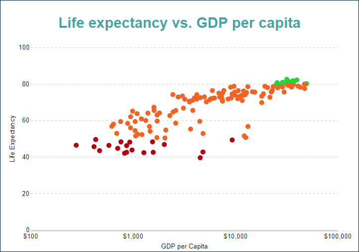
For instance, you can set the following rules for the plot in the Simple Scatter Plot Demo to apply a custom background color for outlying data points(life expectancy values above 80 and below 50 years):
As a result, the output of the chart will be like this:
Action
This group of properties determine the Interactive Action when a report reader clicks a data point symbol. You can use bound field references to pass parameters in a drill-through report or configure a dynamic bookmark or URL. The field value is evaluated in the scope of the current data value. Visit the Drill-Through Reports Walkthrough for more information. It explains how to set up the drill-through column plot, but the same technique applies to a scatter or bubble plot.