
Table
A Table report item is a data region that visualizes the bound data in a multicolumn, multirow fashion, with an ordered set of fields in columns and each data record displayed in a row. The intersection of a row and column is a Table Cell that contains data visualizers such as a TextBox or Image. Merged Cells span multiple columns or rows. In addition, a Table can group, sort, and filter the data based on pre-defined conditions or user input.
You can use the Table data region to build a Tabular Report. Visit the Get Started With Tabular Reports tutorial for more information.
Adding a Table
You can add a Table to a report by either double-click the corresponding item in the Toolbox or drag-and-drop it into a report page area.
Expand to watch adding a Table via the Toolbox in action
Alternatively, you can select data set fields in the Data panel and drag-and-drop them into a report page. The newly created table is automatically bound to the data set and displays the selected fields' captions and values.
Expand to watch adding a Table via the Data panel in action
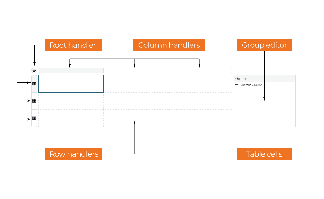
Table Designer
The following diagram depicts the default structure of the Table Designer that appears if you click anywhere inside its bounding box.
General Table Configuration
You can use one of two methods to load the general table configuration into the Properties panel
Select the
Tableitem in the report explorer.Click the
Root handlerin the table designer.
Expand to watch modifying the general configuration of a Table in action
The general configuration includes Base Report Item properties, Common Style Properties, Data Region properties, Visibility, Page Break, and the following specific properties.
Sometimes, the table footer could appear by itself on the top of the page. You can turn on the
Prevent Orphaned Footerswitch to move a previous row to the next page so that it appears together with a "lonely" footer.The
Keep togetherflag determines whether aTablealways appears on a single page if it fits.The
New Sectionflag indicates whether aTablehas its page numbering. Check the Global References documentation for more information.The
Frozen RowsandFrozen Columnsnumeric properties indicate how many rows and columns should remain visible when a report reader scrolls a table that does not fit into a visible area of the Report Viewer component.
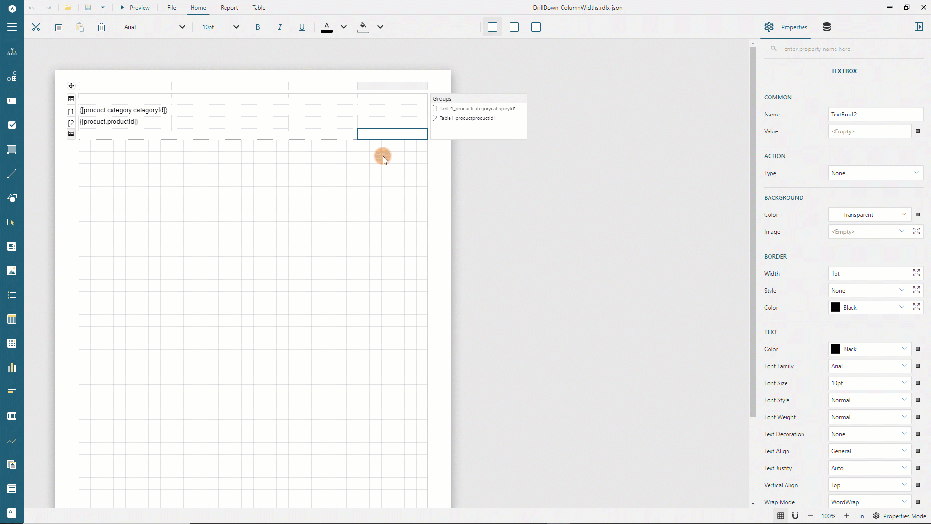
Table Columns
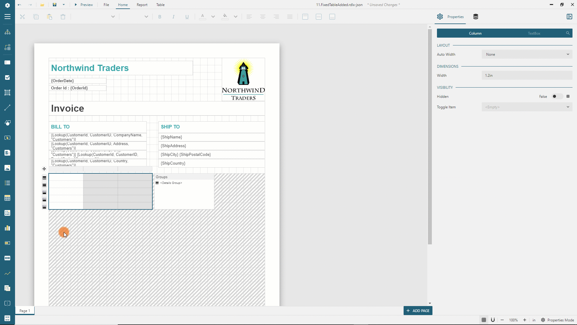
A Column is a vertical group of Cells within a Table. If you add a table via the Toolbox, it has three columns by default. If you use data set fields to create a table, then it has one column per field. You can add new columns or delete existing ones with the context menu that opens if you right-click a column handler.
The Column configuration includes the following properties.
The
Auto Widthproperty determines whether the column width can be automatically adjusted to take up the available space if one or more other columns are dynamically hidden. Check the live demo to see this feature in action. There are two values for this property:None- a column width is not automatically adjusted.Proportional- a column width is automatically adjusted to take up the available space. If there are several columns that have theAuto Widthproperty set toProportional, then the available space is divided equally among them.
The
Widthin Length units determines the width of table cells within a row. The total width of columns equals the table width.The Visibility property defines static or dynamic visibility of a column at preview-time.
Expand to watch adding a column and setting its width in action
If you left-click the Column handler, it automatically selects all the report items in the column's cells. The Properties panel shows the additional tab that lets you modify properties of all these report items simultaneously. In the most common scenario, the additional tab is called TEXTBOX and changes all the column's textboxes' properties.
Expand to watch using the TEXTBOX tab of column properties in action
 )
)
Table Rows
A Row is a horizontal group of Cells within a Table. Several row types serve different purposes but share common properties.
The
Heightin Length units determines the initial height of table cells within a row. However, cells can grow or shrink in height at preview-time. Check theCanGrowandCanShrinkproperties of a TextBox report item for more information.The
Actionproperty determines the interactive action that occurs when a report reader clicks anyReport Item, such asTextBox, contained in the row cells at preview time.The Visibility property defines static or dynamic visibility of a row at preview-time.
You can add new rows or delete existing ones with the context menu that opens if you right-click a row handler.
Expand to watch adding a row into the Table Footer in action
If you left-click the Row handler, it automatically selects all the report items in the row's cells. The Properties panel shows the additional tab that lets you modify properties of all these report items simultaneously. In the most common scenario, the additional tab is called TEXTBOX and changes all the rows's textboxes' properties.
Expand to watch using the TEXTBOX tab of row properties in action
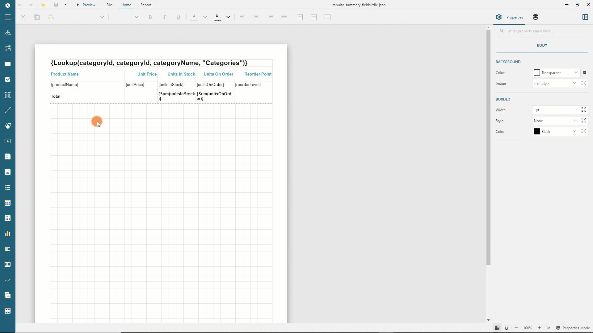
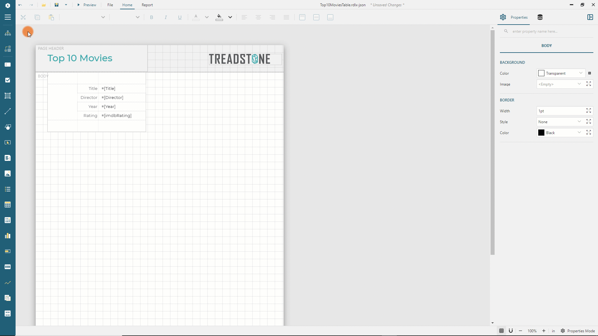
Table Header
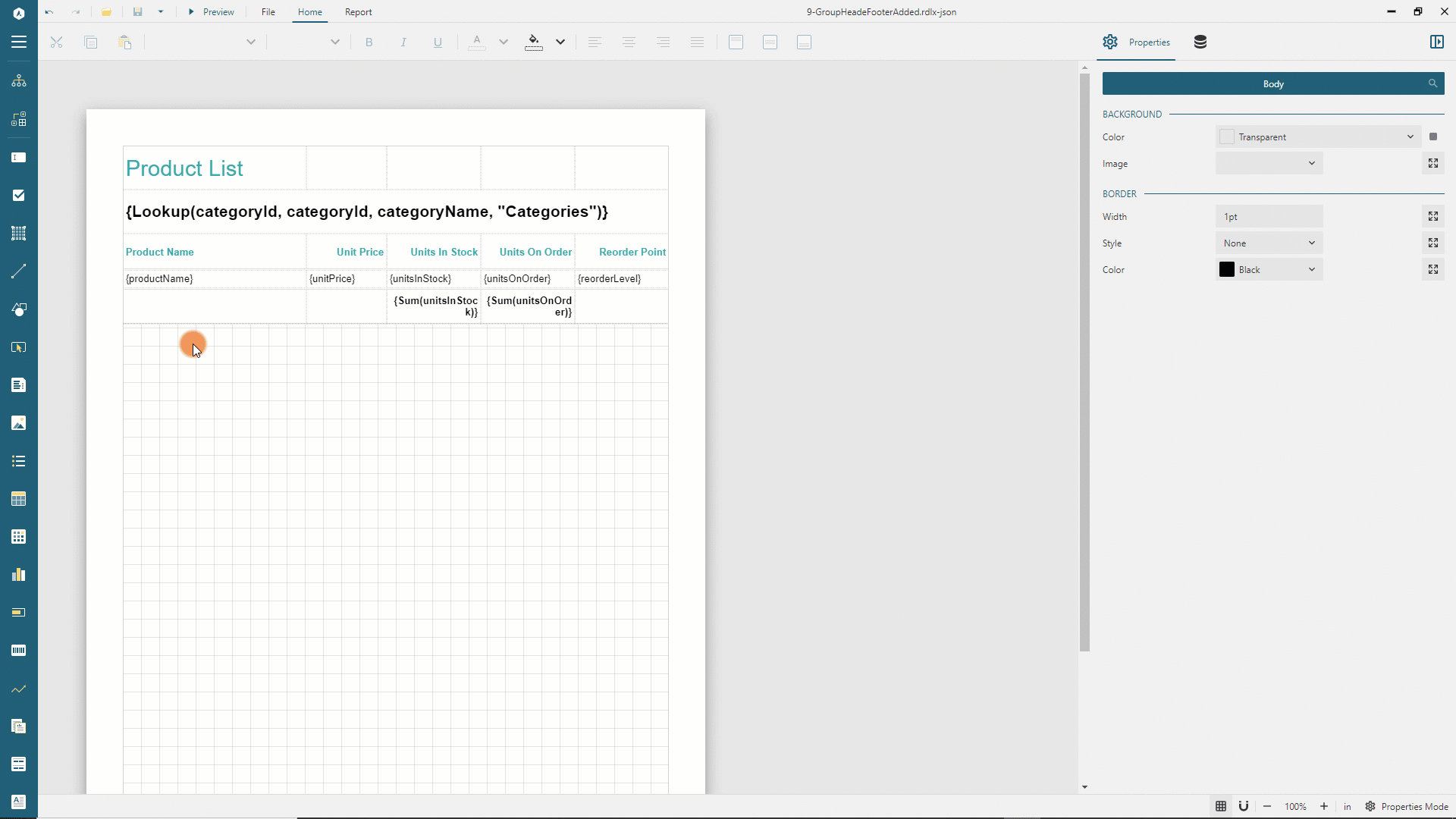
The Table Header row appears at the beginning of a table. Also, if its Repeat On New Page switch is on, it prints on every page taken by the table content. You could use the header row to display the title or the logo of a tabular report. For instance, the Get Started with Tabular Reports demo contains the Product List textbox in the first cell of the header row. A table may have several header rows.
Group Header
The Group Header row appears at the beginning of a group instance. Also, if its Repeat On New Page switch is on, it prints on every page taken by the table content. You could use a group header row to display the group's field value or summary value. For instance, Get Started with Tabular Reports demo groups products by category and has the group header that prints on every page and contains the textbox displaying the category name. A group may have several header rows.
Details
The Details row repeats for each bound data set record that passed through the data set filters and data region filters. For instance, in the Get Started with Tabular Reports demo, the details row displays the name, price, and other product fields in the corresponding columns. Discontinued products are filtered out.
If a table has the grouping configured, then the details row appears between the header and footer of the enclosing group instance.
A table may have more than one detail row. For instance, the Table With Image example has four detail rows.
Group Footer
The Group Footer row appears at the end of a group instance. Also, if its Repeat On New Page switch is on, it prints on every page taken by the table content. You could use the group footer row to display summary values. For instance, in the Get Started with Tabular Reports demo, the table's group footer row displays the Unit in Stocks and Units in Order grouping totals in the corresponding columns. A group may have several footer rows.
Table Footer
The Footer row appears at the end of a table. Also, if its Repeat On New Page switch is on, it prints on every page taken by the table content. You could use the footer rows to display grand totals. For instance, the table in the Get Started With Fixed Layout Reports demo has three footer rows displaying the invoice totals.
Table Cells
A Table Cell is the intersection of a row and column. By default each table cell contains a TextBox report item. However, you can replace it with other data visualizers, such as an Image by drag-and-drop the corresponding item from the Toolbox into the cell.
Expand to watch adding an Image into a table cell in action
In addition, table cells could contain nested data regions. For instance, the table in the List within Table demo contains the List report item in the third Details row.
Merged Cells
Merged Cells span multiple columns or rows. You can merge adjacent cells horizontally or vertically. The horizontal merging requires cells to be on the same row. The vertical merging requires cells to be on the same row type. For example, the table in the Table With Image demo has the vertically merged details cells in the first column.
To merge cells, select them holding the Ctrl button on Windows or Cmd on Mac OS, then right-click the selection and choose the Cells > Merge Cells item in the context menu.
Expand to watch cell merging in action
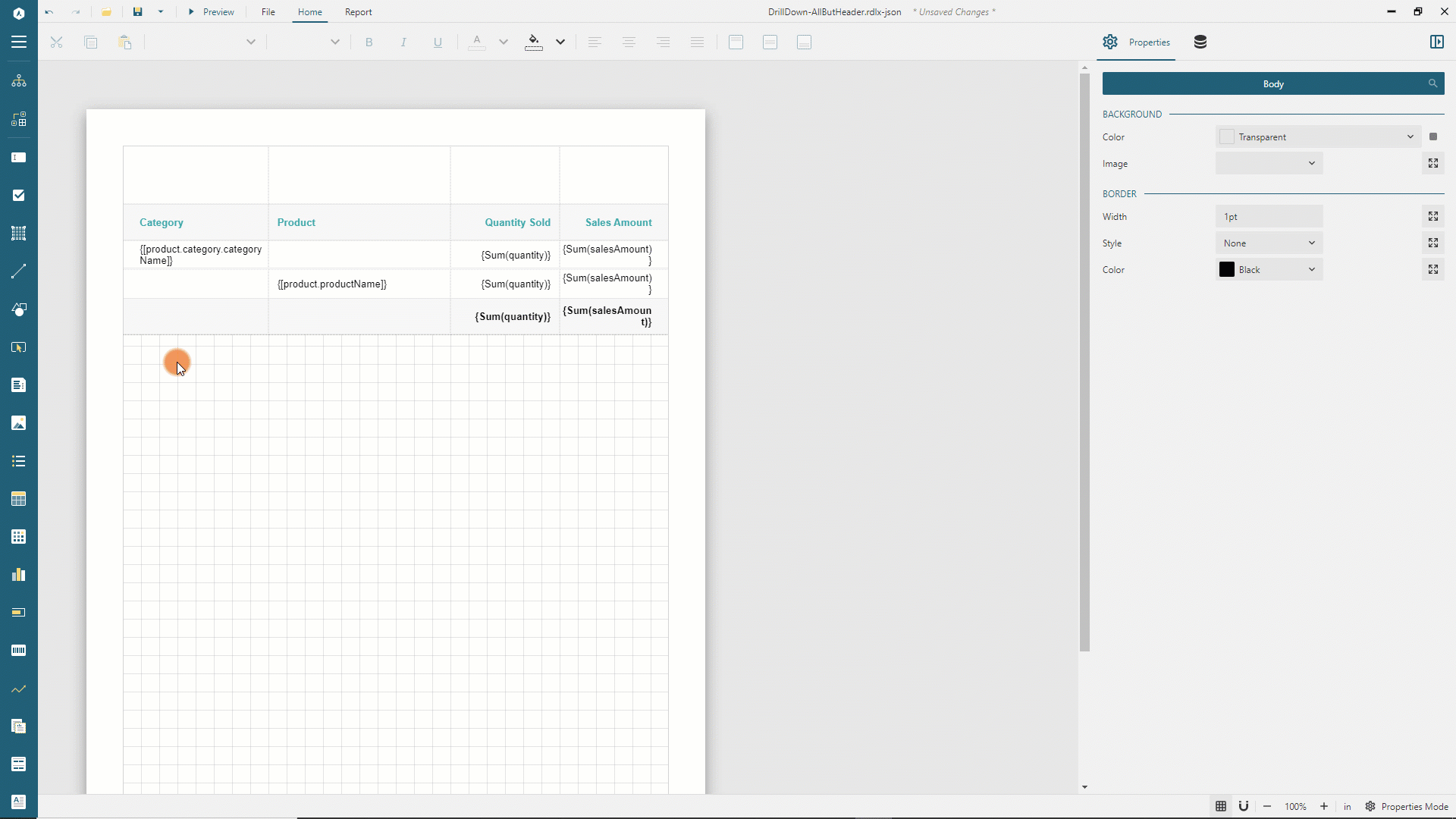
Table Grouping
The Table allows you to group Details rows by one or multiple criteria. For instance, the Get Started with Tabular Reports demo groups the product rows by category. We recommend using the Group Editor in the table designer to configure grouping.
Adding Groups
You can use one of two methods to add a table group.
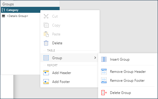
Right-click anywhere inside the table's bounding box and select the
Group -> Insert Groupitem in the context menu.Drag and drop a field that you want to group by from the data panel to the
Group Editor.
Expand to watch adding grouping by drag-and-drop in action
Insert child or parent groups
You can arrange rows in a table with several nested groups.
To insert a child group, right-click the parent group name in the Group Editor and select the Group -> Insert Group item in the context menu. Alternatively, you can drag-and-drop a field from the data panel to the group editor that indicates the position of a newly added group relative to existing groups with the <New Group> placeholder.
Also, you could delete a group or remove or add its header or footer by using the corresponding items of the context menu.
Group Configuration
The Group Editor enumerates group names that you can click to load their configuration into the properties panel.
The
Group Nameis the groupIddisplayed in the group editor.The
Group Expressionsis the collection of bound field references or more advanced expressions. Distinct values of group expressions generateGroup Instancesthat consist of optionalGroup HeaderandGroup Footerand theDetailsrows. For instance, theGet Started with Tabular Reportsdemo has the{categoryId}group expression. Consequently, the table generates 7 group instances, one per product category.The
Parentexpression determines the parent group in a recursive hierarchy. The common use-case for using this property is displaying tree-like data, where the relationship between parent and child is represented by dataset fields. For instance, the Interactive Hierarchy demo displays the retail chain, where eachStorerecord has theEntityKeyand theParentEntityKeyfields. The former is in the Table's DetailGroup Expressions, and the latter is in theParentexpression.The
Labelexpression determines the text of a group instance link in the Report Map.The Filters Editor of a group allows you to filter out certain group instances.
Group Layout Configuration
Sometimes, the
Group Footerrow could appear by itself on the top of the page. You can switch on thePrevent Orphaned Footerflag to move the lastDetailsrow of the group instance to the next page so that it appears together with a "lonely" group footer.The
Keep togetherflag ensures that the group instance always appears on a single page if it fits.The
Page Breakproperty determines the location of page breaks generated by group instances.None- no page breaks are generated.Start- each group instance inserts the page break before theGroup Headeror the firstDetailsrow.End- each group instance inserts the page break after theGroup Footeror the lastDetailsrow.StartAndEnd- the combination of theStartandEndoptions.Between- each group instance starts on the new page. TheGet Started with Tabular Reportsdemo uses this option.
The Visibility property determines static or dynamic visibility of group instances. The
Get Started With Drill-Down Reportsdemo sets the dynamic visibility of theProductgroup to implement the drill-down interactivity.The
New Sectionflag determines whether each group instance has its page numbering. Check the Global References documentation for more information.
Details grouping
In addition, you can group the Details rows without adding a group. The <Details Group> does not have the header and footer but reduces the number of Details rows to one row per distinct grouping value. You can edit the Details Group properties by left-clicking the corresponding item in the group editor. Almost all the properties described above are available.
Sorting Details Rows
You can set the order of the table's details rows appearance using the data region sorting configuration. You could also allow a report reader to arrange the details rows at preview-time by setting the User Sort configuration of a TextBox that will host the sort icon. For example, the Product Name textbox in the Get Started with Tabular Reports demo has the Sort Expression={productName} in the User Sort section of the Properties panel. Consequently, at preview-time, the sort icon appears on the right side of the text and enables a reader to sort products by name.
Expand to sorting at preview-time in action
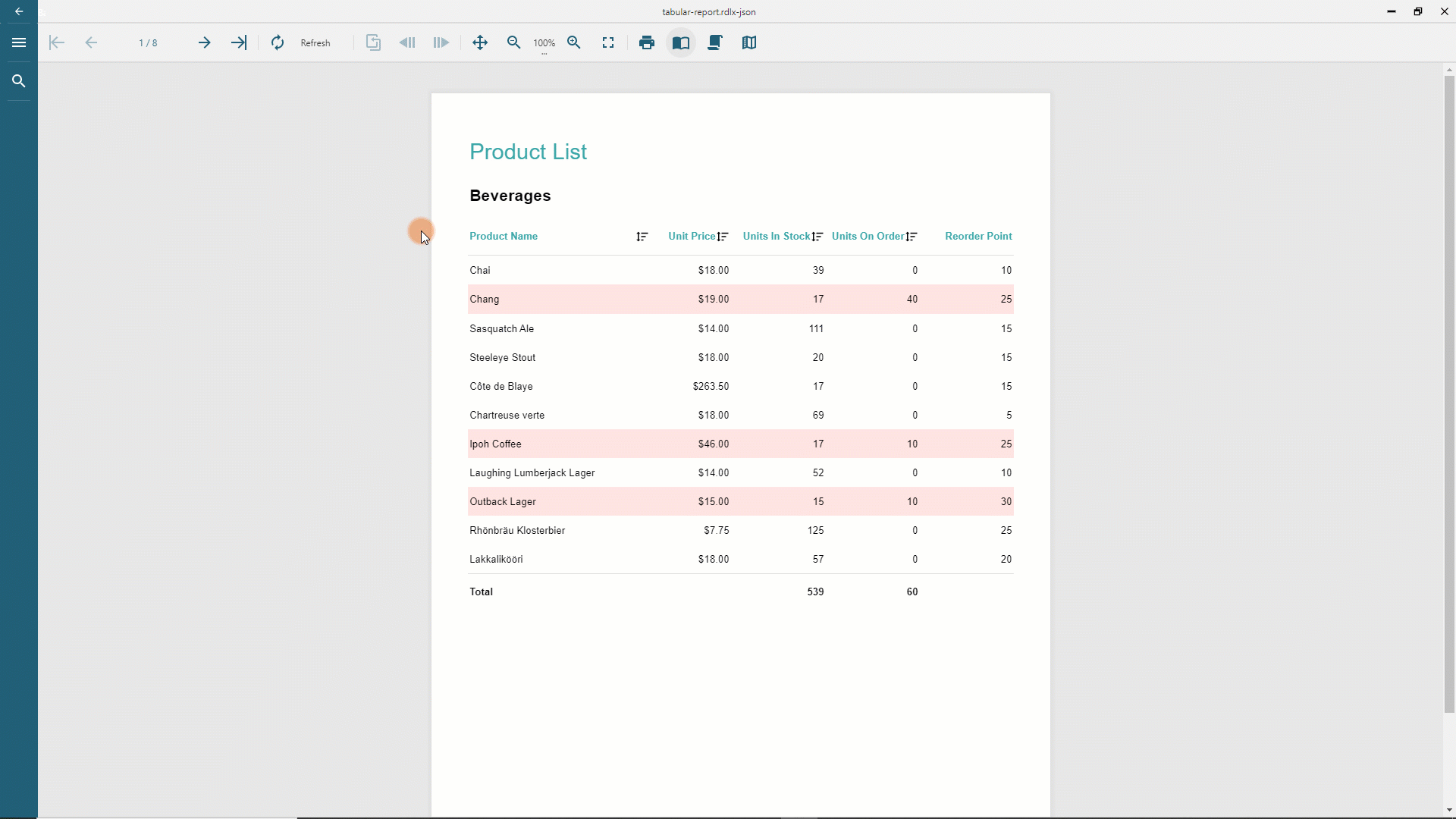
Since the Product Name textbox resides in the group header, products within each category can be sorted independently. To affect all the details rows within the table, the Sort Target property in the User Sort configuration should be set to Table1.
Sorting Group Instances
The Sort Expressions property of a table's group is the collection of items that allows you to sort group instances. Each item consists of the expression and the sort direction. For instance, in the Interactive Sorting demo, the group has the {country} sort expression and ascending order. Consequently, countries appear alphabetically at preview time.
You could also allow a report reader to arrange grouping instances at preview-time by setting the User Sort configuration of a TextBox that will host the sort icon. In the Interactive Sorting demo the CountryHeader textbox in the group header has the Sort Expression={country}, Sort Expression Scope=CountryGroup, Sort Target=CustomersTable configuration to achieve that.