
- GettingStarted
- DeveloperGuide
-
ReportAuthorGuide
- Overview
- Quick Start
- Interface Elements
- Report Controls
- Data Binding
- Expressions
- Parameters
- Drill Down
- Drill Through
- Hyperlinks
- Sort
- Tutorial 1: Create Tabular Report
- Tutorial 2: Create Parameterized Report
- Tutorial 3: Create Master-Detail Report
- Tutorial 4: Create Pivot Report
- Tutorial 5: Create Report with Chart
- Report Templates
- Tutorial-6-Apply-Styles-and-Themes
- Compatibility-with-AR-NET
Chart Types
Depending on the volume of data, number of variables, time period, and other data points, you can create charts from the following available types:
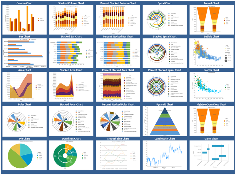
| Chart Type | Description |
|---|---|
| Column | • Column: Compares values of items across categories. • Column Stacked: A column chart with two or more data series stacked one on top of the other that shows how each value contributes to the total. • Column Percent Stacked: A column chart with two or more data series stacked one on top of the other to sum up to 100% that shows how each value contributes to a total with the relative size of each series representing its contribution to the total. |
| Bar | • Bar: Compares values of items across categories. • Bar Stacked: A bar chart with two or more data series stacked one on top of the other that shows how each value contributes to the total. • Bar Percent Stacked:A bar chart with two or more data series stacked one on top of the other to sum up to 100% that shows how each value contributes to the total with the relative size of each series representing its contribution to the total. |
| Line | • Line: Compares trends over a period of time or in certain categories. • Line Smooth: Plots curves rather than angled lines through the data points in a series to compare trends over a period of time or in certain categories. |
| Area | • Area: Compare trends over a period of time or in specific categories. • Area Stacked: An area chart with two or more data series stacked one on top of the other, shows how each value contributes to the total. • Area Percent Stacked: An area chart with two or more data series stacked one on top of the other to sum up to 100%, shows how each value contributes to the total with the relative size of each series representing its contribution to the total. |
| Pie | • Pie: Shows how the percentage of each data item contributes to the total. • Doughnut: Shows how the percentage of each data item contributes to a total percentage. |
| Spiral | • Spiral: Plots series along spirals, starting from the center of the circle. • Spiral Stacked: Plots multiple series one on top of the other showing contribution of each value to the total. • Spiral Percent Stacked: Plots multiple series one on top of the other showing percentage contribution of each value to the total. |
| Polar | • Polar: Polar charts plot series with circular x-axis representing angle values and radial y-axis representing radius values. • Polar Stacked: Plots multiple series one on top of the other showing contribution of each value to the total. • Polar Percent Stacked: Plots multiple series one on top of the other showing percentage contribution of each value to the total. |
| Miscellaneous | • Pyramid: Shows how the percentage of each data item contributes to the whole, with the smallest value at the top and the largest at the bottom. This chart type works best with relatively few data items. • Funnel: Shows how the percentage of each data item contributes to the whole, with the largest value at the top and the smallest at the bottom. This chart type works best with relatively few data items. • Bubble: Shows each series as a bubble. The y-axis values determine the height of the bubble, while the x-axis displays the category labels. • Scatter: Scatter charts present each series as a point or bubble. The y-axis values determine the heights of the points, while the x-axis displays the category labels. Shows the relationships between numeric values in two or more series sets of XY values. • Gantt: This project management tool charts the progress of individual project tasks. The chart compares project task completion to the task schedule. • Candlestick: Displays stock information using High, Low, Open and Close values. The height of the wick line is determined by the High and Low values, while the height of the bar is determined by the Open and Close values. The bar is displayed using different colors, depending on whether the price of the stock has gone up or down. • High Low Close: Displays stock information using High, Low, and Close values. High and low values are displayed using vertical lines, while tick marks on the right indicate closing values. • High Low Open Close: Displays stock information using High, Low, Open, and Close values. Opening values are displayed using lines to the left, while lines to the right indicate closing values. The high and low values determine the top and bottom points of the vertical lines. |