
- GettingStarted
- DeveloperGuide
-
ReportAuthorGuide
- Overview
- Quick Start
- Interface Elements
- Report Controls
- Data Binding
- Expressions
- Parameters
- Drill Down
- Drill Through
- Hyperlinks
- Sort
- Tutorial 1: Create Tabular Report
- Tutorial 2: Create Parameterized Report
- Tutorial 3: Create Master-Detail Report
- Tutorial 4: Create Pivot Report
- Tutorial 5: Create Report with Chart
- Report Templates
- Tutorial-6-Apply-Styles-and-Themes
- Compatibility-with-AR-NET
CheckBox
CheckBox report control is a visualization control that provides input for Boolean values. By default, it appears as an empty small box with text to the right. To control the checked status, use Checked property; and to add text, click the control and type within the control or use Text property.
Some properties of the CheckBox control are described below. Note that you need to enable Advanced Properties Mode to view all properties.
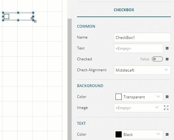
Common
Name: Name for the checkbox that is unique within the report. This name is displayed in the Report Explorer. You can only use underscore (_) as a special character in the Name field.
Text: Enter a static text or an expression to display a field from a data set or a calculated value. You can also display text within the control on multiple lines. With the CheckBox control in edit mode, insert line breaks at the desired location using the 'Enter' key or 'Shift' + 'Enter' key to create multiline text.
Checked: The checked state of the CheckBox. If the Checked property is True, the small box appears with a check mark; if False, the box is empty. You can also select or clear the control by clicking the box.
Check Alignment: Set the alignment of the check (tick) with respect to the text using the Check Alignment property.
Text
Font Style: Apply a font style on the text. Note that if you chose a theme for Layout > Style, the text appears according to the selected theme. You can select the following styles:
Normal - Makes text appear in normal style.
Italic - Makes text appear italicized.
Text Decoration: Lets you decorate the text by use of lines. You can choose from:
Underline - Draws a line below the text.
Overline - Draws a line above the text.
LineThrough - Draws a line through the middle of the text.
Wrap mode: Indicates how and whether a multi-line text automatically wraps words to the beginning of the next line when necessary. You can choose from:
NoWrap - The text spans in a single line.
WordWrap - Wraps words to the next line.
CharWrap - Wraps characters to the next line.
Background
Color: Select a color to use for the background of the CheckBox.
Image: Select an image to use for the background of the CheckBox.
Border
Width: Enter a value in points to set the width of the border.
Style: Select a style for the border.
Color: Select a color to use for the border from Color Picker, Standard Colors, or Web Colors.
Layout
Style: Choose from the list of available styles and set to apply a style to the CheckBox control. Note that changing the Layout > Style property changes the Text and Background properties.
Padding: Amount of gap to leave between the small box or text and the edge of the control. You can choose to set equal padding from all the edges or different padding for edges as:
Left - Inserts gap between the left edge and the content of the control.
Right - Inserts gap between the right edge and the content of the control.
Top - Inserts gap between the top edge and the content of the control.
Bottom - Inserts gap between the bottom edge and the content of the control.
Note: The box within the CheckBox control (where the check or tick is placed) is not resizable. While the CheckBox control can be resized to accommodate larger text, the actual part of the control that contains the checkmark is of fixed size.
Use Case
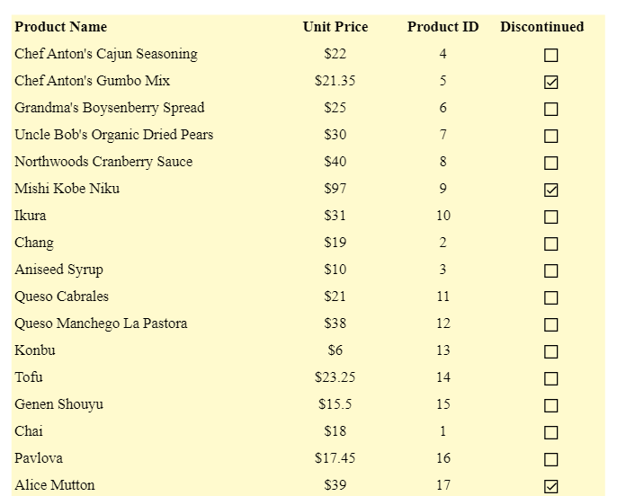
For example, a user has a report that displays information on Products, using the Table data region, as follows:
Since the 'Discontinued' column shows True or False, you can also use CheckBox control to show 'Tick's corresponding to True values. To achieve this,
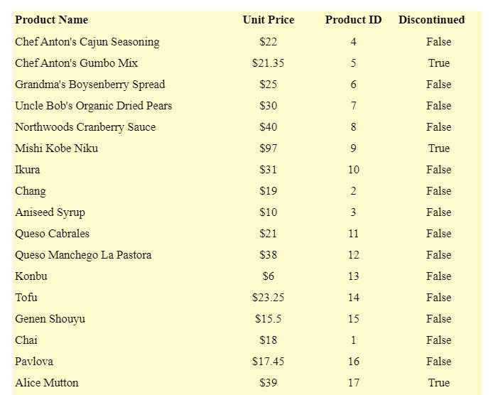
Remove the '=Fields!discontinued.Value' field from the TextBox in the details row of the table. To do so, select the field and press Delete.
Drag-drop the CheckBox control onto the empty TextBox.
With CheckBox selected, set the Checked property to the following expression:
=Fields!discontinued.Value.Preview.