
- GettingStarted
- DeveloperGuide
-
ReportAuthorGuide
- Overview
- Quick Start
- Interface Elements
- Report Controls
- Data Binding
- Expressions
- Parameters
- Drill Down
- Drill Through
- Hyperlinks
- Sort
- Tutorial 1: Create Tabular Report
- Tutorial 2: Create Parameterized Report
- Tutorial 3: Create Master-Detail Report
- Tutorial 4: Create Pivot Report
- Tutorial 5: Create Report with Chart
- Report Templates
- Tutorial-6-Apply-Styles-and-Themes
- Compatibility-with-AR-NET
Input Field
The Input Field report control provides support for editable fields in an exported PDF report.
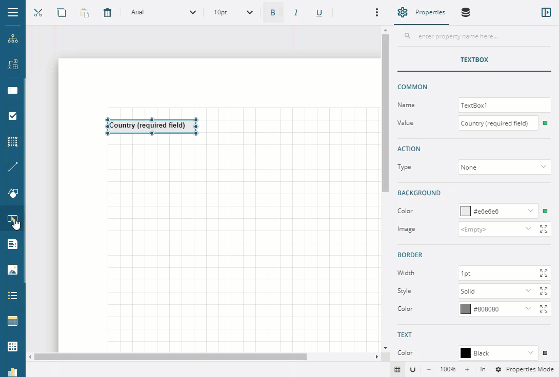
Some properties of the Input Field control are described below. Note that you need to enable Advanced Properties Mode to view all properties.
Input
Type: Select the type of the PDF form field from Text or CheckBox.
Read-Only: Prevents the user from modifying the form field content.
Required: Forces the user to fill in the selected field. At the attempt to submit the form with a blank field, an error message appears and the empty form field is highlighted.
Max Length (if Type property is Text): Specifies the maximum length of the entered text.
Spell-Check (if Type property is Text): Indicates whether the text is spell-checked during its input or not.
Multiline (if Type property is Text): Allows more than a single-line entry in the text field.
Password (if Type property is Text): Displays the entered text as a series of asterisks.
Checked (if Type property is CheckBox): The checked state of the CheckBox. If the Checked property is True, the small box appears with a check mark; if False, the box is empty. You can also select or clear the control by clicking the box.
Check Style (if Type property is CheckBox): Select a style for the check (tick) from the list of available options - Check, Circle, Cross, Diamond, Square, and Star.
Background
Color: Select a color to use for the background of the Input Field.
Border
Width: Enter a value in points to set the width of the border.
Style: Select a style for the border.
Color: Select a color to use for the border from Color Picker, Standard Colors, or Web Colors.
Text
Color: Select a color to use for the border from Color Picker, Standard Colors, or Web Colors.
Font Style: Apply a font style on the text. Note that if you chose a theme for Layout > Style, the text appears according to the selected theme. You can select the following styles:
Normal - Makes text appear in normal style.
Italic - Makes text appear italicized.
Format: Select one of the common numeric formats, provided in the list.
Layout
Style: Choose from the list of available styles and set to apply a style to the control.
Limitation: The exported Input Field control only supports the editable text field. For now, editable the checkbox is not supported.
Use Case
Let's say we want to create a PDF form where a user may enter textual information, for example, Name, or Date, or specify Yes or No for other fields such as Sex or Employment Status.
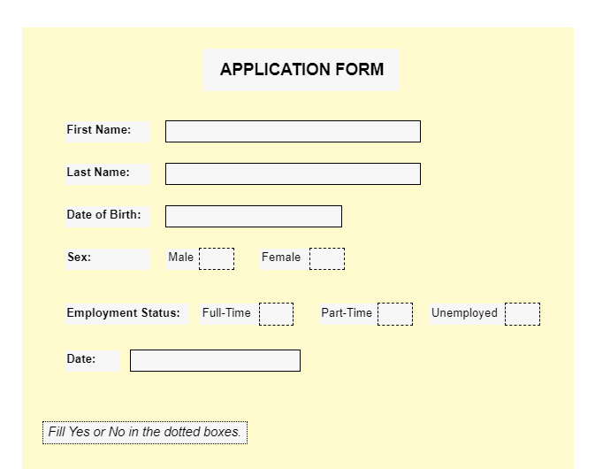
- Create a Page report and drag-drop the TextBox control onto the report’s designer and set its Value to APPLICATION FORM.
- Drag-drop the TextBox controls below the APPLICATION FORM which will be the captions to the user's answer, and set them to the following values:
- TextBox2 Value: First Name:
- TextBox3 Value: Last Name:
- TextBox4 Value: Date of Birth:
- TextBox5 Value: Sex:
- TextBox6 Value: Employment Status:
- TextBox7: Date:
- TextBox8 Value: Male
- Textbox9 Value: Female
- TextBox10 Value: Full-Time
- TextBox11 Value: Part-Time
- TextBox12 Value: Unemployed
- Now, let us add fields that are required to be filled by the users filling the form. Drag-drop the InputField controls next to the TextBoxes added in the previous step.
- Set the InputField's Type value to 'Text'. These InputField controls will support entering text into these fields in the exported PDF format.
- Improve the appearance of the controls.
- Preview.