
- GettingStarted
- DeveloperGuide
-
ReportAuthorGuide
- Overview
- Quick Start
- Interface Elements
- Report Controls
- Data Binding
- Expressions
- Parameters
- Drill Down
- Drill Through
- Hyperlinks
- Sort
- Tutorial 1: Create Tabular Report
- Tutorial 2: Create Parameterized Report
- Tutorial 3: Create Master-Detail Report
- Tutorial 4: Create Pivot Report
- Tutorial 5: Create Report with Chart
- Report Templates
- Tutorial-6-Apply-Styles-and-Themes
- Compatibility-with-AR-NET
List
List report control is a freeform data region in which you can place other report controls, and arrange them in any configuration you like. It repeats any report controls it contains for every record in the dataset.
Some properties of the List control are described below. Note that you need to enable Advanced Properties Mode to view all properties.
Data
Data Set Name: Select a dataset to associate with the list. The drop-down list is populated with all of the datasets in the report's dataset collection.
Sort Expressions: In the Expression box, enter an expression by which to sort the data, and under Direction, select Ascending or Descending for the selected sort expression.
Filters: You need to provide the following values to add a new filter to the collection:
Filter Expression: Enter the expression to use for evaluating whether data should be included in the group.
Operator: Select from the following operators to decide how to compare the expression to the left with the value to the right.
- Equal - Only choose data for which the value on the left is equal to the value on the right.
- Like - Only choose data for which the value on the left is similar to the value on the right. For more information on using the Like operator, see the MSDN Web site.
- NotEqual - Only choose data for which the value on the left is not equal to the value on the right.
- GreaterThan - Only choose data for which the value on the left is greater than the value on the right.
- GreaterThanOrEqual - Only choose data for which the value on the left is greater than or equal to the value on the right.
- LessThan - Only choose data for which the value on the left is less than the value on the right.
- LessThanOrEqual - Only choose data for which the value on the left is less than or equal to the value on the right.
- TopN - Only choose items from the value on the left which are the top number specified in the value on the right.
- BottomN - Only choose items from the value on the left which are the bottom number specified in the value on the right.
- TopPercent - Only choose items from the value on the left which are the top percent specified in the value on the right.
- BottomPercent - Only choose items from the value on the left which are the bottom percent specified in the value on the right.
- In - Only choose items from the value on the left which are in the array of values specified on the right. Selecting this operator enables the Values list at the bottom.
- Between - Only choose items from the value on the left which fall between the pair of values you specify on the right. Selecting this operator enables two Value boxes instead of one.
Value: Enter a value to compare with the expression on the left based on the selected operator. For multiple values used with the Between operator, the lower two value boxes are enabled.
Filter Values: When you choose the In operator, you can enter as many values as you need in this list.
Group
Name: Enter a name for the group that is unique within the report. You can only use underscore (_) as a special character in the Name field. Other special characters such as period (.), space ( ), forward slash (/), back slash (\), exclamation (!), and hyphen (-) are not supported.
Group Expressions: Enter an expression to use for grouping the data. When a detail grouping is set, the value repeats for each distinct result of the grouping expression instead of for each row of data.
Page Break: Specify where the page break occurs relative to grouping on the list:
Start - Inserts page break at the start of the group.
End - Inserts page break at end of the group.
StartAndEnd - Inserts page break at both start and end of the group.
Parent: Enter an expression to use as the parent group in case of recursive hierarchies.
Label: Enter an expression to use as a label to represent this item in the table of contents (document map).
New Section: Indicates if the group constitutes its own page numbering section.
Background
Color: Select a color to use for the background.
Image: Select an image to use for the background.
Border
Width: Enter a value in points to set the width of the border.
Style: Select a style for the border.
Color: Select a color to use for the border from Color Picker, Standard Colors, or Web Colors.
Layout
Style: Choose from the list of available styles and set to apply a style to the control.
Page Break: Specify where the page breaks on each instance of the list:
Start - Inserts page break at the start of the list.
End - Inserts page break at end of the list.
StartAndEnd - Inserts page break at both start and end of the list.
New Section: Select to indicate whether this list is in its own section with regards to pagination.
Keep Together: Indicates if the data inside the list is kept together on a single page if possible.
Consume White Space: Indicates that all white space in the list is consumed during report rendering when the list’s contents grow rather than preserving the minimum white space between the contents and the bounds of the list.
No Data
Message: The message to display in the data region when no rows of data are available.
Color: Select a color to use for the message from Color Picker, Standard Colors, or Web Colors.
Font Style: Apply a font style on the text. Note that if you chose a theme for Layout > Style, the text appears according to the selected theme. You can select the following styles:
Normal - Makes text appear in normal style.
Italic - Makes text appear italicized.
Text Decoration: Lets you decorate the text by use of lines. You can choose from:
Underline - Draws a line below the text.
Overline - Draws a line above the text.
LineThrough - Draws a line through the middle of the text.
Format: Select one of the common numeric formats, provided in the list.
Use Case
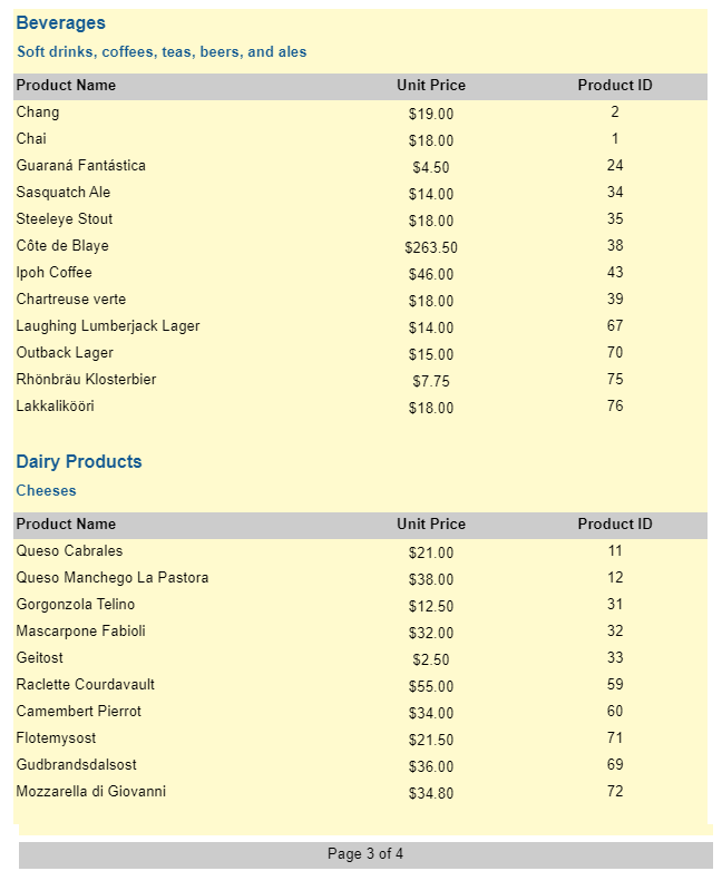
Let’s say that we want to show the products information for each category, that is, the products details should appear corresponding to each category, along with the category name and category description.
For creating such type of report, we will use the List data region and place controls on it so that each control repeats for every record in the dataset. We will use TextBox controls to show [CategoryName] and its [Description], and a Table to show the details corresponding to each category. We will also be applying group expression on the List data region. The final report will be as shown:
Create a Page Report and drag-drop the List data region on the report’s designer. Grab its corner and adjust its size. You can also set the following properties to some suitable values:
- Width
- Height
- FixedWidth
- FixedHeight
Drag-drop the Table data region onto the List data region.
Fill-in the Table's Details row to show the information on products by binding each of the textboxes, for eg., to ProductName, UnitPrice, and ProductID fields, respectively.
Drag-drop a TextBox control above the table (on the List data region). Bind it to
[CategoryName].Drag-drop another TextBox control above the table (on the List data region). Bind it to
[Description].
If we preview our report now, we will see that all the three report controls are repeated and it is difficult to read the report.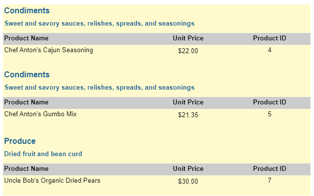
Since we want to view products information for each category to be grouped, we need to add a group expression. We will use
[CategoryName]to group the data as it is a unique value for each category.- Select List data region and go to Group Expressions property.
- Click Add Item and write the expression
=Fields!CategoryName.Value.
Let’s add page numbers on each page of our report. Drag-drop a TextBox control to the bottom of the page, outside the List data region. Set the Value property to
="Page " & Globals!PageNumber & " of " & Globals!TotalPages.Improve the appearance of the report by resizing the controls and applying font style and alignment properties.
Preview.