
- GettingStarted
- DeveloperGuide
-
ReportAuthorGuide
- Overview
- Quick Start
- Interface Elements
- Report Controls
- Data Binding
- Expressions
- Parameters
- Drill Down
- Drill Through
- Hyperlinks
- Sort
- Tutorial 1: Create Tabular Report
- Tutorial 2: Create Parameterized Report
- Tutorial 3: Create Master-Detail Report
- Tutorial 4: Create Pivot Report
- Tutorial 5: Create Report with Chart
- Report Templates
- Tutorial-6-Apply-Styles-and-Themes
- Compatibility-with-AR-NET
Simple Report with Chart
This tutorial guides you through the steps to create a report using the Chart data region.
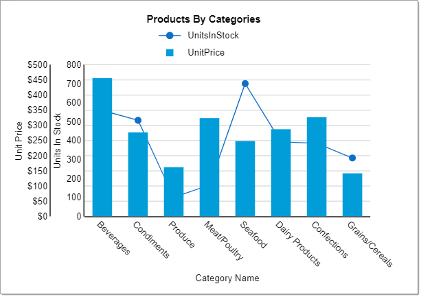
After you complete this tutorial, you will have a report that looks similar to the following.
Bind Data to Report
Create a new report. By default, you have a blank RDL Report.
Connect to a data source.
Go to the Data tab and click Add.
In the DataSource dialog, provide the following URL as Endpoint for the 'Remote JSON' provider:
https://demodata.grapecity.com/northwind/odata/v1/- Click Save Changes.
Add a dataset.
Click Add Data Set for the added data source.
In the DataSet dialog > Uri/Path, write the resource name as 'Products'.
Enter the Json Path:
$.value[*].In the Parameters property, click Add Items and enter the following key/value pair to extract fields from another resource, 'Category'.
- Key=
$expand, Value=Category
Doing this joins the fields from 'Products' and 'Category' resources into the single dataset.
- Key=
Validate the query to retrieve fields and Save Changes.
See Databinding for information on connecting to data sources and adding datasets.
Create a Report Layout
The report uses the Chart data region to display data. Drag and drop the Chart data region ![]() onto the design area of the report.
onto the design area of the report.
Define Plots
We will create a column chart with two series plotted along the Y-axis. For that, we need to add two plots to the chart area.
With the chart selected, from the Properties tab, click Show Items next to the Plots property. You will see that a default Plot1 is already added.
Add one more plot and set its Name as Plot2. Now you have two chart plots - Plot1 and Plot2.
Let us now set the properties for the plots as described below:
From the Report Explorer, select 'Plot - Plot1' and go to Properties tab.
In the Values property, click Show Items, and then select Add Item.
Click
 to display the Value properties.
Again in the Value property, click Show Items, and then select Add Item.
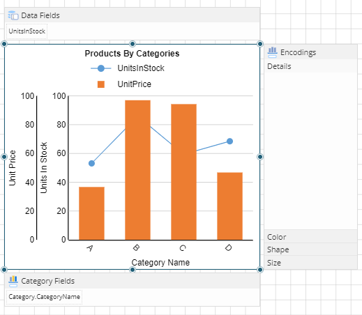
Click the radio button to view the fields and select 'UnitsInStock' from the list.

The 'UnitsInStock' field is added to the Data Fields adorner.
With 'Plot - Plot 1' selected, go to Encodings > Category and click Show Items, and then select Add Item.
Click the radio button to view the fields and select Category.CategoryName from the list.
Set Show Values Names in Legend to 'True' to display the legend in the chart.
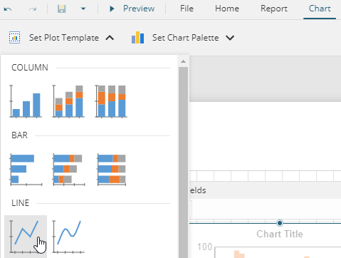
Click Chart tab from the Menu bar.
From the Set Plot Template option, select 'Line'.
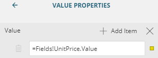
Similarly, set the Values property for 'Plot - Plot2' to UnitPrice as shown in the following image.
Go to Encodings > Category and click Show Items, and then select Add Item.
Click the radio button to view the fields and select Category.CategoryName from the list.
Set Show Values Names in Legend to 'True' to display the legend in the chart.
Click Chart tab from the Menu bar.
From the Set Plot Template option, select Column.
Define Axes, Labels and Legends
From the Explorer
 , select 'Y Axis - [Plot 1]'.
Enter Common > Title property as 'Units In Stock'.
Similarly, select 'Y Axis - [Plot 2]' and enter Common > Title property as 'Unit Price'.
Set Labels > Format property to 'Currency'.
From the Report Explorer, select 'X Axis - Plot 1'.
Enter the Title of the X axis as 'Category Name'.
With 'X Axis - Plot 1' selected, set Plots property to two plots, that is, 'Plot 1' and 'Plot 2':

Set Labels > Label Angle property to -45 deg.
From the Report Explorer, select Global Legend and set its Common > Position to 'Top'.
Add Titles
Let us add titles to our chart and, to the 'X' and 'Y' axes.
From the Explorer
, select Header under Chart1 (or the name of your chart).
From the Properties pane, set Caption to 'Products By Categories'.
Customize the Appearance of Report

Note: You may need to resize and reposition the chart control on the report to accommodate data, and for a cleaner look.
Set the Text - Font Size for the text in chart title.
Choose a suitable color palette for the chart using the Set Color Palette tab available on the top of designer (Blue).
Preview and Save Report
Click Preview to view your report in the final output.
Exit the preview mode by clicking Back on the top left side of the designer.
Click Save to open the Save dialog box. Enter the report name and click Save Report.