ActiveReports 18 .NET Edition
Report Authors: Designer Components / Report Controls / Page/RDLX Report / BandedList
In This Topic
    BandedList
    In This Topic

    You can use the BandedList data region in your Page and RDLX reports to visualize bound data as free-form bands where data may be grouped by data field or an aggregate function like summary and total value. 

    The BandedList data region is a collection of bands. By default, it is composed of three bands: a header, a footer and a details band. The BandedList may also have group header and group footer bands, which are created when you add a data group to a banded list. Report controls in these bands repeat once for each group in a banded list.
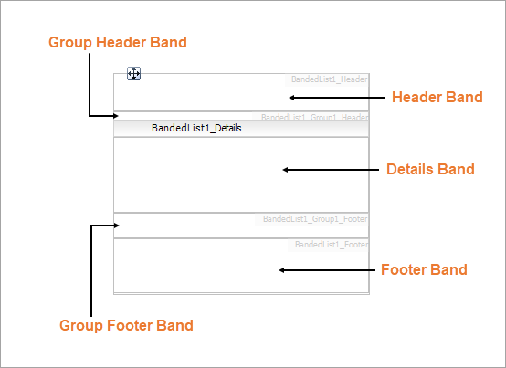
    Structure

    BandedList structure


    Header Band

    The Header band appears at the beginning of a banded list. Also, if its RepeatOnNewPage property is on, it prints on every page taken by the banded list content. You could use the header band to display the title or the logo on top of the report.

    Group Header Band

    The Group Header band appears at the beginning of a group when a group is added in the Details band. Also, if its RepeatOnNewPage property is on, it prints on every page taken by the banded list content. You could use the group header band to display the group's field value or summary value.

    Details Band

    The Details band repeats for each bound data set record that passed through the data set filters and data region filters. For example, the details band may display the name, title, email, phone and photo of each employee.

    If a banded list has groups, then the details bands appear between the header and footer of the enclosing group instance.

    Group Footer Band

    The Group Footer band appears at the end of a group when a group is added in the Details band. Also, if its RepeatOnNewPage property is on, it prints on every page taken by the banded list content. You could use the group footer band to display summary values.

    Footer Band

    The Footer band appears at the end of a banded list. Also, if its RepeatOnNewPage property is on, it prints on every page taken by the banded list content. You could use the footer band to display grand totals.

    Important Properties

    Band Properties

    Clicking inside each band reveals its properties in the Properties window.

    Property Description
    BreakLocation (Details only) Indicates where the report is broken on a new page of the band. Select from None, Start, End, StartAndEnd, and Between.
    CanGrow Change to True to allow the data region to grow vertically to accommodate data.
    CanShrink Change to True to allow the data region to shrink if there is not enough data to fill it.
    KeepTogether Change to True to have ActiveReports attempt to keep all of the data in the band together on one page.
    RepeatOnNewPage With header and footer bands, repeats the band on every page when the related details span multiple pages.
    PageBreakAtStart (all bands except Details) Indicates whether the report breaks to a new page at the start of the band.
    PageBreakAtEnd (all bands except Details) Indicates whether the header or footer bands are displayed on each page that includes the banded list.

    BandedList Properties

    Clicking the four-way arrow selects the entire data region and reveals its properties. 

    Property Description
    DataSetName Select the dataset to use in the data region.
    DataSetParameters Specify the parameters for the data set.
    KeepTogether (RDLX) Change to True to have ActiveReports attempt to keep all of the data in the data region together on one page.
    NewSection Change to True to render the data region in a new section.
    OverflowName (Page) Select the name of the OverflowPlaceHolder control in which to render data that exceeds the allowed space for the data region on the first page of the report.

    Banded List Dialog Properties

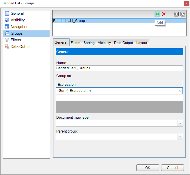
    You can set the BandedList properties in the Banded List dialog. To open it, with the BandedList selected on the report, under the Properties window, click the Property dialog link.

    Name: Enter a name for the banded list that is unique within the report. You can only use underscore (_) as a special character in the Name field. Other special characters such as period (.), space ( ), forward slash (/), backslash (\), exclamation (!), and hyphen (-) are not supported.

    Tooltip: A textual label for the report item used to include TITLE or ALT attributes in HTML reports.

    Dataset name: Select a dataset to associate with the banded list. The combo box is populated with all of the datasets in the report's dataset collection.

    Has own page numbering: Select to indicate whether this banded list is in its own section with regards to pagination.

    Consume all white space during report rendering (RDLX): Select to have all white space consumed at report rendering.  

    Page Breaks (RDLX): Select any of the following options to apply to each instance of the banded list.

    • Insert a page break before this banded list
    • Insert a page break after this banded list
    • Fit banded list on a single page if possible

    NewPage (RDLX): Indicates on which page the content to start after the page break.

    • Next: A default value that makes a new group start from the immediate next page of the report.
    • Odd: A new group starts from the next odd page of the report.
    • Even: A new group starts from the next even page of the report.

    Header and Footer: Select any of the following options.

    • Repeat header band on each page
    • Repeat footer band on each page
    • Prevent orphaned header on the page
    • Prevent orphaned footer on next page
    • Print footer at the bottom of the page

    By default, the banded list is visible when the report runs, but you can hide it when certain conditions are met, or toggle its visibility with another report control. The same applies to banded list groups.

    Initial visibility

    • Visible: The banded list is visible when the report runs.
    • Hidden: The banded list is hidden when the report runs.
    • Expression: Use an expression with a Boolean result to decide whether the BandedList is visible. True for hidden, False for visible.

    Visibility can be toggled by another report item: Select this check box to display a toggle image next to another report item. This enables the drop-down box below where you can specify the TextBox control that toggles the visibility of the BandedList. The user can click the toggle item to show or hide this BandedList.

    Document map label: Enter an expression to use as a label to represent this item in the table of contents (document map).

    Bookmark ID: Enter an expression to use as a locator for this BandedList. You will then be able to provide a bookmark link to this item from another report control using a Jump to bookmark action.

    Click the plus sign button to add a new group to the banded list, and delete them using the X button. Once you add one or more groups, you can reorder them using the arrow buttons, and set up information for each group on the following tabs.

    General

    Name: Enter a name for the group that is unique within the report. This property cannot be set until after a Group on expression is supplied.

    Group on: Enter an expression to use for grouping the data.

    Document map label: Enter an expression to use as a label to represent this item in the table of contents (document map).

    Parent group: For use in recursive hierarchies. Enter an expression to use as the parent group.

    Filters

    You need to provide three values to add a new filter to the collection: Expression, Operator, and Value.

    Expression: Enter the expression to use for evaluating whether data should be included in the group.

    Operator: Select from the following operators to decide how to compare the expression to the left with the value to the right.

    • Equal Only choose data for which the value on the left is equal to the value on the right.
    • Like Only choose data for which the value on the left is similar to the value on the right.
      For more information on using the Like operator, see the MSDN Web site.
    • NotEqual Only choose data for which the value on the left is not equal to the value on the right.
    • GreaterThan Only choose data for which the value on the left is greater than the value on the right.
    • GreaterThanOrEqual Only choose data for which the value on the left is greater than or equal to the value on the right.
    • LessThan Only choose data for which the value on the left is less than the value on the right.
    • LessThanOrEqual Only choose data for which the value on the left is less than or equal to the value on the right.
    • TopN Only choose items from the value on the left which are the top number specified in the value on the right.
    • BottomN Only choose items from the value on the left which are the bottom number specified in the value on the right.
    • TopPercent Only choose items from the value on the left which are the top percent specified in the value on the right.
    • BottomPercent Only choose items from the value on the left which are the bottom percent specified in the value on the right.
    • In Only choose items from the value on the left which are in the array of values specified on the right.
      Selecting this operator enables the Values list at the bottom.
    • Between Only choose items from the value on the left which fall between the pair of values you specify on the right. Selecting this operator enables two Value boxes instead of one.

    Value: Enter a value to compare with the expression on the left based on the selected operator. For multiple values used with the Between operator, the lower two value boxes are enabled.

    Values: When you choose the In operator, you can enter as many values as you need in this list.

    Sorting

    Click the plus sign button to enter new sort expressions, and remove them using the X button.

    Caution: You cannot sort the detail data in a BandedList, so any sorting of this type must be done at the query level.

    Expression: Enter an expression by which to sort the data in the group.

    Direction: Select Ascending or Descending.

    Visibility

    By default, the group is visible when the report runs, but you can hide a group when certain conditions are met, or toggle its visibility with another report item.

    Initial visibility

    • Visible: The group is visible when the report runs.
    • Hidden: The group is hidden when the report runs.
    • Expression: Use an expression with a Boolean result to decide whether the group is visible. True for hidden, False for visible.

    Visibility can be toggled by another report item: Select this check box to display a toggle image next to another report item. The user can click the toggle item to show or hide this band group. This enables the drop-down list where you can select the report control that users can click to show or hide this group.

    Data Output

    Element Name: Enter a name to be used in the XML output for this group.

    Collection: Enter a name to be used in the XML output for the collection of all instances of this group.

    Output: Choose Yes or No to decide whether to include this group in the XML output.

    Layout

    BreakLocation: Select from these options to decide where to insert a page break in relation to the group.

    • None: Inserts no page break.
    • Start: Inserts a page break before the group. 
    • End: Inserts a page break after the group.
    • StartAndEnd: Inserts a page break before and after the group.
    • Between: Inserts a page break between groups (at the end of a current group and the beginning of a next group).

    Include group header: Adds a group header band (selected by default).

    Include group footer: Adds a group footer band (selected by default).

    Repeat group header: Repeats the group header band on each page.

    Repeat group footer: Repeats the group footer band on each page.

    Has own page numbering: Used in conjunction with the "Page Number in Section" and "Total Pages in Section" properties, tells the report that the group constitutes a new page numbering section.

    Keep together on one page if possible: Indicates that the group is kept together on one page if possible.

    Prevent orphaned header: Indicates whether the orphaned header is displayed for the group.

    Prevent orphaned footer: Indicates whether the orphaned footer is displayed for the group

    Print footer at the bottom of the page: Indicates whether to print the group footer at the bottom of the page.

    NewPage: Indicates on which page the content to start after the page break.

    • Next: A default value that makes a new group start from the immediate next page of the report.
    • Odd: A new group starts from the next odd page of the report.
    • Even: A new group starts from the next even page of the report.

    You need to provide three values to add a new filter to the collection: Expression, Operator, and Value.

    Expression: Enter the expression to use for evaluating whether data should be included in the group.

    Operator: Select from the following operators to decide how to compare the expression to the left with the value to the right.

    • Equal Only choose data for which the value on the left is equal to the value on the right.
    • Like Only choose data for which the value on the left is similar to the value on the right.
      For more information on using the Like operator, see the MSDN Web site.
    • NotEqual Only choose data for which the value on the left is not equal to the value on the right.
    • GreaterThan Only choose data for which the value on the left is greater than the value on the right.
    • GreaterThanOrEqual Only choose data for which the value on the left is greater than or equal to the value on the right.
    • LessThan Only choose data for which the value on the left is less than the value on the right.
    • LessThanOrEqual Only choose data for which the value on the left is less than or equal to the value on the right.
    • TopN Only choose items from the value on the left which are the top number specified in the value on the right.
    • BottomN Only choose items from the value on the left which are the bottom number specified in the value on the right.
    • TopPercent Only choose items from the value on the left which are the top percent specified in the value on the right.
    • BottomPercent Only choose items from the value on the left which are the bottom percent specified in the value on the right.
    • In Only choose items from the value on the left which are in the array of values specified on the right.
      Selecting this operator enables the Values list at the bottom.
    • Between Only choose items from the value on the left which fall between the pair of values you specify on the right. Selecting this operator enables two Value boxes instead of one.

    Value: Enter a value to compare with the expression on the left based on the selected operator. For multiple values used with the Between operator, the lower two value boxes are enabled.

    Values: When you choose the In operator, you can enter as many values as you need in this list.

    The Data Output page of the Banded List dialog allows you to control the following properties when you export to XML.

    • Element Name: Enter a name to be used in the XML output for this BandedList.
    • Output: Choose Auto, YesNo, or Contents only to decide whether to include this BandedList in the XML output. Choosing Auto exports the contents of the BandedList.

    BandedList Features

    Adding Data Group

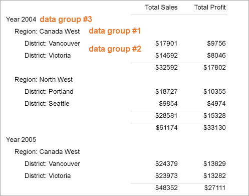
    You can group data in the Details band by one or multiple criteria, for example, group sales data in the sales list by region, district and year.

    1. In the Designer, select a banded list control and right-click it.
    2. In the context menu that appears, select Insert Group.
    3. In the Banded List - Groups dialog that opens, enter a grouping expression for each group in the Group on property. You can also nest groups, plus, in RDLX reports, you can nest other data regions in any header or footer band.
    4. Click the plus sign button to add a new group to the BandedList, and delete them using the X button. Once you add one or more groups, you can reorder them using the arrow buttons, and set up information for each group on the tabs

      BandedList Groups dialog

    In the example of the report with the banded list data region, you can see three (3) data groups - data group #1 (=[RegionID]), data group #2 (=[DistrictID]), and data group #3 (=[SaleYear]).

    Data grouping in BandedList 

    Adding Aggregates

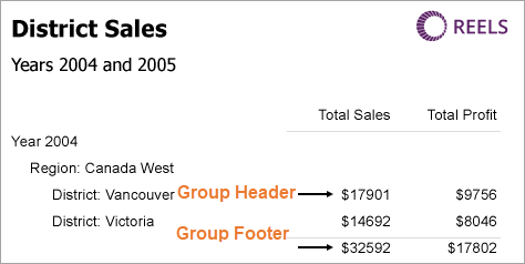
    You can use aggregate functions to group data in the BandedList header, footer and group header/footer bands. See Common Functions for the complete list of aggregate functions you can use. 

    1. Select the banded list and click the Property dialog link at the bottom of the Properties window.
    2. In the Banded List dialog that appears, go to the Groups tab.
    3. In the Expession field under Group on, select <Expression...> to open the Expression Editor.
    4. In the Expression Editor, select an aggregate function in the list of fields under Common Functions and click OK.
    5. In the Banded List dialog, click OK.

    For example, the Sum aggregate function calculates the sum of the values returned by the expression: =Sum(Fields!TotalSales.Value). If you use this aggregate in the group header of the banded list, it will display the total sales value for a data group - in the example below, this is the district sales total value. The same aggregate function, =Sum(Fields!TotalSales.Value), placed to the group footer of the banded list, displays the sum of the values for the District data group.

    Sum aggregate in the BandedList data group 

    See Also