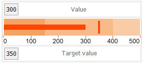
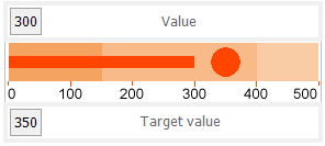
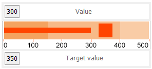
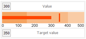
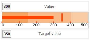
You can use the Bullet control in your Page and RDLX reports. With this control, you can take a single value, the year-to-date revenue, for example, and compare it to a target value that you define in the control's properties. You can also define the beginning of the graph as the worst value and the end of the graph as the best value. To make the data visualization even more intuitive, you can also define a qualitative range (bad, satisfactory and good) for segments on the bullet graph and immediately see the position of the key measure within the bullet graph range.
Multiple bullet graphs can be combined into a data region, a table for example, to show single values side by side. You can orient bullets horizontally or vertically, and put them together as a stack to analyze several data dimensions at once. Bullet graphs are a great way to show progress towards a certain goal and serve as an alternative to dashboard gauges and meters.
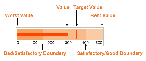
The Value of the bullet defines the key measure displayed on the graph.
The Target Value defines a target for the Value to be compared to. You can select the target shape from a line, dot or square, and define its color and other properties.
The Worst Value and the Best Value define the value range on the graph.
In the Range1Boundary (bad/satisfactory boundary) and Range2Boundary (satisfactory/good boundary), you can optionally set the segments on the graph as qualitative ranges indicating bad, satisfactory and good sections.
By clicking on the Bullet control, you can set its properties in the Properties window.
| Property | Description |
|---|---|
| AccessibleDescription | Enter the alternative description of the control for use by accessibility client application. The property on exporting the report adds the ‘alternative text’ in PDF and ‘alt’ attribute in HTML. |
| BestValue | Enter a value or expression to define the highest value on the bullet graph. |
| Interval | Set the interval at which you want to show tick marks. |
| Range1Boundary | Enter a value or expression to define the boundary between bad and satisfactory values. |
| Range2Boundary | Enter a value or expression to define the boundary between satisfactory and good values. |
| TargetValue | Define a target for the Value to be compared to. |
| TargetShape | Choose the shape of the target from Line, Dot, or Square. By default, the shape is set to Line. |
| TargetStyle | Choose the border color from Color Picker and set the width of the target value marker. This property applies only when the Shape is set to Line. |
| TickMark | Select the position of marks on the bullet control from None, Inside, or Outside. |
| Value | Enter a value or expression to use as the bullet value. |
| ValueColor | Choose a color for the defined value. |
| WorstValue | Enter a value or expression to define the lowest value on the bullet graph. |
You can set the Bullet properties in the Bullet dialog. To open it, with the Bullet selected on the report, under the Properties window, click the Property dialog link.
Name: Enter a name for the Bullet that is unique within the report. You can only use underscore (_) as a special character in the Name field. Other special characters such as period (.), space ( ), forward slash (/), backslash (\), exclamation (!), and hyphen (-) are not supported.
Tooltip: A textual label for the report item used to include TITLE or ALT attributes in HTML reports.
Value: Enter an expression to use as the bullet value.
Target Value: Enter an expression to use as the target value of the bullet graph.
Bullet Graph Orientation
Horizontal: Select to display a horizontal bullet graph.
Vertical: Select to display a vertical bullet graph.
Value Style
Color: Select a color to use for the value marker, or select the <Expression...> option to open the Expression Editor and create an expression that evaluates to a .NET color. The default value is Black.
Target Style
Line
Dot
Square
Target Type: Choose Line, Dot or Square. The default value is Line.
Color: Select a color to use for the target value marker, or select the <Expression...> option to open the Expression Editor and create an expression that evaluates to a .NET color. The default value is Black.
Width: Enter a value in points to set the width of the target value marker. The default value is 3pt.
Note: The Width setting applies only when the Target Type is set to Line.
Tick Marks
None
Inside
Outside
Position: Choose None, Inside or Outside. The default value is Outside.
Color: Select a color to use for the tick marks, or select the <Expression...> option to open the Expression Editor and create an expression that evaluates to a .NET color. The default value is LightGray.
Width: Enter a value in points to set the width of the tick marks. The default value is 1pt.
Interval between tick marks: Set the interval at which you want to show tick marks.
Worst Value: Enter a value or expression to define the lowest value on the graph.
Bad/Satisfactory Boundary: Enter a value or expression to define the boundary between bad and satisfactory values.
Display 3 Sections: Select this check box to show three separate value ranges (bad, satisfactory, and good) instead of two (bad and satisfactory). This enables the Satisfactory/Good Boundary.
Satisfactory/Good Boundary: Enter a value or expression to define the boundary between satisfactory and good values.
Best Value: Enter a value or expression to define the highest value on the graph.
Display Labels: Select this check box to display axis labels for the bullet graph. Selecting this box enables the rest of the properties on this page.
Format: Select one of the provided format codes or use a custom .NET formatting code to format dates or numbers. For more information, see MSDN's Formatting Types topic.
Font
Family: Choose the font family name. The default value is Arial.
Size: Choose the size in points for the font. The default value is 10pt.
Style: Choose Regular, Bold, Italic, Underline or Strikeout. The default value is Regular.
Color: Select a Web or custom color for the font. The default value is Black.
Document map label: Enter an expression to use as a label to represent this item in the table of contents (document map).
Bookmark ID: Enter an expression to use as a locator for this Bullet. You will then be able to provide a bookmark link to this item from another report control using a Jump to bookmark action.
Initial visibility
Visibility can be toggled by another report item: Select this check box to display a toggle image next to another report item. This enables the drop-down box below where you can specify the TextBox control that toggles the visibility of the bullet. The user can click the toggle item to show or hide this bullet.
Element Name: Enter a name to be used in the XML output for this Bullet.
Output: Choose Auto, Yes, No, or Content only to decide whether to include this Bullet in the XML output. Auto exports the contents of the bullet graph only when the value is not a constant.