Smart panels are the dialogs that group commonly used properties of the chart elements using tabs and groups. ActiveReports provides you with the smart panels for these chart elements:
These smart panels can be accessed from the Report Explorer. You just need to select the chart element for which you want the smart panel to show and click the Property dialog link on the Properties pane.
The smart panels are also available from the last screen of the Chart Wizard for advanced chart customizations.
The Chart Smart Panel can also be accessed from the context menu on selecting the Chart on the design area.
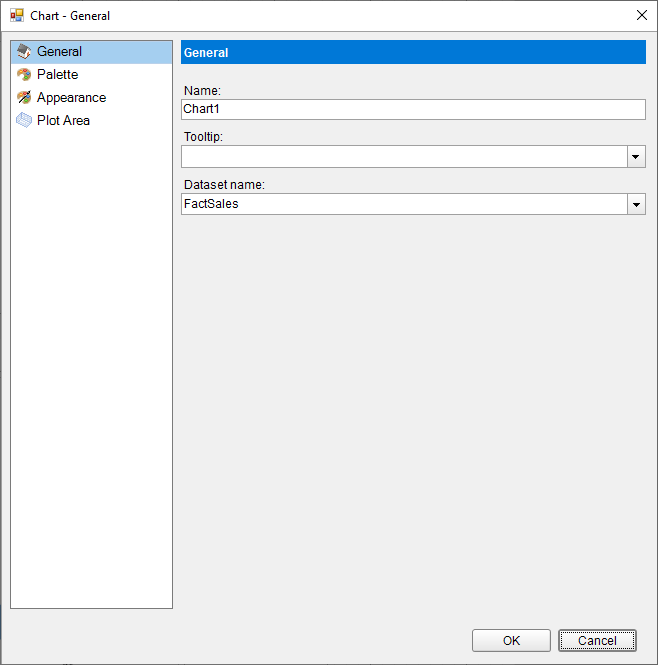
Name: A name for the chart that is unique within the report. This name is displayed in the Document Outline and in XML exports.
Tooltip: A textual label for the report item used to include TITLE or ALT attributes in HTML reports.
Dataset Name: Select a dataset to bind to the chart. The combo box is populated with all of the datasets in the report's dataset collection.
Select a palette for the chart from the list of pre-defined palettes, including the Custom palette.
Border
Style: Select a border style from the list of available options.
Width: Choose a width value between 0.25pt and 20pt for the thickness of the borderlines.
Color: Choose a Web or Custom color to use for the borderlines.
Background Fill Color: Choose a Web or Custom color to fill the background of the chart.
Border
Style: Choose an enumerated style for the border.
Width: Choose a width value between 0.25pt and 20pt.
Color: Select a Web or Custom color.
Background Fill Color: Select a Web or Custom color.
Padding: Set padding values - Top, Left, Right, and Bottom, for the chart.
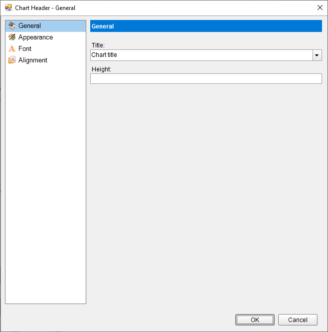
Text: Enter an expression or text to use for the chart header / footer.
Height: Set the height of the chart header/footer in percent.
Border
Style: Select a border style from the list of available options.
Width: Choose a width value between 0.25pt and 20pt for the thickness of the borderlines.
Color: Choose a Web or Custom color to use for the borderlines.
Background Fill Color: Choose a Web or Custom color to fill the background of the chart header/footer.
Family: Choose the font family name for the header/footer text.
Size: Choose the size in points for the header/footer text font.
Style: Choose one from the enumerated styles for the text font.
Weight: Choose from Lighter, Thin, ExtraLight, Light, Normal, Medium, SemiBold, Bold, ExtraBold, Heavy, and Bolder.
Color: Select a Web or custom color for the font.
Decoration: Choose from None, Underline, Overline, LineThrough, and DoubleUnderline.
Horizontal Alignment: Choose Left, Center, or Right.
Vertical Alignment: Choose Top, Middle, or Bottom.
Padding: Set the padding values - Top, Left, Right, and Bottom, for the chart header/footer.
Axis Type: Select between X and Y axis types.
Plots: Select one or more chart axis plots from the list.
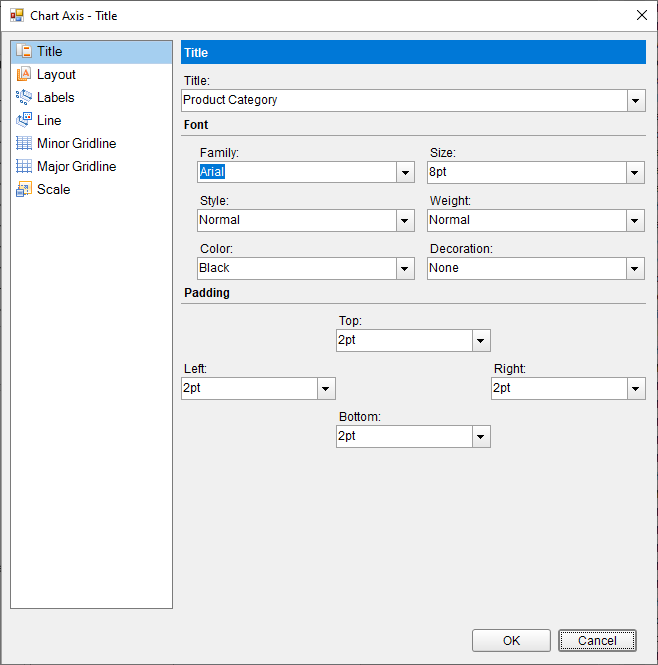
Text: Enter an expression or text to use for the chart axis title.
Font
Family: Choose the font family name for the chart axis title.
Size: Choose the size in points for the chart axis title.
Style: Choose one from the enumerated styles for the text font.
Weight: Choose from Lighter, Thin, ExtraLight, Light, Normal, Medium, SemiBold, Bold, ExtraBold, Heavy, and Bolder.
Color: Select a Web or custom color for the font.
Decoration: Choose from None, Underline, Overline, LineThrough, and DoubleUnderline.
Padding: Set the padding values - Top, Left, Right, and Bottom, for the chart axis title.
Overlapping Labels Mode: Select Auto or Show to specify whether the labels can be overlapped.
Size
Height: Set the height in percent relative to the overall chart height.
Width: Set the width in percent relative to the overall chart width.
MaxHeight: Set the maximum height in percent relative to the overall chart height.
MaxWidth: Set the width in percent relative to the overall chart width.
Position
Reversed: Select this check box to reverse the direction of the axis -top to bottom, or right to left.
Origin: Value or ordinal number, at which an axis crosses the perpendicular axis.
Position: Select from Far, Near, or None for the label position.
Show Labels: Select this checkbox to have the axis labels displayed.
Format: The formatting string used to render dates and numbers.
Label Field: Specify a custom value for the chart axis label.
Angle: Rotation angle for the axis label. The angle is measured in degrees with valid values from -90 to 90.
FontFamily: Choose the font family name for the chart axis label.
Size: Choose the size in points for the chart axis label.
Style: Choose one from the enumerated styles for the text font.
Weight: Choose from Lighter, Thin, ExtraLight, Light, Normal, Medium, SemiBold, Bold, ExtraBold, Heavy, and Bolder.
Color: Select a Web or custom color for the font.
Decoration: Choose from None, Underline, Overline, LineThrough, and DoubleUnderline.
Padding: Set the padding values - Top, Left, Right, and Bottom, for the chart axis label.
Show Line: Select this checkbox to have the axis line shown.
Appearance
Color: Select a Web or Custom color.
Width: Specify the width of the axis line in points.
Style: Choose from an enumerated style for the axis line.
Grid Interval: Set the interval at which you want to show minor grid lines or tick marks or both.
Grid Appearance
Show Grid: Select this check box to show minor grid lines for the axis.
Color: Select a color for the grid line.
Width: Enter a width value between 0.25pt and 20pt.
Style: Choose one from the enumerated styles for the gird line.
Tick mark appearance
Position: Select the tick mark position from None, Inside, Outside, or Cross.
Size: Specify the length of the minor grid tick marks.
Color: Select a Web or Custom color.
Width: Specify the width of the tick mark in points.
Style: Choose from an enumerated style for the minor grid tick mark.
Grid Interval: Set the interval at which you want to show major grid lines or tick marks or both
Grid Appearance
Show Grid: Select this check box to show major grid lines for the axis.
Color: Select a color for the grid line.
Width: Enter a width value between 0.25pt and 20pt.
Style: Choose one from the enumerated styles for the gird line.
Tick mark appearance
Position: Select the tick mark position from None, Inside, Outside, or Cross.
Size: Specify the length of the major grid tick marks.
Color: Select a Web or Custom color.
Width: Specify the width of the tick mark in points.
Style: Choose from an enumerated style for the major grid tick mark.
Scale Type: Select the axis scale from Linear, Logarithmic, Ordinal, or Percentage.
Minimum scale value: Leave this value blank to allow the data to determine the minimum value to use.
Maximum scale value: Leave this value blank to allow the data to determine the maximum value to use.
Logarithmic base: The axis logarithmic base for the logarithmic scale type.
See Axes for more information.
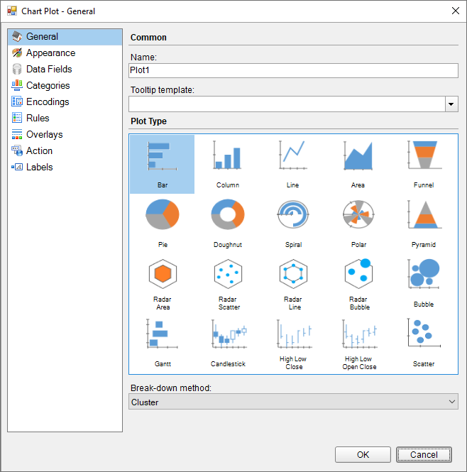
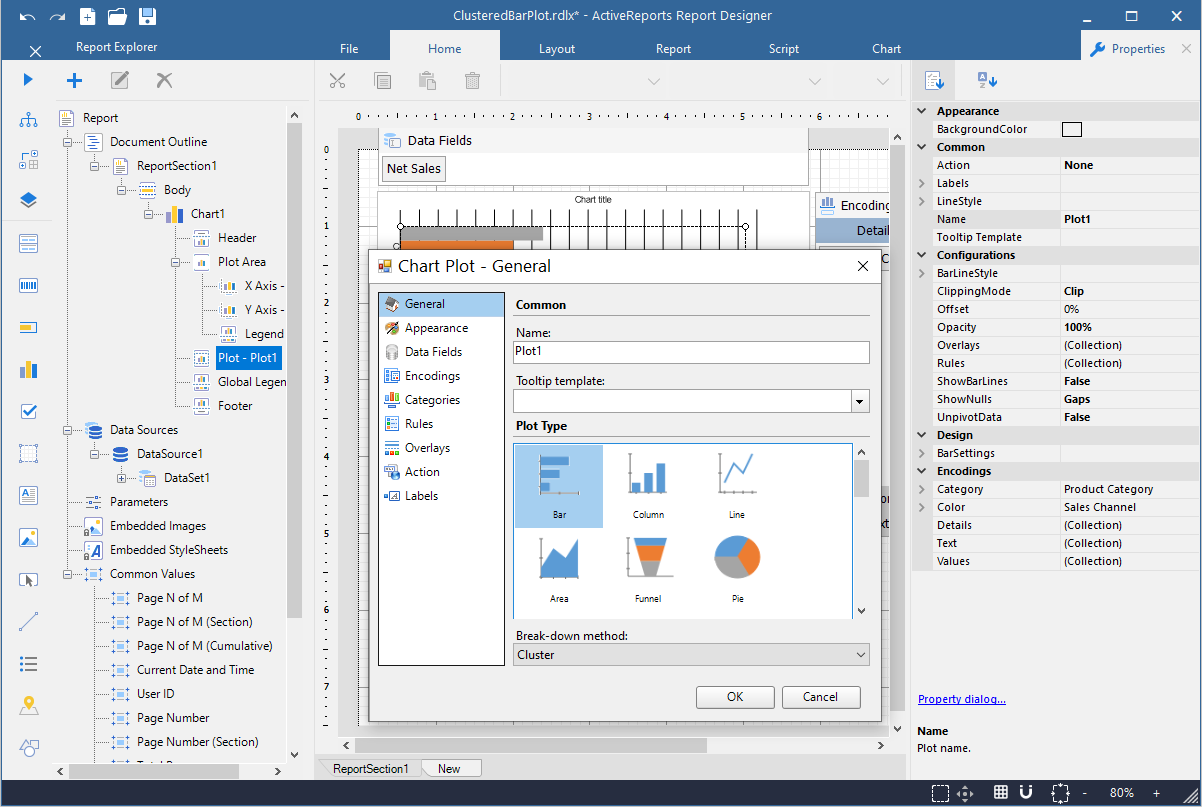
Name: Enter the chart plot name.
Tooltip Template: Select the settings of the tooltip template from the list of predefined chart template tokens or enter your expression.
Plot Type: Select a chart plot type from the following available types:
See Plots topic for more information.
Break-down method: Select from Cluster, Stacked, or Percentage to break down the data values into subcategories and produce additional groups.
Add a data field value by clicking the Add icon.
General tab
Aggregate: Data field aggregate function.
Type: Select from Simple or Complex. Set to 'Complex' for Financial charts like CandleStick, High Low Close, Open High Low Close, and Gantt. For other charts, set to 'Simple'.
Values tab
Expression: Select from the list of dataset fields.
Name: Data field name.
Add a data category by clicking the Add icon.
Expression: The category mapping in the Data Categories Field groups the data into multiple categories for each unique value (or numerical range) that exists for the specified field.
Sorting
Sorting field: A field, used for sorting.
Sort direction: Choose the data sorting direction from None, Ascending, or Descending.
Sorting aggregate: Sorting aggregate function.
Detail tab
Expression: Select a dataset value or enter an expression for a plot encoding.
Group: Select from None, Cluster, or Stack, the way additional groups should be arranged.
Exclude nulls: Select the checkbox to exclude the null details values in the dataset field.
Sorting field: A field, used for sorting.
Sort direction: Choose the data sorting direction from None, Ascending, or Descending.
Sorting aggregate: Sorting aggregate function.
Color tab
Expression: Select a dataset value or enter an expression for color encoding.
Aggregate: Color encoding aggregate function.
Show values name: Select the checkbox to show the values name.
Shape tab
Expression: Select a dataset value or enter an expression for a shape encoding.
Aggregate: Shape encoding aggregate function.
Size tab
Expression: Select a dataset value or enter an expression for a size encoding.
Aggregate: Size encoding aggregate function.
General tab
Template: Select a data label template for the chart plot.
Text position: Select the text position of the data label from Auto, Center, Inside, or Outside.
Overlapping Labels Mode: Specify whether the labels can overlap.
Offset: Gets or sets the text offset of the data label in pixels.
Appearance tab
Background color: Choose a Web or Custom color to fill the background of the chart plot label.
Font
Family: Choose the font family name for the chart plot label.
Size: Choose the size in points for the chart plot label.
Style: Choose one from the enumerated styles for the text font.
Weight: Choose from Lighter, Thin, ExtraLight, Light, Normal, Medium, SemiBold, Bold, ExtraBold, Heavy, and Bolder.
Color: Select a Web or custom color for the font.
Decoration: Choose from None, Underline, Overline, LineThrough, and DoubleUnderline.
Border
Style: Select a border style from the list of available options.
Width: Choose a width value between 0.25pt and 20pt for the thickness of the borderlines.
Color: Choose a Web or Custom color to use for the borderlines.
Connecting Line
Style: Choose one from the enumerated styles for the labels line position.
Color: Choose a Web or Custom color.
Width: Set the line width in points.
Position: Select the position of the label line from Auto or Center.
General tab
Name: Enter the rule name.
Condition: Enter an expression for the rule to apply.
Properties tab
Target property: Select from a predefined list of properties, what property needs to be changed.
Target property value: Specify the target property value by entering an expression.
See Rules topic for more information.
General tab
Name: Enter the chart overlay name.
Type: Set the type of the overlay by selecting it from the predefined list.
Display: Select the display position from Front or Back.
Appearance tab
BorderStyle: Select a border style from the list of available options.
Width: Choose a width value between 0.25pt and 20pt for the thickness of the borderlines.
Color: Choose a Web or Custom color to use for the borderlines.
Config tab
Detail Level: Specify if the overlay calculation should include the entire dataset or each detail group.
Field Name: Set the field name for the overlay to use.
Axis: Specify the axis, to which the overlay belongs.
Aggregate: Set the reference line aggregate function.
Legend Label: Enter the legend label text.
Value: Set the position of the specified axis.
See Trendlines topic for more information.
Choose from the following actions to perform when the user clicks on the chart element.
None: The default behavior is to do nothing when a user clicks the chart element at run time.
Jump to report: For drill-through reporting, select this option and provide the name of a local report, the relative path of a report in another folder, or the full path of a report on another server.
Apply Parameters: Select the name of the parameter, type (Set, Reset, Toggle), and the value of the parameter to be passed. See Actionable Parameters for more information.
Jump to bookmark: Select this option and provide a valid Bookmark ID to allow the user to jump to the report control with that Bookmark ID.
Jump to URL: Select this option and provide a valid URL to create a hyperlink to a Web page.
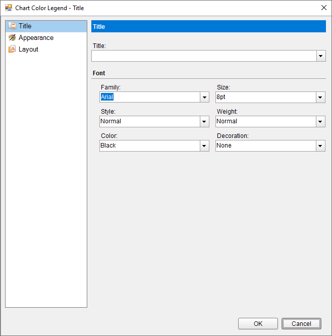
Text: Enter an expression or text to use for the chart legend.
Font
Family: Choose the font family name for the chart legend.
Size: Choose the size in points for the chart legend.
Style: Choose one from the enumerated styles for the text font.
Weight: Choose from Lighter, Thin, ExtraLight, Light, Normal, Medium, SemiBold, Bold, ExtraBold, Heavy, and Bolder.
Color: Select a Web or custom color for the font.
Decoration: Choose from None, Underline, Overline, LineThrough, and DoubleUnderline.
Border
Style: Select a border style from the list of available options.
Width: Choose a width value between 0.25pt and 20pt for the thickness of the borderlines.
Color: Choose a Web or Custom color to use for the borderlines.
Font
Family: Choose the font family name for the chart legend.
Size: Choose the size in points for the header/footer text font.
Style: Choose one from the enumerated styles for the text font.
Weight: Choose from Lighter, Thin, ExtraLight, Light, Normal, Medium, SemiBold, Bold, ExtraBold, Heavy, and Bolder.
Color: Select a Web or custom color for the font.
Decoration: Choose from None, Underline, Overline, LineThrough, and DoubleUnderline.
Background Fill Color: Choose a Web or Custom color to fill the background of the chart legend.
Hide Legend: Select this checkbox to hide the chart legend.
Position: Select an enumerated value from Bottom, Left, Right, or Top to determine the position of the legend relative to the chart area.
Orientation: Select the legend orientation from Horizontal or Vertical.
Size
MaxHeight: Sets the maximum height in percent relative to the overall chart height.
MaxWidth: Sets the maximum width in percent relative to the overall chart width.
Padding: Set the padding values - Top, Left, Right, and Bottom, for the chart legend.
See Legends topic for more information.