ActiveReports 18 .NET Edition
Report Authors: Designer Components / Report Controls / Page/RDLX Report / CheckBox
In This Topic
    CheckBox
    In This Topic

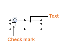
    You can use the CheckBox control to represent a Boolean value in a report. By default, the CheckBox control appears as a small box inside an empty textbox. If the Checked value is set to True, the small box appears with a check mark; if False, the box is empty. By default, the checkbox is empty.

    Structure

     CheckBox Structure

    Important Properties

    Clicking the four-way arrow selects the control and reveals its properties in the Properties window.

    Property Description
    Checked Gets or sets a value indicating whether the check box is in the checked state. You can also set the Checked property of the check box in code or bind it to a Boolean database value.
    Text Gets or sets the printed caption of the check box. 
    CheckAlignment Gets or sets the alignment of the check box text within the control drawing area.

    You can double-click the CheckBox control to enter edit mode and enter text directly in the control, or you can enter text in the Properties window or you can assign data to display in code through the Text property.

    In edit mode, using the toolbar you can format text in the CheckBox control using the toolbar or you modify properties in the Properties window. Formats apply to all of the text in the control. Text formatting changes in the Properties window immediately appear in the control, and changes made in the toolbar are immediately reflected in the Properties window.

    CheckBox Dialog Properties

    You can set the CheckBox properties in the CheckBox dialog. To open it, with the CheckBox selected on the report, under the Properties window, click the Property dialog link.

    Name: Enter a name for the checkbox that is unique within the report. This name is displayed in the Document Outline and in XML exports. You can only use underscore (_) as a special character in the Name field. Other special characters such as period (.), space ( ), forward slash (/), backslash (\), exclamation (!), and hyphen (-) are not supported.

    Tooltip: A textual label for the report item used to include TITLE or ALT attributes in HTML reports.

    Text : Enter an expression or a static label, or choose a field expression from the drop-down list. You can access the expression editor by selecting <Expression...> in the list. The value of this expression or text is displayed in the report to the right of the checkbox. 

    Initial visibility

    Visible: The checkbox is visible when the report runs.

    Hidden: The checkbox is hidden when the report runs.

    Expression: Use an expression with a Boolean result to decide whether the checkbox is visible. True for hidden, False for visible.

    Visibility can be toggled by another report item: Select this checkbox to specify a report control to use as a toggle to show or hide the checkbox. Then specify the TextBox control to display with a toggle image button. When the user clicks the TextBox control, the checkbox changes between visible and hidden.

    Choose one of the following actions to carry out when the checkbox is selected:

    None: The default behavior is to do nothing when you select the checkbox at runtime.

    Jump to Report: It allows you to jump to another report by selecting the checkbox at runtime. For a drill-through report, select the Jump to Report option and choose the name of a local report from the dropdown. To display a report from another folder, enter the relative path of the report. For the report from another server, provide the full path of the report. You can also use expressions to create drill-through links.

    Parameters: Enter the Name and Value of each parameter you want to pass to the targeted report. You can also Omit the parameter by setting the value to True. The parameter names you supply must be the same in both reports.

    Jump to bookmark: Select this option and provide a valid Bookmark ID to jump to the report control with that Bookmark ID.

    Jump to URL: Select this option and provide a valid URL to create a hyperlink to a Web page, and then at runtime, select the checkbox to jump to that Web page.

    Apply Parameters: Select the Name, Type, and Value of the parameter to set a parameter value through user action. See Actionable Parameters for more information.

    Border

    Style: Select a style for the border.

    Width: Enter a value in points to set the width of the border.

    Color: Select a color to use for the border, or select the <Expression...> option to open the Expression Editor and create an expression that evaluates to a .NET color.

    Background

    Color: Select a color to use for the background of the checkbox.

    Image: Enter an image to use for the background of the CheckBox.

    Image Source: Select the location of the image.

    MIME Type: Select the MIME type of the image.

    Background repeat: Specify how the background image fills the space of the CheckBox.

    Family: Select a font family name or a theme font.

    Size: Choose the size in points for the font or use a theme.

    Style: Choose Normal or Italic or select a theme.

    Weight: Choose an enumerated weight value or select a theme.

    Color: Choose a color to use for the text.

    Decoration: Choose from None, Underline, Overline, or LineThrough.

    Amount of space to leave around report control

    Top padding: Set the top padding in points.

    Left padding: Set the left padding in points.

    Right padding: Set the right padding in points.

    Bottom padding: Set the bottom padding in points.

    Element Name: Enter a name to be used in the XML output for this checkbox.

    Output: Choose Auto, Yes, or No to decide whether to include this checkbox in the XML output. Auto exports the contents of the checkbox only when the value is not a constant.

    Render as: Choose Auto, Element, or Attribute to decide whether to render checkboxes as Attributes or Elements in the exported XML file. Auto uses the report's setting for this property

    Attribute example: <table1 checkbox3="Report created on: 7/26/2005 1:13:00 PM">

    Element example: <table1> <checkbox3>Report created on: 7/26/2005 1:13:28 PM</checkbox3>

    Keyboard Shortcuts

    In the edit mode, you can use the following keyboard shortcuts.

    Key Combination Action
    Enter New line.
    Alt + Enter Saves modifications and exits edit mode.
    Esc Cancels modifications and exits edit mode.

    In Visual Studio Integrated Designer, you can disable this feature in the EditModeEntering Event and EditModeExit Event.

    See Also