Bar charts present each series as a horizontal bar, and group the bars by category. The x-axis values determine the lengths of the bars, while the y-axis displays the category labels. With a bar chart, you can select from the following subtypes.
Column charts present each series as a vertical column, and group the columns by category. The y-axis values determine the heights of the columns, while the x-axis displays the category labels. With a column chart, you can select from the following subtypes.
Scatter charts present each series as a point or bubble. The y-axis values determine the heights of the points, while the x-axis displays the category labels. With a scatter chart, you can select from the following subtypes.
Line charts present each series as a point, and connect the points with a line. The y-axis values determine the heights of the points, while the x-axis displays the category labels. With a line chart, you can select from the following subtypes.
Pie charts are circular plots that display the proportionate contribution of each category which is represented by a slice or pie. The magnitude of the dependent variable is proportional to the pie or slice angle. These charts can be used for plotting a single series with non-zero and positive values.
Bubble charts are used to plot three dimensional data. These charts are often used to depict financial data.
A doughnut chart is a pie chart with a hole in the center. The chart is divided into different portions that show the percentage each value contributes to the total. Like pie charts, the doughnut chart is used with small sets of data to compare categories.
Stock charts present each series as a line with markers showing some combination of high, low, open, and close values. The y-axis values determine the heights of the lines, while the x-axis displays the category labels.
Funnel charts show how the percentage of each data item contributes to the whole, with the largest value at the top and the smallest at the bottom. This chart type works best with relatively few data items.
Pyramid charts show how the percentage of each data item contributes to the whole, with the smallest value at the top and the largest at the bottom. This chart type works best with relatively few data items.
In Three Line Break Charts, vertical boxes or lines illustrate price changes of an asset or market. The price in a three line break graph must break the prior high or low set in the NewLineBreak property in order to reverse the direction of the graph.
Kagi charts display supply and demand trends using a sequence of linked vertical lines. The thickness and direction of the lines vary depending on the price movement. If closing prices go in the direction of the previous Kagi line, then that Kagi line is extended. However, if the closing price reverses by the preset reversal amount, a new Kagi line is charted in the next column in the opposite direction. Thin lines indicate that the price breaks the previous low (supply) while thick lines indicate that the price breaks the previous high (demand).
Renko charts depict bricks of uniform size chart price movement. When a price moves to a greater or lesser value than the preset BoxSize value required to draw a new brick, a new brick is drawn in the succeeding column. A change in box color and direction signifies a trend reversal.
In Point and Figure charts, stacked columns of Xs indicate that demand exceeds supply and columns of Os indicate that supply exceeds demand to define pricing trends. A new X or O is added to the chart if the price moves higher or lower than the BoxSize value you set. A new column is added when the price reverses to the level of the BoxSize value multiplied by the ReversalAmount you set. This calculation of pricing trends is best suited for long-term financial analysis.
The Gantt Chart is a project management tool that tracks the progress of individual project tasks. The chart compares project task completion to the task schedule.
A Dot Plot chart is a statistical chart containing group of data points plotted on a simple scale. Dot Plot chart are used for continuous, quantitative, and univariate data. The dot plot chart has one subtype. The plain Dot Plot chart displays simple statistical plots. It is ideal for small to moderate sized data sets. You can also highlight clusters and gaps, as well as outliers, while conserving numerical information.
Smart panels are the dialogs that group commonly-used properties of the chart elements using tabs and groups. ActiveReports .NET provides you with the smart panels for the following chart features:
These smart panels can be accessed from the Property dialog link on the Properties pane:
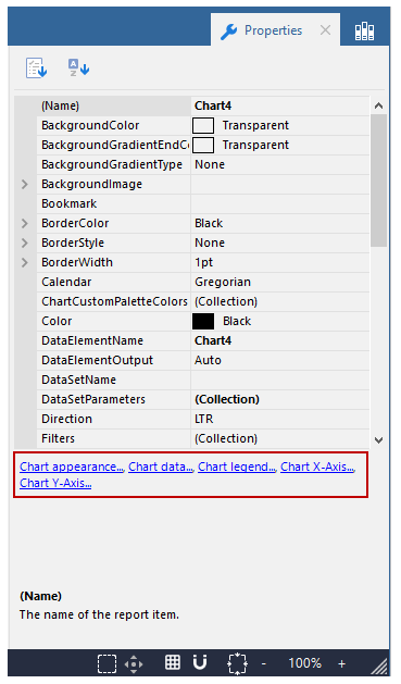
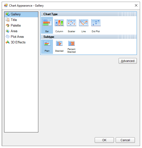
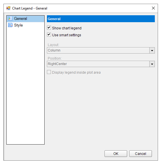
Chart title: Enter an expression or text to use for the title.
Family: Choose the font family name.
Size: Choose the size in points for the font.
Style: Choose Normal or Italic.
Weight: Choose from Lighter, Thin, ExtraLight, Light, Normal, Medium, SemiBold, Bold, ExtraBold, Heavy, and Bolder.
Color: Select a Web or custom color for the font.
Decoration: Choose from None, Underline, Overline, and LineThrough.
Style: Choose an enumerated style for the border.
Width: Choose a width value between 0.25pt and 20pt.
Color: Select a Web or Custom color.
Fill Color: Select a Web or Custom color.
Gradient: Choose from one of the following gradient styles.
Gradient End Color: When you choose any gradient style other than None, this property becomes available. Choose a Web or Custom color.
Display the chart with 3D visual effects.
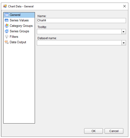
When you first open the Chart Data dialog, you can select a Dataset name to associate with the chart. The list is populated with all of the datasets in the report's dataset collection.
This dialog also gives you access to the following related pages.
Name: Enter a name for the chart that is unique within the report. This name is displayed in the Document Outline and in XML exports.
Tooltip: A textual label for the report item used to include TITLE or ALT attributes in HTML reports.
Dataset name: Assign a dataset name to associate with the chart. The combo box is populated with all of the datasets in the report's dataset collection.
Add at least one Value series to determine the size of the chart element. Click the plus sign button to enable the General tab. Once you have one or more value series in place, you can use the arrow buttons to change the order or the X button to delete them.
Another way to add Chart Series Values is to drag fields from the Report Explorer onto the tray along the top edge of the chart that reads Drop data fields here.
If you have already added values, you can right-click any value displayed in the UI along the top of the chart and choose Edit to open this dialog.
The Series Values page has the following tabs.
General
The General tab of the Series Values page allows you to control different items depending on the Chart Type you have chosen.
For all Chart typesFor Scatter or Bubble Chart typesSeries label: Enter an expression to use as a series label to display in the legend.
For Stock ChartX: Enter an expression to use as an X value.
Y: Enter an expression to use as a Y value.
Size: If the chart type is bubble, enter an expression to use as the bubble size value.
High: Enter an expression to use as the high value.
Low: Enter an expression to use as the low value.
Open: Enter an expression to use as the open value.
Close: Enter an expression to use as the close value.
For Column, Bar, Line, Pie, Area, Doughnut, Funnel, Pyramid, ThreeLineBreak, Kagi, Renko, PointAndFigure, or DotPlot Chart types
For Column, Line, or Area Chart typesValue: Enter an expression to use as a series value.
Chart Type: For Composite charts, select the chart type to use in combination with other chart types within the same plot area. The available chart types are:
Y-Axis: Select the Y-axis from the list of available Y-axes.
- Column Plain
- Column Stacked
- Column Percent Stacked
- Area Plain
- Area Stacked
- Area Percent Stacked
- Line Plain
- Smooth Line
Styles
Background Fill ColorThese properties control the appearance of the border of bars or columns, or the lines, depending on the type of chart.
Style: Choose one of the enumerated styles for the lines.
Width: Choose a width value between 0.25pt and 20pt for the thickness of the lines.
Color: Choose a Web or Custom color to use for the lines.
These properties control the appearance of the background of the series values.
Fill Color: Choose a Web or Custom color to fill the background.
Gradient: Choose from one of the following gradient styles.
- None: No gradient is used. A single color (defined by the Fill Color property above) is used to fill the area and the Gradient End Color property remains disabled.
- LeftRight: A gradient is used. The Fill Color property defines the color at the left, and the Gradient End Color property defines the color at the right. The two colors are gradually blended in between these areas.
- TopBottom: A gradient is used. The Fill Color property defines the color at the top, and the Gradient End Color property defines the color at the bottom. The two colors are gradually blended in between these areas.
- Center: A gradient is used. The Fill Color property defines the color at the center, and the Gradient End Color property defines the color at the edges. The two colors are gradually blended in between these areas.
- DiagonalLeft: A gradient is used. The Fill Color property defines the color at the top left, and the Gradient End Color property defines the color at the bottom right. The two colors are gradually blended in between these areas.
- DiagonalRight: A gradient is used. The Fill Color property defines the color at the top right, and the Gradient End Color property defines the color at the bottom left. The two colors are gradually blended in between these areas.
- HorizontalCenter: A gradient is used. The Gradient End Color property defines the horizontal band of color across the center, and the Fill Color property defines the color at the top and bottom. The two colors are gradually blended in between these areas.
- VerticalCenter: A gradient is used. The Gradient End Color property defines the vertical band of color across the center, and the Fill Color property defines the color at the left and right. The two colors are gradually blended in between these areas.
Gradient End Color: When you choose any gradient style other than None, this property becomes available. Choose a Web or Custom color to blend with the Fill Color in the background of the series.
Markers
Marker type: Choose one of the following values to determine the shape of the marker or whether one is displayed.
Marker size: Enter a value between 2pt and 10pt to determine the size of the plotting area of the markers.
Plot data as secondary: If the chart type is Column, Bar, or DotPlot, you can select this check box and select whether to use a Line or Points to show the data.
Labels
Show point labels: Select this check box to display a label for each chart value. Selecting this box enables the disabled properties on this page.
Data label: Enter a value to use as the label, or select <Expression...> to open the Expression Editor.
Format code: Select one of the provided format codes or use a custom .NET formatting code to format dates or numbers. For more information, see MSDN's Formatting Types topic.
Position: Leave Auto selected to use the default point label position for the chart type, or select an enumerated value to position the labels.
Angle: Enter the value in tenths of degrees to use for the angle of the point label text. The default (0°) position denotes no angle and renders regular horizontal text.
FontFamily: Choose the font family name.
Size: Choose the size in points for the font.
Style: Choose Normal or Italic.
Weight: Choose from Lighter, Thin, ExtraLight, Light, Normal, Medium, SemiBold, Bold, ExtraBold, Heavy, and Bolder.
Color: Select a Web or custom color for the font.
Decoration: Choose from None, Underline, Overline, and LineThrough.
Action
Choose from the following actions to perform when the user clicks on the chart element.
None: The default behavior is to do nothing when a user clicks the chart element at run time.
Jump to report: For drill-through reporting, select this option and provide the name of a local report, the relative path of a report in another folder, or the full path of a report on another server.
Parameters
Jump to bookmark: Select this option and provide a valid Bookmark ID to allow the user to jump to the report control with that Bookmark ID.
Jump to URL: Select this option and provide a valid URL to create a hyperlink to a Web page.
Data Output
Element name: Enter a name to be used in the XML output for this chart element.
Output: Choose Yes or No to decide whether to include this chart element in the XML output.
Add Category Groups to group data and provide labels for the chart elements. Click the Add button to enable the General tab. Once you have one or more category groups in place, you can use the arrow buttons to change the order or the X button to delete them.
Another way to add Category Groups is to drag fields from the Report Explorer onto the tray along the bottom edge of the chart that reads Drop category fields here.
If you have already added values, you can right-click the value displayed in the UI along the bottom of the chart and choose Edit to open this dialog.
The Category Groups page has the following tabs.
General
Name: Enter a name for the group that is unique within the report. This name can be called in code.
Group on: Enter an expression to use for grouping the data.
Label: Enter an expression to use as a label for the group. You can select <Expression...> to open the Expression Editor.
Parent group: For use in recursive hierarchies. Enter an expression to use as the parent group.
Filters
You need to provide three values to add a new filter to the collection: Expression, Operator, and Value.
Expression: Enter the expression to use for evaluating whether data should be included in the group.
Operator: Select from the following operators to decide how to compare the expression to the left with the value to the right:
Value: Enter a value to compare with the expression on the left based on the selected operator. For multiple values used with the Between operator, the lower two value boxes are enabled.
Values: When you choose the In operator, you can enter as many values as you need in this list.
Sorting
The Sorting tab of Category Groups page allows you to enter new sort expressions and remove or change the order of them using the X or arrow buttons. For each sort expression in this list, you can also choose the direction.
Expression: Enter an expression by which to sort the data in the group.
Direction: Select whether you want to sort the data in an Ascending or Descending direction.
Data Output
Element name: Enter a name to be used in the XML output for this group.
Collection: Enter a name to be used in the XML output for the collection of all instances of this group.
Output: Choose Yes or No to decide whether to include this group in the XML output.
Optionally add Series Groups for extra levels of data (for example, Orders by Country can be broken down by year as well). Labels for the series are displayed in the chart legend. Click the Add button to open the General page. Once you have one or more series groups in place, you can use the arrow buttons to change the order or the X button to delete them.
Another way to add Series Groups is to drag fields from the Report Explorer onto the tray along the right edge of the chart that reads Optionally drop series fields here.
If you have already added values, you can right-click the value displayed in the UI along the right edge of the chart and choose Edit to open this dialog.
The Series Groups page has the following tabs.
General
Name: Enter a name for the group that is unique within the report. This name can be called in code.
Group on: Enter an expression to use for grouping the data.
Label: Enter an expression to use as a label for the group. You can select <Expression...> to open the Expression Editor.
Parent group: For use in recursive hierarchies. Enter an expression to use as the parent group.
Filters
You need to provide three values to add a new filter to the collection: Expression, Operator, and Value.
Expression: Enter the expression to use for evaluating whether data should be included in the group.
Operator: Select from the following operators to decide how to compare the expression to the left with the value to the right:
Value: Enter a value to compare with the expression on the left based on the selected operator. For multiple values used with the Between operator, the lower two value boxes are enabled.
Values: When you choose the In operator, you can enter as many values as you need in this list.
Sorting
The Sorting tab of Series Groups page allows you to enter new sort expressions and remove or change the order of them using the X or arrow buttons. For each sort expression in this list, you can also choose the direction.
Expression: Enter an expression by which to sort the data in the group.
Direction: Select whether you want to sort the data in an Ascending or Descending direction.
Data Output
Element name: Enter a name to be used in the XML output for this group.
Collection: Enter a name to be used in the XML output for the collection of all instances of this group.
Output: Choose Yes or No to decide whether to include this group in the XML output.
Chart Data Filters Page
You need to provide three values to add a new filter to the collection: Expression, Operator, and Value.
Expression: Enter the expression to use for evaluating whether data should be included in the chart.
Operator: Select from the following operators to decide how to compare the expression to the left with the value to the right:
Value: Enter a value to compare with the expression on the left based on the selected operator. For multiple values used with the Between operator, the lower two value boxes are enabled.
Values: When you choose the In operator, you can enter as many values as you need in this list.
Value: Enter a value to compare with the expression on the left based on the selected operator. For multiple values (used with the In and Between operators) separate values using commas.
Chart Data Output Page
Element name: Enter a name to be used in the XML output for the chart.
Output: Choose one between Auto, Yes, No or Contents Only to decide whether to include this group in the XML output.
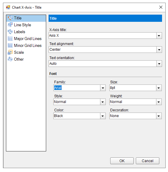
Add the x-axis title, change text alignment, orientation and font.
Change the styling properties related to the appearance of line.
Show x-axis labels.
Show major gridlines.
Show minor grid lines.
Specify the minimum and maximum scale.
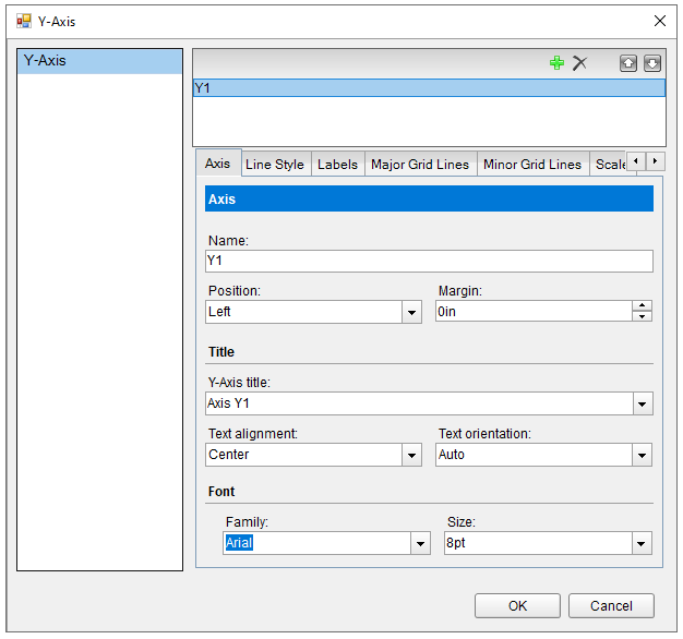
Add the y-axis title, change text alignment, orientation and font.
Change the styling properties related to the appearance of line.
Show y-axis labels.
Show major gridlines.
Show minor grid lines.
Specify the minimum and maximum scale.