In This Topic
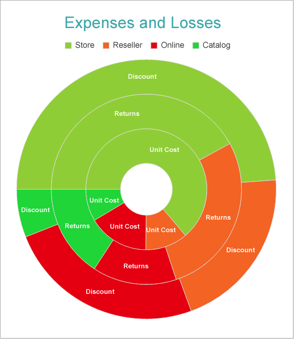
This walkthrough creates a Doughnut Chart. The chart shows the contribution of sales channels to the total unit cost, return, and discount. The final chart appears like this:
Create a Report and Bind Report to Data
In the ActiveReports Designer, create a new RDLX report and follow the New Report wizard to bind the report to data. You can also perform data binding later using the Report Data Source dialog accessed from the Report Explorer.
Connect to a Data Source
- In the Report Data Source dialog, select the General page and enter the name of the data source.
- Under Type, select 'Json Provider'.
- Go to the Content tab under Connection and set the type of JSON data to 'External file or URL'.
- In the Select or type the file name or URL field, enter the following URL:
https://demodata.mescius.io/contoso/odata/v1/FactSales
For more information, see the JSON Provider topic.
- Go to the Connection String tab and verify the generated connection string by clicking the Validate DataSource
 icon.
icon.
- Click OK to save the changes and open the DataSet dialog.
Add a Dataset
- In the Dataset dialog, select the General page and enter the name of the dataset, 'FactSales'.
- Go to the Query page and enter the following query to fetch the required fields:
| Query |
Copy Code
|
$.value[*]
|
- Click OK to save the changes.
- Go to the Fields page to view the available fields and modify the Name of the [ReturnAmount] and [DiscountAmount] fields to [Returns] and [Discount], respectively.
- On the same page, add two calculated fields:
| Name |
Value |
| Net Income |
=[SalesAmount] - [UnitCost] - [Discount] - [Returns] |
| Sales Channel |
=Switch([ChannelKey] = 1, "Store", [ChannelKey] = 2, "Online", [ChannelKey] = 3, "Catalog", [ChannelKey] = 4, "Reseller") |
Create a Chart
We will use the Chart Wizard dialog to configure chart data values. The wizard appears by default if you have a dataset added to your report. See the topic on Chart Wizard for more information.
- Drag-drop Chart data region onto the design area. The Chart Wizard dialog appears with an option to select the data and the chart type.
- Select the Dataset Name as 'FactSales' and the Chart Type as 'Doughnut'.
- Click Next to proceed. Here, you need to specify the doughnut settings.
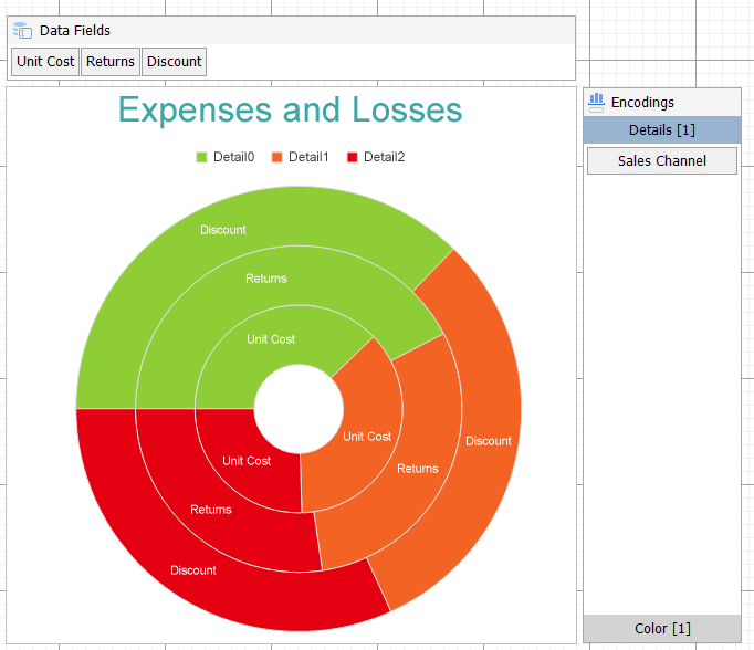
- In Choose Data values section, we will define three data series values to display the sales amount, unit cost, and discount for the sales channels.
Select the following three fields from the drop-down and set the corresponding aggregates:
| Field |
Aggregate |
| =[UnitCost] |
Sum |
| =[Returns] |
Sum |
| =[Discount] |
Sum |
- Click Next to preview your chart.
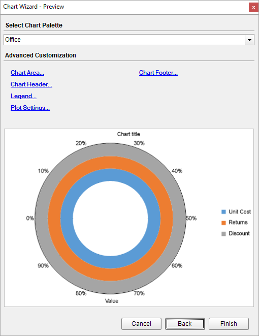
You can also modify the chart palette and do other customizations as the last step in the process of chart creation. Or, you can exit the wizard and access these smart panels as explained below.
Set Advanced Customization
Now that the chart is configured with data values, let us do some customizations on the chart elements using the smart panels.
Plot Settings
- To open the smart panel for advanced plot settings, right-click 'Plot-Plot1' on the Report Explorer and choose Property Dialog.
- Go to the Encodings page.
- On the Detail tab, add a new value, and set its properties as below.
- Set Expression to =[Sales Channel] to display sales data for the subcategories i.e. store, reseller, online, and catalog.
- Under Grouping, set Group to 'Stack' since we want to display the subcategories (i.e. sales data by store, reseller, online, and catalog) in a stack.
- Navigate to the Color page, add a new value, and set the Expression to =[Sales Channel] to display legends based on the subcategories.
- Go to the Labels page > General tab and set the following properties:
- Template: {valueField.name}
- Text Position: Center
- Go to the Appearance tab and set the following properties.
- Font > Size: 10pt
- Font > Weight: SemiBold
- Font > Color: #ffffff
- Connecting Line > Style: Solid
- Connecting Line > Color: Gainsboro
- Click OK to complete setting up the plot.
- With 'Plot-Plot1' selected, go to the Properties pane and set the Inner Radius property for the doughnut to '20%' to reduce the inner size.
Y-Axis
- To open the smart panel for advanced Y-axis settings, right-click 'Y-axis' on the Report Explorer and choose Property Dialog.
- Go to the Title page and remove the text from the Title field to hide the axis title in the chart.
- Go to the Labels page and uncheck the Show Labels option as we are already displaying the sales channel labels in the chart.
- Go to the Line page and set the following properties:
- Color: Gainsboro
- Width: 0.25pt
- Click OK to complete setting up the Y-axis.
Chart Palette
- To open the smart panel for advanced chart settings, right-click 'Chart' on the Report Explorer and choose Property Dialog.
- Go to the Palette page, select Custom from the drop-down and add the following colors.
- #8fcd37
- #f26324
- #e40010
- #1fd537
- Click OK to complete setting up the custom palette.
Legend - Color
- To open the smart panel for the legend, right-click 'Legend - Color' on the Report Explorer, and choose Property Dialog.
- Go to the Appearance page and set the following properties:
- Font > Size: 10pt
- Font > Color: #3c3c3c
- Go to the Layout page and set the following properties:
- Position: Top
- Orientation: Horizontal
- Click OK to complete setting up the chart legend.
Chart Header
- To open the smart panel for the chart header, right-click 'Header' on the Report Explorer and choose Property Dialog.
- Go to the General page and set Title to 'Expenses and Losses'.
- Go to the Font page and set the properties as below.
- Size: 24pt
- Color: #3da7a8
- Click OK to complete setting up the chart header.
You may want to resize the chart.
Note: We use stub data at design time and not real data. So to view the actual final chart, you need to view the chart on the preview.
- Once you are done with configuring and customizing the chart, press F5 to preview the report.