In This Topic
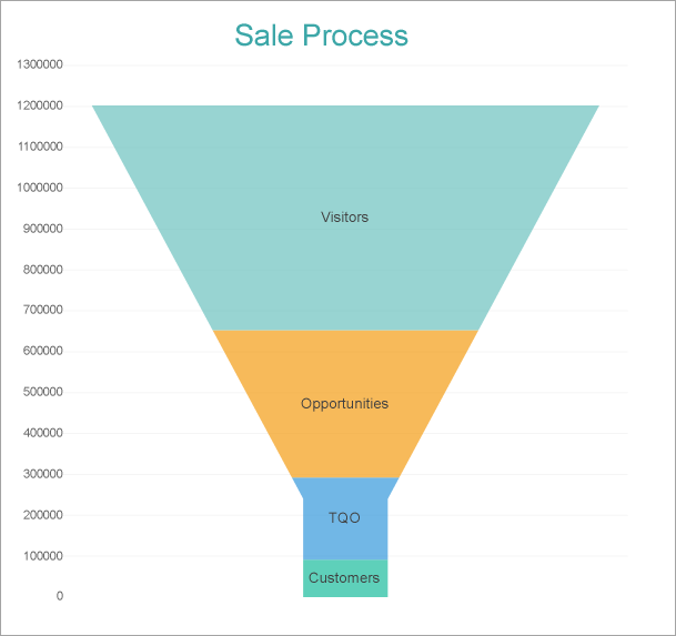
This walkthrough creates a Funnel Chart, which shows how various related values are stacked or arranged on top of one another. For example, the chart represents a Sales Funnel, which depicts many factors like Visitor count, Opportunities, TQO (Total Quality Organization) and Customers in an organization. By Visitor count, we mean the total number of visitors at a website. By Opportunities, we imply the number of potential visitors that can be converted to successful customers. Further, TQO is an important aspect, which drives customer satisfaction and is essential for the growth and survival of the organization.
The final chart appears like this, which looks very similar to an ideal marketing sales funnel in its symmetrical form – a paradigm of efficiency that makes sense of a website's visitors, opportunities, TQO and customers.
Create a Report and Bind Report to Data
In the ActiveReports Designer, create a new RDLX report and follow the
New Report wizard to bind the report to data. You can also perform
data binding later using the
Report Data Source dialog accessed from the
Report Explorer.
Connect to a Data Source
- In the Report Data Source dialog, select the General page and enter the name of the data source.
- Under Type, select 'Json Provider'.
- Go to the Content tab under Connection and set the type of JSON data to 'Embedded'.
- In the Select or type the file name or URL or enter the data to be embedded field, enter the following data:
JSON Data
|
Copy Code
|
{
   "data":{
      "values":[
         {
            "Type":"Customers",
            "Value":91658
         },
         {
            "Type":"TQO",
            "Value":200400
         },
         {
            "Type":"Opportunities",
            "Value":360470
         },
         {
            "Type":"Visitors",
            "Value":550000
         }
      ]
   }
}
|
For more information, see the JSON Provider topic.
- Go to the Connection String tab and verify the generated connection string by clicking the Validate DataSource
 icon.
icon.
- Click OK to save the changes and open the DataSet dialog.
Add a Dataset
- In the Dataset dialog, select the General page and enter the name of the dataset, 'SaleStages'.
- Go to the Query page and enter the following query to fetch the required fields:
| Query |
Copy Code
|
| $.data.values[*] |
- Click OK to save the changes and open the DataSet dialog.
Create a Chart
We will use the Chart Wizard dialog to configure chart data values and customization. The wizard appears by default if you have a dataset added to your report. See the topic on Chart Wizard for more information.
- Drag-drop Chart data region onto the design area. The Chart Wizard dialog appears with an option to select the data and the chart type.
- Select the Dataset Name as 'SaleStages' and the Chart Type as 'Funnel'.
- Click Next to proceed. Here, we will define a data value to display.
- Under Choose Data Values, add a new data value, and set the Field to =[Value].
- In Choose Data Category, set the Field to =[Type] and the Break-down method to 'Stacked'.
- Click Next to preview your chart.
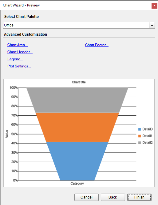
You can also modify the chart palette and do other customizations as the last step in the process of chart creation. Or, you can exit the wizard and access these smart panels as explained below.
Set Advanced Customization
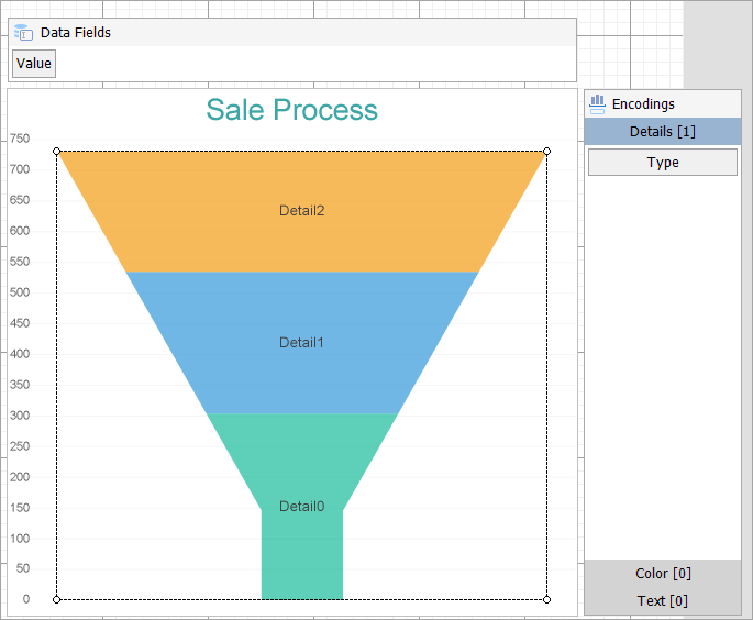
Now that the chart is configured with data values, let us do some customizations on the chart elements using the smart panels.
Plot Settings
- To open the smart panel for advanced plot settings, right-click 'Plot-Plot1' on the Report Explorer and choose Property Dialog.
- Go to the Encodings page > Details tab, ensure that the Expression is set to =[Type]. Remove any value from Sorting field.
- Go to Appearance page and set the following properties.
- Bar Settings > Bottom Width: 15%
- Bar Settings > Neck Height: 20%.
- Common > Opacity: 70%
- Go to the Labels page > General tab and set following properties:
- Template: {detailFields.value}
- Text Position: Center
- Overlapping Labels Mode: Auto
- Go to the Labels page > Appearance tab and set following properties:
- Font > Size: 10pt
- Font > Color: DimGray
- Click OK to complete setting up the plot.
Y-Axis
- To open the smart panel for advanced Y-axis settings, right-click 'Y-axis' from the Report Explorer and choose Property Dialog.
- Go to the Title page and remove the text from the Title field to hide the Y-axis title in the chart.
- Go to the Labels page > General tab and set the Format to 'Default'.
- Go to the Labels page > Appearance tab and set the following properties.
- Font > Size: 8pt
- Font > Color: DimGray
- Go to the Line page and uncheck the Show Line option.
- Go to the Major Gridline page and set the following properties.
- Grid appearance > Show Grid: Check-on
- Grid appearance > Width: 1pt
- Grid appearance > Color: WhiteSmoke
- Grid appearance > Style: Solid
- Go to the Scale page and set Scale Type as 'Linear'.
- Click OK to complete setting up the Y-axis.
X-Axis
- To open the smart panel for advanced X-axis settings, right-click 'X-axis' on the Report Explorer and choose Property Dialog.
- Go to the Title page and remove the text from the Title field to hide the X-axis title in the chart.
- Go to the Labels page and uncheck the Show Labels option to hide the data labels.
- Go to the Line page and uncheck the Show Line option.
- Click OK to complete setting up the X-axis.
Chart Palette
- To open the smart panel for advanced chart settings, right-click 'Chart' on the Report Explorer and choose Property Dialog.
- Go to the Palette page and add the 'Flatly' palette.
- Click OK to complete setting up the chart palette.
Chart Header
- To open the smart panel for the chart header, right-click 'Header' on the Report Explorer and choose Property Dialog.
- Go to the General page and set Title to 'Sale Process'.
- Go to the Font page and set the properties as below.
- Size: 20pt
- Color: #3da7a8
- Click OK to complete setting up the chart header.
You may want to resize the chart.
Note: We use stub data at design time and not real data. So to view the actual final chart, you need to view the chart on preview.
- Once you are done with configuring and customizing the chart, press F5 to preview the report.