In This Topic
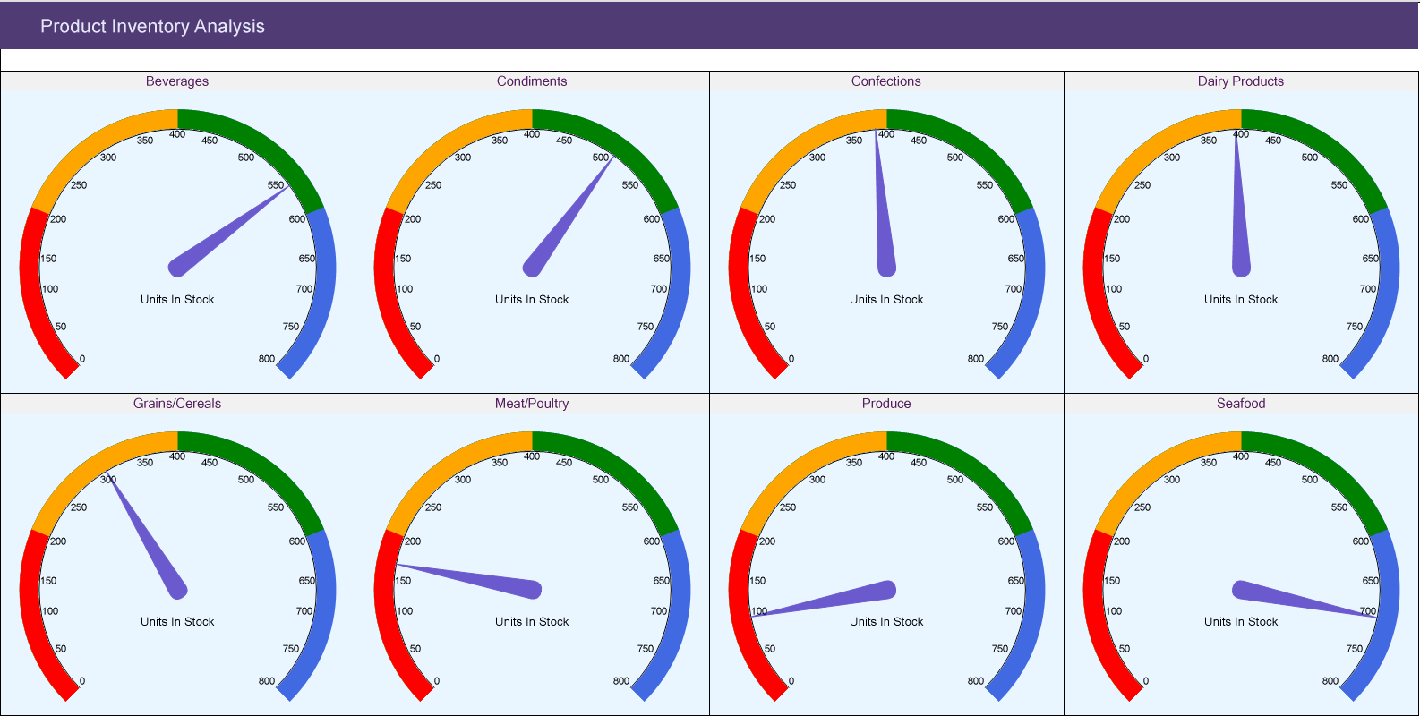
This walkthrough shows creating a Gauge chart. The Gauge chart is placed in a multi-column list to show the units in stock in each category of products. The final chart appears like this:
Create a Report and Bind Report to Data
In the ActiveReports Designer, create a new RDLX report and follow the
New Report wizard to bind the report to data. You can also perform
data binding later using the
Report Data Source dialog accessed from the
Report Explorer.
Connect to a Data Source
- In the Report Data Source dialog, select the General page and enter the name of the data source.
- Under Type, select 'Json Provider'.
- Go to the Content tab under Connection and set the type of JSON data to 'External file or URL'.
- In the Select or type the file name or URL field, enter the following URL:
https://demodata.mescius.io/northwind/api/v1/Products
For more information, see the JSON Provider topic.
- Go to the Connection String tab and verify the generated connection string by clicking the Validate DataSource
 icon.
icon.
- Click OK to save the changes and open the DataSet dialog.
Add a Dataset
- In the Dataset dialog, select the General page and enter the name of the dataset, 'Products'.
- Go to the Query page and enter the following query to fetch the required fields:
- Click OK to save the changes.
Similarly, we will connect to another data source from where we will fetch [categoryName] corresponding to the [categoryId] in 'Products' dataset, in the Chart Header.
The data source URL is https://demodata.mescius.io/northwind/api/v1/Categories and the dataset query is $.[*]. Let's name this dataset, 'Categories'.
Design Report Layout
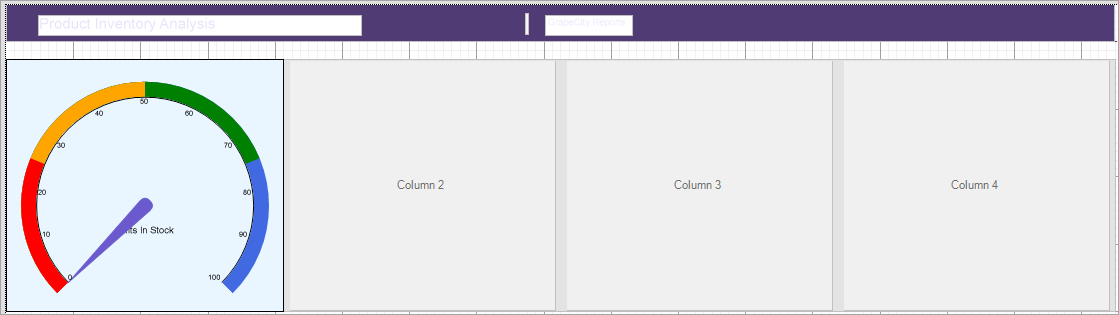
- Drag-drop the List data region.
- In the Properties panel, set the following properties:
| Property |
Value |
| DataSetName |
Products |
| GrowDirection |
Column |
| RowsOrColumnsCount |
4 |
- With List data region selected, click Property dialog.
- Go to Detail Grouping page, and in the General tab, provide a Name to the group and in the Group on: Expression, select =[categoryId].
- Go to the Sorting tab and add a sorting Expression =[categoryId] and Direction as 'Ascending'.
Create a Chart
We will use the Chart Wizard dialog to configure chart data values and customization. The wizard appears by default if you have a dataset added to your report. See the topic on Chart Wizard for more information.
- Drag-drop Chart data region inside the first column of the List data region. The Chart Wizard dialog appears with an option to select the data and the chart type.
You may want to increase the size of the List data region to accommodate the chart.
- Select the Dataset Name as 'Products' and the Chart Type as 'Gauge'.
- Click Next to proceed. Here, you need to specify the settings for the Gauge chart.
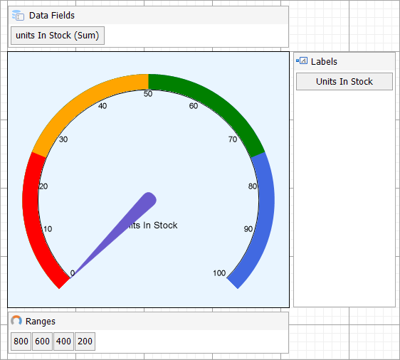
- In Gauge Ranges section, we will define the constant data values to display the ranges on the gauge's dial. Add four data values and enter the Field as follows:
- 800
- 600
- 400
- 200
Set Aggregate as 'Max' for all the above fields.
Note: The first field should be the one with greater value.
-
In the Gauge Pointer section, enter the Expression: =Sum(Fields!unitsInStock.Value)
This expression defines the gauge pointer's End configuration.
We will add more customizations to the category in later steps
- Click Next to preview your chart.
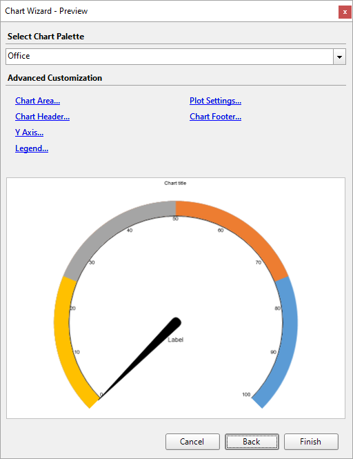
You can also modify the chart palette and do other customizations as the last step in the process of chart creation. Or, you can exit the wizard and access these smart panels as explained below.
Set Advanced Customization
Now that the chart is configured with data values, let us do some customizations on the chart elements using the smart panels.
Plot Settings
- To open the smart panel for advanced plot settings, right-click 'Plot-Plot1' on the Report Explorer and choose Property Dialog.
- Go to the Labels page and update Expression to 'Units in Stock'. You can also update the Offset Y and Offset X settings.
- Click OK to complete setting up the plot.
Chart Palette
- To open the smart panel for advanced chart settings, right-click 'Chart' on the Report Explorer and choose Property Dialog.
- In Palette, select Custom from the drop-down and add the following four colors for each value.
- RoyalBlue
- Green
- Orange
- Red
- Click OK to complete setting up the custom chart palette.
Gauge Pointer
- To set a needle color, go to Gauge Pointers property.
- In the PointerDesigner Collection Editor, go to BackgroundColor property and set 'SlateBlue'.
Chart Header
We want chart header to display the category name from another dataset, 'Categories'. For this, we will use Lookup expression.
- To open the smart panel for the chart header, right-click 'Header' on the Report Explorer and choose Property Dialog.
- Go to the General page and set Title to the following expression:
|
Copy Code
|
=Lookup([categoryId],[categoryId],[categoryName],"Categories")
|
- Go to the Font page and set the properties as below.
- Size: 11pt
- Color: #551e5f
- Click OK to complete setting up the chart header.
You may want to resize the chart.
Note: We use stub data at design time and not real data. So to view the actual final chart, you need to view the chart on the preview.
The final report on design time appears as shown.
- Once you are done with configuring and customizing the chart, press F5 to preview the report.