In This Topic
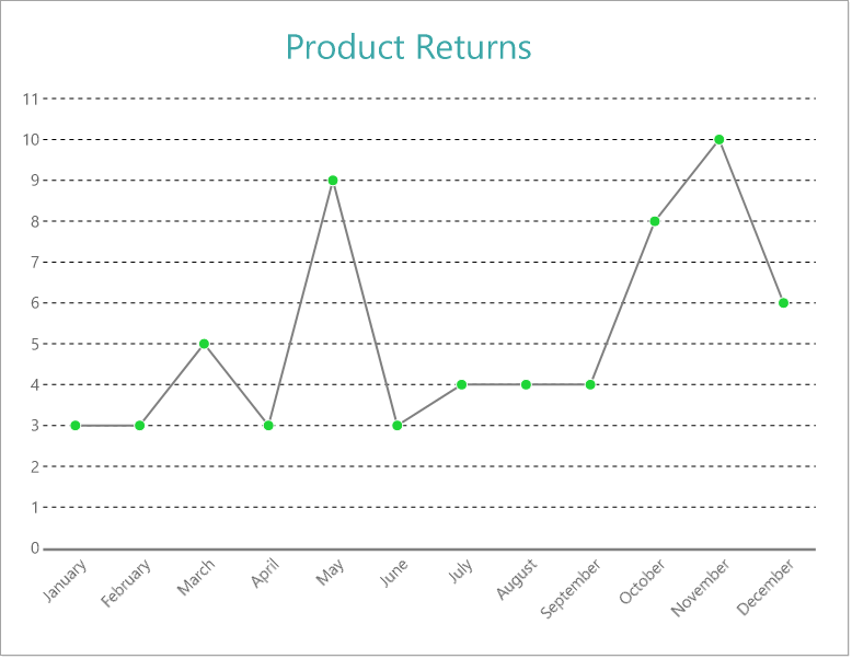
This walkthrough creates a Single Line Chart. The chart shows the trend in the return quantity over the year. The final chart appears like this:
Create a Report and Bind Report to Data
In the ActiveReports Designer, create a new RDLX report and follow the
New Report wizard to bind the report to data. You can also perform
data binding later using the
Report Data Source dialog accessed from the
Report Explorer.
Connect to a Data Source
- In the Report Data Source dialog, select the General page and enter the name of the data source.
- Under Type, select 'Json Provider'.
- Go to the Content tab under Connection and set the type of JSON data to 'External file or URL'.
- In the Select or type the file name or URL field, enter the following URL:
https://demodata.mescius.io/contoso/odata/v1/FactSales For more information, see the JSON Provider topic.
- Go to the Connection String tab and verify the generated connection string by clicking the Validate DataSource
 icon.
icon.
- Click OK to save the changes and open the DataSet dialog.
Add a Dataset
- In the Dataset dialog, select the General page and enter the name of the dataset, 'FactSales'.
- Go to the Query page and enter the following query to fetch the required fields:
| Query |
Copy Code
|
| $.value[*] |
- Click OK to save the changes.
- Go to the Fields page to view the available fields and modify the Name of the [DateKey] and [ReturnQuantity] fields to [Sales Date] and [Return Quantity], respectively.
Create a Chart
We will use the Chart Wizard dialog to configure chart data values and customization. The wizard appears by default if you have a dataset added to your report. See the topic on Chart Wizard for more information.
- Drag-drop Chart data region onto the design area. The Chart Wizard dialog appears with an option to select the data and the chart type.
- Select the Dataset Name as 'FactSales' and the Chart Type as 'Line'.
- Click Next to proceed. Here, you need to specify the line settings. We will define a data series value to display the return quantity values along the horizontal axis.
- Under Choose Data Values, add a new data value, and set its properties as below.
| Field |
Aggregate |
| =[Return Quantity] |
Sum |
- In Choose Data Categories, set Field to =MonthName(Month([Sales Date])). We will add more customizations to the category in later steps.
- Click Next to preview your chart.
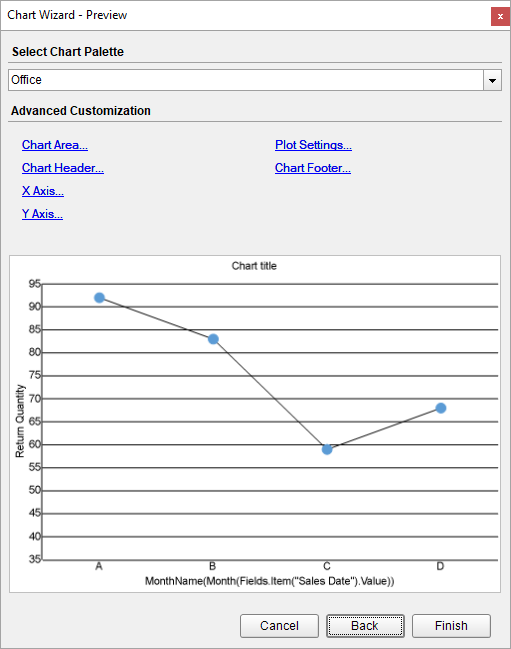
You can also modify the chart palette and do other customizations as the last step in the process of chart creation. Or, you can exit the wizard and access these smart panels as explained below.
Set Advanced Customization
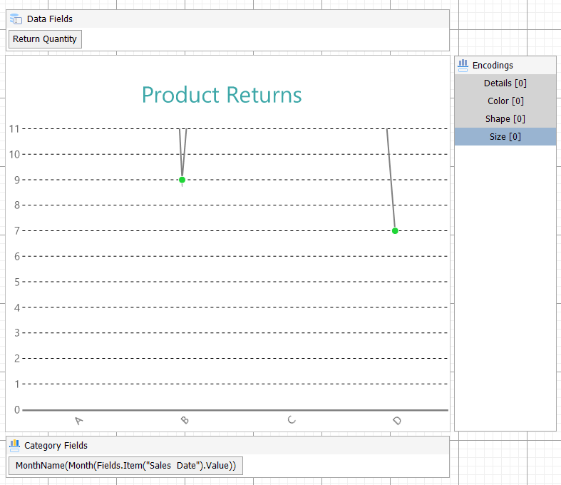
Now that the chart is configured with data values, let us do some customizations on the chart elements using the smart panels.
Plot Settings
- To open the smart panel for advanced plot settings, right-click 'Plot-Plot1' on the Report Explorer and choose Property Dialog.
- Go to the Categories page. Here, we will sort the month names to display in the order of increasing month numbers. So fill in the following settings:
| Field |
Settings |
| Sorting field |
=Month([Sales Date]) |
| Sorting direction |
Ascending |
- Go to the Appearance page and set the following properties.
- Line Style > Width: 1.5pt
- Line Style > Color: #808080
- Symbol Settings > Shape: Dot
- Symbol Settings > Background Color: #1fd537
- Symbol Border Settings > Style: Solid
- Symbol Border Settings > Color: White
- Click OK to complete setting up the plot.
Y-Axis
- To open the smart panel for advanced Y-axis settings, right-click 'Y-axis' on the Report Explorer and choose Property Dialog.
- Go to the Title page and remove the text from the Title field to hide the Y-axis title in the chart.
- Go to the Labels page and set the following properties:
- Font > Size: 10pt
- Font > Color: DimGray
- Go to the Line page and uncheck the Show Line option.
- Go to the Major Gridline page and set the following properties.
- Show Grid: Check-on
- Grid appearance > Width: 0.25pt
- Grid appearance > Color: #cccccc
- Grid appearance > Style: Dashed
- Go to the Scale page and set the following properties.
- Scale Type: Linear
- Minimum scale value: 0
- Maximum scale value: 11
- Click OK to complete setting up the Y-axis.
X-Axis
- To open the smart panel for advanced X-axis settings, right-click 'X-axis' on the Report Explorer and choose Property Dialog.
- Go to the Title page and remove the text from the Title field to hide the X-axis title in the chart.
- Go to the Labels page > General tab and set the Angle to '-45'.
- Now go to the Appearance tab and set the following properties.
- Font > Size: 10pt
- Font > Color: DimGray
- Go to the Line page and set the following properties.
- Color: #cccccc
- Width: 2pt
- Click OK to complete setting up the X-axis.
Chart Header
- To open the smart panel for the chart header, right-click 'Header' on the Report Explorer and choose Property Dialog.
- Go to the General page and set Title to 'Product Returns'.
- Go to the Font page and set the properties as below.
- Size: 24pt
- Color: #3da7a8
- Click OK to complete setting up the chart header.
You may want to resize the chart.
Note: We use stub data at design time and not real data. So to view the actual final chart, you need to view the chart on the preview.
- Once you are done with configuring and customizing the chart, press F5 to preview the report.