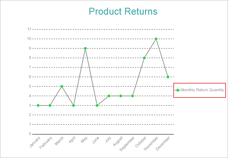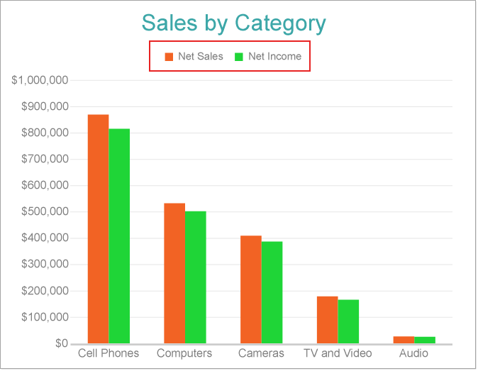
You can use this type of legend if the plot has several Data Values to display their names. In order to display the global legend, set the the ShowValuesNames property to True from the plot properties (or Show values name property in the smart panel for Plot properties). Refer Create Clustered Column Chart walkthrough.
Global legend has lower priority than Color, Size, or Shape legends. So if you have any settings changed in Color, Shape, or Size legends, they will override global settings.
You can configure the appearance of Global Legend using the properties given below.
BackgroundColor: Indicates the color of the background.
Border: Represents the border settings.
Hidden: Indicates whether the legend is hidden.
MaxHeight: Represents the maximum height of the element in percentage.
MaxWidth: Represents the maximum width of the element in percentage.
Orientation: The Orientation property determines the direction of legend item's appearance:
Padding: Represents the amount of padding to place between the text or graphics and the edge of the report item.
Position: Represents the legend position.
TextStyle and TitleStyle: The TextStyle and TitleStyle properties determine how to add styling to the Text and Title respectively. For instance, the TextStyle or TitleStyle has the following settings:
Wrapping: Represents whether the title text is wrapped.
The color legend displays the match between the plot subsections's fill or stroke color and the corresponding data value subcategories. You can configure the Color Encoding of a plot to show the Color Legend. Almost all types of plot support this legend. See Create Clustered Polar Chart walkthrough.
You can configure the appearance of Color Legend using the properties given below.
Title: The string Expression determines the legend heading.
BackgroundColor: Indicates the color of the background.
Border: Represents the border settings
MaxHeight: Represents the maximum height of the element in percentage.
MaxWidth: Represents the maximum width of the element in percentage.
Hidden: Indicates whether the legend is hidden.
Orientation: The Orientation property determines the direction of legend item's appearance:
Position: The Position value sets the location of the legend relative to the plot area.
Padding: You could also set the Padding between the legend box and its content. This will automatically increase the legend size.
TextStyle and TitleStyle: The TextStyle and TitleStyle properties determine how to add styling to the Text and Title respectively. For instance, the TextStyle or TitleStyle has the following settings:
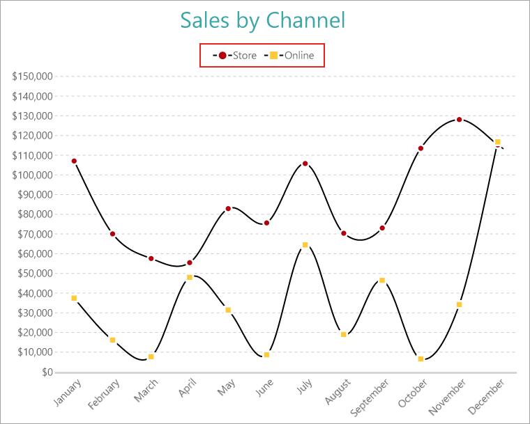
The Shape Legend shows the relationship between the shape of data point symbols and corresponding subcategories of a value in the plot data. You can configure the Shape Encoding in a Line plot to depict the Shape Legend. Consider the Create Multiple Line Chart walkthrough. With the chart selected, set the Shape Encoding to 'Channel Name' (same as the Details encoding) and the Symbols > Shape property to 'Auto'.
You can configure the appearance of Shape Legend using the properties given below.
BackgroundColor: Indicates the color of the background.
Border: Represents the border settings.
Hidden: Indicates whether the legend is hidden.
MaxHeight: Represents the maximum height of the element in percentage.
MaxWidth: Represents the maximum width of the element in percentage.
Orientation: The Orientation property determines the direction of legend item's appearance:
Padding: Represents the amount of padding to place between the text or graphics and the edge of the report item.
Position: Represents the legend position.
TextStyle and TitleStyle: The TextStyle and TitleStyle properties determine how to add styling to the Text and Title respectively. For instance, the TextStyle or TitleStyle has the following settings:
Wrapping: Represents whether the title text is wrapped.
IconColor: Represents the color of the icon.
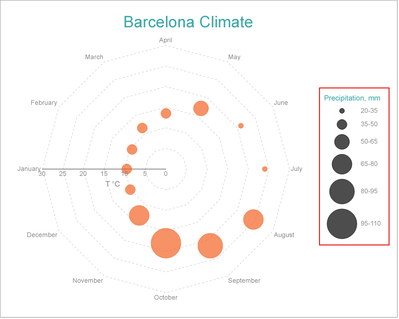
The Size Legend shows the match between the size of data point symbols and corresponding subcategories of a data value. You need to configure the Size Encoding of a plot to depict the Size Legend. The Create Radar Bubble Chart walkthrough illustrates setting up a Size Legend.
You can configure the appearance of Size Legend using the properties given below.
BackgroundColor: Indicates the color of the background.
Border: Represents the border settings.
Hidden: Indicates whether the legend is hidden.
MaxHeight: Represents the maximum height of the element in percentage.
MaxWidth: Represents the maximum width of the element in percentage.
Orientation: The Orientation property determines the direction of legend item's appearance:
Padding: Represents the amount of padding to place between the text or graphics and the edge of the report item.
Position: Represents the legend position.
TextStyle and TitleStyle: The TextStyle and TitleStyle properties determine how to add styling to the Text and Title respectively. For instance, the TextStyle or TitleStyle has the following settings:
Wrapping: Represents whether the title text is wrapped.
IconColor: Represents the color of the icon.
Ranges: Represents the collection of ranges for size legend.
Though the data fields in the legend display the actual dataset field names, you can also define a custom name for a data field using the Caption property as elaborated in below. This is useful in scenarios when the data field names in a legend are difficult to understand.
Note: The Caption property is unavailable in two scenarios:
Consider the Single Line Chart walkthrough. The following steps set a custom legend for the data field name in the chart.