The Polar plot arranges categories along the circumference of a circle and encodes data values into sectors along radial lines. The Polar plot is suitable for comparing data values across categories using a circular shape. The categories can be further split to represent data values as clusters or stacks.
There are different types of Polar charts, which are elaborated below:
A Simple Polar chart displays one value for each category. See Create Simple Polar Chart walkthrough showcases plotting the Sales Amount per Product Category.
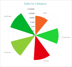
Simple Polar Chart
A Clustered Polar chart splits the values into subcategories by placing corresponding circular sectors adjacent to each other within the containing category. The Create Clustered Polar Chart walkthrough showcases plotting the Sales Amount for each Sales Channel per Product Category.
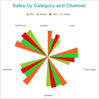
Clustered Polar Chart
A Stacked Polar chart is a good option to split the data values into subcategories by dividing corresponding circular sectors into subsections. The Create Stacked Polar Chart walkthrough showcases plotting the Sales Amount for each Product Category per Sales Channel.
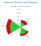
Clustered Polar Chart
A Stacked Percentage Polar chart combines the stacked polar plot and the Percentage axis scale. This chart type indicates the contribution of each data values' sub-category to a total of the containing category. The Create Stacked Percentage Polar Chart walkthrough showcases plotting the percentage share of the Sales Amount of product categories for each Sales Channel.
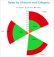
Percentage Stacked Polar Chart
The plot properties discussed below can be accessed from the Properties Panel on selecting the Chart > Plot from the Report Explorer. You can access some of the important properties from the Plot's Smart Panel too. See Chart Smart Panels topic for more information. Both the Properties Panel and the Smart Panel can be accessed by right-clicking the plot in the design area.
Indicates the color used to fill the chart area.
The action to perform when the plot is clicked. The action can be a hyperlink, a bookmark, or a drill-through.
The data labels for each chart.
The line style for the borders. Includes LineColor, LineStyle, and LineWidth properties for the customization.
The name of the plot. By default, a chart containing a single plot has the plot name as 'Plot1'.
Contains the tooltip template settings. You can choose from the list of predefined settings or set your own in the Expression Editor.
The Clipping Mode determines how a plot extends within the plot area. The ClippingMode can be set to:
The Line Aspect determines the line style that connects data points.
The Opacity is the percentage value of the opacity of the plot fill color. 100% opacity means that the plot fill color is opaque while 0% opacity means that the plot fill color is completely transparent.
Overlays property is a collection for superimposing the data trend on a plot. For more information, see Trendlines topic.
Rules control the appearance of plots based on specified conditions. For more information on conditions, see Rules topic.
Represents how null or empty values should be shown in the plot - Gaps (default), Connected, or Zeros.
Indicates the arc angle that defines the clockwise rotation of the plot. A full rotation makes 360 degrees.
Determines whether to display multiple data fields as a single data field. By default, the property is set to 'False'.
The Category Encoding of a plot is a set of properties that determine the period over which the plot generates connected data points representing those above Data Values. The Category encoding includes the following properties.
Values
The Values property is the collection and takes the field as a category.
SortingField
The SortingField defines the order in which the categories are displayed. It takes the default same as the Values field, but you can also specify another field to sort the categories.
SortDirection
The SortDirection defines the ascending or descending order in which the categories should be sorted.
SortingAggregate
The SortingAggregate property specifies the aggregate to use for sorting the categories.
The Colors Encoding enables the color legend of the Details or Category Encoding. It includes the following properties:
Action
The action to take when the color legend is clicked.
Aggregate
Aggregates the value of Color expression.
ShowValuesName
If set to True, the legend is displayed based on the value specified in Details encoding or Color encoding.
Values
The Values is the collection where the value of the Color expression is specified. However, the Polar charts take the first item from the collection.
The Details Encoding breaks down the data values into subcategories and produces additional groups. The Details property is the collection of items and each item includes the following properties that define the Details encoding:
The Values encoding specifies the data values and represents the collection of items and each item includes the following properties.
Type
The Type property provides 'Simple' and 'Complex' options to choose from. However, for Polar charts, 'Simple' is acceptable.
Value
The Value property is the collection and usually takes a bound field. However, the Polar charts take the first item from the collection.
Aggregate
To show aggregated values such as Average, Count, and Sum instead of individual values, specify an Aggregate function.
The Text Encoding provides support of any dataset field in chart labels and tooltips and allows displaying additional info on the chart. When two text encodings are added, they are displayed by default with the ";" delimiter. A text encoding includes the following properties:
Aggregate
Aggregates the value of the Text expression.
Target
Specifies whether this text is for a Label or a Tooltip Label. The label format is controlled with the chart's Labels > Template property or Tooltip Template property.
The Template property can use both the predefined values and the added text encoding fields, for example:
Count:{Text0}
Sum:{valueField.value}
Template Key
A unique key, used in the chart plot's Labels > Template and Tooltip Template to access the text encoding value.
Value
A field, constant or expression to be displayed.