You can use the Sparkline report control as a simple means of displaying the trend of data in a small graph. The Sparkline displays the most recent value as the rightmost data point and compares it with earlier values on a scale, allowing you to view general changes in data over time. With the height similar to the surrounding text and the width not more than 14 letters wide, the sparkline fits well in dashboards, reports, and other documents.
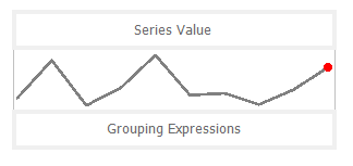
By clicking on the Sparkline control, you can set its properties in the Properties window.
| Property | Description |
|---|---|
| AccessibleDescription | Enter the alternative description of the control for use by accessibility client application. The property on exporting the report adds the ‘alternative text’ in PDF and ‘alt’ attribute in HTML. |
| DataSetName | Specify a dataset associated with the sparkline. |
| DataSetParameters | Specify a dataset parameter associated with the sparkline. |
| FillStyle | Choose the type of gradient for the sparkline from None, LeftRight, TopBottom, Center, DiagonalLeft, DiagonalRight, HorizontalCenter or VerticalCenter. You can also select a color to fill the sparkline from the color picker. |
| Filters | Add a new filter by specifying the Expression, Operator, and Value. |
| LineStyle | Enter a value to set the Width of the Line type sparkline. You can also choose the color of the line from the color picker. |
| Location | Enter a value in points to set the location of the sparkline. |
| MarkerColor | Select a color for the last point marker or select the Expression option to open the Expression Editor and create an expression that evaluates to a .NET color. |
| MarkerVisibility | Select whether to display a marker at the last point on the sparkline of Line type. |
| MaximumColumnWidth | Select the maximum width of columns in the sparkline. |
| Range | Select a value or enter an expression that defines the lower bound and upper bound of the wall range. By using the backdrop, you can choose the type of gradient and color of the wall range. |
| RangeVisibility | Select whether to display the range or not. |
| SeriesValue | Enter a series value of the sparkline. |
| Size | Enter the Width and Height of the sparkline. |
| SparklineType | Choose the sparkline type from Line, Columns, Whiskers, Area, or StackedBar. |
You can set the Sparkline properties in the Sparkline dialog. To open it, with the Sparkline selected on the report, under the Properties window, click the Property dialog link.
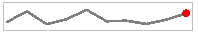
The Line sparkline is widely used in financial and economic data analysis and is based on a continuous flow of data. The currency exchange rates, price change are examples of the application of this type of sparklines.
| Property | Description |
| Last point marker is visible | Select to display a marker at the last point on the sparkline. |
| Marker Color | Select a color to use for the last point marker, or select the <Expression...> option to open the Expression Editor and create an expression that evaluates to a .NET color. |
| Line Style | |
| Color | Select a color to use for the line, or select the <Expression...> option to open the Expression Editor and create an expression that evaluates to a .NET color. |
| Width | Enter a value in points to set the width of the line. |
| Enable Wall Range | Select this check box to display a wall range for the sparkline. Selecting this box enables the rest of the properties in this section. |
| Lower Bound | Select a value or enter an expression that defines the lower bound of the wall range. |
| Upper Bound | Select a value or enter an expression that defines the upper bound of the wall range. |
| Wall Range Backdrop | |
| Fill Color | Select a color to use for the wall range, or select the <Expression...> option to open the Expression Editor and create an expression that evaluates to a .NET color. |
| Gradient | Choose the type of gradient to use for the backdrop: None, LeftRight, TopBottom, Center, DiagonalLeft, DiagonalRight, HorizontalCenter, or VerticalCenter. |
| Gradient End Color | Select a color to use for the end of the wall range gradient, or select the <Expression...> option to open the Expression Editor and create an expression that evaluates to a .NET color. |
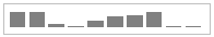
The Column sparkline is used for sports scores, cash register receipts, and other cases where previous values and the current value do not closely influence one another. This sparkline is used when dealing with discrete data points, and not a continuous flow of data as in the Line sparkline.
| Property | Description |
| Fill Color | Select a color to use for the fill of the sparkline, or select the <Expression...> option to open the Expression Editor and create an expression that evaluates to a .NET color. |
| Maximum Column Width | Select the maximum width of columns in the sparkline. If blank, all columns are sized to fit. |
| Enable Wall Range | Select this check box to display a wall range for the sparkline. Selecting this box enables the rest of the properties in this section. |
| Lower Bound | Select a value or enter an expression that defines the lower bound of the wall range. |
| Upper Bound | Select a value or enter an expression that defines the upper bound of the wall range. |
| Wall Range Backdrop | |
| Fill Color | Select a color to use for the wall range, or select the <Expression...> option to open the Expression Editor and create an expression that evaluates to a .NET color. |
| Gradient | Choose the type of gradient from these choices: None, LeftRight, TopBottom, Center, DiagonalLeft, DiagonalRight, HorizontalCenter, or VerticalCenter. |
| Gradient End Color | Select a color to use for the end of the wall range gradient, or select the <Expression...> option to open the Expression Editor and create an expression that evaluates to a .NET color. |
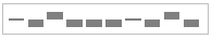
The Whisker sparkline is typically used in win/loss/tie or true/false scenarios. This type is similar to the Column sparkline, but it renders a tie (0 value) in a different manner. The bars in a whisker sparkline render below the baseline for a negative value, above the baseline for a positive value, and on the baseline for a zero value, for example, in a profit/loss and no profit/no loss scenario.
| Property | Description |
| Fill Color | Select a color to use for the fill of the sparkline, or select the <Expression...> option to open the Expression Editor and create an expression that evaluates to a .NET color. |
| Maximum Column Width | Select the maximum width of columns in the sparkline. If blank, all columns are sized to fit. |
| Enable Wall Range | Select this check box to display a wall range for the sparkline. Selecting this box enables the rest of the properties in this section. |
| Lower Bound | Select a value or enter an expression that defines the lower bound of the wall range. |
| Upper Bound | Select a value or enter an expression that defines the upper bound of the wall range. |
| Wall Range Backdrop | |
| Fill Color | Select a color to use for the wall range, or select the <Expression...> option to open the Expression Editor and create an expression that evaluates to a .NET color. |
| Gradient | Choose the type of gradient from these choices: None, LeftRight, TopBottom, Center, DiagonalLeft, DiagonalRight, HorizontalCenter, or VerticalCenter. |
| Gradient End Color | Select a color to use for the end of the wall range gradient, or select the <Expression...> option to open the Expression Editor and create |
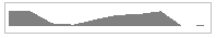
The Area sparkline is similar to the Line sparkline but visually you see the space under the line as shaded.
| Property | Description |
| Fill Color | Select a color to use for the fill of the sparkline, or select the <Expression...> option to open the Expression Editor and create an expression that evaluates to a .NET color. |
| Enable Wall Range | Select this check box to display a wall range for the sparkline. Selecting this box enables the rest of the properties in this section. |
| Lower Bound | Select a value or enter an expression that defines the lower bound of the wall range. |
| Upper Bound | Select a value or enter an expression that defines the upper bound of the wall range. |
| Wall Range Backdrop | |
| Fill Color | Select a color to use for the wall range, or select the <Expression...> option to open the Expression Editor and create an expression that evaluates to a .NET color. |
| Gradient | Choose the type of gradient from these choices: None, LeftRight, TopBottom, Center, DiagonalLeft, DiagonalRight, HorizontalCenter, or VerticalCenter. |
| Gradient End Color | Select a color to use for the end of the wall range gradient, or select the <Expression...> option to open the Expression Editor and create an expression |
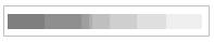
The Stacked Bar sparkline is presented as a horizontal bar with different segment lengths marked by distinct color hues. The Stacked bar illustrates how the various segments of a part-to-whole relationship correspond to one another - the largest segment represents the highest value and the change in brightness indicates a new value on a scale.
| Property | Description |
| Fill Color | Select a color to use for the fill of the sparkline, or select the <Expression...> option to open the Expression Editor and create an expression that evaluates to a .NET color. |