ActiveReports 18 .NET Edition
Report Authors: Designer Components / Report Controls / Page/RDLX Report / Table
In This Topic
    Table
    In This Topic

    The Table data region is available in Page and RDLX reports. It is used to display the information in tabular format in Tabular Reports. The Table data region consists of columns and rows that organize data. By default, a table has three columns and three rows, a total of nine cells, where each cell is filled with a text box. At design time, you can add or remove columns, rows, and groupings to suit your needs. Also, you can embed other data regions in the table cells.

    Structure

    Table Structure

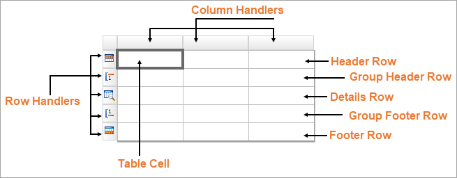
    Column is a vertical group of cells in a table. If you right-click a column handler, you can add new columns or delete existing ones using the context menu that appears.

    Row is a horizontal group of cells in a table. If you right-click a row handler, you can add new rows or delete existing ones using the context menu that appears.

    Cell is the intersection of a row and column. By default, each table cell contains a TextBox report item. But you can replace it with other report controls, such as an Image, by drag-and-drop the corresponding item from the Toolbox into the cell.

    Header row appears at the beginning of a table. If its RepeatOnNewPage property is set to 'True', it prints on every page taken by the table content. You could use the header row to display the title or the logo of a tabular report. A table may have several header rows.

    Group header row appears at the beginning of a group. If its RepeatOnNewPage property is set to 'True', it prints on every page taken by the table content. You could use a group header row to display the group's field value or summary value. A group may have several header rows.

    Details row repeats for each bound dataset record that passed through the dataset filters and data region filters. If a table has the grouped data, then the details row appears between the header and footer of the enclosing group instance. A table may have more than one details row.

    Group footer row appears at the end of a group. If its RepeatOnNewPage property is set to 'True', it prints on every page taken by the table content. You could use the group footer row to display summary values. A group may have several footer rows.

    Footer row appears at the end of a table. If its RepeatOnNewPage property is set to 'True', it prints on every page taken by the table content. You could use the footer rows to display grand totals.

    Table Layout Actions

    The Table data region provides context menu options to perform basic layout actions. You can access layout options for Table rows from the context menu by right-clicking on a selected row.

    You can access layout options for Table columns from the context menu by right-clicking on a selected column.

    Table Dialog Properties

    You can set the Table properties in the Table dialog. To open it, with the Table selected on the report, under the Properties window, click the Property dialog link.

    Name: Enter a name for the table that is unique within the report. This name can be called in code. You can only use underscore (_) as a special character in the Name field. Other special characters such as period (.), space ( ), forward slash (/), backslash (\), exclamation (!), and hyphen (-) are not supported.

    Tooltip: A textual label for the report item used to include TITLE or ALT attributes in HTML reports.

    Dataset name: Select a dataset to associate with the table. The combo box is populated with all of the datasets in the report's dataset collection.

    Has own page numbering: Select to indicate whether the table has its own pagination.

    Page Breaks (RDLX report):

    • Insert a page break before this table
    • Insert a page break after this table
    • Fit table on a single page if possible

    NewPage (RDLX report):

    • Next: A default value that makes a new group start from the immediate next page of the report.
    • Odd: A new group starts from the next odd page of the report.
    • Even: A new group starts from the next even page of the report.

    See Page Breaks in Data Regions topic for more detail.

    Header and Footer: Select any of the following options.

    • Repeat header row on each page
    • Repeat footer row on each page
    • Prevent orphaned footer on next page

    Initial visibility

    • Visible: The table is visible when the report runs.
    • Hidden: The table is hidden when the report runs.
    • Expression: Use an expression with a Boolean result to decide whether the Table is visible. True for hidden, False for visible.

    Visibility can be toggled by another report item: Select this check box to display a toggle image next to another report item. This enables the drop-down box below where you can specify the TextBox control that toggles the visibility of the Table. The user can click the toggle item to show or hide this Table.

    Document map label: Enter an expression to use as a label to represent this item in the table of contents (document map).

    Bookmark ID: Enter an expression to use as a locator for this Table. You will then be able to provide a bookmark link to this item from another report item using a Jump to bookmark action.

    Click the plus sign button to enter new sort expressions, and remove them using the X button.

    Expression: Enter an expression by which to sort the data in the group.

    Direction: Select Ascending or Descending.

    Click the plus sign button to add a new group to the table, and delete them using the X button. Once you add one or more groups, you can reorder them using the arrow buttons, and set up information for each group on the following tabs.

    General

    Name: Enter a name for the group that is unique within the report. This property cannot be set until after a Group on expression is supplied.

    Group on: Enter an expression to use for grouping the data.

    Document map label: Enter an expression to use as a label to represent this item in the table of contents (document map).

    Parent group: For use in recursive hierarchies. Enter an expression to use as the parent group.

    Filters

    You need to provide three values to add a new filter to the collection: Expression, Operator, and Value.

    Expression: Enter the expression to use for evaluating whether data should be included in the group.

    Operator: Select from the following operators to decide how to compare the expression to the left with the value to the right.

    • Equal Only choose data for which the value on the left is equal to the value on the right.
    • Like Only choose data for which the value on the left is similar to the value on the right.
      For more information on using the Like operator, see the MSDN Web site.
    • NotEqual Only choose data for which the value on the left is not equal to the value on the right.
    • GreaterThan Only choose data for which the value on the left is greater than the value on the right.
    • GreaterThanOrEqual Only choose data for which the value on the left is greater than or equal to the value on the right.
    • LessThan Only choose data for which the value on the left is less than the value on the right.
    • LessThanOrEqual Only choose data for which the value on the left is less than or equal to the value on the right.
    • TopN Only choose items from the value on the left which are the top number specified in the value on the right.
    • BottomN Only choose items from the value on the left which are the bottom number specified in the value on the right.
    • TopPercent Only choose items from the value on the left which are the top percent specified in the value on the right.
    • BottomPercent Only choose items from the value on the left which are the bottom percent specified in the value on the right.
    • In Only choose items from the value on the left which are in the array of values specified on the right.
      Selecting this operator enables the Values list at the bottom.
    • Between Only choose items from the value on the left which fall between the pair of values you specify on the right. Selecting this operator enables two Value boxes instead of one.

    Value: Enter a value to compare with the expression on the left based on the selected operator. For multiple values used with the Between operator, the lower two value boxes are enabled.

    Values: When you choose the In operator, you can enter as many values as you need in this list.

    Sorting

    Click the plus sign button to enter new sort expressions, and remove them using the X button.

    Expression: Enter an expression by which to sort the data in the group.

    Direction: Select Ascending or Descending.

    Visibility

    By default, the group is visible when the report runs, but you can hide a group when certain conditions are met, or toggle its visibility with another report item.

    Initial visibility

    • Visible: The group is visible when the report runs.
    • Hidden: The group is hidden when the report runs.
    • Expression: Use an expression with a Boolean result to decide whether the group is visible. True for hidden, False for visible.

    Visibility can be toggled by another report item: Select this check box to display a toggle image next to another report item. The user can click the toggle item to show or hide this band group. This enables the drop-down list where you can select the report control that users can click to show or hide this group.

    Data Output

    Element Name: Enter a name to be used in the XML output for this group.

    Collection: Enter a name to be used in the XML output for the collection of all instances of this group.

    Output: Choose Auto, Yes, No, or Contents only to decide whether to include this group in the XML output.

    Layout

    BreakLocation: Select from these options to decide where to insert a page break in relation to the group.

    • None: Inserts no page break.
    • Start: Inserts a page break before the group. 
    • End: Inserts a page break after the group.
    • StartAndEnd: Inserts a page break before and after the group.
    • Between: Inserts a page break between groups (at the end of a current group and the beginning of a next group).

    New Page:

    • Next: A default value that makes a new group start from the immediate next page of the report.
    • Odd:  A new group starts from the next odd page of the report.
    • Even: A new group starts from the next even page of the report.

    Include group header: Adds a group header band (selected by default).

    Include group footer: Adds a group footer band (selected by default).

    Repeat group header: Repeats the group header band on each page.

    Repeat group footer: Repeats the group footer band on each page.

    Has own page numbering: Used in conjunction with the "Page Number in Section" and "Total Pages in Section" properties, tells the report that the group constitutes a new page numbering section.

    Keep together on one page if possible: Indicates that the group is kept together on one page if possible.

    Prevent orphaned footer: Indicates whether the orphaned footer is displayed for the group.

    Detail grouping is useful when you do not want to repeat values within the details. When a detail grouping is set, the value repeats for each distinct result of the grouping expression instead of for each row of data. For example, if you use the Customers table of the NorthWind database to create a list of countries without setting the details grouping, each country is listed as many times as there are customers in that country. If you set the details grouping to =Fields!Country.Value each country is listed only once.

    Note: If the detail grouping expression you use results in a value that is distinct for every row of data, a customer number for example, you will see no difference in the results.

    The Detail Grouping page has the following tabs.

    General

    Name: Enter a name for the group that is unique within the report. This property cannot be set until after a Group on expression is supplied.

    Group on: Enter an expression to use for grouping the data.

    Document map label: Enter an expression to use as a label to represent this item in the table of contents (document map).

    Parent group: For use in recursive hierarchies. Enter an expression to use as the parent group.

    Filters

    You need to provide three values to add a new filter to the collection: Expression, Operator, and Value.

    Expression: Enter the expression to use for evaluating whether data should be included in the group.

    Operator: Select from the following operators to decide how to compare the expression to the left with the value to the right.

    • Equal Only choose data for which the value on the left is equal to the value on the right.
    • Like Only choose data for which the value on the left is similar to the value on the right.
      For more information on using the Like operator, see the MSDN Web site.
    • NotEqual Only choose data for which the value on the left is not equal to the value on the right.
    • GreaterThan Only choose data for which the value on the left is greater than the value on the right.
    • GreaterThanOrEqual Only choose data for which the value on the left is greater than or equal to the value on the right.
    • LessThan Only choose data for which the value on the left is less than the value on the right.
    • LessThanOrEqual Only choose data for which the value on the left is less than or equal to the value on the right.
    • TopN Only choose items from the value on the left which are the top number specified in the value on the right.
    • BottomN Only choose items from the value on the left which are the bottom number specified in the value on the right.
    • TopPercent Only choose items from the value on the left which are the top percent specified in the value on the right.
    • BottomPercent Only choose items from the value on the left which are the bottom percent specified in the value on the right.
    • In Only choose items from the value on the left which are in the array of values specified on the right.
      Selecting this operator enables the Values list at the bottom.
    • Between Only choose items from the value on the left which fall between the pair of values you specify on the right. Selecting this operator enables two Value boxes instead of one.

    Value: Enter a value to compare with the expression on the left based on the selected operator. For multiple values used with the Between operator, the lower two value boxes are enabled.

    Values: When you choose the In operator, you can enter as many values as you need in this list.

    Visibility

    By default, the group is visible when the report runs, but you can hide a group when certain conditions are met, or toggle its visibility with another report item.

    Initial visibility

    • Visible: The group is visible when the report runs.
    • Hidden: The group is hidden when the report runs.
    • Expression: Use an expression with a Boolean result to decide whether the group is visible. True for hidden, False for visible.

    Visibility can be toggled by another report item: Select this check box to display a toggle image next to another report item. The user can click the toggle item to show or hide this band group. This enables the drop-down list where you can select the report control that users can click to show or hide this group.

    Data Output

    Element Name: Enter a name to be used in the XML output for this group.

    Collection: Enter a name to be used in the XML output for the collection of all instances of this group.

    Output: Choose Yes or No to decide whether to include this group in the XML output.

    Layout

    BreakLocation: Select from these options to decide where to insert a page break in relation to the group.

    • None: Inserts no page break.
    • Start: Inserts a page break before the group. 
    • End: Inserts a page break after the group.
    • StartAndEnd: Inserts a page break before and after the group.
    • Between: Inserts a page break between groups (at the end of a current group and the beginning of a next group).

    NewPage:

    • Next: A default value that makes a new group start from the immediate next page of the report.
    • Odd:  A new group starts from the next odd page of the report.
    • Even: A new group starts from the next even page of the report.

    See Page Breaks in Data Regions topic for more detail.

    Has own page numbering: Used in conjunction with the "Page Number in Section" and "Total Pages in Section" properties, tells the report that the group constitutes a new page numbering section.

    You need to provide three values to add a new filter to the collection: Expression, Operator, and Value.

    Expression: Enter the expression to use for evaluating whether data should be included in the group.

    Operator: Select from the following operators to decide how to compare the expression to the left with the value to the right.

    • Equal Only choose data for which the value on the left is equal to the value on the right.
    • Like Only choose data for which the value on the left is similar to the value on the right.
      For more information on using the Like operator, see the MSDN Web site.
    • NotEqual Only choose data for which the value on the left is not equal to the value on the right.
    • GreaterThan Only choose data for which the value on the left is greater than the value on the right.
    • GreaterThanOrEqual Only choose data for which the value on the left is greater than or equal to the value on the right.
    • LessThan Only choose data for which the value on the left is less than the value on the right.
    • LessThanOrEqual Only choose data for which the value on the left is less than or equal to the value on the right.
    • TopN Only choose items from the value on the left which are the top number specified in the value on the right.
    • BottomN Only choose items from the value on the left which are the bottom number specified in the value on the right.
    • TopPercent Only choose items from the value on the left which are the top percent specified in the value on the right.
    • BottomPercent Only choose items from the value on the left which are the bottom percent specified in the value on the right.
    • In Only choose items from the value on the left which are in the array of values specified on the right.
      Selecting this operator enables the Values list at the bottom.
    • Between Only choose items from the value on the left which fall between the pair of values you specify on the right. Selecting this operator enables two Value boxes instead of one.

    Value: Enter a value to compare with the expression on the left based on the selected operator. For multiple values used with the Between operator, the lower two value boxes are enabled.

    Values: When you choose the In operator, you can enter as many values as you need in this list.

    The Data Output page of the Table dialog allows you to control the following properties when you export to XML.

    • Element Name: Enter a name to be used in the XML output for this Table.
    • Output: Choose Auto, Yes, or No to decide whether to include this Table in the XML output. Choosing Auto exports the contents of the Table.
    • Detail element name: Enter a name to be used in the XML output for the data element for instances of the table. This name is ignored if you have specified a details grouping.
    • Detail collection name: Enter a name to be used in the XML output for the data element for the collection of all instances of the detail grouping.
    • Data element output: Choose Yes or No to decide whether to include the details in the XML output.

    Adding Data to Table

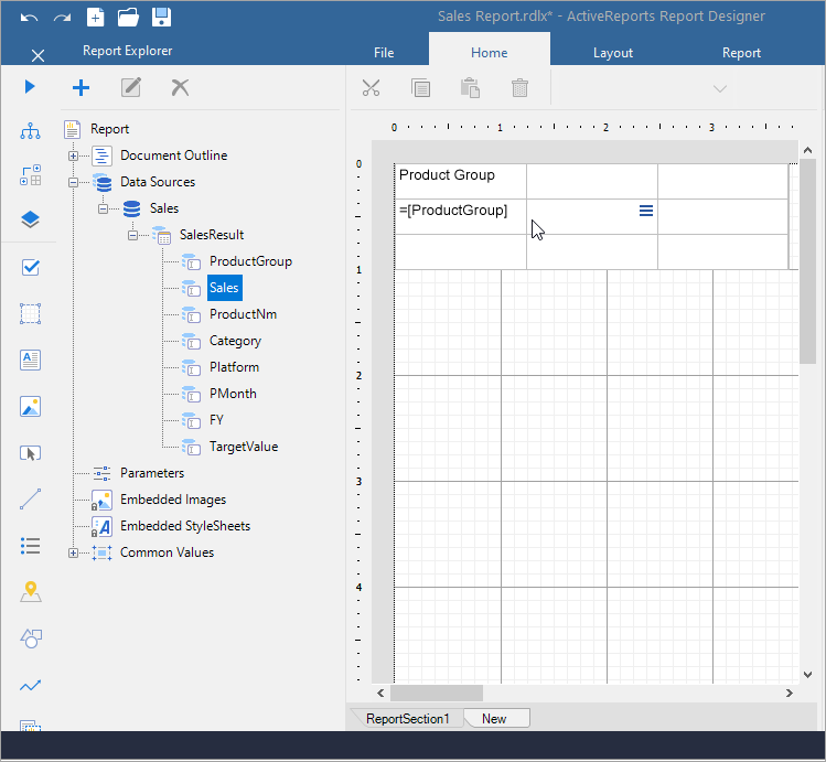
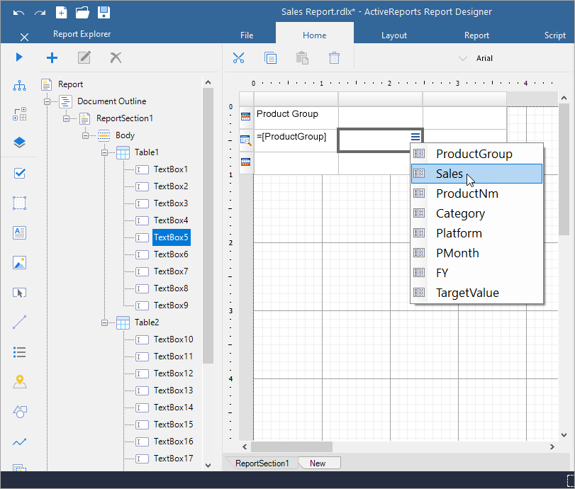
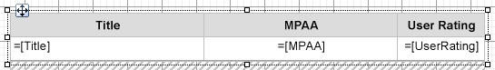
    Once you place the Table data region on a report, you can add data to its cells. As with any data region, you can drag fields from your Fields list onto cells in the table. Although the default report control within each cell of the table is a text box, you can replace it with any other report control or a data region. When you drag a field into a cell in the details row, ActiveReports automatically provides a label in the table header. As with all report controls, you can use expressions to further manipulate the data within the cells of the table. For more information, see Expressions.

    1. From the Toolbox, drag-drop the Table data region onto the design area.
    2. From the Report Explorer, expand the DataSet  and drag-drop data fields onto the cells in the details row.  

    Adding data to Table from Report Explorer

    Alternatively, in the table, select a TextBox in the Details row and, from the Fields Selection Adorner, select a field from the list.


    Adding data to Table with Fields Selection Adorner

    Table Features

    Table Grouping

    Groups provide a way to organize data and make data analyses easy. In a Table data region, you can also create a document map based on the groups by specifying the group expression in the Document map label option. For information on document map and navigation, see the Document Map topic for more details.

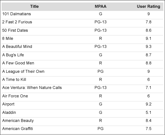
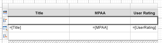
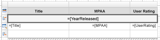
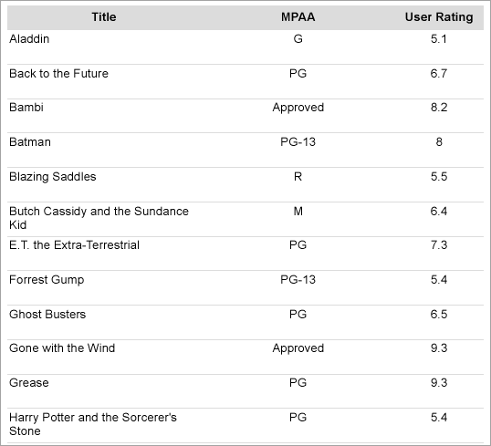
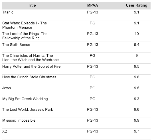
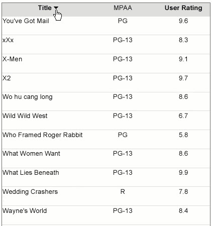
    Let us understand grouping using the report shown. The report consists of a Table that displays Movie details – Title, MPAA, and User Rating fields. The report connects to the 'Movie' table from 'Reels.db' data source on GitHub.
    Table with Movie Details at design


    Table with Movie Details at run time

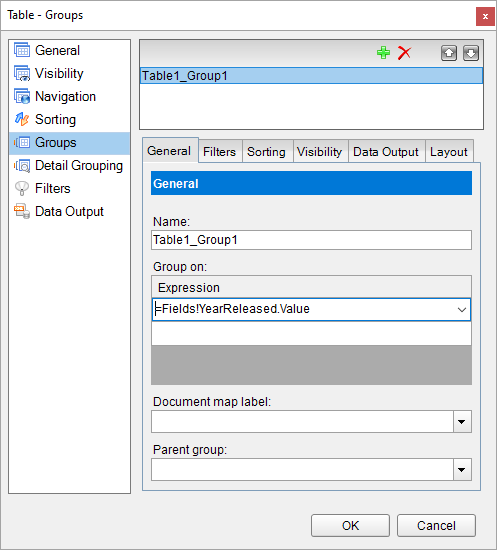
    You can group the table data according to the other dataset field, 'Year Released', to group the details based on the year when a movie was released.

    The following steps add a group in the table using Group On expression. 

    1. With the Table data region selected, under the Properties window, click the Property dialog link to open the Table dialog.
      Note: Alternatively, you can add a group by selecting Insert Group in the context menu of the Table data region, and adding a group in the Table - Groups dialog that opens.
    2. Go to the Groups page and click Add.
    3. Under Group on, enter the expression on which you want to group the data. For e.g.,
      =Fields!YearReleased.Value.
      Adding a group to Table
    4. Click OK to close the dialog. A Group Header and a Group Footer are added as shown.
      Table with an added group at design
    5. Merge the cells in the Group Header row and enter the expression in the Value property as
      =[YearReleased]
      Merging cells in the Table Group Header
      This makes the group value appear and span above each group.
    6. Preview the report. Here's how the table will look like.
      Table with grouping at preview

    Detail Grouping

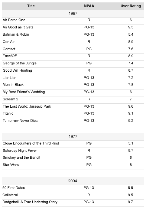
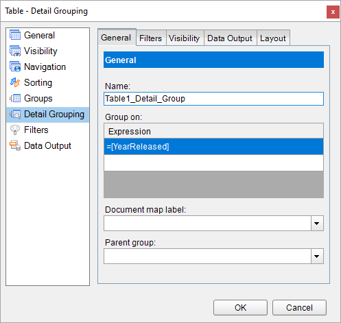
    Another way of grouping the table data is by grouping the Details row without adding a group. The Detail Grouping groups the data in such a way that only one row per distinct grouping value or expression is displayed for each row of data in Details row. Also, it does not add a Group Header and Group Footer. Detail grouping is useful when you do not want the values to repeat within the details as many times as they are present in the data source.

    Let us use Detail Grouping to group the table data. For example, we have a report with the Table that displays Movie details – Title, MPAA, and User Rating fields. The report connects to the 'Movie' table from 'Reels.db' data source on GitHub.
    Table with Movie Details at design   

    1. With the Table selected on the report, under the Properties window, click the Property dialog link to open the Table dialog.
    2. Go to the Detail Grouping page and, under Group on, enter the expression on which you want to group the data. For e.g.,
      =Fields!YearReleased.Value.
      Table Detail Grouping dialog
    3. Click OK to close the dialog.
    4. Preview the report. Here's how the table will look like.
      Note that the report size is smaller after applying the Details Grouping since the details row is shown once for every grouping value.
      Table with added detail grouping at preview

    Merge Cells

    You can combine adjacent cells in horizontal (same row) or vertical (same column) direction into a single cell. Vertical cell merging is possible within the same row type, that is, within the Header, Group Header, Footer, Group Footer, or Details row.

    To merge cells,

    1. Select the cells (Ctrl+Click) and the right-click.
    2. From the context menu, select Merge Cells.

    Auto Merge

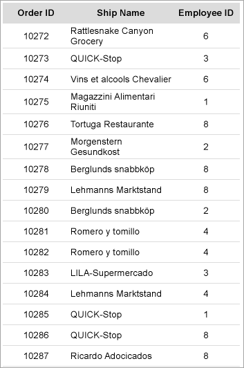
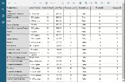
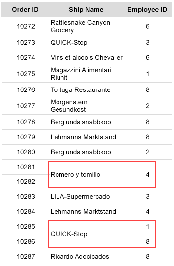
    The AutoMergeMode property lets you set the mode to merge the adjacent cells (text boxes) in details row with the same value. This property takes Always, Never, and Restricted values. The details row with the same data values and with AutoMergeMode property set to:

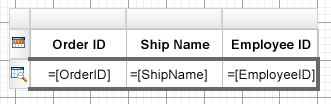
    The following steps take you through how to add automatic merge to the cells in the following table. The report connects to the 'Orders' table from 'NWIND.db' data source on GitHub.

    Orders Table at design

    Orders Table at preview

    1. Select the cell with EmployeeID field and set the Layout > AutoMergeMode property to 'Restricted'. This merges employee ids depending on whether the corresponding ship names (cells in the previous column) are merged.
    2. Select the cell with ShipName field and set the Layout > AutoMergeMode property to 'Always'. This merges the cells with similar ship names.    
    3. Preview the report. Here's how the table will look like.
      Orders Table with auto merged cells at preview

    Freeze Rows and Columns (RDLX Reports)

    When you use a Table data region containing a large amount of data in an RDLX report, the user must scroll to see all of the data. On scrolling the column or row headers out of sight, the data becomes difficult to understand. To resolve this problem, you can use the FrozenRows and FrozenColumns properties that take effect in the JSViewer in Galley mode, and allow you to freeze headers so that they remain visible while scrolling through the data region. You can freeze as many rows or columns as you have headers in the data region.

    Here's how a report with one frozen column looks like in JS Viewer.

    Table with frozen rows and columns at preview

    If any header cells that you want to freeze are merged, you should not set the FrozenRows or FrozenColumns property to a value that would split a merged cell.

    Nesting in Tables

    To display data from different datasets, you can use nested tables that are bound to different datasets. You can do any one of the following to achieve this:

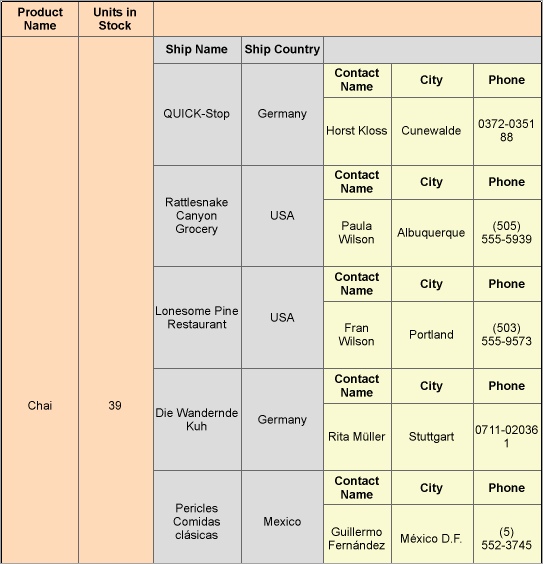
    For example, the following report shows three nested Table data regions that fetch data from three different datasets.

    Nesting in Tables at design

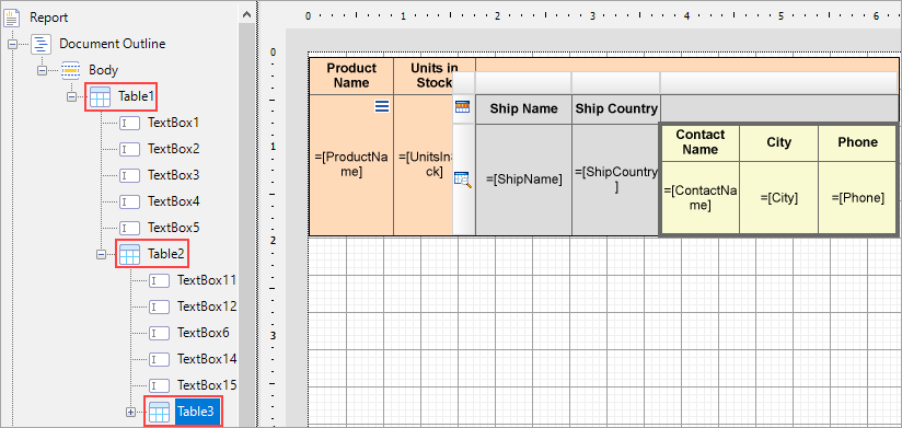
    The report connects to the 'NWIND.db' data source on GitHub.

    Table1 is bound to 'Products' dataset, Table2 is bound to 'Invoices' dataset, and Table3 is bound to 'Customers' dataset. The parent table, Table1, shows the Product Name and Units In Stock information from the Products dataset. For each ProductID, child table, Table2 shows the Ship Name and Ship Country information from the Invoices dataset. And for each CustomerID, the child table, Table3, shows the Contact Name, City, and Phone information from the Customers dataset.

    Nesting in Tables at preview


    Let us create this report using both methods.

    Using a filter

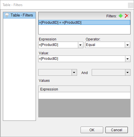
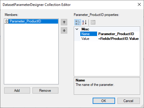
    For the child tables, add a filter using the Filters property as elaborated below:

    1. Select Table2 and go to the Filters property.
    2. In the Table - Filters, add a filter with the expression =[ProductID]==[ProductID], the common field in the datasets of the parent table and the child table.

      Table Filters Dialog

    Similarly,

    1. Select Table3 and go to the Filters property.
    2. In the Table - Filters, add a filter with the expression =[CustomerID]=[CustomerID], the common field in the datasets of the parent table and the child table.

    Using a parameter

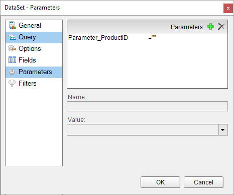
    For each child table, we create a parameter to pass to the dataset and then modify the dataset query to filter the dataset fields. 

    Note: JSON dataset does not have the parameters collection. Hence, the DataSetParameters from the data region cannot interact with such a dataset.

    The following steps elaborate the procedure.

    1. Select Table2 and go to the DataSetParameters property.
    2. Add a new parameter with Name: Parameter_ProductID and Value: =Fields!ProductID.Value.
       DatasetParameterDesigner Collection Editor
    3. Go to the dataset to which the Table2 is bound, that is, Invoices.
    4. In the DataSet designer dialog, go to Parameters and add a new parameter (same name as DataSetParameter): Parameter_ProductID.
      DataSet Parameters Dialog
    5. Go to Query and add a substring with the parameter to the existing dataset query so the updated query is:
      select * from Invoices where ProductID = @Parameter_ProductID

    Similarly,

    1. Select Table3 and go to the DataSetParameters property.
    2. Add a new parameter with Name: Parameter_CustomerID and Value: =Fields!CustomerID.Value.
    3. Go to the dataset to which Table3 is bound, that is, Customers.
    4. In the DataSet designer dialog, go to Parameters and add a new parameter (same name as DataSetParameter): Parameter_CustomerID.
    5. Go to Query and add a substring with the parameter to the existing dataset query so the updated query is:
      select * from Invoices where ProductID = @Parameter_CustomerID

    Filter, Sort, and Interactive Sort

    Filter

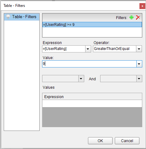
    Filtering allows you to set filters on a large set of data that has already been retrieved from the data source and use them with datasets or data regions to limit the information you want to display on your report. Although not as efficient performance-wise as query parameters which filter data at the source, there are still scenarios that demand filters. The obvious case is when the data source does not support query parameters.

    To apply a filter in a Table data region,

    1. Select the table and go to Filters property.
      Table Filters Dialog
    2. In the Table - Filters dialog, click Add.
      You can also first go to the Property dialog and then select the Filters page.
    3. In the Expression field, select the data field expression (=[UserRating]) available from the dataset to which the table is bound.
    4. Select the filter Operator (GreaterThanOrEqual).
    5. Enter the Value (say 9) to which the expression should evaluate to filter the data.
    6. Click OK.
    7. Preview the report. Here's how the table will look like with the 'User Rating' column showing a rating above '9'.
      Table with a filter at preview

    Sort

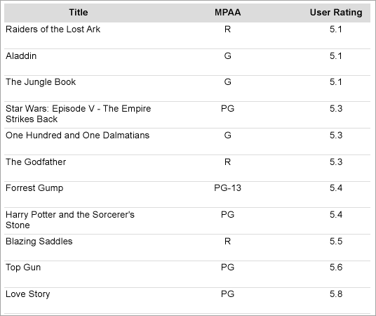
    Sorting helps better organize and present data in your report, you can sort alphabetically or numerically in ascending or descending order.

    To apply sort in a Table data region,

    1. Select the table and click the Property dialog link to open the Table dialog.
      Table Sorting Dialog
    2. Go to the Sorting page and click Add.
    3. In the Expression field, select a value to sort the report data (for example, =[Title]).
    4. Select the sorting direction by clicking Ascending or Descending options.
    5. Click OK.
    6. Preview the report. Here's how the table will look like with the 'User Rating' column sorted in ascending order.
      Table with sorting at preview

    Interactive Sort

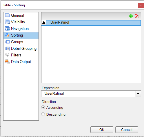
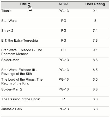
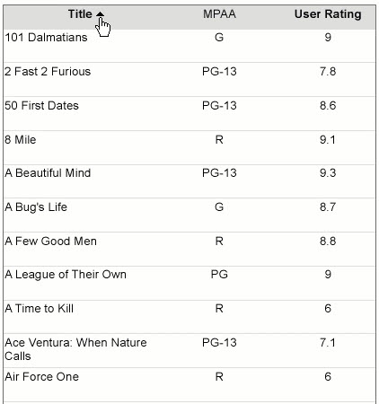
    You can add interactive sort or user sort on a TextBox control to allow sorting columns of data within a data region on a published report.

    The interactive sorting feature is set through the Interactive Sort page in the TextBox dialog.

    Once you set interactive sorting on a TextBox control while viewing the report in the Viewer or in the Preview Tab, the textbox control displays a sort icon inside it. A user can sort data that appears inside the textbox in ascending or descending order by clicking the icons.

    On the Interactive Sort page of the TextBox dialog you can find the following fields available for entering values:

    Table with interactive sorting at preview

    Table with interactive sorting at preview

    Table with interactive sorting at preview

    Dynamic Columns

    The dynamic columns in tables are the columns that grow or shrink depending on the visibility of other columns. When a Table has hidden column(s), the other column(s) can be made dynamic by setting the column's AutoWidth property to 'Proportional'.

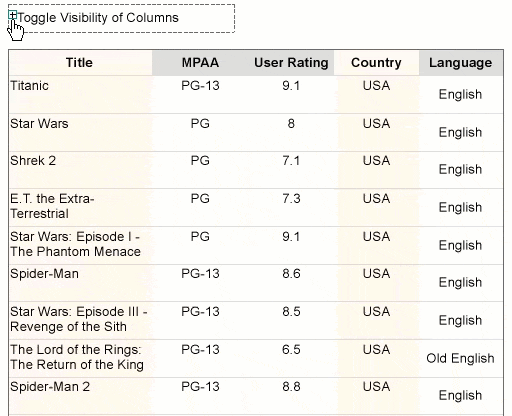
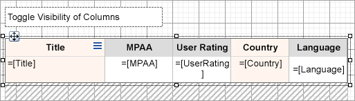
    So, for example, in the following table, we have five columns: Title, MPAA, User Rating, Country, and Language. The visibility of columns MPAA, User Rating, and Language is being toggled by a text box. We want the columns Title and Country to grow or shrink when the visibility of the other three columns is toggled.  

    Dynamic columns in Table at preview

    The above report can be created as elaborated below:


    Designing dynamic coulmns in Table

    1. First set the visibility of columns MPAA, User Rating, and Language and set the toggle control:
      1. Select the columns MPAA, User Rating, and Language (Ctrl+Click the column handlers).
      2. From the Properties window, set the Visibility > Hidden to 'False' and ToggleItem to the name of the textbox from which we will toggle the visibility of these columns.    
    2. Now make columns Title and Country dynamic:
      1. Select the columns Title and Country.
      2. From the Properties window, set their AutoWidth property to 'Proportional'.
    3. Preview the report. 
      The column width of the visible columns is expanded to take up the width of the Table data region. This way, regardless of how many columns a table displays, the width stays the same.
    See Also