The TextBox control is the basis of reporting as it is used to display textual data in section reports. You can add multiple lines, wrap text to the control size, shrink text to fit within the bounds of control, and perform basic formatting.
The TextBox control can be bound to any data or set at run time. Also, it is the same control that forms when you drag a field onto a report from the Report Explorer. In the Text property of the TextBox, you can enter static text or an expression. To enter a text directly into the TextBox, just double-click inside the control on the design surface of the report. An expression in TextBox can display fields from a database, calculate a value, or visually display data.
Note: There is a difference in how the text is rendered in the CrossPlatform and in the GDI compatibility modes. Some text in the CrossPlatform mode (for example, text without spacing, text with non-ASCII characters, etc.) may not appear correctly in the report preview. For the correct text rendering, you must manually update the report layout (for example, change the control's size).
Edit Mode
You can double-click in the TextBox control to enter edit mode and enter text directly in the control, or you can enter text in the Properties window or code through the Text property.
You can format text in the TextBox control in edit mode using the ActiveReports toolbar, or you can modify properties in the Properties window. Formats apply to all of the text in the control. Text formatting changes in the Properties window immediately appear in the control, and changes made in the toolbar are immediately reflected in the Properties window.
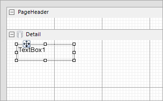
Clicking the TextBox control reveals its properties in the Properties window.
| Property | Description |
|---|---|
| CanGrow | Determines whether ActiveReports should increase the height of the control based on its content. |
| CanShrink | Determines whether ActiveReports should decrease the height of the control based on its value. |
| CharacterSpacing | Gets or sets a character spacing in points. |
| CountNullValues | Boolean which determines whether DBNull values should be included as zeroes in summary fields. |
| Culture | Gets or sets CultureInfo used for value output formatting. |
| DataField | Gets or sets the field name from the data source to bind to the control. |
| DistinctField | Gets or sets the name of the data field used in a distinct summary function. |
| HyperLink | Gets or sets the hyperlink for the text control. |
| LineSpacing | Gets or sets a line spacing in points. |
| MinCondenseRate | Specifies the minimal rate of the text horizontal scaling in percentages. Should be between 10 and 100. |
| MultiLine |
Gets or sets a value indicating whether this is a multi-line textbox control. |
| OutputFormat | Gets or sets the mask string used to format the Value property before placing it in the Text property. |
| ShrinkToFit | Determines whether ActiveReports decreases the font size when text values exceed available space. |
| Style | Gets or sets a style string for the textbox. |
| SummaryFunc | Gets or sets the summary function type used to process the DataField Values. |
| SummaryGroup | Gets or sets the name of the group header section that is used to reset the summary value when calculating subtotals. |
| SummaryRunning | Gets or sets a value that determines whether that data field summary value will be accumulated or reset for each level (detail, group, or page). |
| SummaryType | Gets or sets a value that determines the summary type to be performed. |
| Text | Gets or sets the formatted text value to be rendered in the control. |
| TextJustify | Specifies text justification with TextAlign set to Justify. |
| VerticalAlignment | Gets or sets the position of the textbox's text vertically within the bounds of the control. |
| VerticalText | Gets or sets whether to render text according to vertical layout rules. |
| WrapMode | Indicates whether a multi-line textbox control automatically wraps words or characters to the beginning of the next line when necessary. |
You can set the TextBox properties in the TextBox dialog. To open it, with the TextBox selected on the report, under the Properties window, click the Property dialog link.
The TextJustify property of a Textbox control provides you justification options for aligning your text within a control. It is important to note that the Alignment property must be set to Justify for TextJustify property to affect the text layout.
You can choose from the following values of the TextJustify property:
Auto
Results in Standard MSWord like justification where space at the end of a line is spread across other words in that line. This is the default value.
Distribute
Spaces individual characters within a word, except for the last line.
DistributeAllLines
Spaces individual characters within words and also sets the justification on the last line according to the length of other lines.
To set text justification,
Text justification is supported when you preview a report in the Viewer, print a report, or export a report in PDF, and TIFF formats.
When working with the TextBox or Label control in a Section report, you can use the ShrinkToFit property to reduce the size of the text so that it fits within the bounds of the control. The text shrinks at run time, so you can see the reduced font size when you preview, print or export the report.
You can use other text formatting properties in combination with the ShrinkToFit property.
Caution:
On exporting a report, various file formats handle ShrinkToFit differently. ShrinkToFit gets exported in all formats except Text.
You can display multiline text in TextBox and some other controls such as RichTextBox and Label for section reports.
In a Section report, you can enable multiline display in your report control by setting the Multiline property to True. Then, with your control in edit mode, insert line breaks at the desired location using the Enter key or Ctrl + Enter keys to create multiline text. However, when the MultiLine property is set to False, the text entered into the control is displayed on a single line.
In edit mode, scrollbars appear automatically to fit multiline content within a control. However, these are not displayed at preview, so you may need to adjust the Size property of the control to display all of the text.
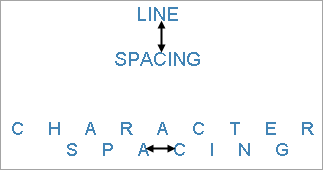
To set Line or Character spacing,
Line and character spacing are supported when you preview a report, print a report, or export a Section report in HTML , PDF, and TIFF formats.
In the edit mode, you can use the following keyboard shortcuts.
| Key Combination | Action |
|---|---|
| Enter | New line. |
| Alt + Enter | Saves modifications and exits edit mode. |
| Esc | Cancels modifications and exits edit mode. |
In Visual Studio Integrated Designer, you can disable this feature in the EditModeEntering Event and EditModeExit Event.