ASP.NET Core FlexGrid - Validation Using the Error Tip
Data validation is an important feature used to allow only specific data entries. This is useful in situations when end-users have the permissions to add/edit data. For example, we may want to limit the data entry into cells to whole numbers, specific text, or to confirm to a regular expression pattern (like an email address).
In the ComponentOne v2 release, we added the ErrorTip for FlexGrid, to display validation error labels based on specific validation rules for columns. ErrorTip can also be customized to validate edits, format tooltip content using CSS.
The complete API for this provider is available here.
In this article, we'll discuss an example where we can add different validation rules using the Error ToolTip in FlexGrid.
Using ErrorTip for FlexGrid with Inventory Management
Let’s take an example of a furniture store that needs to manage its inventory. The store manager is tasked with the job of updating the inventory records after each sale and the fields have certain validation rules.
The Inventory table consists of the following fields and validation rules:
Field Name |
Description | Validation Rule |
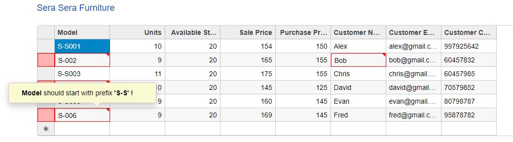
| Model | Model number of Item | Model number should start with Prefix S-S |
| Units | Number of remaining units in Inventory | Number of units sold cannot be less than 1 or more than total inventory |
| Cost Price | Purchase price of item | Read only |
| Sale Price | Sale price of item | Should not be less than cost price |
| Units in Stock | No of units available | Read only |
| Customer Name | Customer name | Cannot be empty/null |
| Customer Email | Email of customer | Should be a valid Email address |
| Customer Phone | Customer’s contact conformation | Should be at least 7 digits |
These rules may seem to be difficult for the store manager to remember while entering records. It would make the store manager’s job easier if there was a way to display messages when these validation rules are not satisfied.
FlexGrid & ErrorTip
Using the FlexGrid & ErrorTip we can easily solve the store manager’s problem. FlexGrid will be used to display and edit inventory records and the Error Tip will be used to implement client-side validation rules for each of these fields.
- Initializing FlexGrid with data & adding columns
- Adding validation rules using ErrorTip
- Formatting the appearance using CSS
Initializing FlexGrid with Data & Adding Columns
Let’s initialize FlexGrid with data form the inventory table and add the field names as columns
Index.cshtml
<c1-flex-grid id="grid" allow-add-new="true" auto-generate-columns="false">
    @*Bind FlexGrid with Model*@
    <c1-items-source source-collection="Model" get-error="ValidateGrid"></c1-items-source>
       @* Define Columns*@
    <c1-flex-grid-column binding="Model" header="Model"></c1-flex-grid-column>
    <c1-flex-grid-column binding="Units" header="Units"></c1-flex-grid-column>
    <c1-flex-grid-column binding="UnitsInStock" header="Available Stock" is-read-only="true"></c1-flex-grid-column>
    <c1-flex-grid-column binding="SalePrice" header="Sale Price"></c1-flex-grid-column>
    <c1-flex-grid-column binding="CostPrice" header="Purchase Price" is-read-only="true"></c1-flex-grid-column>
    <c1-flex-grid-column binding="CName" header="Customer Name"></c1-flex-grid-column>
    <c1-flex-grid-column binding="CEmail" header="Customer Email"></c1-flex-grid-column>
    <c1-flex-grid-column binding="CPhone" header="Customer Contact"></c1-flex-grid-column>
</c1-flex-grid>
Adding Validation Rules Using ErrorTip
In order to implement validation rules, we'll bind the FlexGrid’s fields to the javascript function ValidateGrid() using the collection view’s GetError() method. The ValidateGrid() contains the logic which implements the validation rules for columns.
@* @show-errors: show error for Invalid Entry; @validate-edits: prevent editing another item if current value is invalid*@
<c1-flex-grid id="grid" allow-add-new="true" auto-generate-columns="false"
              show-errors="true" validate-edits="true">
    @*Bind FlexGrid with Model*@
    <c1-items-source source-collection="Model" get-error="ValidateGrid"></c1-items-source>
    @* ErrorTip settings*@
    <c1-flex-grid-errortip is-content-html="true" gap="10" class="error-tip" popup="popupTip"></c1-flex-grid-errortip>
    @* Define Columns*@
    <c1-flex-grid-column binding="Model" header="Model"></c1-flex-grid-column>
    <c1-flex-grid-column binding="Units" header="Units"></c1-flex-grid-column>
    <c1-flex-grid-column binding="UnitsInStock" header="Available Stock" is-read-only="true"></c1-flex-grid-column>
    <c1-flex-grid-column binding="SalePrice" header="Sale Price"></c1-flex-grid-column>
    <c1-flex-grid-column binding="CostPrice" header="Purchase Price" is-read-only="true"></c1-flex-grid-column>
    <c1-flex-grid-column binding="CName" header="Customer Name"></c1-flex-grid-column>
    <c1-flex-grid-column binding="CEmail" header="Customer Email"></c1-flex-grid-column>
    <c1-flex-grid-column binding="CPhone" header="Customer Contact"></c1-flex-grid-column>
Now, we'll take a look into the Javascript ValidateGrid() function which implements the validation rules for the fields. This function accepts item and prop as arguments, they are used to identify fields and apply corresponding validation rules.
function ValidateGrid(item, prop) {
        // no validation for newly added record
        if (Object.keys(item).length == 0) {
            return null;
        }
        // validation for newly added item
        if (item[prop] && item[prop].length==0) {
            return "<span>This field could not be null !</span>";
        }
}
Let’s look at the validations of each of the fields and their implementations inside the ValidateGrid function (). ToolTip Messages also support HTML content and the error messages can be formatted with HTML elements.
<script>
    // validation rules for Stock fields
    function ValidateGrid(item, prop) {
        // no validation for newly added record
        if (Object.keys(item).length == 0) {
            return null;
        }
        // validation for newly added item
        if (item[prop] && item[prop].length==0) {
            return "<span>This field could not be null !</span>";
        }
        switch (prop) {
            case 'Model':
                return /S-S/.test(item[prop]) ? "" : "<span>Model</span> should start with prefix <span>'S-S'</span> !";
                break;
            case 'CEmail':
                return validateEmail(item[prop]) ? null : "<span>Customer Email</span> is not valid !";
                break;
            case 'CName':
                return item[prop].length >3 ? null : "<span>Customer Name</span> should be <span>atleast 4 letter</span>!";
                break;
            case "Units":
                return item["Units"] > item["UnitsInStock"] ? "Number of <span> Units Sold</span> cannot be less than 1 or more than <span>Total Inventory(" + item["InStock"] + ")</span>!" : "";
                break;
            case "SalePrice":
                return item["SalePrice"] < item["CostPrice"] ?  "<span>Sale Price</span> could not be less than <span> Cost Price (" + item["PurchasePrice"] + ") </span>!" : "";
                break;
            case 'CPhone':
                return !/(\D*\d){7}/.test(item[prop]) ? '<span>Contact Number</span> should be at least 7 digits!':'';
                break;
            default:
                return '';
        }
        return null;
    }
    //validate provided email address
    function validateEmail(email) {
        var re = /^(([^<>()\[\]\\.,;:\s@@"]+(\.[^<>()\[\]\\.,;:\s@@"]+)*)|(".+"))@@((\[[0-9]{1,3}\.[0-9]{1,3}\.[0-9]{1,3}\.[0-9]{1,3}\])|(([a-zA-Z\-0-9]+\.)+[a-zA-Z]{2,}))$/;
        return re.test(String(email).toLowerCase());
    }
    //limit Tooltip width to 300px
    function popupTip(s, e) {
        e.tip.style["min-width"] = "300px";
        e.tip.style["width"] = "300px";
    }
    //Generate predefine object
    function ReservedItem(s, e) {
        return { UnitsInStock: 15, CostPrice: 100};
    }
</script></td>
Formatting the Appearance Using CSS
We can also format the appearance of the ToolTip using CSS and customize CSS properties like height, padding, text-alignment, border etc.
<style>
    /* primary variable*/
    :root{
        --tip-color:lightgoldenrodyellow;
    }
    /* Customize Tooltip */
    .error-tip {
        background-color: var(--tip-color);
        height: auto;
        padding: 10px;
        text-align:center;
        border:1px solid var(--tip-color);
    }
    .error-tip::after {
        content: '';
        position: relative;
        top: 2.5em;
        left: -30%;
        border: 10px solid transparent;
        border-top-color: var(--tip-color);
    }
    .error-tip span{
        font-style:italic;
        font-weight:bold;
    }
</style>
Here’s how the ErrorTip validation looks:
Try it yourself and download the sample here.
If you have any questions, comments or issues related to this tutorial, please leave in the comments below.
Related Blogs
Try Our .NET UI Components & Datagrid
Getting Started With ComponentOne

Abhishek Dutta