New SpreadJS Chart Enhancements
GrapeCity’s SpreadJS v14 release includes support for a variety of chart enhancements and a new chart type. These new chart enhancements give users even more customization options and flexibility.
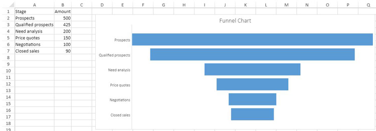
New Funnel Chart
GrapeCity’s SpreadJS v14 chart types now include funnel charts. Funnel charts show values across multiple stages of a process. These charts often represent sales and show the amount of potential revenue at each stage of the sales process.
Read the full SpreadJS v14 release.
For example:
Here is some code that can be used to add data and create a funnel chart type:
var dataArray = [
    ["Stage", "Amount"],
    ["Prospects", 500],
    ["Qualified prospects", 425],
    ["Need analysis", 200],
    ["Price quotes", 150],
    ["Negotiations", 100],
    ["Closed sales", 90],
  ];
  sheet.setArray(0, 0, dataArray);
  var chart = sheet.charts.add(
    "chart1",
    GC.Spread.Sheets.Charts.ChartType.funnel,
    2,
    85,
    800,
    350,
    "A1:B7"
  );
New Chart Enhancements
SpreadJS v14 includes the following new chart enhancements:
- Pattern fill as background color for charts
- Chart titles now supports line break
- Data label delimiter options
- Set the gapWidth and overlap property of bar or column charts
- Adjust the hole size of doughnut charts
- Chart axis crossing
Pattern Fill as Background Color for Charts
SpreadJS v14 supports pattern fill for the background color of chart elements. Pattern fills are useful if your charts are printed to a non-colored printer. SpreadJS v14 includes 48 built-in pattern fill types to choose from.
Customize the pattern fill type by specifying the foreground color of the pattern fills lines or dots, and the background color of the pattern fill.
Set any area of a chart with a pattern fill including the title, legend, and chart series. For example, this code snippet sets the chart area’s back color as a dotted percent pattern fill type with a red foreground and yellow background color.
    var chartArea = chart.chartArea();
    chartArea.backColor = {
      type: GC.Spread.Sheets.Charts.PatternType.dottedPercent20,
      foregroundColor: "yellow",
      backgroundColor: "red",
   };
   chart.chartArea(chartArea);
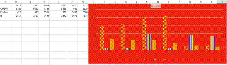
Chart Titles Support Line Breaks
SpreadJS v14 supports line breaks in axis labels and titles using the character "\n". A blank character can also be used as a line break.
When the size of a chart is reduced, the horizontal axis text will automatically word wrap. This allows users to display longer chart titles in a cleaner way.
SpreadJS v14 supports both cases:
- Multi-line using "\n"
- Blank character when chart is resized
Data Label Delimiter Options
SpreadJS v14 lets users create a custom data label separator. This separator option allows users to specify a character such as a space, comma, semicolon, or full stop to indicate where the data label should start displaying on the next line. Use chart.dataLabels() to get or set data labels for every series of a chart.
This code snippet shows the separator set as a comma ",":
var series = chart.series().get(1);
series.dataLabels= {
showValue : false,
showSeriesName: true,
showCategoryName: false,
showPercentage:false,
separator: ",",
position: GC.Spread.Sheets.Charts.DataLabelPosition.Center,
format: "#,##0;-#,##0",
color: "white",
backColor: "red",
borderColor: "blue",
borderWidth: 2
};
chart.series().set(1, series);
Set gapWidth and Overlap Properties of Bar or Column Charts
SpreadJS v14 lets users adjust the gap width and the overlap of bar and column charts. To use this feature, set the gapWidth and overlap properties of a chart’s series. The gapWidth property sets the space between the bar or column cluster as a percentage of the bar or column width.
The gap width value must be between 0 and 5. The overlap property sets the bar and column are positions. Set this value between -1 and 1.
Using the SpreadJS Designer, set both of these properties by double clicking on the chart data to open the Format Data side panel.
Under Series Options input the series overlap and gap width like so:
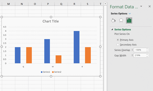
Users can also set these properties using the SpreadJS API code:
var series1 = chart.series().get(0);
series1.gapWidth = 2;
series1.overlap= 0.6;
chart.series().set(0, series1);
Use this new feature to create waterfall charts with the following steps:
1. Add data and set formulas:
var sheet = spread.getActiveSheet();
      // 1.) Add data and set formulas
      // 1.1) Array with data
      sheet.setArray(0, 0, [
        [null, "Base", "End", "Down", "Up", "Start", "Net Cash Flow"],
        ["Start", 2000, null, null, null, null, null],
        ["Jan", null, null, null, null, null, 5000],
        ["Feb", null, null, null, null, null, -503],
        ["Mar", null, null, null, null, null, -1670],
        ["Apr", null, null, null, null, null, 4802],
        ["May", null, null, null, null, null, -1198],
        ["Jun", null, null, null, null, null, -3526],
        ["Jul", null, null, null, null, null, 1826],
        ["Aug", null, null, null, null, null, -2284],
        ["Sep", null, null, null, null, null, 3250],
        ["Oct", null, null, null, null, null, -1780],
        ["Nov", null, null, null, null, null, 2667],
        ["Dec", null, null, null, null, null, 1500],
        ["End", null, null, null, null, null, 2475],
      ]);

      // 1.2) Set formulas
      // B4:B15
      sheet.setFormula(3, 1, "=SUM(B3,E3:F3)-D4");
      sheet.setFormula(4, 1, "=SUM(B4,E4:F4)-D5");
      sheet.setFormula(5, 1, "=SUM(B5,E5:F5)-D6");
      sheet.setFormula(6, 1, "=SUM(B6,E6:F6)-D7");
      sheet.setFormula(7, 1, "=SUM(B7,E7:F7)-D8");
      sheet.setFormula(8, 1, "=SUM(B8,E8:F8)-D9");
      sheet.setFormula(9, 1, "=SUM(B9,E9:F9)-D10");
      sheet.setFormula(10, 1, "=SUM(B10,E10:F10)-D11");
      sheet.setFormula(11, 1, "=SUM(B11,E11:F11)-D12");
      sheet.setFormula(12, 1, "=SUM(B12,E12:F12)-D13");
      sheet.setFormula(13, 1, "=SUM(B13,E13:F13)-D14");
      sheet.setFormula(14, 1, "=SUM(B14,E14:F14)-D15");

      // D4:D15
      sheet.setFormula(3, 3, " =-MIN(G4,0)");
      sheet.setFormula(4, 3, " =-MIN(G5,0)");
      sheet.setFormula(5, 3, " =-MIN(G6,0)");
      sheet.setFormula(6, 3, " =-MIN(G7,0)");
      sheet.setFormula(7, 3, " =-MIN(G8,0)");
      sheet.setFormula(8, 3, " =-MIN(G9,0)");
      sheet.setFormula(9, 3, " =-MIN(G10,0)");
      sheet.setFormula(10, 3, " =-MIN(G11,0)");
      sheet.setFormula(12, 3, " =-MIN(G12,0)");
      sheet.setFormula(13, 3, " =-MIN(G14,0)");
      sheet.setFormula(14, 3, " =-MIN(G15,0)");

      // E4:E15
      sheet.setFormula(3, 4, "=MAX(G4,0)");
      sheet.setFormula(4, 4, "=MAX(G5,0)");
      sheet.setFormula(5, 4, "=MAX(G6,0)");
      sheet.setFormula(6, 4, "=MAX(G7,0)");
      sheet.setFormula(7, 4, "=MAX(G8,0)");
      sheet.setFormula(8, 4, "=MAX(G9,0)");
      sheet.setFormula(9, 4, "=MAX(G10,0)");
      sheet.setFormula(10, 4, "=MAX(G11,0)");
      sheet.setFormula(11, 4, "=MAX(G12,0)");
      sheet.setFormula(12, 4, "=MAX(G13,0)");
      sheet.setFormula(13, 4, "=MAX(G14,0)");
      sheet.setFormula(14, 4, "=MAX(G15,0)");

      // F3
      sheet.setFormula(2, 5, "=G3");

      // C16
      sheet.setFormula(15, 2, "=SUM(B15,E15:F15)-D16");
2. Create a column stacked chart from data in A1:F17
// 2.) Create a Stacked Column chart from data in A1:F17
      var columnStacked = sheet.charts.add(
        "Chart1",
        GC.Spread.Sheets.Charts.ChartType.columnStacked,
        450,
        85,
        650,
        450,
        "A1:F17");
3. Get each series
      // 3.) Get each series
      var seriesCollection = columnStacked.series();
      var series0 = seriesCollection.get(0);
      var series1 = seriesCollection.get(1);
      var series2 = seriesCollection.get(2);
      var series3 = seriesCollection.get(3);
      var series4 = seriesCollection.get(4);
4. Set gap width
// 4.) Set Gap Width to 1
      series0.gapWidth = 1;
      series1.gapWidth = 1;
      series2.gapWidth = 1;
      series3.gapWidth = 1;
      series4.gapWidth = 1;
5. Format each series
// 5.1) Format Base series - no fill, no border, so it isn't visible in the chart
      series0.backColor = null;
      series0.fillColorTransparency = 100;
      seriesCollection.set(0, series0);
      // 5.2) Format Start series - gray fill color
      series1.backColor = "Gray";
      seriesCollection.set(1, series1);
      // 5.3) Format Down series - red fill color
      series2.backColor = "Red";
      seriesCollection.set(2, series2);
      // 5.4) Format Up series - green fill color
      series3.backColor = "Green";
      seriesCollection.set(3, series3);
      // 5.5) Format End series - gray fill color
      series4.backColor = "Gray";
      seriesCollection.set(4, series4);
6. Remove the legend and set the chart title
// 6.) Remove the legend and set chart title
      var legend = columnStacked.legend();
      legend.visible =false;
      columnStacked.legend(legend);

      var title = columnStacked.title();
      title.text = "Waterfall Chart";
      title.fontFamily = "Calibri Light";
      columnStacked.title(title);
The resulting waterfall chart looks like this: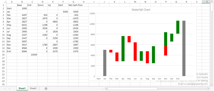
Doughnut Chart Hole Size Customization
The doughnut chart type of SpreadJS v14 lets users adjust the hole size. Enlarge or reduce the size of the hole and the width of the slices. Display wider slices to better accommodate data labels that contain long series or category names, or a combination of names, values, and percentages. To use this feature, set the doughnutHoleSize value of the chart series. This value must be between 0 - 0.9:
var series1 = chart.series().get(0);
series1.doughnutHoleSize = 0.7;
chart.series().set(0, series1);
For example, this is the difference between setting the doughnut hole size to 0.3:
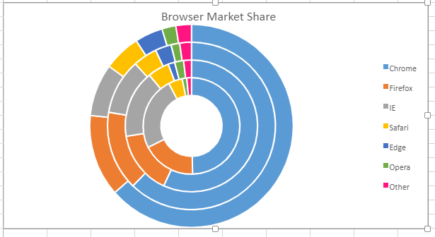
Then setting it to 0.7:
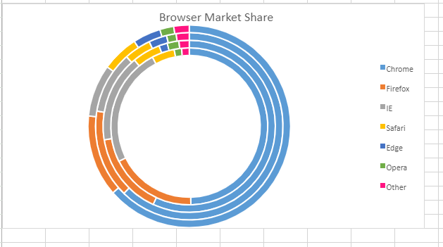
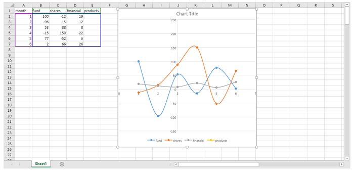
Chart Axis Crossing
SpreadJS v14 charts now support adjusting chart axis crosses. This feature lets users move x-axis / y-axis to a specific crossing point or maximum/minimum axis value.
The GC.Spread.Sheets.Charts.AxisCrossPoint contains three options:
automatic |
SJS sets the axis crossing point. |
| maximum | The axis crosses at the maximum value. |
| minimum | The axis crosses at the minimum value. |
Users can specify an enumeration type and custom number type to a specified location.
This code snippet adds data, and shows how to indicate the specified axis crosses with the following steps.
- Set the primary category axis of the chart's crossPoint to _3_.
- Set the primary value axis of the chart's crossPoint to 100.
- Set the axes to the chart.
var spread = GC.Spread.Sheets.findControl("ss") || GC.Spread.Sheets.findControl("sampleDiv");
var sheet = spread.getActiveSheet();
sheet.suspendPaint();
var dataArray = [
["month", 'fund', 'shares', 'financial products'],
[1, 100, -12, 19],
[2, -96, 15, 12],
[3, 53, 88, 8],
[4, -15, 150, 22],
[5, 77, -52, 6],
[6, 2, 66, 26],
];
sheet.setArray(0, 0, dataArray);
var chart = sheet.charts.add('chart1', GC.Spread.Sheets.Charts.ChartType.xyScatterSmooth, 100, 100, 500, 500, 'A1:E7');
let axes = chart.axes();
axes.primaryCategory.crossPoint = 3;
axes.primaryValue.crossPoint = 100;
chart.axes(axes);
sheet.resumePaint();
Here is the result of the above code snippet:
These are just some of the new charting enhancements and chart types added to SpreadJS v14 release. Download your free trial of SpreadJS to explore these new chart enhancements.

Mackenzie Albitz