Create Side-by-Side Reports Using Tablix in ActiveReports Professional
When you're creating business reports, you'll likely need to occasionally show the data to side-by-side in a single report. Examples might include comparison of sales data over years, assets and liabilities in a balance sheet, or a production report of different regions. In this blog, we'll see how we can use the Tablix data region to create a side-by-side layout report.
Although you can create side-by-side layouts using subreports, I wouldn't recommend using subreports for the following reasons:
- The overhead is high if you're creating and maintaining multiple reports for a single business report.
- Subreports can comprimise performance, as the report engine will have to process every single instance of subreport in the report.
Use DataRegions to Create Side-by-Side Reports
ActiveReports DataRegions — such as List, Table, Tablix, and Banded List — are a good alternative to subreports for creating side-by-side layouts. Not only can they display data in a single report by making use of separate groups, but since the data is only processed once, they're much more efficient than subreports.
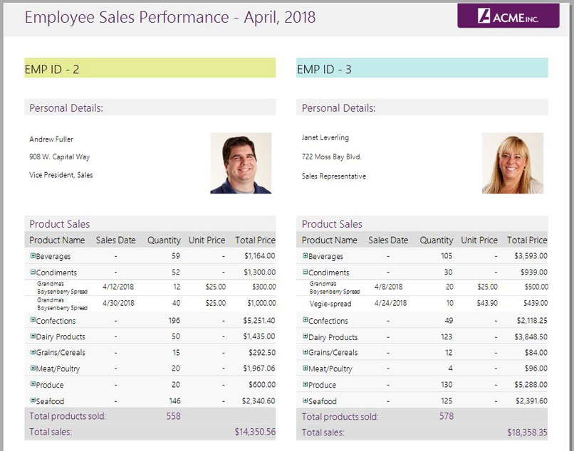
Our example will include creating a side-by-side report using the Tablix data region to create a side-by-side layout report, as shown below, using Adjacent Groups by taking monthly sales performance of two employees.
Step 1: Design a side-by-side layout using Tablix
First, we'll create a new RDL Report in ActiveReports Designer. From the Toolbox, drag the Tablix control onto the design surface to add a 2x2 grid.
To create the desired side-by-side layout, we'll need two column groups, so we'll perform a series of operations:
1. Delete row group and its corresponding column
To delete the row group, you can do either of the following
- Right-click on the row group cell in the Tablix, and from the context menu, select Row Group -> Delete Group
- Select Tablix, and in the group editor at the bottom of the Designer, select the row group, and click the delete button on its right.
To remove the column of the deleted row group, right-click on the corner cell and select the "Delete Column" option in the context menu. You'll get a structure like shown:

Note: If you need to place data vertically adjacent, you may keep the Row Group instead and delete the Column Group.
To learn more about Tablix and its structure, read the documentation.
2. Add adjacent column group
Now we need to add a new Column Group adjacent to the current group. It'll look like this:

3. Configuring the Tablix structure
Next, we'll add more details to both column groups in the Tablix. The structure may include:
- Addition of rows and columns in the column header section to display details such as employee's personal details
- Merging of cells in the header that can be used to display employee's image using the Image control
- Nesting of controls in the body section to show aggregated data. For instance, we'll nest the Table control to show the sales data
- Adjusting the size of rows/columns, etc.
After adding the details, the Tablix in this report will look like this:

Step 2: Fetch data for the report
Next, we'll bind the Tablix with the desired fields.
For this report, we've used NorthWind DataSource and added datasets based on Orders, OrderDetails, and Employees tables in the database. Using the fields selection adorner, bind the controls with desired fields in both column groups to get the layout as shown below:

Note: To fetch sales data from the Orders and OrderDetails tables in the embedded Table control, we've used the Dataset Joins available in ActiveReports 12.
Step 3: Add parameters to the report
Next, we'll add the parameters required to select the aspects for comparison in the report. We'll display data for two employees, and so we'll add parameters for selecting the respective employees to compare the sales performance. In addition to this, we'll add a parameter to select the month for which sales data is to be compared in the report.
Step 4: Add group expression and filters to the Tablix
Next, we'll add group expressions and filters so the column groups can display the details corresponding to the selected aspects.
In this report, we'll add group expression on the EmployeeID field to categorize the data by employees, and then add a group filter on the employee parameters added in step 3 to the respective column groups. For example, filter is added for the first column group using one of the parameter in the report, as shown here:

Step 5: Adjust the layout and formatting
The final step for this report design is to polish the layout and add styles to make it looks like this:

Step 6: Preview the report
Once we're done with the above steps, we can always preview the report in the viewer to see the output:
Please note: to run the sample report attached in this blog, you must edit the data source connection to your copy of the Northwind database. If you have ActiveReports installed, you can locate the database at "C:\Users\
Get the report:
Download EmployeeSalesPerformance.rdlx to see the side-by-side report using Tablix.

Paarisha Rana