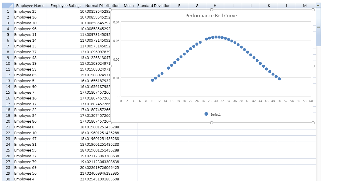
A bell curve (also known as a normal distribution) is a common type of distribution for a variable. There are many use cases for bell curves. In statistics, a bell curve is used to model a wide variety of real-world data. In the industry of finance, analysts and investors use a normal probability distribution when analyzing the returns of a security or of overall market sensitivity.
In this post, I'll discuss how we can design a bell curve in Spread.Sheets. We'll use the scatter chart and built-in formulas to draw the curve.
Let’s fill in Spread.Sheets with some hypothetical data of a company's employee ratings.
The code to fill data in Spread.Sheets is as follows:
   spread = new GC.Spread.Sheets.Workbook(document.getElementById("ss"), { sheetCount: 2 });
            var dataSheet = spread.sheets[0];

            dataSheet.setValue(0, 0, 'Employee Name', GC.Spread.Sheets.SheetArea.colHeader);
            dataSheet.setValue(0, 1, 'Employee Ratings', GC.Spread.Sheets.SheetArea.colHeader);
            dataSheet.setValue(0, 2, 'Normal Distribution', GC.Spread.Sheets.SheetArea.colHeader);
            dataSheet.setValue(0, 3, 'Mean', GC.Spread.Sheets.SheetArea.colHeader);
            dataSheet.setValue(0, 4, 'Standard Deviation', GC.Spread.Sheets.SheetArea.colHeader);

            for (var i = 0; i <= 99; i++)
            {
                dataSheet.setValue(i, 0, "Employee" +" "+ i);
            }
            for (var i = 0; i <= 99; i++) {

                dataSheet.setValue(i, 1, Math.floor(Math.random() * (50 - 10 + 1)) + 10);
            }
Since the bell curve shows a normal distribution we'll use SpreadJS’s Norm.Dist() to calculate data points.
However, normal distribution requires mean and standard deviation to calculate the distribution values. So let's get the mean and standard deviation first for these values.
Please note the values need to be sorted in increasing order to find the correct Mean.
                spread.getActiveSheet().sortRange(-1, -1, -1, -1, true, [
             { index: 1, ascending: true }]);
Let’s calculate the Mean and Standard Deviation:
dataSheet.setFormula(0, 3, "=AVERAGE(B1:B100)", GC.Spread.Sheets.SheetArea.viewport);
                dataSheet.setFormula(0, 4, "=STDEV(B1:B100)", GC.Spread.Sheets.SheetArea.viewport);
Let’s put these values in a Norm.Dist formula to get the distribution:
  for (var i = 0; i <= 99; i++) {
                    var j = i + 1;
                    dataSheet.setFormula(i, 2, "=NORM.DIST(B" + j + ",D1,E1,FALSE) ", GC.Spread.Sheets.SheetArea.viewport);
                }
Now the most important part is to use the calculated distribution to draw the bell curve graph. In SpreadJS, we'll set the data range for Scatter chart to these distribution values:
    var chartType = GC.Spread.Sheets.Charts.ChartType.xyScatter;
                var chart = dataSheet.charts.add('Bell Curve', chartType, 280, 30, 700, 390, "B1:C100");
The result of the normal distribution shown by the bell curve looks like this:

Thanks for following along! Download the sample code and application here, and be sure to add your comments or questions below.
