Creating Column Groups in MVC Core FlexGrid
The usual layout for a grid consists of a header row with column names when working with flat data structure. However, in the case of hierarchical data structures we may need several levels of column headers to represent such a hierarchy.
The image below illustrates an example which we are going to implement.
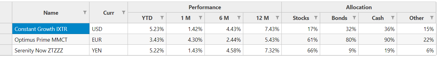
The above table compares the performance and composition of investment funds. Here we have a group of columns to show performance, and another to show composition.
In this example, time related fields are grouped under "performance" for easier readability. The allocation type fields like “Stocks, Bonds" etc. are grouped under allocation. This helps in better readability of the complex data structure.
In previous releases of FlexGrid, creating a similar structure involved writing a “CustomGroupProvider” JavaScript extension which required writing extensive JavaScript code to implement Grouping and Merge Columns.
The JS implementation is discussed here.
In the latest ComponentOne 2019 v1 release, implementing Column Groups is easier using the HeaderTemplate and HeaderTemplateCell class.
First let's look at the DataSource that we are going to use for this example.
We have created a DataRepresentation class to define the columns for this example.
public class DataRepresentation
    {
        public DataRepresentation(params string[] args)
        {
            name = args[0];
            currency = args[1];
            ytd = args[2];
            m1 = args[3];
            m6 = args[4];
            m12 = args[5];
            stock = args[6];
            bond = args[7];
            cash = args[8];
            other = args[9];
        }

        public string name;
        public string currency;
        public string ytd;
        public string m1;
        public string m6;
        public string m12;
        public string stock;
        public string bond;
        public string cash;
        public string other;
    }
The custom DataRepresentation class contains properties for name, currency, time (ytd,m1,m6,m12), and allocation fields (stock, bond, cash, other).
It should be noted that DataSource does not contain the column groups performance and allocation, we'll add them using the HeaderTemplateCell later in this blog.
Now, let's populate the DataSource in the Controller.
CustomHeaderTemplateController.cs
 public partial class FlexGridController : Controller
    {
        private static List<DataRepresentation> _data = new List<DataRepresentation>
        {
            new DataRepresentation("Constant Growth IXTR",  "USD",   "0.0523%", "0.0142%", "0.0443%", "0.0743%", "0.17%", "0.32%", "0.36%", "0.15%"),
            new DataRepresentation("Optimus Prime MMCT",    "EUR",  "3.43%",    "4.30%",    "2.44%",    "5.43%",    "61%",  "80%",  "90%",  "22%"),
            new DataRepresentation("Serenity Now ZTZZZ",    "YEN",  "5.22%",    "1.43%",    "4.58%",    "7.32%",    "66%",  "9%",   "19%",  "6%")
        };

        public ActionResult CustomHeaderTemplate_Bind([C1JsonRequest] CollectionViewRequest<DataRepresentation> DataRepresentation)
        {
            return this.C1Json(CollectionViewHelper.Read(DataRepresentation, _data));
        }

        public ActionResult CustomHeaderTemplate(IFormCollection collection)
        {
            return View();
        }
    }
Now that we have our DataSource ready, we will need to do the following:
Define the HeaderColumn Groups in View
This is done by creating an instance of the HeaderTemplate Class.
We are going to use the RowCount to set the number of Rows in the Column Groups. In our example, we have performance and allocation column groups which span across 2 rows, hence we have set the RowCount =2.
Define the Header Template Cells in View
We need to create a List of Type HeaderTemplateCell, and add each of the column headers that we would like to display.
Based on the example we need to add name, currency, performance, and allocation as HeaderTemplate Cells and set the row, col, rowSpan, colSpan, and title properties.
The header columns "Performance" and "Allocation" should be noted here as they each span 4 columns, and 1 row each. They have been added explicitly and are not included in the DataSource.
Now, we need to set the cells property for the HeaderTemplate we created earlier with List to display the column groups.
Set method in HeaderTemplateCell class
Set(int row, int col, int rowSpan, int colSpan, string title);
CustomHeaderTemplate.cshtml
      @{
    var customHeader = new C1.Web.Mvc.HeaderTemplate();
    customHeader.RowCount = 2;

    customHeader.Cells = new List<C1.Web.Mvc.HeaderTemplateCell>();
    {
        customHeader.Cells.Add(new C1.Web.Mvc.HeaderTemplateCell().Set(0, 0, 2, 1, "Name"));
        customHeader.Cells.Add(new C1.Web.Mvc.HeaderTemplateCell().Set(0, 1, 2, 1, "Currency"));
        customHeader.Cells.Add(new C1.Web.Mvc.HeaderTemplateCell().Set(0, 2, 1, 4, "Performance"));
        customHeader.Cells.Add(new C1.Web.Mvc.HeaderTemplateCell().Set(0, 6, 1, 4, "Allocation"));
    };
}
Now, we need to define the FlexGrid Control and its Columns in the view and set the header-template attribute to the HeaderColumn that we created above. Our implementation is now complete!
CustomHeaderTemplate.cshtm
<c1-flex-grid id="fnFlexGrid" auto-generate-columns="false" class="grid" is-read-only="true"
              header-template="@customHeader"
            allow-sorting="false"
>
    <c1-items-source read-action-url="@Url.Action("CustomHeaderTemplate_Bind")"></c1-items-source>

    <c1-flex-grid-column binding="name" width="*"></c1-flex-grid-column>
    <c1-flex-grid-column binding="currency"></c1-flex-grid-column>
    <c1-flex-grid-column binding="ytd"></c1-flex-grid-column>
    <c1-flex-grid-column binding="m1"></c1-flex-grid-column>
    <c1-flex-grid-column binding="m6"></c1-flex-grid-column>
    <c1-flex-grid-column binding="m12"></c1-flex-grid-column>
    <c1-flex-grid-column binding="stock"></c1-flex-grid-column>
    <c1-flex-grid-column binding="bond"></c1-flex-grid-column>
    <c1-flex-grid-column binding="cash"></c1-flex-grid-column>
    <c1-flex-grid-column binding="other"></c1-flex-grid-column>

</c1-flex-grid>
If you have any questions, comments or issues related to this tutorial, please leave in the comments below.
Happy Coding!

Abhishek Dutta