Introduction
Reporting is a common requirement for business applications, and React is one of the most popular JavaScript libraries. We created blogs on both subjects and got a lot of interest. You can check out the original blogs here:
- Creating Simple Reports with AngularJS and Wijmo
- How to Create Dynamic Dashboards with React and Wijmo
Because both blogs were so popular, we decided to merge the topics and talk about how to create simple reports with React and Wijmo. The idea is the same as before: create reports quickly and easily, using only the basic tools and nothing extra. There are many specialized tools available (SSRS, FlexReport, Active Reports). These tools are powerful and flexible, but have a learning curve associated with them.
But we can create many reports simply by loading the report data into one or more CollectionView objects, using the framework’s templating mechanism to create elements containing the reports, and finally copying the element’s content to a PrintDocument instance to preview, print, or export the reports.
- The CollectionView is responsible for sorting, grouping, and filtering the data.
- JSX-based components transform the data into reports, using the regular layout and styling features made available by HTML and CSS.
- Finally, the PrintDocument class transforms the report into a print-friendly version and sends that to the browser’s printing infrastructure. The browser then takes over to provide features including print-preview (Chrome and Edge), page size and orientation, headers and footers, output device (including PDF output), etc.
This approach has some advantages and some limitations.
The main advantage is that by using the browser’s own render engine, you get the same rich layout and styling features provided by HTML and CSS. The CollectionView and PrintDocument classes are part of the Wijmo core (wijmo.min.js), so there is nothing new to learn, and nothing extra to download.
The main disadvantage is that HTML is provides little control over page dimensions. Headers, footers, and margins are defined outside the report, between the user and the browser. There are CSS attributes that provide some control over page breaks though, so this is not as big a limitation as it may seem at first.
If you are looking for more interactive data tables, you might want to try our React DataGrid.
A Simple Example
We have created a sample application that demonstrates the basic ideas behind creating simple reports. You can see it live, inspect the source code, or download the sample here:
http://demos.wijmo.com/5/SampleExplorer/SampleExplorer/Sample/SimpleReports.
The React version of the sample is available here:
http://demos.wijmo.com/5/React/SimpleReports/SimpleReports
The sample implements a few reports, all based on the same mechanism:
- Load the report data into one or more CollectionView objects
- Define a JSX fragment that uses the Array.map method to iterate over the data and generate components that make up the report content
- Render the report into a PrintDocument and print it
Let's go over the details of each step.
Architecture
The Application Component
The main component in the sample is called "App". It has a state the contains the current report being viewed and the zoom level, and methods to print the current report and to change the zoom level.
The "App" component is implemented as follows:
class App extends React.Component<any, any> {
  constructor(props: any) {
    super(props);

    this.state = {
      // report definitions
      reports: new wijmo.collections.CollectionView([
        { name: 'Alphabetical List of Products', component: Alphabetical… },
        { name: 'Customer Labels', component: CustomerLabels },
        // other reports…
      ], {
        currentChanged: function (s, e) {
          this.setState({currentReport: s.currentItem});
        }.bind(this)
      }),
      // zoom levels
      zoomLevels: new wijmo.collections.CollectionView([
        { header: '25%', value: 0.25 },
        { header: '50%', value: 0.5 },
        // other zoom levels…
      ], {
        currentChanged: function (s, e) {
          this.setState({currentZoom: s.currentItem});
        }.bind(this)
      })
    };
    // select first report
    this.state.currentReport = this.state.reports.currentItem;
    // start at 75% zoom level
    this.state.zoomLevels.moveCurrentToPosition(2);
    this.state.currentZoom = this.state.zoomLevels.currentItem;
  }
  // print the current report
  print() {
    var doc = new wijmo.PrintDocument({
      title: this.state.reports.currentItem.name
    });
    var view = document.getElementById('report');
    doc.append(view);
    doc.print();
  }
  // zoom in and out
  zoomIn() {
    this.state.zoomLevels.moveCurrentToNext()
  }
  zoomOut() {
    this.state.zoomLevels.moveCurrentToPrevious()
  }
The class defines a “reports” CollectionView to hold a list of reports available, and the current report being viewed. It also defines a “zoomLevels” CollectionView to hold a list of zoom levels available, and the current zoom level. The App component’s render method is responsible for building the UI:
render() {
    return <div>
      <div className="header">
        <div className="container">
          <img src="resources/wijmo5.png" alt="Wijmo Core" />
          <h1>
            Simple Reports
          </h1>
          <p>
            Creating simple reports in React is easy
            with <b>PrintDocument</b>, <b>CollectionView</b>,
            and a few lines of JSX code.</p>
        </div>
      </div>
      <div className="container">
        <p>
          Select a report to see a quick preview.
          Click the print button to print, preview, or export to PDF:</p>
        <div className="shadow">
          <div className="toolbar">
            <Wj.ComboBox style={{ width: '300px'}}
              displayMemberPath="name"
              itemsSource={this.state.reports} />
            <div className="glyphicon glyphicon-minus-sign group-start"
              onClick={this.zoomOut.bind(this)} />
            <Wj.ComboBox style="width:150px"
              displayMemberPath="header"
              itemsSource={this.state.zoomLevels} />
            <div className="glyphicon glyphicon-plus-sign"
              onClick={this.zoomIn.bind(this)} />
            <div className="glyphicon glyphicon-print group-start"
              onClick={this.print.bind(this)} />
          </div>
          <div className="report">
            <div style={{ zoom: this.state.currentZoom.value }}>
              <div id="report">
                {
                   React.createElement(this.state.currentReport.component)
                }
              </div>
            </div>
          </div>
        </div>
      </div>
    </div>;
  }
The component uses two Wijmo ComboBox controls to allow users to select reports and zoom levels. It also has buttons to change the zoom level one step at a time. The actual report is rendered using React’s “createElement” method to create the report component based on the current state.
The ReportBase Component
The app defines a “ReportBase” component that is used as a base for all reports. The main purpose of this base component is to monitor the state of the component and update the “loading” property when the ODataCollectionView members are done loading the data:
//
// Base class for report components.
//
// Adds a 'loading' property and updates it based on the report's
// properties of type ODataCollectionView. When all collections
// have been loaded, updates the 'loaded' property causing the
// report to render.
//
class ReportBase extends React.Component<any, any> {
  constructor(props: any) {
    super(props);
    this.state = { loading: true };
  }
  // handle the loaded event for all ODataCollectionView properties
  componentDidMount() {
    let loading = false;
    for (var k in this.state) {
      let view = this.state[k];
      if (view instanceof wijmo.odata.ODataCollectionView) {
        loading = true;
        view.loaded.addHandler(this.updateLoadedViews.bind(this));
      }
    }
    this.setState({ loading: loading});
  }
  // update the report's loaded property when each of the report's
  // ODataCollectionView properties finishes loading
  updateLoadedViews(s, e) {
    let loading = false;
    for (var k in this.state) {
      let view = this.state[k];
      if (view instanceof wijmo.odata.ODataCollectionView) {
        if (view.isLoading) {
          loading = true;
        }
      }
    }
    this.setState({loading: loading});
  }
}
Now every component that extends “ReportBase” has a state variable called “loading” that gets updated automatically when the report data finishes loading.
The Spinner Component
The “loading” property allows us to define a “Spinner” component that shows a spinner image while the report data loads, and switches to the full report view when the data is available:
//
// Component that shows a spinner while the report data loads,
// then shows the report when all data is loaded
//
// This is used by all the report components in the sample.
//
class Spinner extends React.Component<any, any> {
  render() {
    if (this.props.loading) {
      return <div style={{
        display: 'flex',
        justifyContent: 'center',
        alignItems: 'center',
      }}>
        <img src="resources/spinner.gif" />
      </div>;
    } else {
      return <div>
        {this.props.children}
      </div>
    }
  }
}
If the “loading” property is true, the component displays a spinner image. When the state changes and “loading” becomes false, the report is rendered. The next sections will show how the “ReportBase” and “Spinner” components are used to implement an actual report.
A Typical Report Component
Loading the Data
The report data is typically downloaded from a server using a web service. If the data is available as an OData source, you can get it easily using an ODataCollectionView object. This is what we used in the sample, which is based on the traditional NorthWind database. This is the definition of the ProductsByCategory report:
class ProductsbyCategory extends ReportBase {
  constructor(props: any) {
    super(props);
    this.state = {
      products: new wijmo.odata.ODataCollectionView(Util.getUrl(), 'Products', {
        sortDescriptions: ['ProductName']
      }),
      categories: new wijmo.odata.ODataCollectionView(Util.getUrl(), 'Categories', {
        fields: ['CategoryID', 'CategoryName', 'Description'],
        sortDescriptions: ['CategoryName']
      }),
      today: new Date()
    };
  }
The “ProductsByCategory” class extends “ReportBase”, so it automatically gets a “loading” property that is updated when the CollectionView properties in the state finish loading.
The “products” property is a CollectionView that loads and groups the data by product initial. Notice how the groupDescriptions property is initialized with a PropertyGroupDescription object with a function that returns the first letter in the product name. When the CollectionView is loaded, in addition to the regular items collection containing the products, it will contain a groups collection containing CollectionViewGroup objects. Each group provides a name property containing the grouping value (in this case the product’s initial) and an items property that contains the products within the group. This is very useful for creating grouped reports.
The “categories” property is another CollectionView that loads and sorts product categories by category name. Notice how the code specifies which properties should be loaded. This is done to avoid loading the category images, which are large and not interesting to us in this application.
Rendering the Report
After the data has been loaded, it is rendered into a report:
render() {
    return <Spinner loading={this.state.loading}>
      <h1 style={{ backgroundColor: '#cccccc', padding: '6px'}}>
        Products By Category
        <br />
        <span style={{ fontSize: '50%', fontStyle: 'italic' }}>
          As of {Util.format(this.state.today, 'd')}
        </span>
      </h1>
      {
         this.state.categories.items.map((category, index) => {
           return <ProductsbyCategoryCategory category={category}
                               products={this.state.products} key={index}/>
         })
     }
   </Spinner>
  }
}
Notice how the “Spinner” component described earlier is used as a parent for the report content. It will render a spinner image while the state is “loading”, and the actual report content once the data becomes available.
The report content is built using the map function of the JavaScript array object. In this case, it creates a “ProductsByCategoryCategory” component for each category in the data. This is a nice example of how easy it is to create components in React, and to use them when generating hierarchical documents.
In this sample, child report components have names that start with the name of the main report component (“ProductsByCategory”) followed by the name of the child element being rendered (“Category”). This pattern helps avoid name collisions, since several reports might have child components named “Product” or “Category”.
Using the map function to generate lists of React components is a typical pattern, and is used in all the reports in the sample. Notice how the index parameter is used to generate unique values for the “key” attribute of each component. This helps React keep its virtual document in sync with the actual DOM.
The “ProductsByCategoryCategory” component is defined as follows:
class ProductsbyCategoryCategory extends React.Component<any, any> {
  render() {
    return <div style={{ pageBreakInside: 'avoid' }}>
      <h2>
        {this.props.category.CategoryName}
      </h2>
      <div style={{ marginLeft: '12pt', columnCount: 3 }}>
        {
          Util.select(this.props.products, 'CategoryID',
            this.props.category.CategoryID).map((product, index) => {
              return <div key={index}>
                {index + 1}) {product.ProductName}
              </div>;
            })
        }
      </div>
    </div>
  }
}
The output looks like this on the screen: 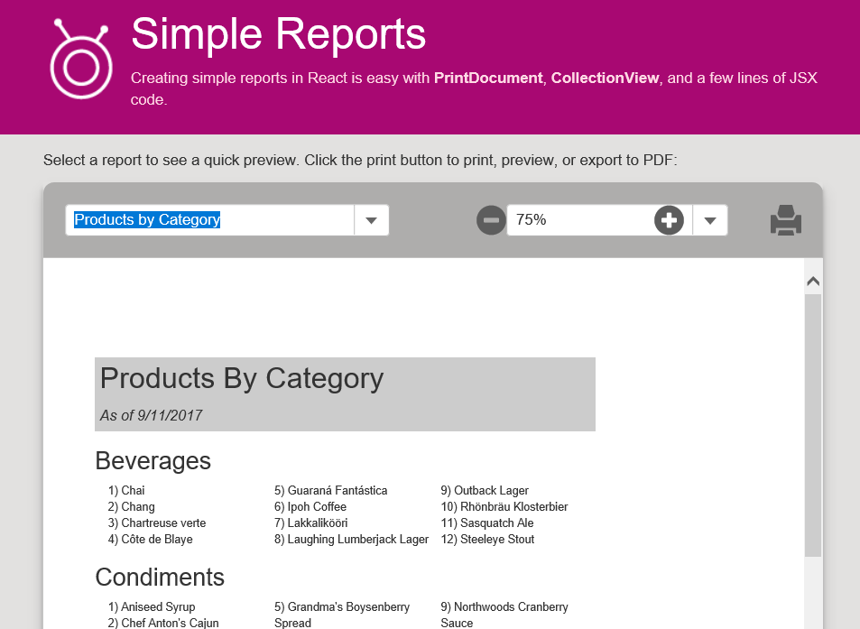
The print preview looks like this when previewed in Chrome and in Edge:
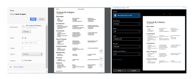 Notice how the preview shows only the current report, without titles, navigation and selection tools. This happens because the App’s render method sends only the contents of the report element into the PrintPreview object, rather than the entire document body.
Useful techniques
All of the reports in the sample use the same techniques to accomplish simple and common tasks. Some of these are especially useful when generating report-style output:
Aggregates
The CollectionView and CollectionViewGroup classes provide a getAggregate method that computes aggregates over the whole collection or group. These are useful to generate ranges or sums over groups as shown in the examples above.
For example, the “EmployeeSalesByCountry” report has a header that shows the report period. This is done using the getAggregate method as follows:
class EmployeeSalesbyCountry extends ReportBase {
  render() {
    let invoices = this.state.invoices;
    return <Spinner loading={this.state.loading}>
      <div className="watermark">
        <img
          style={{ opacity: 0.25, … }
            src="resources/confidential.png" />
      </div>
      <h1 style={{ backgroundColor: '#666', color: '#fff', padding: '10px' }}>
        Employee Sales By Country
        <br />
        <span style={{ fontSize: '50%', fontStyle: 'italic' }}>
          Between
          {Util.format(invoices.getAggregate('Min', 'OrderDate'), 'd')} and
          {Util.format(invoices.getAggregate('Max', 'OrderDate'), 'd')}
        </span>
      </h1>
      {
        invoices.groups.map((country, index) => {
          return <EmployeeSalesbyCountryCountry country={country} key={index} />
        })
      }
    </Spinner>
  }
}
In another component the same report, we calculate the total sales per country and store that value in a variable that can be used in the report and in later calculations:
class EmployeeSalesbyCountryCountry extends React.Component<any, any> {
  render() {
    let country = this.props.country,
        countrySales = country.getAggregate('Sum', 'ExtendedPrice');
    return <div style={{
             marginBottom:'0.5in',
             pageBreakInside: 'avoid' }}>
      <div style={{
        borderBottom: '6pt solid #a0a0a0',
        fontSize: '16pt',
        fontWeight: 'bold',
        display: 'flex' }}>
        <div style={{ width: '600px' }}>
          {this.props.country.name}
        </div>
        <div style={{ width: '500px', textAlign: 'right' }}>
          {Util.format(country.getAggregate('Sum', 'ExtendedPrice'), 'c')}
        </div>
      </div>
        {
          this.props.country.groups.map((salesPerson, index) => {
            return <EmployeeSalesbyCountrySalesPerson
              salesPerson={salesPerson}
              countrySales={countrySales}
              key={index} />
          })
        }
      </div>
    }
}
Page breaks
One of the main limitations in using the browser to generate documents is the lack of control over page size, orientation, and margins. But you do get some level of control over page breaks, which is very convenient to prevent page breaks within report sections.
This is done using the pageBreakBefore, pageBreakAfter, and pageBreakInside CSS properties. These attributes have no effect on the screen, but they do affect printed output. Most of the reports in this sample have header sections with the pageBreakInside attribute set to “avoid”, which results in groups that stay together on a page (if possible).
For example, the “render” method in the “EmployeeSalesbyCountrySalesPerson” component tries to keep each salesperson together in the report by setting the pageBreakInside CSS property to “avoid”:
class EmployeeSalesbyCountrySalesPerson extends React.Component<any, any> {
  render() {
    let countrySales = this.props.countrySales,
        personSales = this.props.salesPerson.getAggregate('Sum', 'ExtendedPrice');
    return <div style={{
             display: 'flex'
             pageBreakInside: 'avoid'}}>
      <div style={{ width: '600px', paddingLeft: '0.5in' }}>
        {this.props.salesPerson.name}
      </div>
      <div style={{ width: '200px', textAlign: 'right' }}>
        {Util.format(personSales / countrySales * 100, 'n0')}%
      </div>
      <div style={{ width: '300px', textAlign: 'right' }}>
        {Util.format(personSales, 'c')}
      </div>
    </div>
  }
}
The pageBreak* properties are being replaced by more generic break* properties, which will also handle column and region breaks and will be syntactically compatible with pageBreak-*. For the time being, however, we only have control over page breaks, and not columns or regions.
Watermarks and other repeating content
In addition to controlling page breaks, you can specify content that repeats on every page, such as a watermark, letterhead, headers and footers.
This is done by putting the repeating content in a div with the position property set to “fixed”. The HTML/CSS specification dictates that this type of element should be rendered on every page. You can use this setting and a CSS media query to generate sections that repeat on every page.
The “EmployeeSalesByCountry” report uses this technique to add a “Confidential” watermark image to every page on the report. Unfortunately, there are some caveats:
- Not all browsers implement position:fixed according to the spec. We mentioned earlier that Edge and IE 11 do. Chrome however renders the fixed content only on the first page.
- Using this technique to adding page headers and footers to reports can be tricky because they have to be sized and positioned in a way that would work with all page sizes and orientations.
- Users may configure the browser to add its own page headers and footers, which may conflict with the custom report headers and footers.
Multiple columns
Creating reports with multi-column sections is easy using the CSS columnWidth, columnCount, and columns properties, or with flexible boxes.
The column property allows you to specify a column width to be used within a div. The browser will automatically calculate how many columns fit within the div and how many rows are needed to render it. This makes it easy to create responsive multi-column reports. You can also specify how many columns you want, in which case the browser will calculate the column width.
The flexible box approach is slightly more complicated, but offers even more flexibility. Just set the div’s display property to “flex”, and set the wrap, align, and justify properties to achieve the layout you want. For details about flexible boxes, please see this page: https://css-tricks.com/snippets/css/a-guide-to-flexbox
The reports in the sample use both approaches. The “ProductsByCategory” report uses a div with columns set to three to render product names into three columns:
class ProductsbyCategoryCategory extends React.Component<any, any> {
  render() {
    return <div style={{ pageBreakInside: 'avoid' }}>
      <h2>
        {this.props.category.CategoryName}
      </h2>
      <div style={{ marginLeft: '12pt', columnCount: 3 }}>
        {
          Util.select(this.props.products, 'CategoryID',
            this.props.category.CategoryID).map((product, index) => {
              return <div key={index}>
                {index + 1}) {product.ProductName}
              </div>;
            })
        }
      </div>
    </div>
  }
}
The “EmployeeSalesByCountrySalesPerson” component and several others use flex boxes to render headers aligned above the actual data:
class EmployeeSalesbyCountrySalesPerson extends React.Component<any, any> {
  render() {
    let countrySales = this.props.countrySales,
        personSales = this.props.salesPerson.getAggregate('Sum', 'ExtendedPrice');
    return <div style={{ pageBreakInside: 'avoid', display: 'flex' }}>
      <div style={{ width: '600px', paddingLeft: '0.5in' }}>
        {this.props.salesPerson.name}
      </div>
      <div style={{ width: '200px', textAlign: 'right' }}>
        {Util.format(personSales / countrySales * 100, 'n0')}%
      </div>
      <div style={{ width: '300px', textAlign: 'right' }}>
        {Util.format(personSales, 'c')}
      </div>
    </div>
  }
}
Borders
Borders are very useful when defining some reports because they are always rendered in the printed output, as opposed to div backgrounds which are sometimes omitted.
For example, the “SalesChartInvoice” component uses this code to build a bar chart where each bar is a border on an element with a variable width:
class SalesChartInvoice extends React.Component<any, any> {
  render() {
    return <div style={{ display: 'flex', paddingRight: '6pt' }}>
      <div style={{ width: '600px' }}>
        <div style={{
          height: '1em',
          marginTop: '.25em',
          borderTop: '.6em solid #007200',
          width: this.props.invoice.ExtendedPrice * 100 / 18000 + '%'
        }}>
        </div>
      </div>
      <div style={{ width: '200px' }}>
        {Util.format(this.props.invoice.ShippedDate, 'd')}
      </div>
      <div style={{ width: '200px', textAlign: 'right'}}>
        {Util.format(this.props.invoice.ExtendedPrice, 'c')}
      </div>
    </div>
  }
}
In this case, setting the background-color would not work. The chart would appear correctly on the screen, but it would not render at all on the print document.
Using Controls in Reports
You can use plain HTML in your report definitions, but you can also go beyond that and include other controls such as charts and gauges. For example, the “SalesByCategoryCategory” component in the sample contains this code:
class SalesbyCategoryCategory extends React.Component<any, any> {
  render() {
    return <div>
      <div style={{ display: 'flex', … }}>
        {this.props.category.CategoryName}
      </div>
      <div style={{ display: 'flex', minWidth: '800px', pageBreakInside: 'avoid' }}>
        <div>
          <div style={{ display: 'flex', … }}>
            <div style={{ width: '200px' }}>
              Product:
            </div>
            <div style={{ width: '100px', textAlign: 'right' }}>
              Sales:
            </div>
          </div>
          {
            this.props.category.items.map((productSale, index) => {
              return <div style={{ display: 'flex' }} key={index}>
                <div style={{ width: '200px' }}>
                  {productSale.ProductName}
                </div>
                <div style={{ width: '100px', textAlign: 'right' }}>
                  {Util.format(productSale.ProductSales, 'c')}
                </div>
              </div>
            })
          }
        </div>
        <Wj.FlexChart
          style={{width: '500px', height: '350px', ..}}
          itemsSource={this.props.category.items}
          bindingX="ProductName"
          series={[
            { name: 'Sales', binding: 'ProductSales' }
          ]}
          legend={{ position: 'None' }}/>
      </div>
    </div>
  }
}
The markup uses the map method to loop over the categories. For each category, it defines a flexible box with a table containing product names and sales on the left, and a FlexChart on the right.
The Wj.FlexChart component sets the chart’s itemsSource property to “category.items”, which contains an array of objects with ProductName and ProductSales properties. We could easily customize the chart by adding more attributes to the markup.
Here is the result as seen in Chrome:
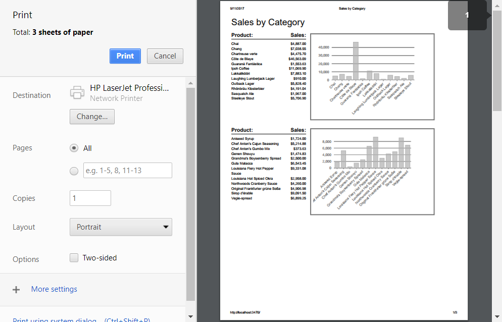
You can use any controls in your reports, including charts, linear and radial gauges, and bullet graphs.
Specialized Reporting Tools
The techniques discussed here can be very useful for generating relatively simple reports. But if your needs are more complex, then you should consider using specialized reporting tools. These tools provide advanced features like server-side rendering and caching, control over page headers and footers, cross-tabs, parameterized reports, and much more.
We will soon release the Wijmo ReportViewer control which will work with server-side reporting tools including ActiveReports and Microsoft Reporting Services.
To use the ReportViewer control, you will create the control and set a couple of properties as usual:
var viewer = new wijmo.viewer.ReportViewer('#flexViewer', {
  serviceUrl: serviceUrl,
  filePath: reportFilesCombo.value,
  reportName: reportNamesCombo.value,
});
The viewer will contact the service, retrieve and display the report in a UI element similar to the one in the Adobe Pdf viewer.
Users will then be able navigate through the report using outline or thumbnail views, zoom, search, select report parameters, set page size and orientation, and save or print the results.
Stay tuned for more details about FlexReport and the ReportViewer control.
Conclusion
Browsers are amazing applications. They have many features that we all take for granted and are really useful in many real-world scenarios. Printing support is one of these.
You may need a specialized component for creating reports, but if you are using Wijmo and React (or Angular or AngularJS), you already have all the tools you need to generate basic reports quickly and efficiently.
And when you outgrow the basic capabilities already in your toolbox, rest assured knowing that Wijmo also supports advanced and flexible server-based reporting.

Bernardo de Castilho