Customizing Tooltips and Data Points for Specific Series
When we use FlexChart with multiple series, many of the features set through the API will affect all series. For instance, the tooltip, data labels and itemFormatter are typically set once per chart and will apply to all series. In the 2019 v1 release, we added the ability to customize the tooltips and the itemFormatter for each individual series.
Read the full Wijmo 2019 v1 release.
Custom Series Tooltips
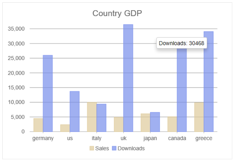
Tooltips are essential and quite common in all charts. Sometimes their most important job is to display additional information about a data point that may not be gleaned from the chart alone. The FlexChart Series has a new tooltipContent property. This overrides the global tooltip content for the specific series. It supports the same string parameters to display bound data within the text.
The code sample below shows the main control tooltip versus the new series tooltipContent.
let myChart = new chart.FlexChart('#chart', {
        bindingX: 'country',
        series: [{
                binding: 'sales',
                name: 'Sales'
            }, {
                binding: 'downloads',
                name: 'Downloads',
                // custom series tooltip
                tooltipContent: 'Downloads: {downloads}'
            }],
        tooltip: { // global tooltip
            content: '<b>Country: </b>{country}</br>Sales: {sales}';
            }
        }
    });
Custom Series Formatter
The itemFormatter is a function that allows you to customize the appearance of the chart elements. It’s used to apply conditional formatting to the chart.
The function takes three arguments:
- A render engine responsible for rendering elements on the chart
- Hit-test information about which data point is being rendered
- A function that provides the default rendering for the item.
The global (chart-wide) itemFormatter applies to all data points so the series formatter makes it easier to customize each series in a completely different way.
In this example, the itemFormatter is used to draw an arrow for a certain series.
let myChart = new chart.FlexChart('#chart', {
        chartType: 'LineSymbols',
        bindingX: 'hour',
        series: [
            {
                binding: 't',
                name: 'temperature'
            },
            {
                chartType: "Scatter",
                binding: 'wspeed',
                name: 'wind speed',
                // series itemFormatter
                itemFormatter: (engine, ht, render) => {
                    render();
                    var dir = ht.item.wdir;
                    drawArrow(engine, ht.point, dir);
                }
            }
        ],
        // global itemFormatter
        itemFormatter: (engine, hitTestInfo, defaultRenderer) => {
            var ht = hitTestInfo;
            if (ht.x < 8) {
                engine.stroke = 'red';
                engine.fill = 'rgba(255,0,0,0.7)';
            }
            defaultRenderer();
        }
    });
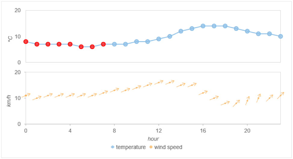
The main control’s itemFormatter is used to apply some standard conditional formatting. Notice that the wind speed series itemFormatter overrides anything from the main one.
Check out the full Custom Series demo to see the entire drawArrow method.
If you have any questions or comments, feel free to leave a comment below.

Greg Lutz