Data visualization is a hot topic. There are many great articles that discuss the tools available for adding charts, graphs, gauges, and maps to your JavaScript applications.
This blog focuses on a topic that is not as well-covered: preparing the data for creating these charts, graphs, gauges, and maps.
To illustrate, imagine that you want to create a chart that shows sales by product. The data comes from the server in this format:
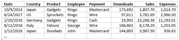
Here's a sample with a few thousand data items to give you a good idea of the data: https://react-ts-epqaqu.stackblitz.io/#raw
You could try to get a summarized version of the data directly from the server. Perhaps your IT department already created queries that return the data in the format you need. If you are lucky, they may have queries that get the data summarized by country, product, employee, and payment method.
Unfortunately, many people in IT are often too busy with other tasks, and the databases they manage already have a thousand tables and queries. They may not like to change or add anything to it. Additionally, it can be a time consuming process.
Another option is to summarize the data on the client, using a little JavaScript. You would write a method that would scan the data, create groups, and accumulate one or more properties. You could write another method to filter and sort the data before grouping it so you could show sales for a specific product or country as well.
Using CollectionView to Group the Data
The good news is, Wijmo's CollectionView class already does all that for you. It provides sorting, filtering, and grouping for all Wijmo controls, including the FlexGrid and FlexChart.
Here's the same data, sorted and grouped with a CollectionView, and shown in a FlexGrid:
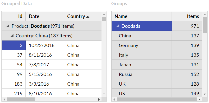
The grid on the left shows the data, organized into collapsible groups. The grid on the right shows the groups only, without the data items.
Here is the code we used to create these grids:
https://stackblitz.com/edit/react-ts-epqaqu?file=components%2FGroupedData.tsx
export class GroupedData extends Component<CardProps, CardState> {
  constructor(props) {
    super(props);
    const view = new CollectionView(this.props.data, {
      sortDescriptions: ['product', 'country'],
      groupDescriptions: ['product', 'country'],
      collectionChanged: s => {
        if (this.state) {
          this.setState({ groups: s.groups });
        }
      }
    });

    this.state = {
      view: view,
      groups: view.groups
    }
  }
The code creates a CollectionView sorted and grouped by Product and Country. It adds the CollectionView and the CollectionView's groups to the component state.
The component's render method shows both collections on FlexGrid controls:
render() {
  return (
    <div id={this.props.id} className="card">
      <h2>
        Grouping Data with CollectionView
      </h2>
      <p>…</p>
      <div className="row">
        <div className="col-xs-6">
          <p className="caption">Grouped Data</p>
          <FlexGrid
            alternatingRowStep={0}
            itemsSource={this.state.view} />
        </div>
        <div className="col-xs-6">
          <p className="caption">Groups</p>
          <FlexGrid
            childItemsPath="groups"
            autoGenerateColumns={false}
            columns={[
              { binding: 'name', header: 'Name', width: '2*' },
              { binding: 'items.length', header: 'Items', width: '*' }
            ]}
            itemsSource={this.state.groups} />
        </div>
      </div>
    </div>
  );
}
This is a step in the right direction, but the data is still not ready for charting. We need to add aggregates to the items in the groups collection.
Creating Rollups and Pivots with ChartView
To avoid re-writing the same code over and over again, we decided to create a ChartView class that extends the CollectionView and adds two methods:
- getRollup: A method that returns an array with items that correspond to each group, plus aggregates added to whatever fields you choose. The getRollup method is like the SQL ROLLUP command.
- getPivot: A method that converts groups into columns (as opposed to rows) and returns them as an array. The getPivot method is like the SQL PIVOT command.
We won't discuss the details of the ChartView code, but it's pretty simple and you can check out the source code here if you are interested: https://stackblitz.com/edit/react-ts-epqaqu?file=ChartView%2FChartView.ts
Rollup Charts with ChartView
Using the ChartView to create rollup (summary) charts is easy:
- Create the view as usual, passing it the raw data, the sort and group descriptions you want to use
- Call the view's getRollup method to obtain an array with the summarized data, and
- Use the rollup array as the itemsSource for a FlexChart control
You can see an example here: https://react-ts-epqaqu.stackblitz.io/#rollup
The charts look like this:
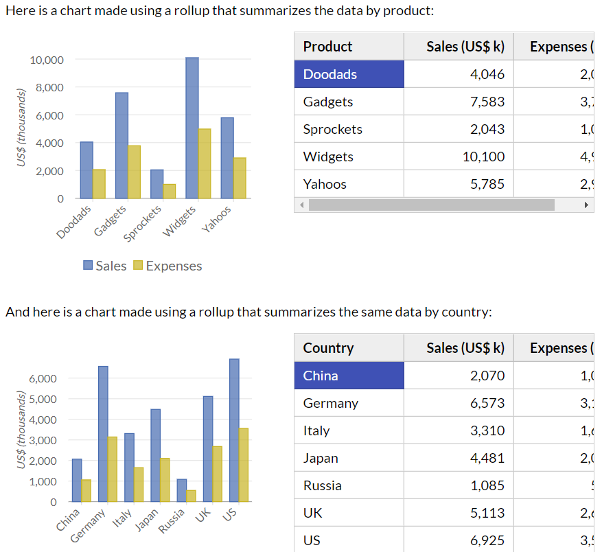
Notice how the first chart summarizes sales and expenses by product, and the second by country. Both charts are live. If you edit the raw data, they are automatically updated. If you sort the grids next to the charts, they are updated to display the sorted data.
The code used to create the charts is very simple:
https://stackblitz.com/edit/react-ts-epqaqu?file=components%2FSummaryChart.tsx
export class SummaryChart extends Component<CardProps, CardState> {
  constructor(props) {
    super(props);

    let rollupByProduct = new ChartView(this.props.data, {
      sortDescriptions: ['product'],
      groupDescriptions: ['product']
    }).getRollup();
    let rollupByCountry = new ChartView(this.props.data, {
      sortDescriptions: ['country'],
      groupDescriptions: ['country']
    }).getRollup();

    this.state = {
      rollupByProduct: new CollectionView(rollupByProduct),
      rollupByCountry: new CollectionView(rollupByCountry)
    }
  }
The code creates two rollup arrays and adds them to the component state as rollupByProduct and rollupByCountry. In this example, we wrapped both in extra CollectionView objects so if you sort them on the grids, the charts will be automatically updated.
Once the data is ready, creating the charts is easy. The render method uses the rollups as data sources for FlexChart controls:
render() {
  return (
    <div id={this.props.id} className="card">
      <h2>
        Creating Charts with ChartView.getRollup
      </h2>
      <div className="row">
        <div className="col-xs-6">
          <FlexChart
            bindingX="product"
            series={[
              { binding: 'sales', name: 'Sales' },
              { binding: 'expenses', name: 'Expenses' }
            ]}
            itemsSource={this.state.rollupByProduct}/>
        </div>
      </div>
      <div className="row">
        <div className="col-xs-6">
          <FlexChart
            bindingX="country"
            series={[
              { binding: 'sales', name: 'Sales' },
              { binding: 'expenses', name: 'Expenses' }
            ]}
            itemsSource={this.state.rollupByCountry}/>
        </div>
      </div>
    </div>
  );
}
Filtered Rollup Charts
Because the ChartView class extends CollectionView, the rollups and pivots it creates can be filtered using the filter method.
You can see an example here: https://react-ts-epqaqu.stackblitz.io/#filter
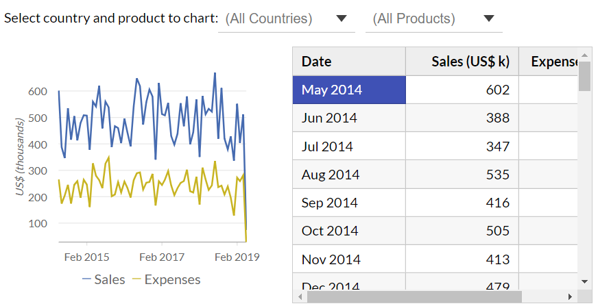
The app shows a time series chart with sales and expenses, and allows you to choose a product and/or country to focus on:
The source code is like the one we showed earlier, with the addition of a filter method that gets invoked when the user selects a country or product:
https://stackblitz.com/edit/react-ts-epqaqu?file=components%2FFilteredChart.tsx
export class FilteredChart extends Component<CardProps, CardState> {
  dateFormat = 'MMM yyyy'; //'"Q"q yyyy';

  constructor(props) {
    super(props);
    let view = new ChartView(this.props.data, {
      sortDescriptions: ['date'], // sort by date
      groupDescriptions: [ // group by formatted date
        new PropertyGroupDescription('date', (item: any) => {
          return format('{date:' + this.dateFormat + '}', item);
        })
      ],
      filter: item => { // filter by selected product/country
        let product = this.state ? this.state.product : '';
        if (product && item.product != product) return false;
        let country = this.state ? this.state.country : '';
        if (country && item.country != country) return false;
        return true;
      }
    });
    this.state = {
      country: '',
      product: '',
      rollup: view.getRollup()
    }
  }
The code creates a ChartView that filters the data by product and country, and groups the data by month. It does this using a GroupDescription based on a function that returns the date formatted to show the month and year. We could have easily grouped the data by quarter or year simply by changing the date format.
The render method is responsible for showing and updating the filter as well as the chart.
render() {
  return (
    <div id={this.props.id} className="card">
      <h2>
        Data Filtering with ChartView.getRollup
      </h2>
      <p>…</p>
      <p>
        Select country and product to chart:
        <ComboBox
          isRequired={false}
          placeholder="(All Countries)"
          itemsSource={this.props.countries}
          text={this.state.country}
          textChanged={(s) => {
            this.setState({ country: s.text });
            this.state.rollup.view.refresh();
          }} />
        <ComboBox
          isRequired={false}
          placeholder="(All Products)"
          itemsSource={this.props.products}
          text={this.state.product}
          textChanged={(s) => {
            this.setState({ product: s.text });
            this.state.rollup.view.refresh();
          }} />
      </p>
The component uses ComboBox controls to display the current product and country. When their values change, the state is updated, and the view is refreshed.
Once the data is ready, creating the chart is easy:
      <div className="row">
        <div className="col-xs-6">
          <FlexChart
            chartType={ChartType.Line}
            bindingX="date"
            series={[
              { binding: 'sales', name: 'Sales' },
              { binding: 'expenses', name: 'Expenses' }
            ]}
            itemsSource={this.state.rollup}
          />
        </div>
        <div className="col-xs-6">
          <FlexGrid…/>
        </div>
      </div>
    </div>
  );
}
Drill-Down Charts
The getRollup method creates summaries for all group levels, which makes it possible to create drill-down charts.
Drill-down charts allow users to double-click chart elements (like a country) to drill down and see the details for that element (like product sales for that country).
Adding event handlers to support drilling-down and backing up, as well as bread crumbs to display and navigate the chart's hierarchy is not too difficult, but the rollupArray class has an enableDrillDown method that handles these details in a standard way, so you don't have to re-invent the wheel.
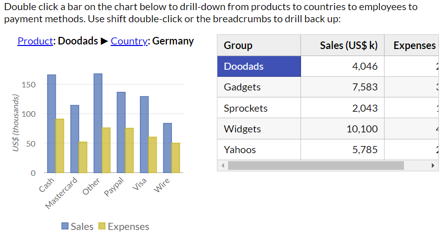
Here is an example that shows sales by product: https://react-ts-epqaqu.stackblitz.io/#drilldown
If you double-click any of the products, the chart will show the sales and expenses for that product, this time by country. You can keep drilling down to see sales and expenses by payment method and by employee.
As you navigate the chart, a "bread crumbs" element above the chart shows what you are looking at and allows you to drill back up one or more levels at a time:
Because most of the heavy lifting is done by the ChartView class (and its RollupArray helper), the code required to create the drill-down chart is very declarative and simple:
https://stackblitz.com/edit/react-ts-epqaqu?file=components%2FDrillDownChart.tsx
export class DrillDownChart extends Component<CardProps, CardState> {
  constructor(props) {
    super(props);

    let rollup = new ChartView(this.props.data, {
      sortDescriptions: ['product', 'country', 'payment', 'employee'],
      groupDescriptions: ['product', 'country', 'payment', 'employee']
    }).getRollup();

    this.state = {
      rollup: rollup
    }
  }
The constructor creates the view with four grouping levels and uses the getRollup method to obtain a hierarchical array that will be used as the data source for the drill-down chart.
In addition to rendering the chart itself, the render method creates a "crumbs" element to show the bread crumbs:
render() {
  return (
    <div id={this.props.id} className="card">
      <h2>
        Drill-Down Charts with ChartView.getRollup
      </h2>
      <p>…</p>
      <div className="row">
        <div className="col-xs-6">
          <div id="crumbs" className="crumbs"></div>
          <FlexChart
            bindingX="$rollupInfo.group.name"
            series={[
              { binding: 'sales', name: 'Sales' },
              { binding: 'expenses', name: 'Expenses' }
            ]}
            itemsSource={this.state.rollup}
            initialized={s => {

                // enable drill-down and crumbs
                let crumbs = document.getElementById('crumbs');
                this.state.rollup.enableDrillDown(s, crumbs);

                // add some animation to the chart
                new ChartAnimation(s, {
                  animationMode: AnimationMode.All,
                  easing: Easing.EaseOutElastic,//.Swing,
                  duration: 800
                });
            }}/>
        </div>
        <div className="col-xs-6">
          <FlexGrid…/>
        </div>
      </div>
    </div>
  );
}
Notice how the component uses the chart's initialize event for two things:
- To enable the view's built-in drilldown behaviors (mouse and bread crumb navigation), and
- To add animation to the chart, so as the user navigates the chart changes with a nice transition rather than all at once.
Pivot Charts
I hope by now you agree that rollups are a powerful and convenient way to aggregate data for charting. Rollups can easily summarize raw data so you can show sales by country, product, or date. And with one line of code you can create drill-down charts that allow users to navigate multiple group levels on the same chart.
But there's a piece still missing. What if you wanted to show sales by product AND by country on the same chart, all at once?
The ChartView's getPivot method supports that scenario by allowing you to create data summaries where groups are represented as columns rather than rows (or, more accurately, as properties of the summary objects rather than extra summary objects).
The getPivot method is not as powerful and flexible as a full pivot engine such as the one in Wijmo's OLAP module, but it is extremely simple and easy to use, and in many cases it may be all you need for your charting needs.
Here is an example: https://react-ts-epqaqu.stackblitz.io/#pivot
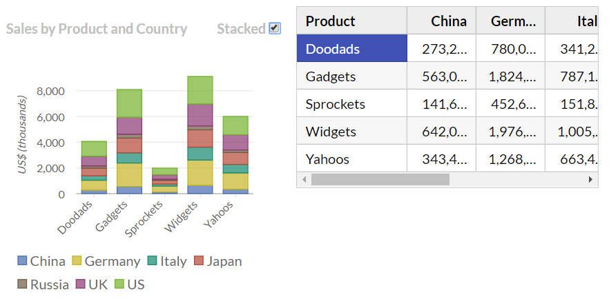
The chart shows sales by product, broken down by country. The sample includes another chart that shows sales by country, broken down by product. The component looks like this:
https://stackblitz.com/edit/react-ts-epqaqu?file=components%2FPivotChart.tsx
export class PivotChart extends Component<CardProps, CardState> {
  constructor(props) {
    super(props);

    let pivotPC = new ChartView(this.props.data, {
      sortDescriptions: ['product', 'country'],
      groupDescriptions: ['product', 'country']
    }).getPivot('sales');
    let pivotCP = new ChartView(this.props.data, {
      sortDescriptions: ['country', 'product'],
      groupDescriptions: ['country', 'product']
    }).getPivot('sales');

    this.state = {
      pivotPC: pivotPC,
      stackPC: true,
      pivotCP: pivotCP,
      stackCP: true,
    }
  }
The component creates a view grouped by product and country and one grouped by country and product. It uses the getPivot method to aggregate and group the sales values as usual, but this time the value returned is a pivotArray that contains extra columns for each value in the second group (country or product).
The component state also includes members that determine whether the series should be stacked on the chart or not.
The render method is responsible for using this data to create the charts:
render() {
    return (
      <div id={this.props.id} className="card">
        <h2>
          Pivot Charts with ChartView.getPivot
        </h2>
        <p>…</p>
        <div className="row">
          <div className="col-xs-6">
            <p className="caption">
              Sales by Product and Country
              <label>
                Stacked
                <input type="checkbox"
                  defaultChecked={this.state.stackPC}
                  onChange={() => {
                    this.setState({stackPC: !this.state.stackPC });
                  } } />
              </label>
            </p>
            <FlexChart
              bindingX="product"
              stacking={this.state.stackPC ? Stacking.Stacked : Stacking.None}
              series={this.state.pivotPC.chartSeries}
              itemsSource={this.state.pivotPCView} />
          </div>
          <div className="col-xs-6">
            <FlexGrid…/>
          </div>
        </div>
The render method uses an input element to show and toggle the chart's stacking property.
Notice how the chart's series property is set to an array provided by the pivotArray. In this case, the array contains one series for each country. If countries are added or removed from the data, the chart is updated automatically, with series being added or removed to match the data.
The code that creates the second chart (sales by country and product) is almost identical:
      <div className="row">
       <div className="col-xs-6">
          <p className="caption">
            Sales by Country and Product
            <label>
              Stacked
              <input type="checkbox"
                defaultChecked={this.state.stackCP}
                onChange={() => {
                  this.setState({ stackCP: !this.state.stackCP });
                }} />
            </label>
          </p>
          <FlexChart
            bindingX="country"
            stacking={this.state.stackCP ? Stacking.Stacked : Stacking.None}
            series={this.state.pivotCP.chartSeries}
            itemsSource={this.state.pivotCPView} />
        </div>
        <div className="col-xs-6">
          <FlexGrid…/>
        </div>
      </div>
    </div>
  );
}
Data Visualizations with CollectionView Conclusion
If you didn't know about Wijmo's CollectionView class, I hope you now know enough about it to create great charts based on clean, declarative, and easy-to-maintain code.
If you were already familiar with the CollectionView class, I hope you liked the ChartView extensions.
Either way, I hope this blog will bring you some useful tools and (more importantly) inspiration for extending the CollectionView class even further, so it can be used as a source for your own great visualizations.
Happy coding!

Bernardo de Castilho