Fundamentals of Tablix
In ActiveReports, the Tablix data region provides an ability to showcase report data in a tabular layout, by categorizing it in horizontal and/or vertical directions. Using this, you can create reports that depict information about multiple dimensions. For example, you can create a report comparing the performance of different employees, price lists for different car models with respect to their variants, and water consumption in different regions over the years and so on.
By producing a report with strong elements of data visualization, Tablix can improve the readability of the content. This will improve user comprehension and the ability for data analyzation.
Tablix architecture
When added from the Toolbox, Tablix consists of 4 cell each representing the four different areas: the Corner, Row Group, Column Group, and the Body.
Below image shows an example of a simple Tablix structure, containing these four areas.

Each cell in the Tablix area comprises of a TextBox control, by default. You can add different controls like Image, Barcode or data regions, like a Table, a List or add Tablix in it.
| Tablix Areas | Usage/Purpose |
|---|---|
| Corner | For displaying static information like headline representing the Tablix data, page-wise information related to Tablix or page filters, etc. |
| Row Group | Groups in these areas are used to categorize report data in the vertical direction. These can be arranged either hierarchically or adjacent to each other. |
| Column Group | Groups in these areas are used to categorize report data in the horizontal direction. These can be arranged either hierarchically or adjacent to each other. |
| Body | For displaying aggregated data with respect to row and column grouped data in the report. |
Based on the above structure, a more complex Tablix can be designed by adding multiple groups, like in the image shown below.

Here, multiple row and column groups are present, where ProductCategory-ProductName and Year-Quarter groups are forming a hierarchical structure while Year-Region groups are placed adjacent to each other. The aggregate value for 'Sales' would be displayed according to the intersecting row and column groups, as shown below.

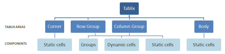
Let's now read about the different Tablix components/parts that constitute the Tablix areas using the diagram below.
-
Groups: Are a vital component in the Row and Column Group areas. Groups categorize the report data using a specified expression. This component is accessible from the Group Editor window when the Tablix data region is selected. In Tablix, you can add row/column groups in the following ways:
- Parent-child groups: To depict the hierarchical relation
- Adjacent groups: To show the side-by-side grouping of report data
-
Dynamic cells: Are associated with, and present in respective row/column groups of Tablix. There can be only one dynamic cell in a group, for representing the grouped data.
-
Static cells: Are rendered only once in Tablix. However, these may repeat when added beside the grouped cells in Row/Column Group areas. These are generally used to display headers/labels and totals in Tablix.
The below Tablix structure depicts all the mentioned areas and its components:

Here, 'Tablix1_ProductCategory1', 'Tablix1_ProductName1', 'Tablix1_Year1', 'Tablix1_Quarter1' and 'Tablix1_Region1' are groups (as depicted in Group Editor), the cells containing values '=[ProductCategory]', '=[ProductName]', '=[Year]', '=Quarter([Year])' and '=[Region]' are the dynamic cells representing respective groups. Rest other cells in Tablix areas are static cells.
Following output is shown on previewing such report.

As you can see, dynamic cells are repeated with different values of respective groups (for example, the year 1996 and 1995, product categories beverages, condiments, etc.). Static cells are rendered only once (YEAR, REGION and CATEGORY), except when placed next to the dynamic cells, like in the case of static cell 'Total.'
You can also refer to the AR12 documentation for information on Tablix structure.
Using Tablix to create different report layouts and templates
Using the Tablix data region, you can arrange your data to create reports in different layouts.
-
Hierarchical cross-tabulation layout: You can create a report using Tablix that consists of multiple row and column groups, arranged in the hierarchical structure.
See the example below:

-
Adjacent group layout: You can choose to represent your report data in the form of parallel or adjacent row/column groups of Tablix, to view the data grouped by different dimensions (side-by-side), sales calculations for different products, by different year, as well as regions on same levels (like the one explained in the above section).
See Using Multiple Adjacent Groups topic for more details.
-
Stepped layout: If you want to group data in the vertical direction only, you can add a Tablix data region that does not have column groups in your report.
An example of this type of layout is a regular ledger, as shown in the image below:

This way, you can customize the Tablix data region to create the simplest to more complex layouts in your reports. If you have a question or comment, please leave in the thread below.
Happy coding!

Neha Madan