How to Add Custom Tooltips to Charts
Today, we'll look into how to build custom tooltips for charts in WinForms, UWP, and WPF. Tooltips are an important, integral addition to charts: they provide additional information about the data without adding visual clutter. You'll find that tooltips in FlexChart and FlexPie are easily configurable, highly flexible chart elements.
Considering that tooltips in FlexChart and FlexPie extend the System.Windows.Forms.ToolTip.aspx) class, you might already be familiar with properties and methods like AutoPopDelay, ReshowDelay and ToolTipTitle, which control the tooltip appearance, time interval etc. In this blog post, we'll cover:
- How to configure the tooltip content
- How to format content of a tooltip
- How to add HTML content to a tooltip
- How to embed a chart in a tooltip
Default Tooltips Appearance
In absence of any custom content, tooltip in FlexChart and FlexPie displays the data point value when you hover over a series or pie slice. The following figure shows the default tooltip displayed in FlexChart and FlexPie.  Default tooltip appearance in FlexChart
Build a Custom Tooltip
FlexChart makes tooltip customization easier and simpler by allowing you to specify a template string in the Content Property. Some pre-defined parameters can be specified in template string, thereby giving you flexibility to display chart data information of your choice in the chart tooltip:
- propertyName: Any property of the data object represented by the point.
- seriesName: Name of the series that contains the data point (FlexChart only).
- pointIndex: Index of the data point.
- value: Value of the data point (y-value for FlexChart, item value for FlexPie).
- x: x-value of the data point (FlexChart only).
- y: y-value of the data point (FlexChart only).
- name: Name of the data point (x-value for FlexChart or legend entry for FlexPie).
Specifying the property names in the template string is useful when the value of multiple series is to be displayed in the tooltip. The following snippet shows using the property names as parameters in the template string:
flexChart.ToolTip.Content = "Month: {Name}\\nS: {Sales}\\nE: {Expenses}";
flexPie.ToolTip.Content = "Name: {Fruit}\\nValue: {March}";
 Display the value of multiple series in a tooltip Specifying the predefined parameter names is useful when information regarding only the series is required. The following snippet shows using the pre-defined parameter names in the template string:
flexChart.ToolTip.Content = "Series: {seriesName}\\nIndex: {pointIndex}\\nX: {x}\\nY: {y}";
flexPie.ToolTip.Content = "Index: {pointIndex}\\nValue: {value}";
 Display specific series information in a tooltip
Formatting the Content of a Custom Tooltip
You can not only configure what to display in chart tooltip, but also format how the content is displayed. FlexChart supports culture formatting, for instance. You can adjust currency symbols and number separators in expenses and sales figures. You can also present your tooltip information in a variety of formats, including displaying short or long date formats and specifying number of decimal places. This can be done by specifying .NET Standard and Custom Numeric.aspx)/DateTime.aspx) format strings in FlexChart's tooltip:
flexChart.ToolTip.Content = "Month: {Name}\\nS: {Sales:C0}\\nE: {Expenses:C0}";
flexPie.ToolTip.Content = "Fruit:{Fruit}\\nValue:{Value:0.00}";
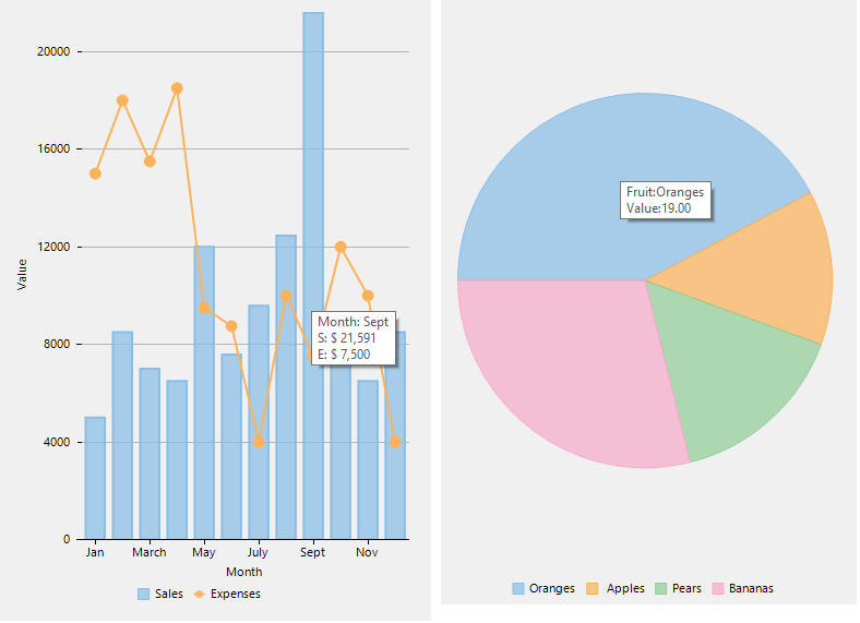 Formatting content of a tooltip
Adding HTML Content to a Custom Tooltip
You can also display HTML text in a tooltip with C1SuperTooltip. C1SuperTooltip for WinForms supports virtually all HTML constructs, including cascading style sheets, mixed fonts, text colors and more.  Display HTML content in a tooltip The following example shows how to display HTML content in chart tooltip using C1SuperTooltip:
private void flexChart_MouseMove(object sender, MouseEventArgs e)
{
var hitTestInfo = flexChart.HitTest(e.Location);
if (hitTestInfo == null)
return;
if (hitTestInfo.Item != null && hitTestInfo.Distance <= MAX_DIST)
{
var item = hitTestInfo.Item as CategoricalPoint;
var htmlTemplate = @"

**Month: **{0}

**Sales: **{1}

**Expenses: **{2}

";
var htmlContent = String.Format(htmlTemplate, item.Name, item.Sales, item.Expenses);
c1SuperTooltip1.SetToolTip(flexChart, htmlContent);
}
else
c1SuperTooltip1.Hide();
}
private void flexPie_MouseMove(object sender, MouseEventArgs e)
{
var hitTestInfo = flexPie.HitTest(e.Location);
if (hitTestInfo == null)
return;
if (hitTestInfo.Item != null && hitTestInfo.Distance <=MAX_DIST)
{
var item = hitTestInfo.Item as FruitDataItem;
var htmlTemplate = @"

**Fruit: **{0}

**Value: **{1}

";
var htmlContent = String.Format(htmlTemplate, item.Fruit, item.Value);
c1SuperTooltip1.SetToolTip(flexPie, htmlContent);
}
else
c1SuperTooltip1.Hide();
}
Embed a Chart Image in a Custom Tooltip
If you're displaying summary information and want to provide details, you can also use the C1SuperTooltip and embed a chart image. This gives the user a drill-down effect for detailed information. The chart below shows the order totals per country initially, and when the user hovers over a column, the tooltip displays an annual breakdown. 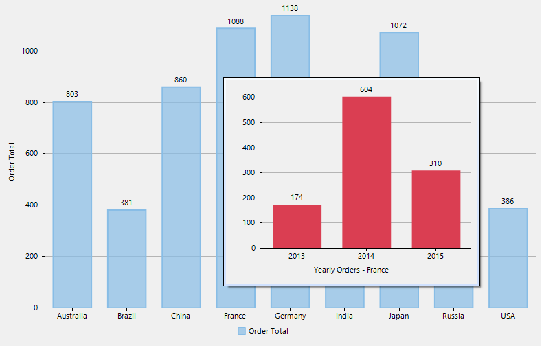 Embed a chart in a tooltip Here’s the code implementation:
void flexChart_MouseMove(object sender, MouseEventArgs e)
{
var hitTestInfo = flexChart.HitTest(e.Location);
if (hitTestInfo != null && hitTestInfo.Item != null && hitTestInfo.Distance <= MAX_DIST)
{
var item = hitTestInfo.Item as FlexPoint;
// Get Detailed data for the data point hit
var data = from order in _orders
where order.ShippedCountry.Equals(item.XValue)
group order by order.OrderDate.Year into newGroup
orderby newGroup.Key
select new
{
Year = newGroup.Key,
Amount = newGroup.Sum(order => order.Amount)
};
//Prepare chart for the data point hit
var chart = new FlexChart();
chart.DataSource = data;
chart.Footer.Content = "Yearly Orders - " + item.XValue;
chart.BindingX = "Year";
chart.Font = new Font("Segoe UI", flexChart.Font.Size);
Series orderAmountSeries = new Series { Name = "Amount", Binding = "Amount" };
orderAmountSeries.Style.FillColor = ColorTranslator.FromHtml("#DA3E52");
chart.Series.Add(orderAmountSeries);
chart.Legend.Position = Position.None;
chart.AxisX.MajorUnit = 1;
chart.DataLabel.Content = "{y}";
chart.DataLabel.Position = LabelPosition.Top;
using (var ms = new MemoryStream())
{
//Save the chart to C1SuperTooltip's Images collection
chart.SaveImage(ms, ImageFormat.Png, 400, 300);
var img = Image.FromStream(ms);
var imageName = item.XValue + ".png";
c1SuperTooltip1.Images.Add(imageName, img);
}
string html = "";
c1SuperTooltip1.SetToolTip(flexChart, html);
}
else
{
c1SuperTooltip1.Hide();
c1SuperTooltip1.Images.Clear();
}
}
Download the Sample: WPF | UWP | WinForms

MESCIUS inc.