Tables are prevalent in web products because they're one of the easiest ways to present and organize complex data. Plain HTML tables will solve the most common use-case scenarios, but trying to do anything sophisticated with them will make you frustrated quickly.
This is when developers should make a decision. They either start coding tables in an old-fashioned way by creating HTML tables and adding enhancements by themselves — at the risk of losing focus of their project — or looking for existing market products that already solve those problems.
Many companies use data tables to show complex reports, dashboards, financial data, sales results, and even interactive spreadsheets. With high demand came specialized supply, so tables are ubiquitous assets in web component libraries.
Today there are dedicated smart table controls made for the Angular framework that handle the table part for you and provide additional features, including selection modes, sorting, and column reordering.
Try all of Wijmo's specialized controls with the Enterprise trial! Download it Today!
This article describes which capabilities are expected from a smart table, evaluate an open-source project, and demonstrate how to implement enterprise-grade, smart data tables with Wijmo FlexGrid, a GrapeCity solution for the Angular framework.
Table Capabilities
How smart can a smart table be? Just adding a few features to a plain HTML table is not enough. Current products in the market can vary greatly, but there are some key features that people expect to see when they look for a smart data table:
- Data features:
- Import data from and export to various sources, including local files (including Excel import and export), databases, and APIs
- Searching, filtering, and sorting options
- Load and display large datasets with pagination
- UI features:
- Showing and hiding columns
- Inline editing
- Responsiveness: built-in support for desktop and mobile
- Resizable columns to accommodate long data points or multiline comments
- Horizontal and vertical scroll support
- Data validation and visualizations, such as sparklines
Some frameworks have built-in implementations with a few features, but you have to code advanced features requiring unplanned development effort.
Using Data Tables with Angular
Maintained by Google and with contributions from individual developers and companies, Angular is an open-source, front-end web application platform based on TypeScript.
Unlike other lightweight JavaScript libraries, Angular is a complete application design framework for sophisticated single-page applications (SPA). Angular apps are built on an opinionated architecture, which means that apps must be written around some conventions and good practices to work correctly.
Angular's robust architecture is one of the main reasons many mid to large companies have adopted this framework. With such a strong adoption in the enterprise area, multiple open source communities and third-party vendors have created productivity components for Angular-based businesses.
Some popular open-source smart data table libraries made for Angular include:
- swimlane/ngx-datatable: A feature-rich yet lightweight data-table crafted for Angular
- angular-ui/ui-grid: UI Grid: an Angular Data Grid
- angular-data-grid/angular-data-grid.github.io: Light and flexible Data Grid for AngularJS
- shlomiassaf/ngrid: A angular grid for the enterprise
- yanivps/angular-7-data-table: An Angular 7 data table
Implementing an Angular App with ngx-datatable
The different open-source projects listed above have advantages and disadvantages. Depending on which features you’re looking for, some of these components will score higher than others, so let's demonstrate just one of them.
We’ll implement a new Node-based, Angular application with ngx-datatable, an open-source component with a look-and-feel close to the smart table we're going to demonstrate in the end.
First, install Node.js. Next, using a command-line console, create a new Node app and move to its folder:
ng new my-app
cd my-app
Install the angular package...
npm i @angular/core...and run your new application:
npm startNow we need to install the ngx-datatable and the bootstrap packages:
npm i @swimlane/ngx-datatable
npm i bootstrap
Create a new folder named data under the src folder, and create a new file named data.js. These data represent sales information that will be used to populate our data grid:
export const recentSales = [
{
  id: 1,
  country: "Canada",
  soldBy: "Bill",
  client: "Cerberus Corp.",
  description: "Prothean artifacts",
  value: 6250,
  itemCount: 50
},
{
  id: 2,
  country: "Canada",
  soldBy: "Bill",
  client: "Strickland Propane",
  description: "Propane and propane accessories",
  value: 2265,
  itemCount: 20
},
{
  id: 3,
  country: "USA",
  soldBy: "Ted",
  client: "Dunder Mifflin",
  description: "Assorted paper-making supplies",
  value: 4700,
  itemCount: 10
},
{
  id: 4,
  country: "USA",
  soldBy: "Ted",
  client: "Utopia Planitia Shipyards",
  description: "Dilithium, duranium, assorted shipbuilding supplies",
  value: 21750,
  itemCount: 250
},
{
  id: 5,
  country: "USA",
  soldBy: "Ted",
  client: "Glengarry Estates",
  description: "Desks, phones, coffee, steak knives, and one Cadillac",
  value: 5000,
  itemCount: 5
},
{
  id: 6,
  country: "Germany",
  soldBy: "Angela",
  client: "Wayne Enterprises",
  description: "Suit armor and run-flat tires",
  value: 35000,
  itemCount: 25
},
{
  id: 7,
  country: "Germany",
  soldBy: "Angela",
  client: "Stark Industries",
  description: "Armor and rocket fuel",
  value: 25000,
  itemCount: 10
},
{
  id: 8,
  country: "Germany",
  soldBy: "Angela",
  client: "Nakatomi Trading Corp.",
  description: "Fire extinguishers and replacement windows",
  value: 15000,
  itemCount: 50
},
{
  id: 9,
  country: "UK",
  soldBy: "Jill",
  client: "Spaceley Sprockets",
  description: "Anti-gravity propulsion units",
  value: 25250,
  itemCount: 50
},
{
  id: 10,
  country: "UK",
  soldBy: "Jill",
  client: "General Products",
  description: "Ion engines",
  value: 33200,
  itemCount: 40
}];
Add a new opensource-demo folder under the app folder, and create three new files named opensource-demo.css, opensource-demo.html, and opensource-demo.ts. These files will hold the stylesheet, HTML, and the TypeScript code necessary for our new component:
/my-app
  /src
    /app
      /opensource-demo
        opensource-demo.css
        opensource-demo.html
        opensource-demo.ts
Open the opensource-demo.css file and add the imports below. This will apply the stylesheets required by the open-source component:
@import '@swimlane/ngx-datatable/themes/bootstrap.css';
@import '@swimlane/ngx-datatable/assets/app.css';
@import 'bootstrap/dist/css/bootstrap.css';
Open the opensource-demo.ts file and add the TypeScript code below. Here, we import the sales data and export our demo class, and declare the Angular state variable that will be used by the data grid as the component's data source:
import { Component, ViewEncapsulation } from '@angular/core';
import { recentSales } from "../../data/data"

@Component({
  selector: 'app-root',
  styleUrls: ['opensource-demo.css'],
  encapsulation: ViewEncapsulation.None,
  templateUrl: 'opensource-demo.html'
})
export class OpenSourceDemo {
  rows = recentSales;
}
Open the opensource-demo.html file and add the code to include the ngx-datatable component:
<div class="card main-panel">
    <div class="card-header">
        <h1>Open Source Demo</h1>
    </div>
    <div class="card-body">
        <div class="container-fluid">
            <ngx-datatable
              class="bootstrap"
              [rows]="rows"
              [headerHeight]="50"
              [rowHeight]="40">
              <ngx-datatable-column name="Id" prop="id"></ngx-datatable-column>
              <ngx-datatable-column name="Country" prop="country"></ngx-datatable-column>
              <ngx-datatable-column name="Sold By" prop="soldBy"></ngx-datatable-column>
              <ngx-datatable-column name="Client" prop="client">
              </ngx-datatable-column>
              <ngx-datatable-column name="Description" prop="description">
              </ngx-datatable-column>
              <ngx-datatable-column name="Value" prop="value"></ngx-datatable-column>
              <ngx-datatable-column name="Item Count" prop="itemCount"></ngx-datatable-column>
            </ngx-datatable>
        </div>
    </div>
</div>
Edit the app.module.ts file located at the src\app folder and replace its contents with the lines below. Notice how the NgxDatatableModule is imported to provide our demo with the open source components:
import { BrowserModule } from '@angular/platform-browser';
import { NgModule } from '@angular/core';
import { OpenSourceDemo } from './opensource-demo/opensource-demo';

// import NgxDatatable modules
import { NgxDatatableModule } from '@swimlane/ngx-datatable';

@NgModule({
  declarations: [
    OpenSourceDemo
  ],
  imports: [
    BrowserModule,
    NgxDatatableModule
  ],
  providers: [],
  bootstrap: [OpenSourceDemo]
})
export class AppModule { }
Now run the app:
npm startOnce the app is running, you’ll see the ngx-datatable component displaying the sales data:

To show some of the component features, let’s start customizing our open-source data grid to support cell value updates.
Implementing Cell Value Update
The ngx-datatable project supports updating cell values, but it’s not provided out of the box. To use this feature, you must follow a few steps to implement it.
First, open the opensource-demo.ts file and include the updateValue function in the OpenSourceDemo class. The ngx-datatable component will invoke this function whenever the user finishes editing a cell value:
export class OpenSourceDemo {
  editing = {};
  rows = recentSales;

  updateValue(event, cell, rowIndex) {
      this.editing[rowIndex + '-' + cell] = false;
      this.rows[rowIndex][cell] = event.target.value;
      this.rows = [...this.rows];
  }
}
Modify the opensource-demo.html file to make the Client and Description columns editable:
<ngx-datatable-column name="Client" prop="client">
    <ng-template ngx-datatable-cell-template let-rowIndex="rowIndex" let-value="value" let-row="row">
        <span title="Double click to edit"
        (dblclick)="editing[rowIndex + '-client'] = true"
        *ngIf="!editing[rowIndex + '-client']"
        >{{value}}
        </span>
        <input
        autofocus
        (blur)="updateValue($event, 'client', rowIndex)"
        *ngIf="editing[rowIndex + '-client']"
        type="text"
        [value]="value"
        />
    </ng-template>
</ngx-datatable-column>
<ngx-datatable-column name="Description" prop="description">
    <ng-template ngx-datatable-cell-template let-rowIndex="rowIndex" let-value="value" let-row="row">
        <span title="Double click to edit"
        (dblclick)="editing[rowIndex + '-description'] = true"
        *ngIf="!editing[rowIndex + '-description']"
        >{{value}}
        </span>
        <input
        autofocus
        (blur)="updateValue($event, 'description', rowIndex)"
        *ngIf="editing[rowIndex + '-description']"
        type="text"
        [value]="value"
        />
    </ng-template>
</ngx-datatable-column>
As we can see, the code above uses the dblclick event handler to tell ngx-datatable to open the text editor when the cell is double-clicked and the blur event handler to update the cell value when the user finishes editing.
These changes allow our ngx-datatable to handle updates on the Client and Description columns and persist them in the underlying data source:

Modifying or adding a few lines to customize a single data table doesn’t seem to be a big problem. However, when you have different smart tables implemented in numerous pages across multiple projects, it becomes evident that your organization needs a more robust and consistent solution.
Alternatives to Customizing Open Source Data Tables
For everyday use, open-source smart table components do the work and are enough to fulfill basic needs. But if your company is developing first-rate, enterprise-grade applications, you should look into more professional products that offer support for multiple JavaScript frameworks and cover a complete set of functionalities.
GrapeCity provides several data table products that can be implemented in an Angular app with a few code lines. These products are packed with a rich set of features that we would otherwise have to customize, just like we did previously with the open-source component.
Let’s see some highlights from different lightweight smart table products provided by GrapeCity, including SpreadJS, DataViewJS, and Wijmo FlexGrid.
SpreadJS
SpreadJS is the World's best-selling JavaScript Spreadsheet with over 450 Excel functions. With SpreadJS, you can quickly deliver Excel-like spreadsheet experiences with zero dependencies on Excel, along with full support for React, Vue, Angular, and TypeScript.
For standard spreadsheet scenarios, SpreadJS enables you to create financial reports and dashboards, budgeting, and forecasting models, scientific, engineering, healthcare, education, science lab notebooks, and other similar JavaScript applications.
For more advanced spreadsheet use cases, SpreadJS allows you to create custom spreadsheets, advanced grids, dashboards, reports, and data input forms with the comprehensive API. Powered by a high-speed calculation engine, SpreadJS enables the most complex calculations.
SpreadJS enables integration by importing and exporting features that work seamlessly with the most demanding Excel spreadsheets.
DataViewJS
DataViewJS is a Datagrid platform focused on advanced data presentation. It goes beyond traditional tabular displays provide several presentation views, including tree, card, masonry, trellis, timeline, Gantt, calendar, and grid.
DataViewJS allows you to change layouts freely with a single line of code and has full support for Angular, React, and Vue.JS.
Wijmo FlexGrid
FlexGrid is part of the Wijmo product family, including JavaScript/HTML5 UI components such as FlexChart, Input, PivotChart, FinancialChart, ReportViewer, and more. FlexGrid has full support for Angular, AngularJS, ReactJS, VueJS, and Knockout.
The lightning speed and extensibility make Wijmo FlexGrid the ultimate JavaScript smart data grid. FlexGrid’s small footprint improves performance and reduces load time by keeping your web applications compact.
You can take advantage of Excel-like features of FlexGrid, such as data aggregation, cell merging, star sizing, and cell freezing. Also, Cell Templates provide limitless templates with support for declarative markup and binding expressions.
Each of these GrapeCity’s products is lightweight and works with virtualization, meaning they keep running at high performance even when connected to massive data sources.
An Angular Smart Data Table with Wijmo FlexGrid
Let’s demonstrate how to implement a Wijmo FlexGrid smart data table in the same Node.JS app we previously built.
First, install the Wijmo package with npm:
npm install @grapecity/wijmo.angular2.allAdd a new flexgrid-demo folder under the app folder, and create three new files named flexgrid-demo.css, flexgrid-demo.html, and flexgrid-demo.ts:
/my-app
  /src
    /app
      /flexgrid-demo
        flexgrid-demo.css
        flexgrid-demo.html
        flexgrid-demo.ts
Open the flexgrid-demo.ts file and add the following lines to import the Wijmo FlexGrid modules and export our FlexGridDemo component:
import { Component, NgModule, ViewChild, ViewEncapsulation } from '@angular/core';

// import Wijmo components
import * as wjcCore from '@grapecity/wijmo';
import * as wjcGrid from '@grapecity/wijmo.grid';
import { WjGridModule } from '@grapecity/wijmo.angular2.grid';
import { recentSales } from "../../data/data"

@Component({
  selector: 'app-root',
  templateUrl: 'flexgrid-demo.html',
  styleUrls: ['flexgrid-demo.css'],
  encapsulation: ViewEncapsulation.None
})
export class FlexGridDemo {
  sales: any[];

  // references FlexGrid named 'flex' in the view
  @ViewChild('flex') flex: wjcGrid.FlexGrid;

  // DataSvc will be passed by derived classes
  constructor() {
      this.sales = recentSales;
  }
}
Open flexgrid-demo.html and add the code below to implement the wj-flex-grid and wj-flex-grid-column components:
<div class="card main-panel">
  <div class="card-header">
      <h1>Wijmo FlexGrid Demo</h1>
  </div>
  <div class="card-body">
    <div class="container-fluid">
      <wj-flex-grid #flex
          [itemsSource]="sales">
          <wj-flex-grid-column [header]="'ID'" [binding]="'id'" [width]="50"></wj-flex-grid-column>
          <wj-flex-grid-column [header]="'Client'" [binding]="'client'" [width]="150"></wj-flex-grid-column>
          <wj-flex-grid-column [header]="'Description'" [binding]="'description'" [width]="320"></wj-flex-grid-column>
          <wj-flex-grid-column [header]="'Value'" format="n2" [binding]="'value'" [width]="100"></wj-flex-grid-column>
          <wj-flex-grid-column [header]="'Quantity'" format="n0" [binding]="'itemCount'" [width]="100"></wj-flex-grid-column>
          <wj-flex-grid-column [header]="'Sold By'" [binding]="'soldBy'" [width]="100"></wj-flex-grid-column>
          <wj-flex-grid-column [header]="'Country'" [binding]="'country'" [width]="100"></wj-flex-grid-column>
      </wj-flex-grid>
    </div>
  </div>
</div>
Modify the app.module.ts file to import and reference our new FlexGridDemo component:
import { BrowserModule } from '@angular/platform-browser';
import { NgModule } from '@angular/core';
import { OpenSourceDemo } from './opensource-demo/opensource-demo';
import { FlexGridDemo } from './flexgrid-demo/flexgrid-demo';

// import NgxDatatable modules
import { NgxDatatableModule } from '@swimlane/ngx-datatable';

// import Wijmo modules
import { WjGridModule } from '@grapecity/wijmo.angular2.grid';

// apply Wijmo license key
import { setLicenseKey } from '@grapecity/wijmo';
setLicenseKey('your license key goes here');

@NgModule({
  declarations: [
    OpenSourceDemo,
    FlexGridDemo
  ],
  imports: [
    BrowserModule,
    WjGridModule,
    NgxDatatableModule
  ],
  providers: [],
  // bootstrap: [OpenSourceDemo]
  bootstrap: [FlexGridDemo]
})
export class AppModule { }
Open the opensource-demo.css file and add the imports below. This will apply the stylesheets required by the FlexGridcomponent:
@import "@grapecity/wijmo.styles/wijmo.css";
@import 'bootstrap/dist/css/bootstrap.css';
Now run the app:
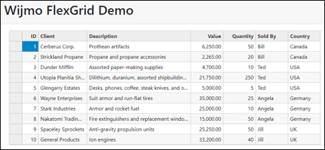
npm startOnce the app is running, you’ll see the FlexGrid component displaying the sales data:
Editing Grid Cell Values with FlexGrid
Cell editing is an out-of-the-box feature in FlexGrid. You can double-click the cells and start editing in place:

By default, a FlexGridColumn is editable. But you can disable editing by explicitly defining the isReadOnly property in the FlexGridColumn component:
<wj-flex-grid-column [header]="'ID'" [binding]="'id'" [width]="50" [isReadOnly]="true">
</wj-flex-grid-column>
Row Sorting with FlexGrid
By default, every FlexGrid column is sortable by ascending or descending order.
You can lock column sorting by setting the allowSorting property to false:
<wj-flex-grid-column [header]="'Client'" [binding]="'client'" [width]="150" [allowSorting]="false"></wj-flex-grid-column>Column Reordering with FlexGrid
FlexGrid comes with the ability to reposition columns out of the box freely:

Again, you can disable column reordering by setting the allowDragging property to false:
<wj-flex-grid-column [header]="'Client'" [binding]="'client'" [width]="150" [allowDragging]="false">
</wj-flex-grid-column>
Importing Excel Data with FlexGrid
Let’s see how to import Excel data into our FlexGrid component.
First, append the following HTML segment after the card-body div in the render function:
<div className="card-body">
<div class="card-footer">
  <div class="input-group">
    <div class="custom-file">
      <input type="file" id="importFile"/>
    </div>
    <div class="input-group-prepend">
      <input type="button" value="Import"/>
    </div>
  </div>
</div>
Run the application and notice the import section at the bottom of the page:

Now we should tell the Import button to import the file into our FlexGrid component. Add the onClick function to the input element and pass the name of the function as “load”:
<input type="button" value="Import" (click)="load()"/>Then add a new load function inside the component class in the flexgrid-demo.ts file. Here, we’ll first obtain the full path of the user-selected file:
load() {
    let fileInput = <HTMLInputElement>document.getElementById('importFile');
    if (fileInput.files[0]) {

    }
}
Now, add an import directive to the Wijmo libraries, which will handle the Excel functionalities we want to implement:
import * as wjcXlsx from '@grapecity/wijmo.xlsx';
import * as wjcGridXlsx from '@grapecity/wijmo.grid.xlsx';
Back to the load function, add a call to the loadAsync function of the Wijmo library to load the file’s contents into the FlexGrid:
load() {
    let fileInput = <HTMLInputElement>document.getElementById('importFile');
    if (fileInput.files[0]) {
        wjcGridXlsx.FlexGridXlsxConverter.loadAsync(this.flex, fileInput.files[0], { includeColumnHeaders: true });
    }
}
Rerun the app and test the import feature.
npm startOpen Excel and create a new Demo.xlsx file with the following contents:

Back to our Angular app, click Choose File, choose Demo.xlsx, and click Import to see the result:

Exporting Grid Data to Excel with FlexGrid
Finally, let’s see what’s needed to export data from our FlexGrid to Excel.
First, add the following HTML snippet after the Import button code to add a new Export button:
<div class="input-group-append">
  <input type="button" value="Export" (click)="save()"/>
</div>
Note that the click event handler is pointing to the save function. Let’s implement this function inside the component class:
save() {

}
To export FlexGrid data to an Excel file, we need to call the saveAsync function of the FlexGridXlsxConverter class:
save() {
  wjcGridXlsx.FlexGridXlsxConverter.saveAsync(this.flex,
    {
      includeColumnHeaders: true,
      includeCellStyles: false,
      formatItem: null
    },
    'FlexGrid.xlsx');
}
Run the app once again and test the export button:

Now you can open the Excel file exported by the FlexGrid component:

This demo barely scratches the surface of the FlexGrid component. You can explore the GrapeCity page for the Wijmo family of JavaScript UI Components and Tools to find complete documentation, demos, and examples written for Angular, React, and Vue. Also, if you would like to see the example code for this demo, it can be found here.
Wrapping Up
You can create and use Angular-based smart data tables in various ways. Angular is a rich JavaScript framework and is relatively more complicated than competing JavaScript libraries, which is why some approaches require far more manual work than others. Still, you can’t tell the difference until you have already spent precious time customizing them.
There’s plenty of free and open-source table libraries that are decent for everyday needs. We’ve seen how to implement one of them in this article. However, when it comes to business and enterprise projects, you don’t want to distract developers and waste their time developing workarounds, additional features, or configuration. This is why a commercial library component suite like Wijmo ensures a solid return on investment.
Built to be framework-agnostic, Wijmo includes full support for Angular, AngularJS, ReactJS, and VueJS, with the same grid across frameworks. This consistency across different libraries means freedom of choice and the ability to save time and development effort if your organization decides to migrate to another JavaScript framework.
Try all of Wijmo's specialized controls with the Enterprise trial! Download it Today!
Tags:
Related Blogs
Try Our JavaScript UI Components & Datagrid

Joel Parks