Spread.NET 15 features 17 new Enhanced Sparkline Functions, which are built-in Visual Functions designed to produce data visualizations for dashboards and reports. A Visual Function is a formula function that users can type directly in a cell to create a data visualization in the cell, referencing other cells to provide the arguments with the data to visualize.
These sparkline functions are also supported by SpreadJS, the JavaScript version of Spread for modern web applications. This feature is especially useful with the new Enhanced Camera Shape for creating rich interactive dashboards that conditionally display various Visual Functions based on user input in a cell. These new Enhanced Sparkline Functions are covered in the following sections:
- Area
- BoxPlot
- Bullet
- Cascade
- GaugeKPI
- HBar and VBar
- HistogramSparkline
- Image
- Month and Year
- Pareto
- Pie
- Scatter
- Spread
- Stacked
Area

Figure 1 AreaSparkline Example
AreaSparkline creates an area chart in the cell, which is useful for comparing trends in values across several categories, departments, regions, etc.
AreaSparkline Syntax
=AREASPARKLINE(points, [min, max, line1, line2, colorPositive, colorNegative])
- points (required): Range or array of values to plot in the area chart. If a value is not a valid number, it will be treated as 0.
- min (optional): A number that represents the minimum value of the sparkline. The default value is the minimum value in the range.
- max (optional): A number that represents the maximum value of the sparkline. The default value is the maximum value in the range.
- line1 (optional): A number that represents a horizontal line's vertical position. The line does not exist by default.
- line2 (optional): A number that represents another horizontal line's vertical position. The line does not exist by default.
- colorPositive (optional): A string that represents the color of the area in which the value is positive. The default value is "#787878".
- colorNegative (optional): A string that represents the color of the area in which the value is negative. The default value is "#CB0000".
You can specify only the points argument, or you can specify any optional argument to override the default value. The Area chart rendered in the cell shows positive and negative values using different colors.
BoxPlot
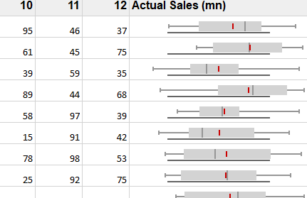
Figure 2 BoxPlotSparkline Example
BoxPlotSparkline is useful for showing distributions of values to determine the variability or dispersion of the data. BoxPlotSparkline takes up less space than a histogram or density plot, and is useful for comparing distributions between many groups or datasets.
BoxPlotSparkline Syntax
=BOXPLOTSPARKLINE(points, [boxPlotClass, showAverage, scaleStart, scaleEnd, acceptableStart, acceptableEnd, colorScheme, style, vertical])
- points (required): A reference that represents the cell range that contains the values, such as "A1:A4".
- boxPlotClass (optional): The box plot class to render. One of the following:
boxPlotClass
- (default): Q1–>25% percentile, Q3–>75% percentile, IQR–>Q3-Q1. This is the default if boxPlotClass is not specified.
- 5ns: whisker ends at minimum and maximum, median, no outliers.
- 7ns: whisker ends at 2% percentile and 98% percentile, hatch marks at 9% percentile and 91% percentile, outliers beyond 2% percentile and 98% percentile.
- tukey: whisker ends at a value (the minimum of the points between Q1 and Q1 - 1.5 * IQR, use the point if it exists or use the minimum) and a value (the maximum of the points between Q3 and Q3 + 1.5 * IQR, use the point if it exists or use the maximum), outliers beyond Q1 - 1.5 * IQR and Q3 + 1.5 * IQR, and extreme outliers beyond Q1 - 3 * IQR and Q3 + 3 * IQR.
- bowley: whisker ends at minimum and maximum, hatch marks at 10% percentile and 90% percentile, no outliers.
- sigma3: whisker ends at a value (average - 2 StDev > scaleStart ? average - 2 StDev : minimum) and a value (average + 2 StDev < scaleEnd ? average = 2 StDev : maximum), box at average +/- stdev, outliers beyond average - 2 * StDev and average + 2 * StDev, and extreme outliers beyond average - 3 * StDev and average + 3 * StDev.
- showAverage (optional): A boolean that represents whether to show the average. The default value is FALSE.
- scaleStart (optional): A number or reference that represents the minimum boundary of the sparkline, such as 1 or "A6". The default value is the minimum of all values.
- scaleEnd (optional): A number or reference that represents the maximum boundary of the sparkline, such as 8 or "A7". The default value is the maximum of all values.
- acceptableStart (optional): A number or reference that represents the start of the acceptable line, such as 3 or "A8". The default value is None.
- acceptableEnd (optional): A number or reference represents the end of the acceptable line, such as 5 or "A9". The default value is None.
- colorScheme (optional): A string that represents the color of the sparkline's box. The default value is "#D2D2D2".
- style (optional): A number or reference that represents the sparkline style. The default value is 0 (Classical). The style can be 0 or 1.
style
- 0: the whisker is a line and outlier is a circle.
- 1: the whisker is a rectangle and outlier is a line.
vertical (optional): A boolean that represents whether to display the sparkline vertically. The default value is FALSE.
BoxPlotSparkline is very versatile, supporting many optional arguments to specify how the box plot should be drawn, including box plot classes tukey, bowley, sigma3, and more, as well as different whisker styles and color schemes.
Bullet

Figure 3 BulletSparkline Example
BulletSparkline is useful for displaying performance data (e.g. Key Performance Indicators) across a set of categories for comparison, such as salespersons, regions, product lines, etc.
BulletSparkline Syntax
=BULLETSPARKLINE(measure, target, maxi, [good, bad, forecast, tickunit, colorScheme, vertical, measureColor, targetColor, maxiColor, goodColor, badColor, forecastColor, allowMeasureOverMaxi, barSize])
- measure (required): Number or reference that represents the length of the measure bar, such as 5 or "A1".
- target (required): Number or reference that represents the location of the target line, such as 7 or "A2".
- maxi (required): Number or reference that represents the maximum value of the sparkline, such as 10 or "A3".
- good (optional): Number or reference that represents the length of the good bar, such as 3 or "A4". The default value is 0.
- bad (optional): Number or reference that represents the length of the bad bar, such as 1 or "A5". The default value is 0.
- forecast (optional): Number or reference that represents the length of the forecast line, such as 8 or "A6". The default value is 0.
- tickunit (optional): Number or reference that represents the tick unit, such as 1 or "A7". The default value is 0.
- colorScheme (optional): String that represents the color scheme for generating a group of colors to display the sparkline. The default value is "#A0A0A0".
- vertical (optional): Boolean that represents whether to display the sparkline vertically. The default value is false.
- measureColor (optional): String that represents the color of measure bar. The default value is "#252525".
- targetColor (optional): String that represents the color of target line. The default value is "#A0A0A0".
- maxiColor (optional): String that represents the maxi area color. The default value is "#A0A0A0".
- goodColor (optional): String that represents the good area color. The default value is "#A0A0A0".
- badColor (optional): String that represents the bad area color. The default value is "#CB0000".
- forecastColor (optional): String that represents the forecast line color. The default value is "#3690BF".
- allowMeasureOverMaxi (optional): Boolean that represents if the measure could exceed maxi area. The default value is false.
- barSize (optional): Number that represents that the percentage of bar width/height according to the cell height/ width. This value must be greater than 0 and less than or equal to 1. The default value is 0.6.
BulletSparkline requires specifying the measure, target, and maxi values, with all other arguments optional. BulletSparkline presents a lot of information in a small space and is ideal for dashboards and tables of performance measures.
Cascade

Figure 4 CascadeSparkline Example
CascadeSparkline is useful for analyzing a value over time, such as yearly sales, total profit, net tax, etc. CascadeSparkline is widely used in finance, sales, legal, construction, and more.
CascadeSparkline Syntax
=CASCADESPARKLINE(pointsRange, [pointIndex, labelsRange, minimum, maximum, colorPositive, colorNegative, vertical, itemTypeRange, colorTotal])
- pointsRange (required): A reference that represents the range of cells that contains values, such as "B2:B8".
- pointIndex (optional): A number or reference that represents the points index. The pointIndex is >= 1 such as 1 or "D2". The default value is determined by the order of points in pointsRange.
- labelsRange (optional): A reference that represents the range of cells that contains the labels, such as "A2:A8". The default value is no label.
- minimum (optional): A number or reference that represents the minimum values of the display area. The default value is the minimum of the sum (the sum of the points' value), such as -2000. The minimum you set must be less than the default minimum; otherwise, the default minimum is used.
- maximum (optional): A number or reference that represents the maximum values of the display area. The default value is the maximum of the sum (the sum of the points' value), such as 6000. The maximum you set must be greater than the default maximum; otherwise, the default maximum is used.
- colorPositive (optional): A string that represents the color of the first or last positive sparkline's box (this point's value is positive). The default value is "#8CBF64". If the first or last box represents a positive value, the box's color is set to colorPositive. The middle positive box is set to a lighter color than colorPositive.
- colorNegative (optional): A string that represents the color of the first or last negative sparkline's box (this point's value is negative). The default value is "#D6604D". If the first or last box represents the negative value, the box's color is set to colorNegative. The middle negative box is set to a lighter color than colorNegative.
- vertical (optional): A boolean that represents whether the box's direction is vertical or horizontal. The default value is FALSE. You must set vertical to true or false for a group of formulas because all the formulas represent the entire sparkline.
- itemTypeRange (optional): An array or reference that represents all the item types of the data range. The values should be {"-", "+", "=", "#"} or "A1:A7" that reference the value of {"+", "-", "=", "#"}, where "+" indicates positive change, "-" indicates negative change, "=" indicates total columns, and "#" indicates to skip painting the item.
- colorTotal (optional): A string that either represents the color of the last sparkline's box when itemTypeRange does not exist or represents the color of the total sparkline's box when itemTypeRange exists.
CascadeSparkline is excellent for accounting, budgeting, inventory management, and much more. CascadeSparkline can render horizontal or vertical, and provides precise control using the itemRangeType argument.
GaugeKPI

Figure 5 GaugeKPISparkline Example
GaugeKPISparkline displays a gauge with various colored regions and a line indicator. Gauge KPI is useful for displaying Key Performance Indicator results for comparison across categories, employees, etc.
GaugeKPISparkline syntax
=GAUGEKPISPARKLINE(targetValue, currentValue, minValue, maxValue, [showLabel, targetValueLabel, currentValueLabel, minValueLabel, maxValueLabel, fontArray, minAngle, maxAngle, radiusRatio, gaugeType, colorRange,…])
- targetValue (required): Number or reference to the target value. The target value must be between minValue and maxValue.
- currentValue (required): Number or reference to the current value. The current value must be between minValue and maxValue.
- minValue (required): Number or reference to the min value. The minValue must be less than maxValue.
- maxValue (required): Number or reference to the max value. The maxValue must be greater than minValue.
- showLabel (optional): Boolean value or reference indicating whether to show the labels of targetValue, currentValue, minValue and maxValue. If the showLabel is false, no labels will show. If the showLabel is true, when the cell width or height is not sufficient to show one label, the graph and other labels will show, until the cell has enough width and height to show the graph and all labels. The default value is true.
- targetValueLabel (optional): String or reference to the displayed label of targetValue. The default value is the same as the targetValue.
- currentValueLabel (optional): String or reference to the displayed label of currentValue. The default value is the same as the currentValue.
- minValueLabel (optional): String or reference to the displayed label of minValue. The default value is the same as the minValue.
- maxValueLabel (optional): String or reference to the displayed label of maxValue. The default value is the same as the maxValue.
- fontArray (optional): Array or reference to four font string items that follow the CSS font format: first for targetValueLabel (default value is "16px Calibri"), second for currentValueLabel (default value is "bold 22px Calibri"), third for minValueLabel (default value is "12px Calibri") and fourth for maxValueLabel (default value is "12px Calibri"). Only works when the showLabel is true.
- minAngle (optional): Number or reference to the min angle value of circle type. The minAngle must be less than maxAngle. (0 is the 12 o'clock position, -90 is the 9 o'clock position, 90 is the 3 o'clock position, -180 and 180 are the 6 o'clock position). Only works when the gaugeType is 0 (The circle type). The default value is -90.
- maxAngle (optional): Number or reference to the max angle value. The maxAngle must be greater than minAngle. (0 is the 12 o'clock position, -90 is the 9 o'clock position, 90 is the 3 o'clock position, -180 and 180 is the 6 o'clock position). The default value is 90. Only works when the gaugeType is 0 (The circle type). The default value is 90.
- radiusRatio (optional): Number or reference to ratio between the inner circle radius and the outer circle radius. This value must be between 0 and 1. The outer circle radius value is decided by the cell size. Only works when the gaugeType is 0 (The circle type). The default value is 0.
-
gaugeType (optional): Number or reference to the KPI sparkline type. One of the following:
gaugeType
- 0 (default): circle type
- 1: verticalBar
- 2: horizontalBar.
-
colorRange (optional): Array or reference specifying the special color range. The first item is the startValue of the range. The second item is the endValue of the range. The third item is the color of the range between startValue and endValue. The startValue must be less than the endValue and both must be between minValue and maxValue. This argument can be repeated to specify multiple color ranges in the gauge (each specifying startValue, endValue, and color). The default color range is from minValue to maxValue filling with light gray color.
GaugeKPISparkline is ideal for creating dashboards or reports for comparing Key Performance Indicators across salespeople, regions, departments, product lines, or any other category. Find the important categories with low or high performance with just a glance.
HBar and VBar

Figure 6 VBarSparkline Example
HBarSparkline and VBarSparkline are useful for creating customized data bars in cells to represent values.
HBarSparkline and VBarSparkline syntax
=HBARSPARKLINE(value, [colorScheme, axisVisible, barHeight])
=VBARSPARKLINE(value, [colorScheme, axisVisible, barWidth])
- value (required): Number or reference that represents the length of the bar, such as 0.3 or "A1". If value is greater than 100% or smaller than -100%, an arrow is displayed.
- colorScheme (optional): String that represents the color of the bar. The default value is "gray".
- axisVisible (optional): Boolean that represents whether to show the axis. The default value is true.
- barHeight (optional): Number that represents the percentage of bar height according to the cell height. This value must be greater than 0 and less than or equal to 1.
- barWidth (optional): Number that represents the percentage of bar width according to the cell width. This value must be greater than 0 and less than or equal to 1.
You can specify custom colors, axis, and/or custom bar height and width. Use HbarSparkline for horizontal bars in the cells with positive values starting at the left of the cell and negative values starting at the right of the cell, or use VbarSparkline for vertical bars in the cells with positive values starting at the bottom of the cell and negative values starting at the top of the cell.
HistogramSparkline

Figure 7 HistogramSparkline Example
HistogramSparkline displays the counts of values that fall within various ranges of values. A Histogram is useful for finding patterns in the distribution of values across a set of data.
HistogramSparkline syntax
=HISTOGRAMSPARKLINE(dataRange, [continuous, paintLabel, scale, barWidth, barColor, labelColor, edgeColor])
- dataRange (required): Array or range of values, such as "{1,2,2,3,3}" or "A1:C6". If a cell value isn't a valid number, it will be ignored.
- continuous (optional): If it's true, the histogram is continuous. If it's false, the histogram is discrete.
- paintLabel (optional): Boolean that represents whether to show the data label.
- scale (optional): Number that represents the data binning width when the histogram is continuous. Must be greater than 0.
- barWidth (optional): Number that represents the percent of bar width according to the average bar width. This value must be greater than 0 and less than or equal to 1.
- barColor (optional): String that represents the bar color.
- labelFontStyle (optional): String that represents the data label CSS font style. It supports custom font style, font weight, font family, font size.
- labelColor (optional): String that represents the data label font color.
- edgeColor (optional): String that represents the color of bar edge.
HistogramSparkline is useful for finding different patterns by looking at the same underlying data using various scale values, and scale can use a cell reference so the user can adjust it.
Image

Figure 8 ImageSparkline Example
ImageSparkline displays a specified image in the cell from a URL or base-64 encoded string and using the specified size and display mode.
ImageSparkline syntax
=IMAGE(source, [mode, height, width, clipX, clipY, clipHeight, clipWidth, vAlign, hAlign])
- source (required): String or reference to the URL location of the image on the web, or a base64-encoded image string.
-
mode (optional): A number that represents the image fit mode. One of the following:
mode
- 1: Keep Scale To Fit
- 2: Entire Image To Fit
- 3: Origin Size To Fit
- 4: Custom Size To Fit
-
height (optional): Number or reference to the height of image when the mode is 4.
- width (optional): Number or reference to the width of image when the mode is 4.
- clipX (optional): The X-axis coordinate of the top left corner of the sub-rectangle of the source image to draw into the destination context.
- clipY (optional): The Y-axis coordinate of the top left corner of the sub-rectangle of the source image to draw in the cell.
- clipHeight (optional): The height of the sub-rectangle of the source image to draw in the cell.
- clipWidth (optional): The width of the sub-rectangle of the source image to draw in the cell.
-
vAlign (optional): This value indicates the vertical alignment of the image. One of the following:
vAlign
-
0: Top
- 1: Center
- 2: Bottom
hAlign (optional): This value indicates the horizontal alignment of the image. One of the following:
hAlign
- 0: Left
- 1: Center
- 2: Right
ImageSparkline can display the whole image in the cell with scaling, or it can display a clipped portion of the image using the optional arguments to specify which part of the image to display.
Month and Year

Figure 9 MonthSparkline Example
MonthSparkline and YearSparkline display the days in a month or year as a grid of colored squares. The colors can be determined by a range of values for each day and show colors representing empty values, minimal values, average values, and maximal values, or by specifying a range of color values for each day.
MonthSparkline and YearSparkline syntax
=MONTHSPARKLINE(year, month, dataRange, emptyColor, startColor, middleColor, endColor)
=YEARSPARKLINE(year, dataRange, emptyColor, startColor, middleColor, endColor)
OR
=MONTHSPARKLINE(year, month, dataRange, colorRange)
=YEARSPARKLINE(year, dataRange, colorRange)
- year (required): The full year number, such as 2015.
- month (required): The month number, such as 3.
- dataRange (required): The reference represents a range where the first column is the date and the second column is the number, such as "A1:B400".
- emptyColor (required): The color string represents days that have no value or zero value, such as "lightgray".
- startColor (required): The color string represents the day where the value is a minimal value, such as "lightgreen".
- middleColor (required): The color string represents the day where the value is around the average of minimum and maximum, such as "green".
- endColor (required): The color string represents the day where the value is a maximal value, such as "darkgreen".
- colorRange (required): Array or reference containing color strings for each day.
MonthSparkline and YearSparkline are ideal for displaying a set of values across time to quickly find patterns across seasons, quarters, business cycles, etc.
Pareto

Figure 10 ParetoSparkline Example
ParetoSparkline is useful for displaying and comparing sorted sets of values using a pareto distribution curve ParetoSparkline renders the bars in the cells adjacent to the previous one to create the pareto distribution curve.
ParetoSparkline syntax
=PARETOSPARKLINE(points, [pointIndex, colorRange, target, target2, highlightPosition, label, vertical, targetColor, target2Color, labelColor, barSize])
- points (required): Reference that represents the range of cells that contains the values, such as "B2:B7".
- pointIndex (optional): Number or reference that represents the segment's index in points. The pointIndex is >= 1 such as 1 or "D2". The default value is determined by the order of values in points.
- colorRange (optional): Reference that represents the range of cells containing the color for the segment box, such as "D2:D7". The default value is null.
- target (optional): Number or reference that represents the "target" line position, such as 0.5. The default value is null.
- target2 (optional): Number or reference that represents the "target2" line position, such as 0.75. The default value is null.
- highlightPosition (optional): Number or reference that represents the rank of the segment to be colored in red, such as 3. The default value is null.
-
label (optional): Number that represents whether and how the segment's label is displayed. The default value is 0 (no label).
label
- 0: none (no label)
- 1: cumulative percentage
- 2: single percentage
-
vertical (optional): Boolean that represents whether the box's direction is vertical. The default value is false.
- targetColor (optional): String that represents the target line color. The default value is "#FF8CBF64".
- target2Color (optional): String that represents the target2 line color. The default value is "#FFEE5D5D".
- labelColor (optional): String that represents the label fore color. The default value is "#FF000000".
- barSize (optional): Number that represents that the percentage of bar width/height according to the cell height/ width. This value must be greater than 0 and less than or equal to 1.
ParetoSparkline is useful for finding areas to focus on for process improvement that will maximize the impact and optimize resources.
Pie

Figure 11 PieSparkline Example
PieSparkline creates a pie chart in the cell, which is useful for displaying relative percentages across categories, departments, regions, etc.
PieSparkline syntax
=PIESPARKLINE(percentage, [color1, color2,…])
- percentage (required): Values for the pie slices. If the param is a cell (such as "A1"), the percentage is the cell's value. If the param is a range (such as "A1:B3"), the percentage is the result of each cell's value divided by the sum of the range. If the param is a percent value (such as "30%" or 0.3), the percentage is the value. If the parsed value is invalid, it will be treated as 0.
- color1, color2, … (optional): String value representing the color of each sector. If the color parameter count is greater than or equal to the range count, values and colors have a one-to-two correspondence; redundant colors will be ignored. If the color parameter count is less than the range count, the given colors are reused and a linear gradient is used to ensure each sector has a different color. If there is no color, uses "darkgray" as default.
PieSparkline is useful for showing the relative percentage contribution of various categories to a total.
Scatter

Figure 12 ScatterSparkline Example
ScatterSparkline is useful for plotting and comparing two sets of associated values across a set of data.
ScatterSparkline syntax
=SCATTERSPARKLINE(points1, [points2, minX, maxX, minY, maxY, hLine, vLine, xMinZone, xMaxZone, yMinZone, yMaxZone, tags, drawSymbol, drawLines, color1, color2, dash])
- points1 (required): Range or array of first series of x,y data, such as "H1:I6". If the row count is greater than or equal to the column count, get data from the first two columns; the first column contains x values, and the second column contains y values. Otherwise, get data from the first two rows; the first row contains x values, and the second row contains y values.
- points2 (optional): The second series of x,y data. It is a range, such as "J1:K6". If the row count is greater than or equal to the column count, get data from the first two columns; the first column contains x values, and the second column contains y values. Otherwise, get data from the first two rows; the first row contains x values, and the second row contains y values.
- minX (optional): The x minimum limit of both series; each series has its own value if it is omitted.
- maxX (optional): The x maximum limit of both series; each series has its own value if it is omitted.
- minY (optional): The y minimum limit of both series; each series has its own value if it is omitted.
- maxY (optional): The y maximum limit of both series; each series has its own value if it is omitted.
- hLine (optional): The position of the horizontal axis; there is no line if it is omitted.
- vLine (optional): The position of the vertical axis; there is no line if it is omitted.
- xMinZone (optional): The x minimum value of the gray zone; there is no gray zone if any of these four zone params are omitted.
- xMaxZone (optional): The x maximum value of the gray zone; there is no gray zone if any of these four zone params are omitted.
- yMinZone (optional): The y minimum value of the gray zone; there is no gray zone if any of these four zone params are omitted.
- yMaxZone (optional): y maximum value of the gray zone; there is no gray zone if any of these four zone params are omitted.
- tags (optional): If true, mark the point where the y value is the maximum of the first series as "#0000FF", and mark the point where the y value is the minimum of the first series as "#CB0000". The default value is false.
- drawSymbol (optional): If true, draw each point as a symbol. The symbol of the first series is a circle, and the symbol of the second series is a square. The default value is true.
- drawLines (optional): If true, connect each point with a line by sequence in each series. The default value is false.
- color1 (optional): Color string of the first series of points; the default value is "#969696".
- color2 (optional): Color string of the second series of points; the default value is "#CB0000".
- dash (optional): If true, the line is a dashed line; otherwise, the line is a full line. The default value is false.
ScatterSparkline is useful for finding relationships between variables.
Spread

Figure 13 SpreadSparkline Example
SpreadSparkline displays lines or dots to indicate the frequency of occurrence of a set of values.
SpreadSparkline syntax
=SPREADSPARKLINE(points, [showAverage, scaleStart, scaleEnd, style, colorScheme, vertical])
- points (required): Array or reference that represents the range values, such as "A1:A10".
- showAverage (optional): Boolean that represents whether to display the average. The default value is false.
- scaleStart (optional): Number or reference that represents the minimum boundary of the sparkline. The default value is the minimum of all values.
- scaleEnd (optional): Number or reference that represents the maximum boundary of the sparkline. The default value is the maximum of all values.
-
style (optional): Number or reference for the style of the spread sparkline. One of the following:
style
- 1: Stacked - line from center to two sides
- 2: Spread - dot from center to two sides
- 3: Jitter - dot whose location is random
- 4 (default): Poles - line from one side to another side
- 5: StackedDots - dot from one side to another side
- 6: Stripe - line whose length is equal
-
colorScheme (optional): String that represents the color of the sparkline's box. The default value is "#646464".
- vertical (optional): Boolean that represents whether to display the sparkline vertically. The default value is false.
SpreadSparkline is useful for finding trends and outliers.
Stacked

Figure 14 StackedSparkline Example
StackedSparkline displays a stacked bar in the cell that shows cumulative values, like a stacked column or bar chart.
StackedSparkline syntax
=STACKEDSPARKLINE(points, [colorRange, labelRange, maximum, targetRed, targetGreen, targetBlue, targetYellow, color, highlightPosition, vertical, textOrientation, textSize])
- points (required): Array or reference containing all the values, such as "A1:A4".
- colorRange (optional): Array or reference containing all the colors, such as "B1:B4". The default value is generated by color.
- labelRange (optional): Reference that represents the range of cells containing all the labels, such as "C1:C4". The default value is an empty string (no labels).
- maximum (optional): Number that represents the maximum value of the sparkline. The default value is the sum of all positive values.
- targetRed (optional): Number that represents the location of the red line. The default value is an empty string (no red line).
- targetGreen (optional): Number that represents the location of the green line. The default value is an empty string (no green line).
- targetBlue (optional): Number that represents the location of the blue line; the default value is an empty string (no blue line).
- targetYellow (optional): Number that represents the location of the yellow line. The default value is an empty string (no yellow line).
- color (optional): A string that represents the color for generating colors if colorRange is omitted. The default value is "#646464".
- highlightPosition (optional): Number that represents the index of the highlighted area. The default value is an empty string (no highlight).
- vertical (optional): Boolean that represents whether to display the sparkline vertically. The default value is false.
-
textOrientation (optional): Number that represents the orientation of the label text. One of the following:
textOrientation
- 0 (default): Horizontal
- 1: Vertical
-
textSize (optional): Number that represents the size (in px) of the label text. The default value is 10.
StackedSparkline is useful for comparing two or more series of values across a common variable or set of categories.
Vari

Figure 15 VariSparkline Example
VariSparkline is useful for comparing two sets of data and displaying the difference or variance between them.
VariSparkline syntax
=VARISPARKLINE(variance, [reference, mini, maxi, mark, tickunit, legend, colorPositive, colorNegative, vertical])
- variance (required): Number or reference that represents the length of the bar, such as 2 or "A1".
- reference (optional): Number or reference that represents the location of the reference line, such as 0 or "A2". The default value is 0.
- mini (optional): Number or reference that represents the minimum values of the sparkline, such as -5 or "A3". The default value is -1.
- maxi (optional): Number or reference that represents the maximum values of the sparkline, such as 5 or "A4". The default value is 1.
- mark (optional): Number or reference that represents the position of the mark on the line, such as 3 or "A5". The default value is 0.
- tickunit (optional): Number or reference that represents the tick unit, such as 1 or "A6". The default value is 0.
- legend (optional): Boolean that represents whether to display the text. The default value is false.
- colorPositive (optional): String that represents the color scheme for when the variance is larger than the reference. The default value is "green".
- colorNegative (optional): String that represents the color scheme for when the variance is smaller than the reference. The default value is "red".
- vertical (optional): Boolean that represents whether the box's direction is vertical or horizontal. The default value is false.
VariSparkline displays the variance as a positive percentage with a green bar extending to the right of the center axis, or as a negative percentage with a red bar extending to the left of the center axis.

Sean Lawyer