Expand your data visualization toolset with these great new features from SpreadJS 12! Not only have we added animation to the most common chart types, but we've also added three new charts: radar, treemap, and sunburst.
Add loading and updating animation to JavaScript charts
With SpreadJS' new seamless loading and updating animation for column, bar, line, and pie chart, your dashboards will truly shine.
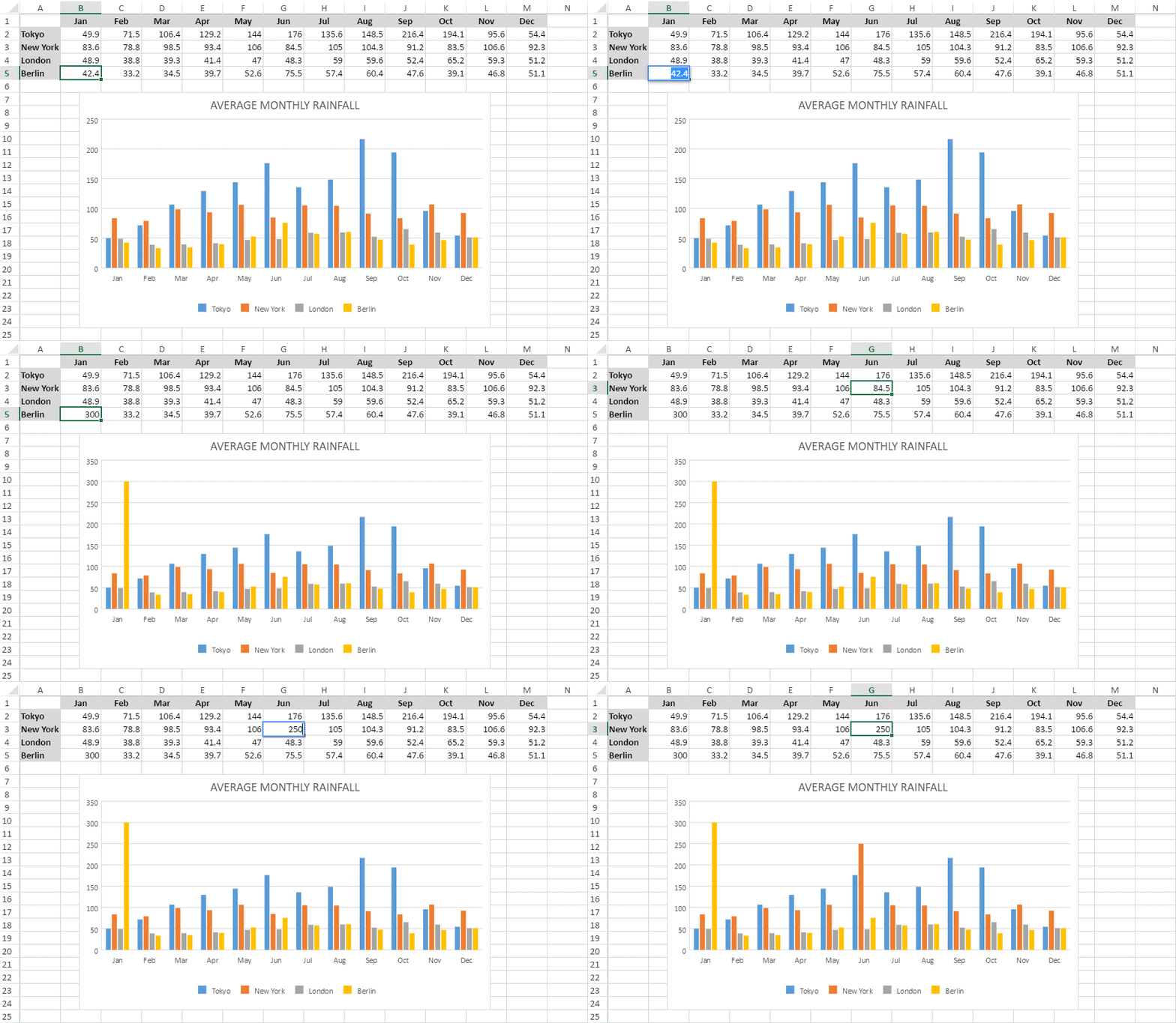
In this example, we have data for monthly rainfall for several geographical regions, and we need to compare which country witnessed the highest and the lowest rainfall in a particular month. When we plot the data in the spreadsheet and create the chart, the additional animation allows us to more easily visualize data in real-time and make informed decisions quickly and efficiently.
You can add an existing animation in a worksheet based on your requirements as shown here:

You can also update the animation in the worksheet by dynamically changing the data to identify trends in real-time:

Learn more about chart animation
New Charts: Radar, Sunburst, and Treemap Charts
These new charts (also available in Excel) have full Spread Web Designer support, and you'll be able to seamlessly import and export Excel files that include these charts.
Radar Charts
Radar charts displays multivariate observations with an arbitrary number of variables; it's often used to show personality traits or test scores. Radar charts are typically used to compare between two or more entities over a range of characteristics. In a radar chart, three or more quantitative variables are represented on axes with each category having its own value axis radaiating from the center point. Lines are used to connect the series values and the relative position or angle of the axes is usually unpredictable.
SpreadJS supports three types of radar charts:
1) Basic radar chart
2) Filled radar chart
3) Radar chart with markers
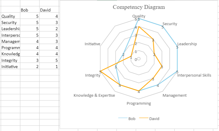
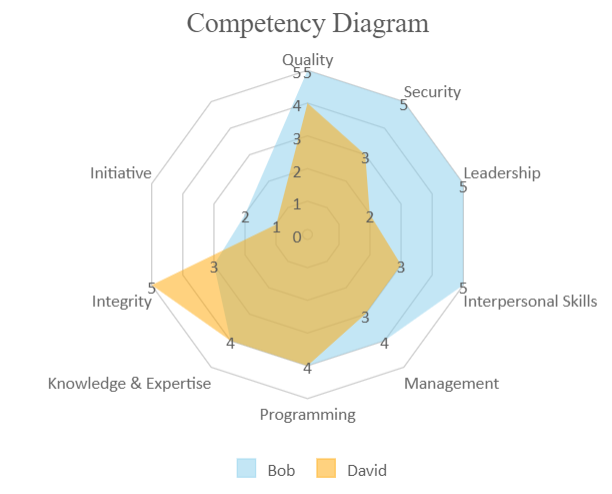
In this example, Bob and David's scores are depicted for different competencies. When we've plotted their scores on the radar chart, we can see how Bob's strengths (in blue) differ from David's strengths (in orange).


In addition to these options, SpreadJS includes customization for legend, labels, title, axes, and color.
Try the Radar Chart Demo | Radar Chart Documentation
Sunburst Charts
A sunburst chart visualizes hierarchical data from a root node (center) outward to lower hierarchies. A segment of the inner circle is a parent to the segments of the outer circle which lie within the angular sweep of the parent. Sunburst charts are great for showing how one category or level (ring) is broken into its contributing pieces.
In the example below, the world population is expressed by continent; region; and country. The distribution of population becomes immediately clear when we see the prominence of some colors:
Try the Sunburst Demo | Read Sunburst Documentation
Treemap Chart
A treemap chart displays hierarchical information combined with relative quantity. They're especially useful if your app has space constraints and you need to plot thousands of datapoints with numerous entities defined in the tables in the worksheet.
Here's a look at the world population chart as expressed in a treemap:
