New Release! ComponentOne 2019 v2
What's New in ComponentOne 2019 v2
We're pleased to announce the second major release of 2019—ComponentOne 2019 v2. For the 2019 v2 release, ComponentOne Studio Enterprise and ComponentOne Ultimate continue to grow and address the needs of .NET, mobile, and web developers.
In the previous release, we added Wijmo, a suite of 60+ JavaScript UI controls with full framework support, into the Studio Enterprise (and Ultimate) subscriptions. We've expanded this further in the newest release by adding two new .NET Core and .NET Standard service components into ComponentOne Ultimate. .NET Standard service components are unique because they can run on many different platforms including desktop (full .NET framework), mobile (Xamarin) and the web (ASP.NET Core or MVC). These service components enable developers to more efficiently manage large data sets for ETL (extraction, transformation, and loading) and extracting and parsing text from HTML and other semi-structured text sources.
DataEngine for .NET Core
The new ComponentOne DataEngine (C1DataEngine) for .NET Core uses in-memory caching technology to deliver faster extraction, transformation, and loading of large and complex data sets.
- Fetch and query millions of records in a second or less.
- Sort, filter, group, and aggregate data at runtime without needing to hit the server.
- Blend data from multiple data sources into a single collection (SQL, CSV, JSON, .NET Objects).
- Any .NET Core or ASP.NET Core application supported.
TextParser for .NET Standard
The new ComponentOne TextParser (C1TextParser) for .NET Standard enables you to efficiently extract data from plain text or HTML files that can then be stored in a table of records or transferred to another system.
- Extract and integrate data from semi-structured sources such as emails and invoices, into your workflows.
- Parse data using a variety of different techniques (Starts-After-Continues-Until, HTML and template-based with regular expression matching)
- Extract repeated fields from HTML files to generate a data table of records.
- Supported with any .NET Framework, .NET Core, ASP.NET Core, UWP or Xamarin application.
C1DataEngine and C1TextParser can both be downloaded from the service components tile in the ComponentOne Studio Installer. They are licensed as part of the ComponentOne Ultimate Bundle. See ComponentOne Studio Enterprise Feature comparison & pricing here.
Support for .NET Framework 4.5.2
In addition to adding new libraries for .NET Standard and .NET Core, we continue to update ComponentOne Studio components to support the latest .NET Framework. Microsoft has ended support for .NET 4.5.1, and based upon feedback from an earlier survey, we decided to update all ComponentOne .NET controls to .NET 4.5.2. In this release, we've updated all WinForms and ASP.NET (MVC and Web Forms) controls. We will finish updating WPF controls by the next release in November.
Starting with 2019 v2, .NET 4.5.2 will be the lowest supported framework for the controls. This means that all new features and new controls will be exclusive to .NET 4.5.2, however, we will continue to maintain the 4.0 version of the controls for one year until 2020 v2.
Office 365 Ribbon for WinForms (beta)
We originally released the popular C1Ribbon control for WinForms more than a decade ago, and over the years we continued to add features to keep pace with Microsoft Office. This year we decided it was time to create a new ribbon control to cater to requests from our users. The new Ribbon for WinForms is built on .NET 4.5.2 and it's based on UI concepts of Office 365. With it you'll enjoy:
- New simplified view when the ribbon is collapsed.
- 20+ embedded controls including buttons, progress bars, updated galleries and more.
- Enhanced set of embedded images for buttons along with support for font and vector-based icons.
- A backstage view and status bar component.
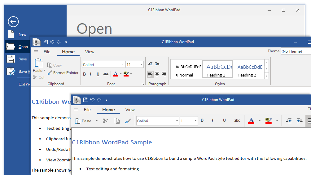
Users of the old ribbon will be pleased to know that the new ribbon also supports the same 40+ themes, or they can customize one using the C1ThemeController. We will continue to maintain the old C1Ribbon, but please consider the first version of the new ribbon as a beta this release, so that we can gather useful feedback from users and make necessary changes.
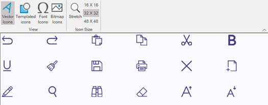
Icon Classes for Modern Apps
The new C1Icon is a set of classes which generate monochromatic icons that can be tinted and resized easily, without all the pain points that bitmap-based icons have. These icons are used internally in some controls, such as the new Ribbon for WinForms, where users are able to specify different icons through the API. C1Icon sources can be fonts, vectors (path or SVG), and images. C1Icon is supported in WinForms, WPF and UWP.
FlexGrid for WinForms Enhancements
Column Footers Enable Fixed Column Summaries
The popular FlexGrid for WinForms now supports column footers. The footer row can be fixed or scrollable as the last row in the grid. Within the footer you can easily show aggregates like sum, average, min, max, etc. Footers can also show values based on expressions, such as calculations based on several columns (ie, a grand total). This feature comes with full design-time support to configure the column footers with expressions and captions.
Now You can Use Custom Expressions in Subtotal Groups
With FlexGrid for WinForms, it is now finally possible to use custom expressions as subtotals in groups along with aggregates. For example, a group expression can contain a total, such as sum(product(quantity, price)).
FlexPivot for WinForms Supports Group Ranges
ComponentOne FlexPivot for WinForms now supports group ranges for fields. Grouped ranges allow for custom grouping of data into binned ranges, such as Ages 10-20, Ages 21-39, Ages 40-59+, or you can now create yearly quarter groups with just a simple date field. You can create grouped ranges based upon string, numeric and date fields. Once the grouped ranges are created, users can also filter upon these ranges to further enhance their pivot views.
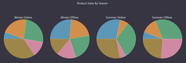
FlexPie for WinForms, WPF, ASP.NET & UWP Supports Multiple Pie Series
You can now use FlexPie to visualize more of your data in a single chart by creating multiple pie chart "series" using the same data source. To create multiple pie chart series, specify several comma-separated properties in FlexPie.binding. This feature is now supported in the WinForms, WPF, ASP.NET MVC, and UWP versions of FlexChart.
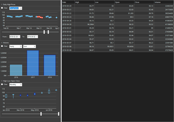
FlexChart for WinForms Custom Data Filter Sample
We added a new sample that demonstrates using a FlexChart inside a DataFilter control as a custom filter. The sample displays open, high, low, close, and volume of a stock, and it lets you filter these values by showing the values in different charts over a period of time within the data filter. You can choose to filter the data by clicking on data points, adjust the time period by using the range bar, and filter the range selection by dragging the mouse. You can see this sample in action by downloading the WinForms Edition Samples.
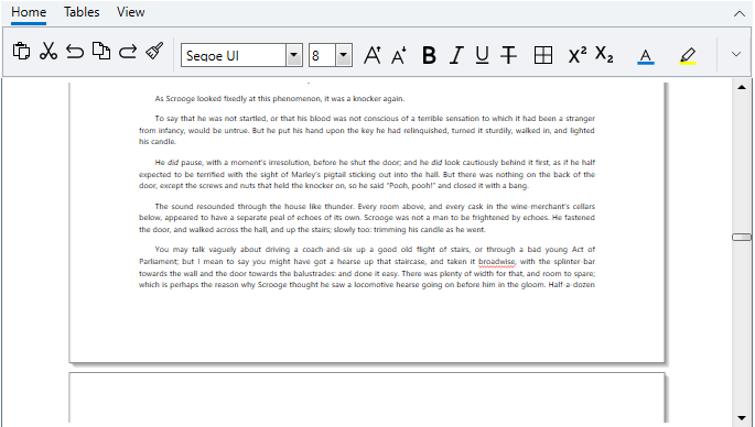
RichTextBox for WPF Gets a Simplified Ribbon Toolbar
For our favorite RichTextBox control in WPF, we've improved the ribbon-style toolbar to support a simplified look-and-feel based off the latest Microsoft Office UI. The ribbon toolbar can be expanded and collapsed just like the ribbon in Microsoft Office.
Display PDFs in Xamarin with FlexViewer
The cross-platform FlexViewer control is now partially supported for the Xamarin Platform. Use the FlexViewer to display PDF files in your Xamarin.Forms, Xamarin.Android or Xamarin.iOS mobile apps. The viewer supports page navigation and text search.
CollectionView for Xamarin Virtualization Enhancements
The CollectionView for Xamarin is enhanced with virtualization features including several new collection views designed for specific scenarios. For example, you can implement paged data virtualization by wrapping a C1VirtualCollectionView with a C1PagedCollectionView. Both of these data-providing and transforming collection views are newly added in 2019 v2 along with several others:
- C1VirtualCollectionView - provides page-like data virtualization with a GetPageAsync() method that populates the collection view. This collection resolves the problem of synchronizing requests and avoiding duplicates.
- C1PagedCollectionView - provides a paged collection view that supports the ISupportPaging interface that allows controls like C1DataPager to change the pages. This collection is a transforming collection, like C1SortCollectionView or C1FilterCollectionView.
- C1SelectManyCollectionView - this is like C1SelectCollectionView, but every item of the original collection is converted to a range of items in the resulting collection.
- C1CacheCollectionView - this collection keeps a reference to the items when they are accessed. It can be used together with C1SelectCollectionView to avoid calling the selector repeatedly for the same item, and thus improve performance.
- C1SequenceCollectionView - this collection allows composing a range of collection into one sequentially to be exposed as a single collection.
- C1EditableCollectionView – with this collection view changes made to the collection are tracked locally and aren’t committed to the source immediately. It’s similar to the .NET DataTable.
Also this release we’re introducing the EntityFrameworkVirtualCollectionView to join our EntityFrameworkCursorCollectionView. The benefit of the virtual collection view is that when you scroll a list of items, you can go directly to the last item. With the cursor collection view you need to bring the pages in one at a time (and the activity indicator displays at the bottom).
The trade off to using the new virtual collection view is that it needs to calculate the total count of items in the table, which can be an expensive database operation.
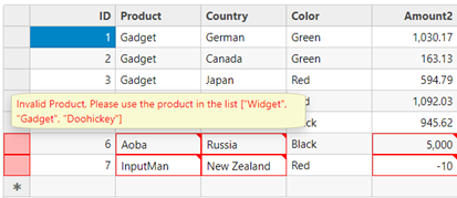
FlexGrid Enhancements for ASP.NET MVC and ASP.NET Core MVC
We've added a FlexGrid.ErrorTip property that allows you to specify a tooltip to use when showing validation errors. Use this property to customize the tooltip, or set it to null to restore the original behavior (use the cell's "title" attribute to show validation errors).
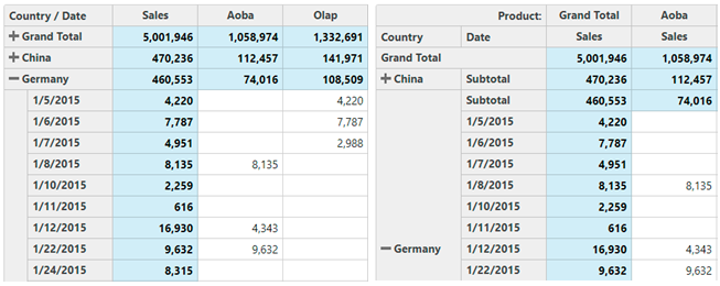
OLAP for ASP.NET MVC Enhancements
In this release, we've added two enhancements for OLAP including an outline mode and value field column headers. The PivotGrid.OutlineMode property causes the grid to show groups in outline format, allowing users to collapse rows to create a compact display. The PivotGrid.showValueFieldHeaders property causes the grid to show headers for value fields even in views that have a single value field.
FlexChart for ASP.NET MVC Enhancements
Range Area Charts
Range area charts plot two values on the Y axis for each data point and fill the area between. This is like the range bar and column charts that plot a range of two values for each data point. This new chart type is enabled by setting the chart type as 'Area' and then setting the upper and lower range values in the series binding.
Series Tooltips & ItemFormatter
The new series itemFormatter function enables you to customize appearance of data points for specific series in charts that contain multiple series. And the new series tooltip property enables you to customize the tooltip for specific series in charts that contain multiple series. In previous versions the itemFormatter and tooltip template applied to all series.
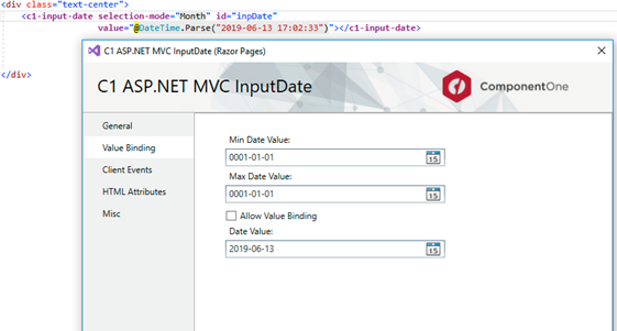
Control Wizard Updated for MVC
In this release, we've updated the control wizard to support insert and update of the controls inside Razor Page applications. This means that you can insert a ComponentOne ASP.NET MVC control at a cursor position on a .cshtml page of the Razor app by using the control wizard. Additionally, you can update a control by right-clicking inside a control declaration and choosing "Update C1 MVC Control". This feature also takes care of all resource registration and reference additions.
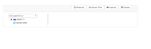
ASP.NET Web API Now Has CRUD Support for Cloud Storages
We have added built-in support for CRUD operations for the following cloud storage services: Azure, AWS (Amazon Web Services), DropBox, OneDrive, and Google Drive. You can use the API to list, upload, download, and delete files from these services.
Other WinForms Edition Enhancements
FlexGrid for WinForms
- Added SearchThroughVisibleRows property that determines to search in all rows or only visible.
- Provided the feature to save the collapsed node in C1FlexGrid as it is in the Excel format.
- In the C1FlexGrid the FilterEditorForm's MaximumSize.Height has been increased.
- Provided scrollbars in C1FlexGridGroupPanel when AutoSize = False.
- Added IC1ColumnFilter2 interface. Implementation of this interface by custom filter allows to serialize and deserialize the xml filter definition during getting or setting of C1FlexGridBase.FilterDefinition property.
- Exposed ColumnCollection.DefaultSize and RowCollection.DefaultSize properties to property grid. These properties can be reset to its default values in design time to achieve the adjusting defauls sizes for columns or rows based C1FlexGrid font size. The default value of these properties is -1.
Gauges for WinForms
- [C1BulletGraph] Added a new overloaded Render method that allows to render the C1BulletGraph control in a specified graphics with a given rectangle where the graph will be drawn.
- [C1BulletGraph] Improved performance (styles).
Input for WinForms
- [C1ComboBox] Added the MouseWheelSelection property. This property indicating whether the selected item changes using the mouse wheel when the C1ComboBox isn't dropped down.
- Added the HandleScrolling property. This property indicates whether the C1ComboBox handles the scrolling of the parent control or not.
Scheduler for WinForms
- The default print preview dialog is changed to C1RibbonPreviewDialog from the C1.Win.C1RibbonPreview.4 assembly. If this assembly is not included into project references, then C1Schedule will try to use old preview dialog from the C1.Win.C1Report.4 assembly. If you want to use new preview dialog, please make sure that added references to the C1.Win.C1RibbonPreview.4, C1.Win.C1Ribbon.4 and C1.Win.C1SplitContainer.4 assemblies.
- Added C1Calendar.DisplayRangeChanged event.
TrueDBGrid for WinForms
- The default print preview is changed to C1RibbonPreview from the C1.Win.C1RibbonPreview.4 assembly. If this assembly is not included into project references, then C1TrueDBGrid will try to use old preview from the C1.Win.C1Report.4 assembly. If you want to use new preview, please make sure that you added references to the C1.Win.C1RibbonPreview.4, C1.Win.C1Ribbon.4, and C1.Win.C1SplitContainer.4 assemblies.
Calendar for WinForms
- [C1CalendarView] Added BeginUpdate and EndUpdate methods.
- [C1DateEdit] Improved performance.
- [C1CalendarView] Added GetDisplayRange method and DisplayRangeChanged event.
- [C1DateEdit] Added CalendarSettings.DisplayRangeChanged event.
DataFilter for WinForms
- Added CollapseAll and ExpandAll methods. (TFS:366020)
- Improved performance (styles).
MultiSelect for WinForms
- [C1CheckList] Added the RightClickSelect property. This property gets or sets a value indicating whether a item can be selected by right click or not.
- [C1CheckList] Added the Radio option to the SelectionMode enum. This option allows the user to select only one item at a time and deselect the item while holding down the CTRL modifier key.
- Improved performance of modifying, adding, or removing items from a data source.
- The focus no longer moves down when the user presses the Enter key.
- C1CheckList & C1MultiSelect - added xml docs remarks.
- Added SelectedValues array of selected item values in C1CheckList and C1MultiSelect.
- [C1MultiSelect] Added ValueMemberPath property.
TreeView for WinForms
- Added support of IAccessible interface.
- Added the RightClickSelect property. This property gets or sets a value indicating whether a node can be selected by right click or not.
- Added support Shift modifier in Multiple SelectionMode when SelectionModifier is None.
- When the user changes the SelectionMode, then the C1TreeView saves the selection state, if it can.
- Added the MoveDownByEnter property. This property is protected and gets or sets a value indicating whether the focus can move down when the Enter button is pressed.
- Added the FocusCell method. This method sets focus to a node cell. Added the GetFocusedColumnIndex method. This method gets a column index of focused cell.
- Added the GetFocusedNode method. This method gets a node that contains the focused cell.
Other WPF Enhancements
- Updated project templates to support Visual Studio 2019.
FlexGrid for WPF
- Added new PrintPreview() method to display print preview window, along with PrintParameters class to allow print setting customization.
- Improved the performance when adding/removing/reseting large number of items from items source.
- Column header and unbound rows no longer invalidated when reseting the items source.
FlexSheet for WPF
- Added new PrintPreview() method to display print preview window, along with PrintParameters class to allow print setting customization.
- Added support for formulas with unbound cells in bound mode.
Excel for WPF
- Added feature that allows users to visualize loading and saving processes (.xlsx, .xls, *.csv).
Other ASP.NET MVC & ASP.NET Core MVC Enhancements
FlexGrid for ASP.NET MVC
- Added an extra parameter to the FlexGrid.getClipString method so it can export row headers (in addition to column headers). This new feature is important for exporting the content of PivotGrid controls for example
- Added a new "ExclusiveValueSearch" property to the FlexGridFilter and ValueFilter, ValueFilterSetting classes. This new property is set to true by default, which enables an Excel-like behavior (searching excludes items from the filter). Set it to false to disable this, so searching only affects which items are displayed on the list, and not which items are included in the filter.
OLAP for ASP.NET MVC
- Improved keyboard support in the PivotGrid to allow expanding and collapsing row groups with the keyboard (use alt-Left to collapse, alt-Right to expand).
- Changed the olap.PivotGrid to honor the allowMerging property. Also changed the default setting of the property to 'All'.
- Added two new settings to the wijmo.olap. ShowAs enumeration: PctPrevRow and PctPrevCol cause the engine to show values for each item as a percentage of the value in the previous row or column.
- Added a new "ExclusiveValueSearch" property to the PivotEngine. This new property is set to true by default, which enables an Excel-like behavior (searching excludes items from the filter). Set it to false to disable this, so searching only affects which items are displayed on the list, and not which items are included in the filter.
Multirow for ASP.NET MVC
- Added support for explicitly setting the rowspan in MultiRow cells.
- Added support for the MultiRow.NewRowAtTop property (in previous versions the new row template was always displayed at the bottom of the MultiRow.
TreeView for ASP.NET MVC
- Added a TreeView.ExpandOnLoad property that determines whether the TreeView should automatically expand the first node when it loads (default behavior) or if all nodes should be initially collapsed.
- Added a TreeView.CheckOnClick property that allows users to check nodes by clicking anywhere on the node header (as opposed to clicking on the checkbox itself).
- Added a TreeView.CheckedMemberPath property that allows you to bind the Mcheckboxes in the TreeView to data members.
Menu for ASP.NET MVC
- Added a Menu.closeOnLeave property to work with Menu.OpenOnHover and provide more control over when menus open and close.
- Added a cssClassAll property to the FlexGrid's Row and Column classes so you can add CSS classes to header cells as well as to data cells.
- Added a Tooltip.cssClass property to allow different types of tooltips to use different styles (e.g. information, validation, etc.).
Input for ASP.NET MVC
- Added property InputType for DropDown and InputMask.
Other UWP Enhancements
FlexGrid for UWP
- Support for printing with new Print() method to display built-in print preview dialog, along with PrintParameters class to allow print setting customization.
- Improved the performance when adding/removing/reseting large number of items from items source.
FlexViewer for UWP
- String resources localized to German
Excel for UWP
- Added feature that allows users to visualize loading and saving processes (.xlsx, .xls, *.csv).
Other Xamarin Enhancements
- Xamarin.Forms upgraded to 4.0.0.425677
CollectionView for Xamarin
- C1PagedCollectionView, ISupportPaging, C1VirtualCollectionView, C1SequenceCollectionView, C1SelectCollectionView, C1SelectManyCollectionView, C1CacheCollectionView, C1EditableCollectionView, C1DelegateList and ISupportAsyncLoading, EntityFrameworkVirtualCollectionView added.
FlexGrid for Xamarin
- Rows and Columns.DisableAnimations() allows performing changes in the model without being animated.
- Performance of load, sort and filter improved for scenarios with a huge number of rows (Model-virtualization)

Greg Lutz