Office 365-Based Ribbon Control for WinForms
To guide its work in the direction of advancement and changes, Microsoft came up with "The Three Cs" — a set of guiding principles that they use as a North Star. These include Customers, Context, and Control, making the process feel different from any previous user experience update. Following the same principles, Microsoft came up with the new Office 365 Ribbon last year as well.
Ribbons are command bars designed to arrange features into a sequence of tabs at the top of a window. They help users keep functions and features in their line of sight in order to have a controlled experience with the application and learn functions with ease.
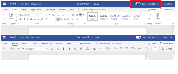
The Office 365 Ribbon is an updated version of the original ribbon, designed to help users pay attention to their work and collaborate with others. It also provides an option to switch to the classic three-line view (that provided an extended view of the ribbon functions), in case users wish to allocate more screen space to the commands. The primary concept is to make the main features available but take up less vertical space.
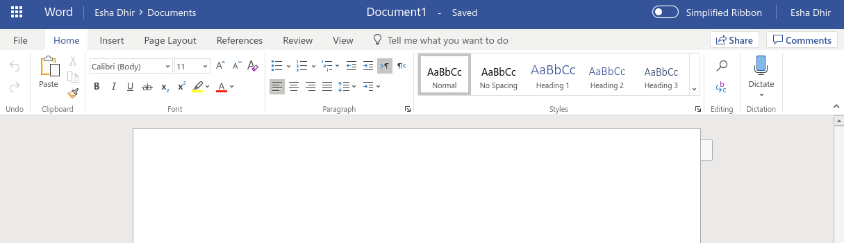
MS Word Ribbon: Classic View and Simplified View
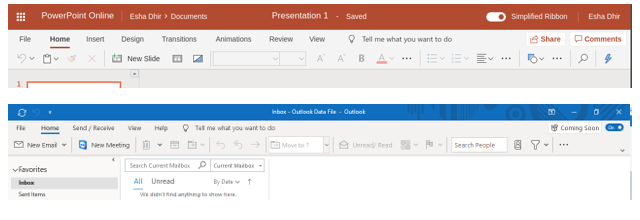
Simplified View of MS PowerPoint and Outlook
ComponentOne's New Office 365 based Ribbon Control
ComponentOne's Ribbon control for WinForms came up in 2007, based on the MS Office 2007 Ribbon's style and actions. The control has eventually been updated with new features.
With the change in time and trends, ComponentOne is delighted to announce a new Ribbon control based on the Office 365 style. This control meets the new requirements and stays updated with the recent trends of the Ribbon.
What's new?
The new Ribbon promises to be versatile and have a simplified view. It follows the Office 365 Ribbon's look and has a flat style. This means that the new Ribbon is collapsed from the standard three-line appearance to a single line of options. It will be shipped as a separate C1.Win.Ribbon assembly and will use some code and API from the old execution. If your existing applications have C1Ribbon without big customization, then upgrading to the new version will be possible with minimal code changes.
Usage in Applications
User's needs change with time. The new Ribbon addresses these needs with its layout and functions. It's an updated version of the old Ribbon and can be used to create applications where users need to interact with the Ribbon functionalities using simple clicks.
With its own set of elements, the new Ribbon can be used to create a wide variety of applications ranging from a simple interface to an Office-style professional text editor (WordPad).

The New Ribbon offers several features that make it unique.
New Features
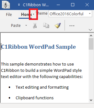
Simplified Ribbon
End-users can switch the Ribbon between full and simplified views at runtime. Application can create new elements or reuse elements from the full ribbon view. It provides better control over the available screen space.

There is a "More" button available in the simplified view to access elements.
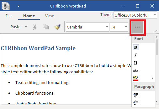
Icons
Now all Ribbon elements use the IconSet property to define a collection of images that can be used for different item sizes or DPI options. For every element that supports images, the application can define one or more icons. For example, the application can define a 16x16 icon for small view, a 20x20 icon for medium view, 32x32 icon for large view and (optionally) icons of bigger size for HighDPI environments. At runtime, the most appropriate icon will automatically be selected for the current item type and screen resolution.
this.FormatPainterButton.IconSet.Add(new C1.Framework.C1BitmapIcon("FormatPainterButton",
new System.Drawing.Size(16, 16), System.Drawing.Color.Transparent,
((System.Drawing.Image)(resources.GetObject("FormatPainterButton.SmallImage")))));
This code assigns an image to the RibbonButton "FormatPainterButton." The image is picked from the resources and its size is specified. Likewise, other images related to this RibbonButton and having different sizes can be added to the IconSet too.
In addition to bitmap images, the new Ribbon supports symbolic and vector icons as well.
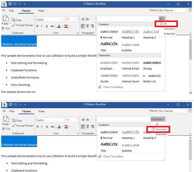
Gallery
The new Gallery supports grouping and filtering of items. This helps to have an easy way to select options from a large list. The AllowGroupFiltering property of RibbonGallery must be set to True to show these filtering choices.
styleRibbonGallery.AllowGroupFiltering = true;
Scrolling
Scrolling through the tabs is possible in the new Ribbon. This helps to view tab elements in the simplified view.
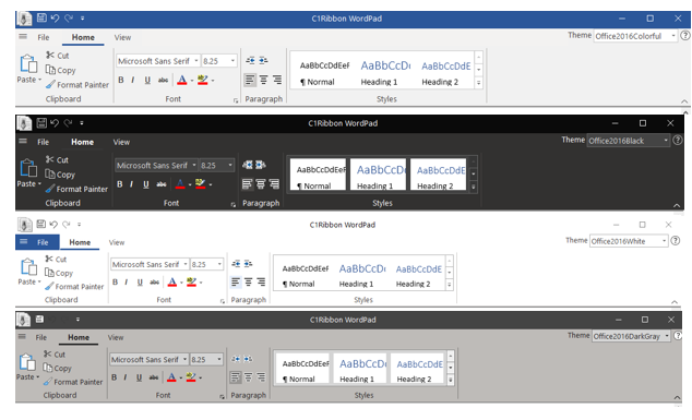
Themes and Images
The number of Office2016 themes and a big set of embedded images for dark and light themes are available to be applied to the new Ribbon. The themes allow customization of the Ribbon UI with ease so that it meets recent trends, and looks appealing.
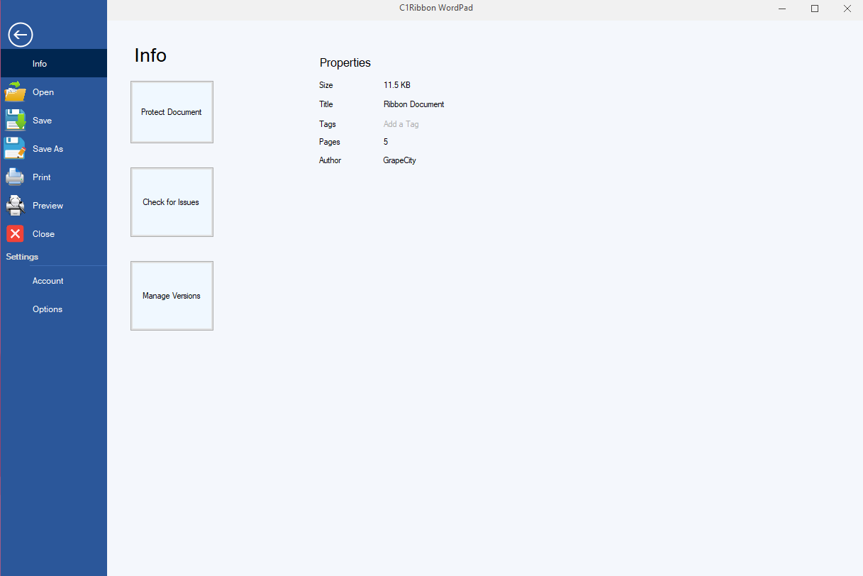
Backstage
Backstage is a separate component that gives various options for opening, saving, and printing a file. It gives details about the current document and is a one-stop solution to perform various tasks related to a document.
Note that these tasks need to be performed manually by adding controls related to each function (i.e. add labels for displaying current document related details, add buttons for opening and saving of files, etc.). A user-control is hosted to display on the right panel. This contains all the functionalities that we add related to a tab in the BackStageView.
Let us know what you think of the new Ribbon as you use it in your applications. Please leave any questions or comments below. Happy coding!

Esha Dhir