Created by Google, Angular has become one of the most well-known and widely used front-end web frameworks available. While AngularJS has been around for over ten years and Angular for five years, datagrids have been one of the most common visual software elements since the advent of UIs themselves.
The popularity of Angular and the commodity of datagrids means that there are many options for adding one to your application. But among open-source, commercial, and homegrown grids, one solution stands out above the rest.
Wijmo was the first enterprise library to offer support for Angular, and we continue to provide the best support for Angular with our Angular UI component library. In another post, we discuss the usefulness and importance of datagrids and why FlexGrid is the best Angular datagrid.
In this article, I'll talk about:
- What makes datagrids so useful as UI elements
- How Wijmo's Angular DataGrid, FlexGrid, rises above all other datagrid components
- Some examples to show you how easy it is to use FlexGrid in an Angular web application
Using FlexGrid with Angular is so easy that it's fun! If you don't believe me, download Wijmo for free and follow along.
Why Datagrids?
Even if you're not a developer, you're probably familiar with the paradigm of a datagrid. Grouping and sorting data aren't merely for the meticulous; it's human nature. Datagrids appeal to the instinct that drives us to organize take in, and understand as much data as possible, as efficiently as possible.
The usefulness and universality of datagrids have allowed them to permeate throughout time, but not without some amount of evolution. With the advent of screens in the digital age, the datagrid has changed more than ever before.
Now, grids are more useful than ever, not only for displaying data but also for editing it. Could you imagine creating a sales report or monthly budget using Microsoft Word? Microsoft Excel would be the natural choice for most users with automatic conveniences, such as sorting, filtering, and autocomplete, plus advanced features like custom formulas.
Beyond the helpful and time-saving features, most users would naturally choose Excel because it's what they first experienced when it came to datagrids on a computer. Excel is familiar. Any good UX designer or business analyst will tell you: educating users is difficult and expensive. This is one of the most significant advantages of datagrids in general – they are intuitive.
Although Excel has become the most common example of software using a datagrid, the paradigm has increased throughout the software world. As web apps continue to replace the traditional native applications that we're used to, it only makes sense that datagrids would make their way to web app UIs as well.
At Mescius, we've found that industries across the board are including datagrid UI components in new web app projects.
Whether you're building an app to track manufacturing stats, analyze financial data, or create sales reports, I'm willing to bet you've already thought about the intuitiveness a datagrid would add. And, as we'll see, Wijmo's Angular DataGrid can maximize the bang for your buck by providing the best datagrid UX with the best performance available.
Datagrid components like FlexGrid provide natural, intuitive interfaces between humans and data.
Wijmo's FlexGrid: The Best Datagrid Component Solution
We now know that one of the biggest advantages of using datagrids is that they're inherently intuitive. That's a massive plus for the end-user experience, but what about the developers building the applications?
Creating a datagrid UI component from scratch is certainly no small task for any development team. It's possible that building a datagrid for your application is just as expensive as educating users about a different UI component you create.
Fortunately, that's where FlexGrid comes in! Just import Wijmo's library into your application, add FlexGrid to your application, and attach it to your data source. With just a few simple steps, your application now includes a full-functioning datagrid!
Suppose the greatest advantage of using a datagrid is that it creates a better end-user experience. In that case, the benefit of using a third-party datagrid is that it makes a better developer experience.
As we continue through this article, I'll use some examples to show how Wijmo's FlexGrid offers the biggest boost in efficiency to development workflow with out-of-the-box Angular interoperability. But first, let's look at what sets FlexGrid apart from the competition as a pluggable datagrid component.
The FlexGrid Package's Performance: Extensibility and Familiarity with a Small Footprint
Creating Angular's most powerful datagrid component didn't happen overnight. FlexGrid is older than Wijmo itself. FlexGrid was first written in 1996 using C++ for Visual Basic. It even shipped as a part of Visual Studio! It has since evolved and has been refined in many platforms, the most recent being JavaScript.
Decades of user input and refinement have resulted in a high-performance datagrid with an extensively documented API. But, there's a reason that FlexGrid has retained its name all this time; stressing our "Flex Philosophy" is a top priority for us.
Controls should include only the critical set of features required and offer everything else through an extensibility model.
Features like sorting, grouping, editing, and filtering are built-in, while other bells and whistles are offered as easily implementable, optional extensions of FlexGrid. This keeps the controls small and fast and gives our customers and us the ability to build unique custom features.
Performance
Many Angular developers choose the framework because of the component-based architecture, handling of many every day and time-consuming tasks, and constant support by the Angular team. Wijmo brings this same style of help to Angular with our UI library while maintaining speed and a small footprint.
The Wijmo development team keeps the footprint of FlexGrid small by requiring no external dependencies. FlexGrid only adds about 25k (gzipped) to your application.
The most significant performance improvement, however, is through virtual rendering. FlexGrid virtualizes all of its DOM and only renders the cells needed to fill the viewport (with some additional buffer for smooth scrolling). The cells (DOM elements) are recycled as the grid scrolls. Virtual rendering means that the grid can bind to millions of records in under a second.
Familiarity
FlexGrid bases nearly all its interaction behavior on Excel, which – as stated previously – is probably the most common datagrid/data table used by any end-user. People expect certain behaviors when scrolling, clicking and especially using key commands (including clipboard functions).
Instead of inventing our behaviors, we mimic Excel, and end-users immediately feel comfortable using our datagrid. Surprisingly, many other datagrids either develop their behavior or don't fully support keyboard actions. For example, you may select a row in a grid and hold the down arrow key, and the grid may not function as expected.
Accessibility
We're incredibly excited to say that our FlexGrid control offers full accessibility support for all of the most popular modern web browsers. Making a control as dense and complex as a datagrid accessible is a problem at best, and no other datagrid components offer FlexGrid's level of framework interoperability and accessibility.
If you'd like to check out the details of how FlexGrid makes your data accessible to everyone, check out our blog post about accessibility development. Whether you have a standalone accessibility team or not, you can ensure that your application complies with the latest standards by using FlexGrid.
FlexGrid and Angular: A Match made in Web Development Heaven
FlexGrid does much more than seamlessly integrate with Angular's robust, high-performance Ivy and View Engine. Our datagrid component makes it fun, easy, and natural to add datagrids to your web application UIs.
Now for the fun stuff! Let's look at some specific examples that illustrate the advantages of FlexGrid's Angular interoperability.
Datagrid Example: Up and Running with ng new
Wijmo ships with both CommonJS and ES modules for all its components, including FlexGrid! And since Wijmo is written with an interoperability layer for Angular, you can import FlexGrid just like any other Angular class component.
All of this means that you can create an Angular project and add FlexGrid with just a few simple steps. To illustrate how easy it is to use FlexGrid, we'll walk through the process of setting up an Angular app, including Wijmo in your application and rendering a grid full of data to the screen.
First, you'll need to create your Angular application. This is done by running the following command at the location that you want your project to live:
ng new flexgrid-app --no-standaloneThis will set up our Angular application, named "flexgrid-app".
Next, we'll install Wijmo in our application. Since we're building an Angular application, we only need to include the Angular modules. This is done with the following command:
npm install @mescius/wijmo.angular2.allCongratulations! You now have complete access to Wijmo's entire UI library, including FlexGrid and its API. You can even use it directly in the HTML markup! We'll go over how to do that next.
Declaring FlexGrid in HTML Markup
Continuing with the work we've done above, we're now going to see how we can render a FlexGrid now that we've imported the Wijmo code into the App component.
Before we get to writing any actual code, we'll need to import the component that we'll be using, as well as Wijmo's CSS file, so that FlexGrid will display correctly:
styles.css:
@import "~@mescius/wijmo.styles/wijmo.css"app.module.ts:
import { WjGridModule } from '@mescius/wijmo.angular2.grid'; ... imports: [...WjGridModule],There will be some default HTML markup inside of your application's app.component.html file. Go ahead and delete that default markup and replace it with the following:
<div> <wj-flex-grid #flexTemp [itemsSource]="data"></wj-flex-grid> </div>For a 3-line code snippet, a lot is going on here. Before discussing what makes declaring components in the markup so important, let's finish off the example. There's still one thing that we're missing to load up the FlexGrid properly.
You may have noticed that the itemsSource property references a variable called "data". Since there currently is a data variable defined for the application, FlexGrid will render with no data! To fix this, we're going to add some mock data to the datagrid. Add the following code within the app.component.ts file:
data = [
  { id: Math.floor(Math.random() * 1000), customer: 'Gia Shields', sale: Math.random() * 100000 },
  { id: Math.floor(Math.random() * 1000), customer: 'Jayden Foster', sale: Math.random() * 100000 },
  { id: Math.floor(Math.random() * 1000), customer: 'Selena Casey', sale: Math.random() * 100000 },
];
gridData = new wjcCore.CollectionView(this.data);
Now go ahead and fire up your app by running ng serve --open and behold FlexGrid in all its glory! Before moving on to exploring some of the more exciting features offered by FlexGrid in Angular, think about the implications of being able to declare a complex datagrid control in markup entirely.

If you can't wait to see this app in action, check out the live sample on Stackblitz.
Declarative markup is ideal for following the MVVM (Model-View-ViewModel) design pattern, and we can fully configure our components within the view (markup).
FlexGrid supports declaring its entire API using natural, unextended HTML markup. You can set properties, attach events, and even configure child components (like columns) entirely in markup.
Easily Bind FlexGrid API Events to Component Functions
Since it was so easy to attach FlexGrid properties to the component state, it follows that attaching FlexGrid events to handler functions should be just as easy, right?
If that's what you were thinking after reading the last section, then you're correct! Just as data from the app.component.ts file can be passed to the FlexGrid via properties, component functions can be given as handlers for FlexGrid events.
To demonstrate, let's add a new feature to our example. Since we already have a working FlexGrid with some data, we have access to dozens of events that the FlexGrid API supports out-of-the-box. We'll take advantage of two events – beginningEdit and cellEditEnded – to display a descriptive message when a user starts editing a cell in the datagrid.
Before we move any further, double-check to make sure the code for your component (in app.component.html and app.component.ts files) looks like this:
app.component.html:
<div> <wj-flex-grid [itemsSource]="gridData"></wj-flex-grid> </div>app.component.ts:
import { Component } from '@angular/core';
import * as wjcCore from '@mescius/wijmo';
@Component({
selector: 'app-root',
templateUrl: './app.component.html',
styleUrl: './app.component.css',
})
export class AppComponent {
data = [
{
id: Math.floor(Math.random() * 1000),
customer: 'Gia Shields',
sale: Math.random() * 100000,
},
{
id: Math.floor(Math.random() * 1000),
customer: 'Jayden Foster',
sale: Math.random() * 100000,
},
{
id: Math.floor(Math.random() * 1000),
customer: 'Selena Casey',
sale: Math.random() * 100000,
},
];
gridData = new wjcCore.CollectionView(this.data);
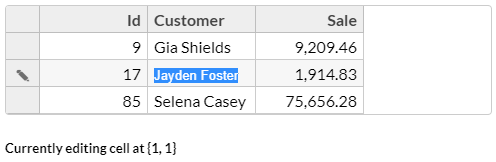
}Let's continue and add our edit-tracking feature! First, we'll need to add some new variables to the component's TypeScript file to track whether a cell is being edited along with the coordinates of the cell in edit mode. Go ahead and add these two variables to the app.component.ts file:
cellEdit = false; // whether or not any cell is in edit mode
editingCell = ''; // a string representation of the coordinates for the cell being edited
By default, when the app loads, we assume a cell can't be in edit mode. Next, we should add a textual element visible when a cell is in edit mode and hidden when no cells are being edited. To give the additional user context, the text in the element will include the coordinates of the cell they're editing.
To make sure our helpful, informative text is noticeable, we'll place it in an h5 tag. Add the following directly below the FlexGrid HTML markup in your app.component.html file:
<h5 [ngStyle]="{'display': cellEdit ? 'block' : 'none'}">
  Currently editing cell at {{ editingCell }}
</h5>
All of that code is pretty fundamental Angular - it was a piece of cake, right?! Now for the big finale...connecting the variables we created to FlexGrid events. Surely this must require some complex observable handlers, right?
Nope! We can hook up the FlexGrid's events to component class functions just like you'd expect from an Angular component you've written yourself. First, add the handler functions to the App class:
beginningEdit(grid) {
  this.cellEdit = true;
  this.editingCell = '{' + grid.selection.col + ', ' + grid.selection.row + '}';
}

endingEdit() {
  this.cellEdit = false;
}
Again, some pretty straightforward Angular component functions are designed to update the state based on whether or not a cell is being edited. Note the grid object passed to the beginningEdit function; FlexGrid will automatically pass relevant context to all event handlers.
To figure out what information is passed for a specific event, consult the extensive FlexGrid API documentation.
To finish off this handy new feature, we have to tell FlexGrid to call these event handlers. Fortunately, because FlexGrid is a native Angular component, we can quickly hook up these handlers in markup. Just add these properties to FlexGrid's declaration:
<wj-flex-grid #grid [itemsSource]="gridData" (beginningEdit)="beginningEdit(grid)" (cellEditEnding)="endingEdit()"></wj-flex-grid>Your Angular files should look like this:
app.component.html:
<div>
  <wj-flex-grid #grid [itemsSource]="gridData" (beginningEdit)="beginningEdit(grid)" (cellEditEnding)="endingEdit()"></wj-flex-grid>
  <h5 [ngStyle]="{'display': cellEdit ? 'block' : 'none'}">
    Currently editing cell at {{ editingCell }}
  </h5>
</div>
app.component.ts:
import { Component } from '@angular/core';

import * as wjcCore from '@mescius/wijmo';

@Component({
  selector: 'my-app',
  templateURL: './app.component.html',
  styleUrls: ['./app.component.css']
})
export class AppComponent {
  data = [
    { id: Math.floor(Math.random() * 1000), customer: 'Gia Shields', sale: Math.random() * 100000 },
    { id: Math.floor(Math.random() * 1000), customer: 'Jayden Foster', sale: Math.random() * 100000 },
    { id: Math.floor(Math.random() * 1000), customer: 'Selena Casey', sale: Math.random() * 100000 },
  ];
  gridData = new wjcCore.CollectionView(this.data);
  cellEdit = false;
  editingCell = '';

  constructor() {}

  beginningEdit(grid) {
    this.cellEdit = true;
    this.editingCell = '{' + grid.selection.col + ', ' + grid.selection.row + '}';
  }
  endingEdit() {
    this.cellEdit = false;
  }
}
When you're all set, run your app in play around with FlexGrid in the browser! To see the events in action, double-click any cell in FlexGrid. The beginningEdit event is immediately dispatched, and the app's variables are updating, showing the label with the proper cell coordinates. If you click outside of the grid, the label should disappear.
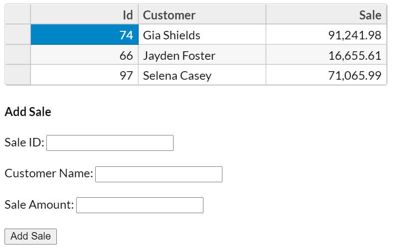
Automatically Update FlexGrid with Data Binding
Now that our app handles displaying some data in a FlexGrid component and responds to our users' edit events, maybe it would be helpful to provide a form for users to add another sale to our list of sales data.
Providing a form to update the state shouldn't be too hard, but how can we ensure that change propagates to the datagrid component?
Since the datagrid's data is already bound to a property inside of our component, all the app needs to do is update that property, and FlexGrid will update accordingly.
Since each user in our system has three unique characteristics - an order id, a customer name, and a sales price - add three new corresponding properties to the app.component.ts file:
saleId = null;
customerName = '';
saleAmount = null;
Next, we'll add a couple of quick functions that update the properties with input from the 'add user' form and allow the App component to add a new object to the data array:
addSale() {
  if(this.saleId == null || this.customerName.length == 0 || this.saleAmount == null) {
    return;
  }
  this.gridData.items.push({ id: +this.saleId, customer: this.customerName, sale: +this.saleAmount });
  this.gridData.refresh();
  this.saleId = null;
  this.customerName = '';
  this.saleAmount = null;
}
These functions are just plain old Angular component functions that will enable our components to update the application in specific ways. The last step is to add the actual markup for the form:
<h4>Add Sale</h4>
<div>
  <label htmlFor="saleId">Sale ID: </label>
  <input type="text" id="saleId" [(ngModel)]="saleId">
</div>
<div>
  <label htmlFor="customerName">Customer Name: </label>
  <input type="text" id="customerName" [(ngModel)]="customerName">
</div>
<div>
  <label htmlFor="saleAmount">Sale Amount: </label>
  <input type="text" id="saleAmount" [(ngModel)]="saleAmount">
</div>
<button (click)="addSale()">Add Sale</button>
Now that we've got all of that done, we're ready to take one last look at the code before we run our application:
app.component.ts:
import { Component } from '@angular/core';

import * as wjcCore from 'wijmo/wijmo';

@Component({
  selector: 'my-app',
  templateUrl: './app.component.html',
  styleUrls: [ './app.component.css' ]
})
export class AppComponent {
  data = [
    { id: Math.floor(Math.random() * 1000), customer: 'Gia Shields', sale: Math.random() * 100000 },
    { id: Math.floor(Math.random() * 1000), customer: 'Jayden Foster', sale: Math.random() * 100000 },
    { id: Math.floor(Math.random() * 1000), customer: 'Selena Casey', sale: Math.random() * 100000 },
  ];
  gridData = new wjcCore.CollectionView(this.data);
  cellEdit = false;
  editingCell = '';
  saleId = null;
  customerName = '';
  saleAmount = null;

  beginningEdit(grid) {
    this.cellEdit = true;
    this.editingCell = '{' + grid.selection.col + ', ' + grid.selection.row + '}';
  }

  endingEdit() {
    this.cellEdit = false;
  }

  addSale() {
    if(this.saleId == null || this.customerName.length == 0 || this.saleAmount == null) {
      return;
    }
    this.gridData.items.push({ id: +this.saleId, customer: this.customerName, sale: +this.saleAmount });
    this.gridData.refresh();
    this.saleId = null;
    this.customerName = '';
    this.saleAmount = null;
  }
}app.component.html:
<wj-flex-grid #grid [itemsSource]="gridData" (beginningEdit)="beginningEdit(grid)" (cellEditEnding)="endingEdit()"></wj-flex-grid>
<h5 [ngStyle]="{'display': cellEdit ? 'block' : 'none'}">
  Currently editing cell at {{ editingCell }}
</h5>
<h4>Add Sale</h4>
<div>
  <label htmlFor="saleId">Sale ID: </label>
  <input type="text" id="saleId" [(ngModel)]="saleId">
</div>
<br />
<div>
  <label htmlFor="customerName">Customer Name: </label>
  <input type="text" id="customerName" [(ngModel)]="customerName">
</div>
<br />
<div>
  <label htmlFor="saleAmount">Sale Amount: </label>
  <input type="text" id="saleAmount" [(ngModel)]="saleAmount">
</div>
<br />
<button (click)="addSale()">Add Sale</button>
We also need to add the FormsModule into our app.module.ts or we will get an error. Add this code:
...
import { FormsModule } from '@angular/forms';

@NgModule({
  declarations: [AppComponent],
  imports: [BrowserModule, AppRoutingModule, WjGridModule, FormsModule],
  providers: [],
  bootstrap: [AppComponent],
})
...
If everything looks good, go ahead and start your app! You should see a brief form that accepts three inputs from users. If you fill it out and click the "Add Sale" button, you should see the grid immediately update with the new sale information you just added. That's the magic of FlexGrid's support for native two-way databinding.
There you have it; a quick, straightforward, and natural two-way data binding with FlexGrid and Angular. I won't inundate you with more code, but there's an even easier way to do what we just did with FlexGrid. If you're intrigued, check out FlexGrid's allowAddNew property.
Take the Next Step: Build Your FlexGrid App
If you're an Angular fan like I am and our Angular DataGrid examples above pique your interest, you can give Wijmo a try for yourself! Join the thousands of users and companies who use Wijmo to supercharge their UI development workflows.
"We purchased Wijmo, and their team is doing a great job: good-looking, well-thought-out architecture; documentation; keeping up with the ever-changing landscape like no others."
- Bj Jeoing, Cisco
If my words still haven't convinced you, I encourage you to try FlexGrid and prove me wrong. We haven't stopped refining and improving our grid for 20 years, and we won't stop anytime soon.

Joel Parks