How to Create a Range Area Chart
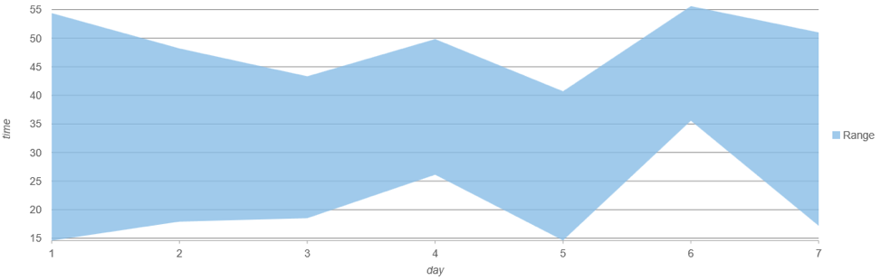
Range area charts plot two values on the Y axis for each data point and fill the area between. They are useful for visualizing range-based data trending over time (such as temperature and high-low intervals in financial data).
The Wijmo 2019 v1 release includes several new chart features. FlexChart now supports range area charts using the existing ‘Area’ chart type when you declare two fields (upper and lower bounds) for the binding property.
Read the full Wijmo 2019 v1 release.
Quick Example:
myChart.chartType = 'Area'; myChart.binding = 'min,max';
Creating a Range Area Chart
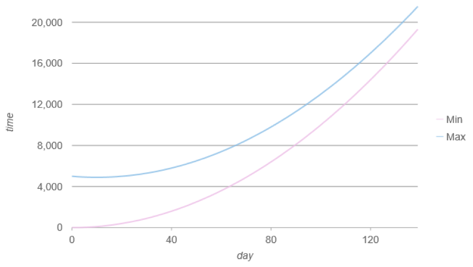
Conceptually, you can think of range area charts like two separate line charts. For instance, if you were plotting two lines using FlexChart, you would define two series bound to two separate fields such as ‘min’ & ‘max’:
This example creates two line series:
let myChart = new chart.FlexChart('#chart', {
        chartType: 'Line',
        series: [
            {
                itemsSource: getData(),
                bindingX: 'day',
                binding: 'min',
                name: 'Min',
                style: { stroke: 'rgba(236, 189, 230, 0.8)' }
            },
            {
                itemsSource: getData(),
                bindingX: 'day',
                binding: 'max',
                name: 'Max',
                style: { stroke: 'rgba(136, 189, 230, 0.8)' }
            }
        ],
}
The result looks like this:
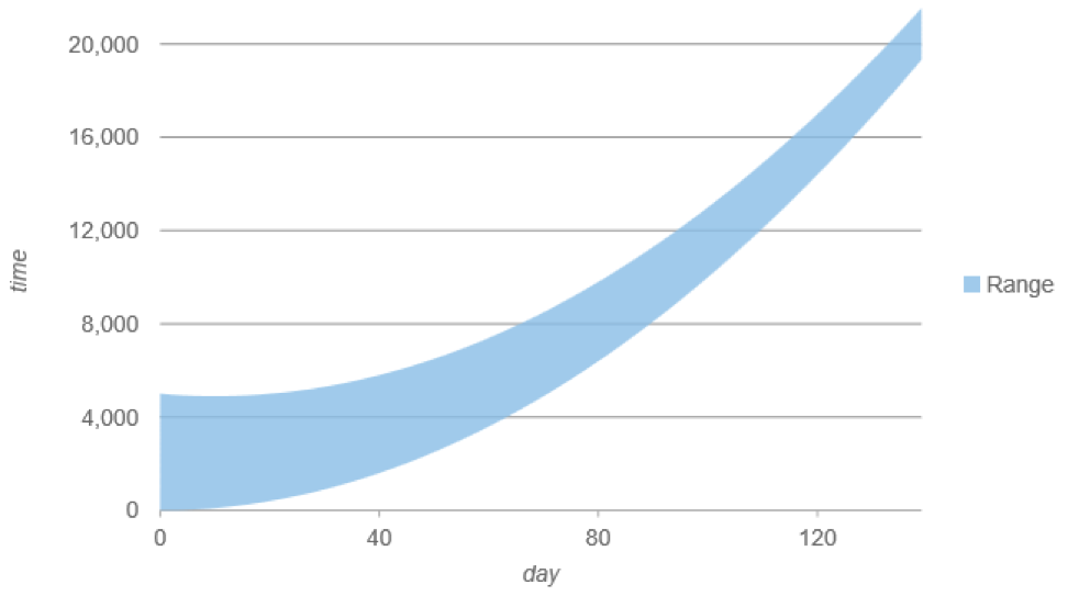
Now we can visualize this same data as a range area chart by changing the chartType to ‘Area’ and consolidating the series to one. The binding property supports both the upper and lower boundary for the range separated by a comma.
Range Area Example:
let myChart = new chart.FlexChart('#chart', {
        chartType: 'Area',
        series: [

            {
                itemsSource: getData(),
                bindingX: 'day',
                binding: 'min,max',
                name: 'Range',
                style: { fill: 'rgba(136, 189, 230, 0.8)', stroke: 'transparent' }
            }
        ]
}
The resulting range area chart looks like this. Notice that we can use the name property to set the legend text (which by default uses the field names).
You can try out the range area chart for yourself in the demo explorer.

Greg Lutz