Angular Reactive Forms provide a model-based alternative to the traditional template-based forms. They are more robust and scalable than template-based forms. For details on reactive forms and how they differ from template-based forms, please see the Reactive and Template-Driven forms in Angular article in the Angular documentation.
Wijmo input controls can be used in both types of form, and bring the usual benefits in both:
- Multiple control types (InputDate, InputNumber, ComboBox, AutoComplete, InputMask, etc.)
- Built-in accessibility, validation, and styling.
In this article, we'll walk through the steps required to replace standard input elements with Wijmo input controls in a simple Angular application that uses reactive forms.
Step 1: A Simple Reactive Form
We'll start with a simple reactive form sample taken directly from the Angular documentation.
This is our version of the sample.
The app.module.ts file imports Angular’s ReactiveFormsModule which provides all the infrastructure used by the form.
The my-form.component.ts file defines the model that drives the form. Notice how the model has a hierarchical structure and how it specifies some validators:
export class MyFormComponent {
  profileForm = this.fb.group({
    firstName: ['', Validators.required],
    lastName: [''],
    address: this.fb.group({
      street: [''],
      city: [''],
      state: [''],
      zip: ['']
    }),
    aliases: this.fb.array([
      this.fb.control('')
    ])
  });
And the my-form.component.html contains the markup that defines the form:
<form [formGroup]="profileForm" (ngSubmit)="onSubmit()">
  <label>
    First Name:
    <input type="text" formControlName="firstName" required>
  </label>
  <label>
    Last Name:
    <input type="text" formControlName="lastName">
  </label>
  <div formGroupName="address">
    <h3>Address</h3>
    <label>
      Street:
      <input type="text" formControlName="street">
    </label>
Notice how the markup uses the formControlName attribute to specify the bindings, instead of the traditional ngModel directive, and how it uses nested div elements with a formGroupName attribute, so the form and the model have the same hierarchy.
Our basic reactive form is ready. It works OK, but it is very basic. We'll improve it in the next two steps.

Step 2: Replacing HTML Elements with Wijmo Controls
In this step, we'll replace the basic input elements in our form with more powerful Wijmo controls. Wijmo provides a full suite of enterprise-grade Angular components.
This is the revised version of the sample
To use Wijmo, we start by adding a reference to the Wijmo NPM package. Since we’re using Stackblitz, this is done by typing “Wijmo” into our project’s dependencies pane:
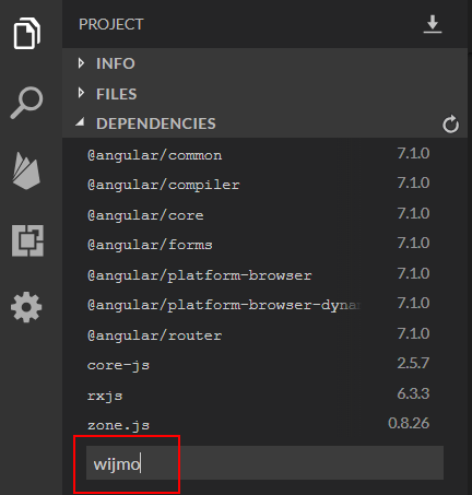
In stand-alone projects, we would do this by typing "npm install wijmo" into the command line.
Now that the Wijmo package is installed, we import it into the app by changing the app.module.ts file:
import { BrowserModule } from '@angular/platform-browser';
import { NgModule } from '@angular/core';
import { ReactiveFormsModule } from '@angular/forms';
import { AppComponent } from './app.component';
import { MyFormComponent } from './my-form/my-form.component';
import { WjInputModule } from 'wijmo/wijmo.angular2.input';

@NgModule({
  declarations: [
    AppComponent,
    MyFormComponent
  ],
  imports: [
    BrowserModule,
    ReactiveFormsModule,
    WjInputModule
  ],
  providers: [],
  bootstrap: [AppComponent]
})
export class AppModule { }
Before using any Wijmo controls, we need to import Wijmo’s CSS. To add Wijmo’s material theme to our our application, we add the following to the styles.css file:
/* Wijmo Styles */
@import "wijmo/styles/themes/wijmo.theme.material.css";
.wj-control {
  background-color: #e7f5f5
}
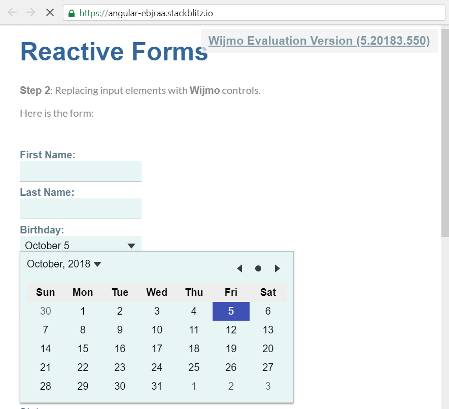
Now we are ready to use Wijmo’s input controls on our form. The markup is quite similar to the original version, except instead of plain input elements we are now using specialized input control that provide extensive configuration and built-in validation.
This is what the my-form.component.html file looks like:
<form [formGroup]="profileForm" (ngSubmit)="onSubmit()">
  <label>
    First Name:
    <wj-combo-box formControlName="firstName" required></wj-combo-box>
  </label>
  <label>
    Last Name:
    <wj-combo-box formControlName="lastName"></wj-combo-box>
  </label>
  <label>
    Birthday:
    <wj-input-date formControlName="birthday"
      [isRequired]="false"
      [format]="'MMMM d'"></wj-input-date>
  </label>
  <label>
    Team Size:
    <wj-input-number formControlName="teamsize" required
      [min]="1"
      [max]="10"
      [step]="1"></wj-input-number>
  </label>
Notice how the ComboBox control can be used to replace plain input elements, even without a drop-down. This is convenient because it leverages Wijmo’s styling, which we will customize in the next step of the app.
Notice also how the markup:
- Uses the isRequired property of the Wijmo input controls instead of the required attribute which is applicable to input elements only,
- Specifies a format for the InputDate control to display the date in the format we want (in this case, day and month only),
- Specifies min and max values for the InputNumber control so the user cannot enter values outside the valid range. (no need for a validator).
The form looks and works better now. The InputDate, InputNumber, and ComboBox controls make data entry easier and less error-prone:
Step 3: Inproved Validation and Styling
In this step, we'll add some styling to substantially enhance the form’s usability.
This is the final version of the sample.
We start by adding a new CSS file to the project: wijmo.labeled-input.css, and referencing it from the styles.css file:
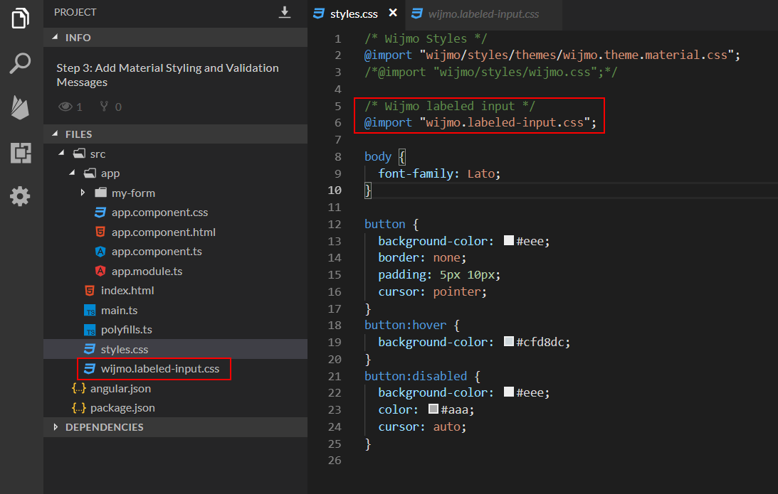
The wijmo.labeled-input.css file contains CSS rules that take advantage of Wijmo’s built-in pseudo-selectors to implement features such as animated floating labels and focus elements to Wijmo’s input controls.
To enable the new styling, we must change the markup in my-form.component.html and wrap each input element in a div with the wj-labeled-input class:
<form [formGroup]="profileForm" ngNativeValidate (ngSubmit)="onSubmit()">
  <h3>Personal Info</h3>
  <div class="wj-labeled-input">
    <wj-combo-box formControlName="firstName"></wj-combo-box>
    <label>First Name</label>
    <div class="wj-error" tabindex="-1">Please tell us your first name</div>
  </div>
  <div class="wj-labeled-input">
    <wj-combo-box formControlName="lastName"></wj-combo-box>
    <label>Last Name</label>
    <div class="wj-error" tabindex="-1">Please tell us your last name</div>
  </div>
  <div class="wj-labeled-input">
    <wj-input-date formControlName="birthday"
      [isRequired]="false"
      [format]="'MMMM d'"></wj-input-date>
    <label>Birthday</label>
  </div>
  <div class="wj-labeled-input narrow">
    <wj-input-number formControlName="teamsize"
      [isRequired]="false"
      [min]="1"
      [max]="10"
      [step]="1"></wj-input-number>
    <label>Team Size</label>
  </div>
The wj-labeled-input elements contain:
- A Wijmo input control used to edit the value,
- A label element which is uses as a placeholder when the control is empty and as a caption when it has content.
- An optional error element that is displayed when the control has been touched and is in an invalid state.
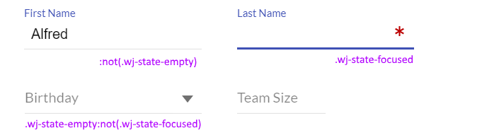
Improved Styles
The new CSS and adjusted markup make the form responsive (it makes better use of the space available on large and small screens).
It also implements Material Design Style input panels, with labels that act as placeholders when the input controls are empty and turn into captions when the input controls have content or are focused.
Accessibility is improved by an animated underline element that indicates focused controls:
Improved Validation
The original version of the app used this markup to disable the Submit button until the form was valid:
<button type="submit" [disabled]="!profileForm.valid">
    Submit
</button>
This approach works, but I find it frustrating to see a disabled Submit button and no indication showing what about the form is currently invalid.
To remedy this situation, in the latest version of the app we removed the disabled attribute from the Submit button and added an ngNativeValidate directive to the form:
<form [formGroup]="profileForm" ngNativeValidate (ngSubmit)="onSubmit()">
This allows users to click the Submit form and get error messages showing which fields are invalid: 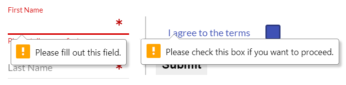
We also used CSS to add red asterisks to required fields that are empty, even if they haven’t been touched. The new form is much more attractive and easier to use than the previous ones: 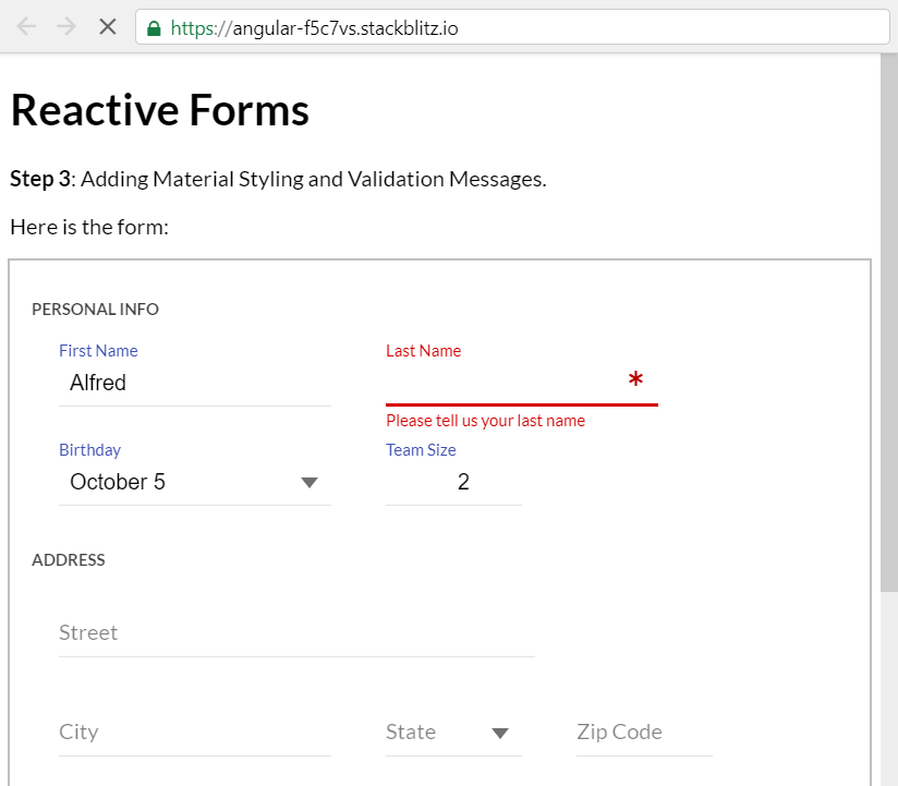
Conclusion
Angular reactive forms are better than traditional template-based forms in many common scenarios. They build upon existing technologies so you can leverage techniques that you are familiar with and that have worked well in the past.
These technologies include standard HTML elements, accessibility, validation, and custom controls such as the ones in Wijmo’s input module, which can be used with reactive as well as template-based forms.
Happy coding! If you have questions or comments be sure to enter them below.
If you are looking for a powerful Angular DataGrid, then check out FlexGrid.

Bernardo de Castilho