Wijmo’s first major release of 2019 has landed, and it includes brand new developer resources, nice customer-requested features, improved components using a new browser API, and more.
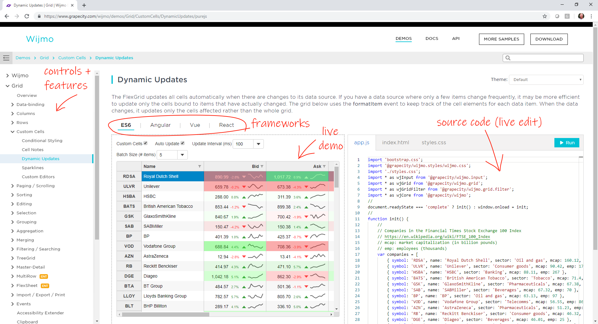
Explore Controls & Features in Every Framework!
We have consolidated all of our (500) samples into one place. And each sample is available in the following frameworks:
- Pure JavaScript, using ES6 modules (no framework)
- Angular (v2+)
- Vue (v2+)
- React
](https://gccontent.blob.core.windows.net/gccontent/marketingrelease/2019-04/demo-shell-markup.png)
We wanted to make it easy to find any feature you need, try it in the browser, view the source code for your favorite framework, and make live edits to the code. We hope this makes your life easier as a developer. Please feel free to suggest a feature and we can add it to our collection.
Watch Wijmo's New Demo Explorer Video:
Explore our New Demos!
Some React samples are still being completed. We plan to add Web Components and other framework samples as we support them.
New Documentation Guides
We want using Wijmo to be as easy as possible. To support this, we wrote over 200 new documentation guides that will help walk you through using our controls and implementing features. Our documentation site also includes a full text search for helping you quickly find what you need help with.
](https://gccontent.blob.core.windows.net/gccontent/marketingrelease/2019-04/doc-shell.png)
Explore our new documentation guides
New API Reference
We have also rebuilt our API Reference. The output is not much different than before, but we designed it to be consistent with our other new developer resources (samples and doc guides). Take a look and let us know what you think of the new API Reference.
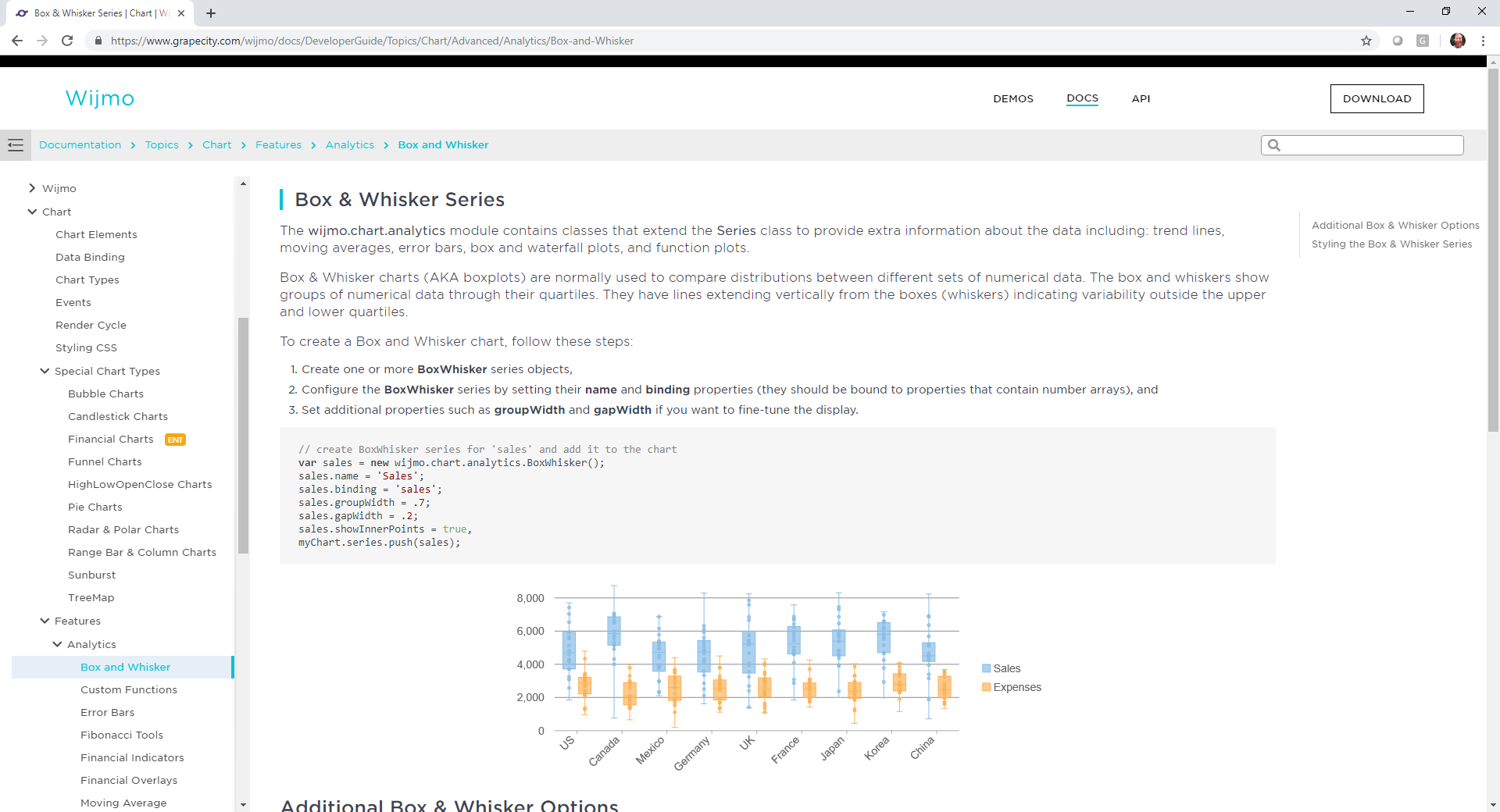
FlexGrid Tooltips
We added a FlexGrid.errorTip property that allows you to specify a Tooltip to use when showing validation errors. You can use this property to customize the tooltip, or set it to null to restore the original behavior (use the cell's "title" attribute to show validation errors).
](https://gccontent.blob.core.windows.net/gccontent/marketingrelease/2019-04/flexgrid-tooltips.png)
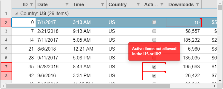
FlexGrid Excel-like Selection
We added an option to FlexGrid called anchorCursor, which changes the range selection to look more like Excel. By default, FlexGrid keeps the cell where the cursor is highlighted, whereas, Excel keeps the first cell selected (the anchor) as highlighted. We like our default because it gives a visual indicator of where your cursor is in the grid. It's also ideal when using keyboard navigation since you otherwise have no other indicator. But Excel is very familiar to users, so we wanted to provide the option to look just like it.
](https://gccontent.blob.core.windows.net/gccontent/marketingrelease/2019-04/flexgrid-cursor.png)
Simpler CSS Styling in FlexGrid
We refactored and simplified the grid CSS rules so customizing cell backgrounds is now simpler and easier. Previously, our CSS selectors for cells were strong and could not be overridden using a single class selector. After refactoring, you can now write a single class and style the cell background and text more easily.
For example:
<pre>.blue {
 background: #0000cc;
 color: white;
}</pre>
](https://gccontent.blob.core.windows.net/gccontent/marketingrelease/2019-04/flexgrid-styling.png)
Styling FlexGrid with CSS example
Note that in order to make wj-cell class weaker and easier to style, we had to make a few other classes stronger like: wj-header and wj-alt. You might need to adjust your CSS to use combined class selectors like .wj-cell.wj-header { }
FlexGrid Performance
We improved the FlexGrid scrolling performance even further by extending the cell reordering logic to work when scrolling horizontally and on grids with frozen cells. This is a small change, but it has big impacts, especially on older browsers where DOM operations are expensive. Of course, it makes FlexGrid faster in modern browsers too!
OLAP Outline Mode
We added a new PivotGrid.outlineMode property in OLAP. In outline mode, the PivotGrid renders row fields in an outline format that is more compact and reduces the amount of white space shown on the screen. Outline mode is recommended for views with a large number of row fields. It's similar to what Excel offers in it's PivotTables.
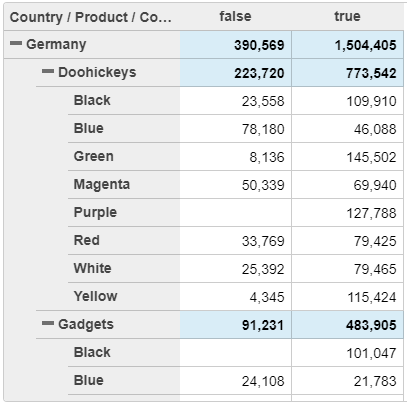](https://gccontent.blob.core.windows.net/gccontent/marketingrelease/2019-04/olap-outlinemode.png)
FlexChart Custom Series
We added two new features that make it easier to customize specific series. FlexChart has a new Series.tooltipContent property that allows you to customize tooltips for specific series. It also has a new Series.itemFormatter property that allows you to customize the appearance of data points in a specific series. Prior to this release, the tooltips and itemFormatter were control-wide so they typically applied to all series in the chart. These new improvements add more flexibility and customization options to charts with multiple series.
Read more about customizing tooltips and data points for specific series
](https://gccontent.blob.core.windows.net/gccontent/marketingrelease/2019-04/flexchart-customseries.png)
FlexChart Custom Series example
FlexChart Range Area Chart
This release includes several new features for FlexChart and FlexPie. We have added support for range area charts to FlexChart. This is similar to the range bar and column charts that plot a range of two values for each data point. This new chart type is enabled by setting the chart type as 'Area' and then setting the min and max values in the series binding.
Read more about creating range area charts
](https://gccontent.blob.core.windows.net/gccontent/marketingrelease/2019-04/flexchart-ranged-area.png)
FlexChart Ranged Area chart example
Multiple Pie Charts with FlexPie
You can now use FlexPie to visualize more of your data in a single chart by creating multiple pie chart "series" using the same data source. To create multiple pie chart series, specify several comma-separated properties in FlexPie.binding.
Read more about creating a multiple pie chart series
](https://gccontent.blob.core.windows.net/gccontent/marketingrelease/2019-04/flexpie-rmultiple-pie.png)
NPM Package Changes
Wijmo npm packages have been moved to the @grapecity scope. This brings obvious benefits like multiple module formats, and drastically simplifies Wijmo usage for companies that host Wijmo on their own npm servers.
Previously, Wijmo npm modules have been stored in the single ‘wijmo’ npm package. Now every module is represented as a separate package in the @grapecity scope, like @grapecity/wijmo.input or @grapecity/wijmo.grid.
Switching of your application to use new scoped packages will require some modifications in the application code, namely update of Wijmo module names in ‘import’ statements. We have published a guide on migrating to wijmo's @grapecity scoped npm packages (BLOG LINK).
In order to make a smooth transition, we’ll continue to maintain the non-scoped ‘wijmo’ package for a limited amount of time. So the latest Wijmo version will be shipped as both scoped and non-scoped packages. But you should schedule an update of your application to use new @grapecity scoped packages as soon as possible.
If you want to install everything (similar to the wijmo package), you can install the @grapecity/wijmo.all package.
Learn more about migrating to @grapecity/wijmo npm packages
Better Components with ResizeObserver
In this release, we utilize a new browser API called ResizedObserver to improve layout rendering in all of our controls. This API allows us to know when our control element is resized or changes visibility. We can use these events to make sure our control layouts adapt to their container and optimize their layout. Previously, this wasn't possible for us to build into the controls. But thanks to this new API, we can add this nice bit of polish.
Learn more about how we use ResizeObserver
Change Log
- [Build 606] This is identical to (the previously released) build 603, other than a fix to our angular module structure to solve a problem in the AOT compiler.
- [FlexGrid] Added a FlexGrid.errorTip property that allows you to specify a Tooltip to use when showing validation errors. Use this property to customize the tooltip, or set it to null to restore the original behavior (use the cell's "title" attribute to show validation errors)
- [FlexGrid] Added an extra parameter to the FlexGrid.getClipString method so it can export row headers (in addition to column headers). This new feature is important for exporting the content of PivotGrid controls for example.
- [FlexGrid] Added a FlexGrid.alternatingRowStep property that allows you to specify the number of regular rows that should appear between alternating rows (the default is one; set this property to zero to disable alternating rows or set it to a value greater than one to show multiple regular rows between alternate rows). Note: The alternatingRowStep property replaces/extends the showAlternatingRows property which has been deprecated.
- [GroupPanel] Added a GroupPanel.showDragGlyphs property that causes the control to show drag handle glyphs in the group marker elements.
- [PivotGrid] Added a PivotGrid.outlineMode property that causes the PivotGrid to show row groups in outline format, allowing for more compact displays.
- [PivotGrid] Improved keyboard support in the PivotGrid to allow expanding and collapsing row groups with the keyboard (use alt-Left to collapse, alt-Right to expand).
- [PivotGrid] Changed the olap.PivotGrid to honor the allowMerging property. Also changed the default setting of the property to 'AllHeaders'.
- [PivotGrid] Added a PivotGrid.showValueFieldHeaders property that causes the grid to show headers for value fields even in views that have a single value field.
- [MultiRow] Added support for the MultiRow.newRowAtTop property (in previous versions the new row template was always displayed at the bottom of the MultiRow.
- [MultiRow] Added support for explicitly setting the rowspan in MultiRow cells.
- [FlexChart] Added a Series.tooltipContent property that allows you to add tooltips for specific series.
- [FlexChart] Added a Series.itemFormatter property that allows to specify an item formatter function for specific series.
- [FlexChart] Added support for ranged Area charts: this is similar to the support for ranged Bar and Column charts: specify the name of the properties that contain the min and max values in the series binding, e.g. myAreaSeries.binding = "ymin,ymax".
- [TreeView] Added a TreeView.expandOnLoad property that determines whether the TreeView should automatically expand the first node when it loads (default behavior) or if all nodes should be initially collapsed.
- [TreeView] Added a TreeView.checkOnClick property that allows users to check nodes by clicking anywhere on the node header (as opposed to clicking on the checkbox itself).
- [TreeView] Added a TreeView.checkedMemberPath property that allows you to bind the checkboxes in the TreeView to data members.
- [Menu] Added a Menu.closeOnLeave property to work with Menu.openOnHover and provide more control over when menus open and close.
- [PrintDocument] Added an optional callback to the PrintDocument.print method gets invoked when the document is done printing
- Added combobox.trimText property
- Improved the FlexGrid mouse handling logic to prevent sorting columns when clicking column headers that are merged horizontally (because in this case the header refers to multiple columns).
- Changed the FlexGrid's CSS to use weaker rules for cell styles so they are easier to override.
- Improved FlexGrid rendering performance by reordering cells when scrolling horizontally.
- Improved the FlexGridFilter's date/time condition filtering logic.
- Improved the FlexGridFilter's condition editor by disabling the value editors when no condition is set. You can also hide the value editors using this CSS rule:
 .wj-conditionfilter-editor .wj-control.wj-state-disabled {
    display: none;
 }

Chris Bannon