WinRT XAML (Part 9) Input
Script 9: Input in Studio for WinRT XAML
Input

Provide smarter input for phone numbers, zip codes, percentages and more. With ComponentOne Input™ for WinRT XAML you get two controls for masked and numeric input. Quickly gather valid input while displaying formatted text automatically.
Features
Standard Format Strings
Provide instant formatting on user input using the Mask or Format properties. The C1MaskedTextBox and C1NumericBox controls support the standard formatting strings defined by Microsoft and uses the same syntax as the classic Windows Forms controls. The Format property enables you to use the familiar .NET format strings to display numbers in several formats with support for decimal places. Supported formats include fixed-point (F), number (N), general (G), currency (C), exponential (E), hexadecimal (X), and percent (P).
Include Prompts and Literals
Choose whether or not to show prompt characters and literals in the C1MaskedTextBox control by simply setting one property. The prompt character indicates to the user that text can be entered (such as _ or *). Literals are non-mask characters that will appear as themselves within the mask (such as / or -).
Numeric Range
With the C1NumericBox control you can restrict input to a specific numeric range by setting the Minimum and Maximum properties.
Watermark Support
Using the Watermark property you can provide contextual clues of what value users should enter. The watermark is displayed in the control while no text has been entered.
Getting Started with Input
Step 1 of 4: Setting up the Application
In this step you'll begin in Visual Studio to create a WinRT-style application using MaskedTextBox for WinRT XAML. When you add a C1MaskedTextBox control to your application, you'll have a complete, functional input editor. You can further customize the control to your application.
To set up your project and add C1MaskedTextBox controls to your application, complete the following steps:
- In Visual Studio 2012 Select File | New | Project.
- In the New Project dialog box, expand a language in the left pane, under the language select Windows Store, and in the templates list select Blank App (XAML). Enter a Name and click OK to create your project.
Open MainPage.xaml if it isn't already open, place the cursor between the
and tags.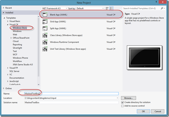
- Navigate to the Toolbox and double-click the StackPanel icon to add it to the page.
- Add x:Name="sp1" Width="Auto" Height="Auto" Orientation="Vertical" HorizontalAlignment="Center" VerticalAlignment="Center" to the tag so that it appears similar to the following:

    <StackPanel x:Name="sp1" Width="Auto" Height="Auto" Orientation="Vertical" HorizontalAlignment="Center" VerticalAlignment="Center">    </StackPanel>


Elements in the panel will now appear centered and vertically positioned.
You've successfully created a WinRT-style application. In the next step you'll add and customize TextBlock and C1MakedTextBox controls and complete setting up the application.
Step 2 of 4: Customizing the Application
In the previous step you created a new WinRT-style project and added a StackPanel to the application. In this step you'll continue by adding and customizing TextBlock and C1MakedTextBox controls.
Complete the following steps:
- In the XAML window of the project, place the cursor between the <StackPanel x:Name="sp1"...> and tags and press enter.
- Add the following markup within the StackPanel to add two standard TextBlock controls:
<TextBlock Margin="2,2,2,10" Name="tb1" Text="Employee Information" /> <TextBlock FontSize="16" Margin="2,2,2,0" Text="Employee ID" />
- Place the cursor just below the makrup you just added , navigate to the Toolbox and double-click the C1MaskedTextBox icon to add the control to the StackPanel. This will add the reference and XAML namespace automatically. The XAML markup resembles the following:
<Xaml:C1MaskedTextBox Text="C1MaskedTextBox"/>
- Modify the C1MaskedTextBox control and give it a name by adding Name="c1mtb1" VerticalAlignment="Top" Margin="2" Mask="000-00-0000" TextChanged="c1mtb1_TextChanged" to the tag so that it appears similar to the following:
    <Xaml:C1MaskedTextBox Name="c1mtb1" VerticalAlignment="Top" Margin="2" Mask="000-00-0000" TextChanged="c1mtb1_TextChanged"/>


Notice that this markup adds a name, sets the margin and alignment, and sets a mask for the content of the box. Note that you'll add code for the event handler you added in a later step.
- Place the cursor just after the Xaml:C1MaskedTextBox tag and add the following XAML to add additional C1MaskedTextBox and TextBlock controls to the StackPanel:
    <TextBlock x:Name="tb2" FontSize="16" Margin="2" />    <TextBlock FontSize="16" Margin="2,2,2,0" Text="Name"/>    <Xaml:C1MaskedTextBox Name="c1mtb2" VerticalAlignment="Top" Margin="2" TextChanged="c1mtb2\_TextChanged"></Xaml:C1MaskedTextBox>    <TextBlock x:Name="tb3" FontSize="16" Margin="2"/>    <TextBlock FontSize="16" Margin="2"  Text="Hire Date"/>    <Xaml:C1MaskedTextBox Name="c1mtb3" VerticalAlignment="Top" Margin="2" Mask="00/00/0000" TextChanged="c1mtb3\_TextChanged"></Xaml:C1MaskedTextBox>    <TextBlock x:Name="tb4" FontSize="16" Margin="2"/>    <TextBlock FontSize="16" Margin="2,2,2,0" Text="Phone Number"/>    <Xaml:C1MaskedTextBox Name="c1mtb4" VerticalAlignment="Top" Margin="2" Mask="(999) 000-0000" TextChanged="c1mtb4_TextChanged"><Xaml:C1MaskedTextBox>    <TextBlock x:Name="tb5" FontSize="16" Margin="2"/>


You've successfully set up your application's user interface. In the next step you'll add code to your application.
Step 3 of 4: Adding Code to the Application
In the previous steps you set up the application's user interface and added controls to your application. In this step you'll add code to your application to add additional functionality.
Complete the following steps:
- In the XAML, place cursor on a c1mtbl_TextChanged and create event handler by right clicking and selecting Navigate to Event Handler.
In Code view, add the following using statement to the top of the page:
    using C1.Xaml;


    private void c1mtb1\_TextChanged(object sender TextChangedEventArgs e)        {            this.tb2.Text = "Mask: " + this.c1mtb1.Mask + " Value: " + this.c1mtb1.Value + " Text: " + this.c1mtb1.Text;        }            private void c1mtb2\_TextChanged(object sender, TextChangedEventArgs e)        {            this.tb3.Text = "Mask: " + this.c1mtb2.Mask + " Value: " + this.c1mtb2.Value + " Text: " + this.c1mtb2.Text;        }            private void c1mtb3\_TextChanged(object sender, TextChangedEventArgs e)        {            this.tb4.Text = "Mask: " + this.c1mtb3.Mask + " Value: " + this.c1mtb3.Value + " Text: " + this.c1mtb3.Text;        }            private void c1mtb4\_TextChanged(object sender, TextChangedEventArgs e)        {            this.tb5.Text = "Mask: " + this.c1mtb4.Mask + " Value: " + this.c1mtb4.Value + " Text: " + this.c1mtb4.Text;        }
- Add code to the page's constructor so that it appears like the following:
public MainPage()        {            this.InitializeComponent();            this.c1mtb1\_TextChanged(null, null);            this.c1mtb2\_TextChanged(null, null);            this.c1mtb3\_TextChanged null, null);            this.c1mtb4\_TextChanged(null, null);        }


In this step you completed adding code to your application. In the next step you'll run the application and observe run-time interactions.
Step 4 of 4: Running the Application
Now that you've created a WinRT-style application and customized the application's appearance and behavior, the only thing left to do is run your application. To run your application and observe MaskedTextBox for WinRT XAML's run-time behavior, complete the following steps:
From the Debug menu, select Start Debugging to view how your application will appear at run time. It will appear similar to the following:
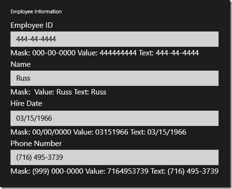
Notice the watermark that appears in each C1MaskedTextBox control.
Enter a number in the first C1MaskedTextBox control.
The label below the control displays the mask, current value, and current text.
Enter a string in the second C1MaskedTextBox control.
Notice that there was no mask added to this control – if you chose, you could type numbers or other characters in the control.
- Try entering a string in the third C1MaskedTextBox control. Notice that you cannot – that is because the Mask property was set to only accept numbers. Enter a numeric value instead – notice that this does work.
Enter numbers in each of the remaining controls.
Notice that the Value property displayed under each C1MaskedTextBox control does not include literal characters, while the Text property does.

Congratulations! You've completed the MaskedTextBox for WinRT XAML quick start and created a MaskedTextBox for WinRT XAML application, customized the appearance and behavior of the controls, and viewed some of the run-time capabiliies of your application.
See this example in our documentation for both VB and C#
Next: Blog Series (Part 10) Layout Panels: Windows 8 Studio for WinRT XAML

MESCIUS inc.