Working with ASP.NET MVC TabPanel
TabPanel lets you create multiple tabs to display related information in a small screen effectively. Some of the scenarios where using TabPanel can be helpful in your application are: to display different functional aspects, different views of the same data, categorized information, etc.
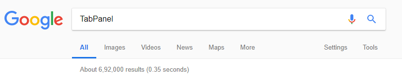
The most common example is the Google search window. As soon as you search for a keyword, Google displays the search results in multiple tabs like 'All,' 'Images,' 'Videos,' and 'News' for improved readability and organization of the displayed information.
ASP.NET MVC TabPanel overview
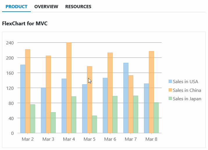
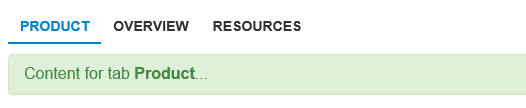
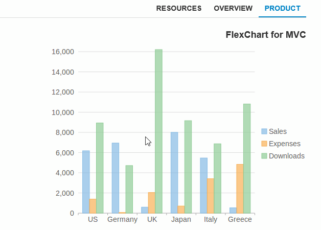
TabPanel was introduced with 2018 v2 release of ComponentOne Studio for ASP.NET MVC. It allows you to create multiple tabs wherein each tab has a header and a content pane. The header pane is used for showing the title of the information displayed in the tab, using the anchor tag. The content tab opens when you click the header pane. It can display either HTML content or it can host the MVC controls to display information as seen below.
Styling and CSS
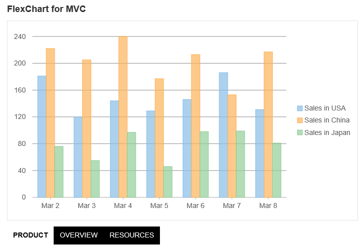
The TabPanel control can be styled using CSS to customize the appearance of the tabs. For example, the tab headers can be repositioned to the left, right, or bottom (like in the image below) instead of getting displayed at the top (the default layout of the TabPanel). Further, you can add an animation effect for switching between tabs.
Disabled and Invisible Tabs
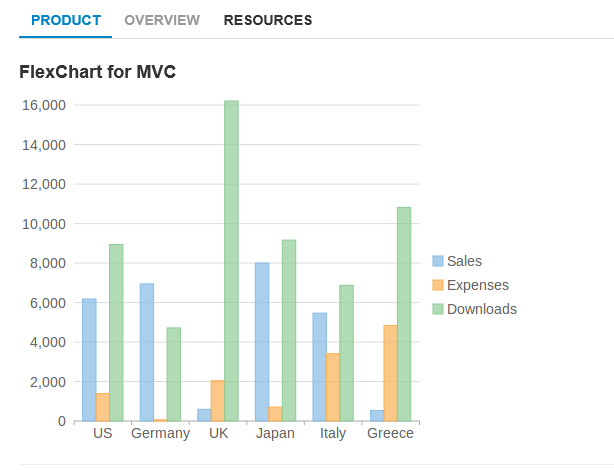
By default, the TabPanel control displays all the tabs that has been added to it. However, you can choose to hide or disable particular tabs, so that the user cannot access the tab. The tabs can be disabled either by adding the wj-state-disabled class to the specific tab, or by setting the client-side isDisabled property. For example, the 'Overview' tab has been shown as disabled. Similarly, the client-side isVisible property can be used to hide/show the tab.
Detatched Panels
The TabPanel has a built-in panel to show the content of the selected tab, but in certain cases, you may want to display the content in a different element. This can be done by hiding the built-in content element and using the selectedIndexChanged event of the TabPanel control to display the content in a different HTML element like below.
TabPanel and WAI-ARIA accessibility guidelines
The TabPanel supports WAI-ARIA accessibility guidelines. All tab elements have their respective role attributes as well as all applicable ARIA attributes. The TabPanel automatically generates the "aria-controls" and "aria-labelledby" attributes based on the unique IDs assigned to the tab headers and panes. Now, depending upon what has been specified in the AutoSwitch property, it will determine how the control will handle the tab and cursor keys. For a detailed information on accessibility you can refer to W3C ARIA practices and the SimplyAccessible article.
RightToLeft
The TabPanel supports the HTML 'dir' attribute, so if the element hosting the control has the 'dir' attribute set to 'rtl' the panel will render with tabs aligned from right to left. Here is an image depicting the same:
For further details, please review the ASP.NET MVC TabPanel demo samples and documentation.
If you have a question, please comment in the thread below. Happy Coding!

Manpreet Kaur