Must-Have C# Blazor Input Controls
ComponentOne Blazor Edition includes several essential input controls for C# web development on the server or client.
- Give the power of search and selection to the user with an AutoComplete control
- Select, edit and validate numerically and date/time ranges
- Get the classic CheckBox control for Boolean display and selection
- Display a list of items for selection in an editable ComboBox.
- Validate and format user input against a mask
Why Choose Blazor Input Controls?
Fill the Gap in Your Toolbox
Our Blazor Input controls fill the gap with essential editors that every application needs.
Validate User Input
Our Blazor Input controls provide quick and easy input validation for numbers, dates and text with masking. There's no need to parse and check the input yourself.
Quickly Capture User Input
Several of our Blazor input components support autocomplete functionality to provide suggestions to users as they type and improve efficiency.
Blazor Input Controls

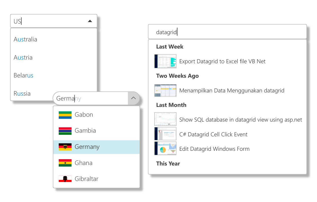
Blazor AutoComplete
Quickly capture input from the user with auto-suggest functionality. View completion suggestions in a drop-down list while the user types in the editable textbox, and style the highlighted matches.

Blazor CheckBox
Get a classic CheckBox control for editing and displaying Boolean values. Use it inside FlexGrid cells for non-adjacent, multi-row selection.

Blazor ComboBox
Display a list of items in an editable drop-down. Our Blazor ComboBox supports item template customization, text input capability, auto-suggestion as the user types, and a full-screen mode that is designed for mobile web apps.

Blazor DataPager
Display and navigate through paged data. DataPager supports button template and text customization, custom styling, and it provides paging for FlexGrid and ListView.

Blazor Date and Time Pickers
Get four components for quickly selecting dates and times.
- The C1DatePicker control lets users switch between month, year, and decade views for quick navigation.
- Select times from a wide range of supported formats using C1TimeEditor.
- Get both date and time editing in one control with C1DateTimePicker.
- Select a date range with the C1DateRangePicker component.

Blazor Masked TextBox
Validate and format user input against a mask using the MaskedTextBox component. Prevent users from entering invalid text, and the masked input component skips literals when saving the data back to the datasource.

Blazor NumericBox
The Blazor NumericBox control edits a single numeric value that can be incremented or decremented by clicking the up and down buttons. Display data in different formats with flexible formatting.

Blazor TextBox
ComponentOne Blazor Edition includes a standard textbox that provides autosuggest functionality similar to AutoComplete and ComboBox.


