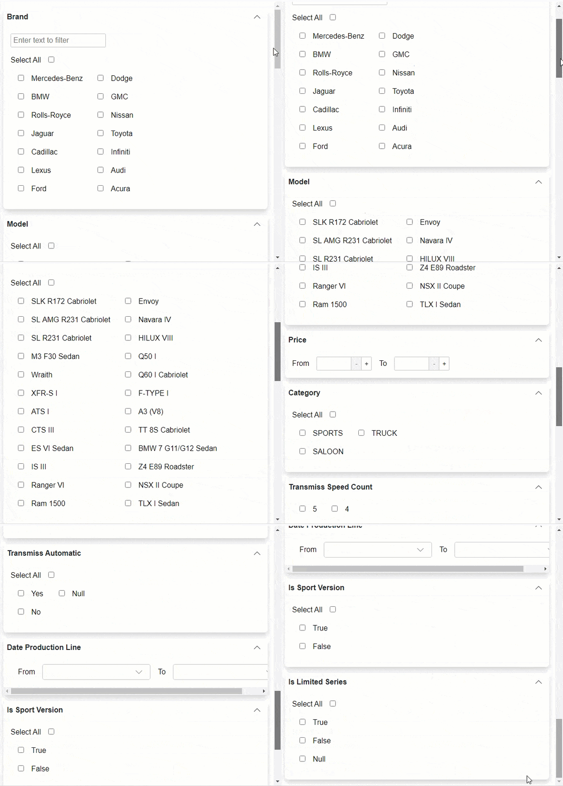
The DataFilter control enables you to create an interactive user interface by organizing the filter conditions (or filters) as a vertically stacked list of items, which gives it the look and feel of an accordion layout. You can easily toggle the display of the conditions associated with each filter separately using expand and collapse icons.
In addition, you can also expand and collapse the filter conditions using ExpandMode property of C1DataFilter class, which makes it convenient to navigate through different filter headers as a group when required. The ExpandMode property sets the expanding behavior for the DataFilter control through ExpandMode enumeration which specifies how many filter conditions or items can be expanded
The following image demonstrates how the expand behavior of the DataFilter control when ExpandMode is set to Any.
 |
The following code demonstrates how to the set the ExpandMode property for changing the expanding behavior of the DataFilter filter conditions. To get the output of the following code, you can replace it in Data Binding sample code with the existing <C1DataFilter></C1DataFilter> tags.
| Index.razor |
Copy Code
|
|---|---|
<C1DataFilter @ref="dataFilter" ItemsSource="@data" ExpandMode="@ExpandMode.Any" FilterAutoGenerating="@FilterAutoGenerating" Style="@("max-height: inherit")"></C1DataFilter> |
|