FlexChart supports a wide range of chart types including various variations. For instance, along with line charts, you can also create stacked line chart, stacked 100% line chart etc. using properties available in the FlexChart API. This topic gives a quick snapshot of all the major chart types along with their use cases. The thumbnails below let you have a glance of how a particular chart type looks like. To know about variations of these chart types, you can navigate to corresponding topics by clicking on the hyperlinks.
| Chart Type | Chart Snapshot | Use Case |
|---|---|---|
| Line Chart |
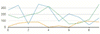
Line chart |
Use line charts to plot the continuously changing data against a periodic interval. They are generally used to show trends over a period of time. However, they can also be used to plot data against other continuous periodic values such as temperature, distance etc. |
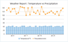
| Line Symbol Chart |
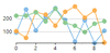
Line Symbol Chart |
Use line symbol charts when you want to indicate the exact data points plotted on a line chart. |
| Spline Chart |
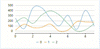
Spline Chart |
Like line charts, use the spline charts to demonstrate the data changing against a periodic interval. However, unlike line chart, they show the gradual change in trend. They are also aesthetically better than a line chart. |
| Spline Symbol Chart |

Spline Symbol Chart |
Use spline symbol charts when you want to indicate the exact data points plotted on a spline chart. |
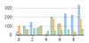
| Bar Chart |
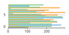
Bar Chart |
Use bar charts for demonstrating patterns and trends across different categories. In these charts, each horizontal bar corresponds to a category and its length corresponds to the value or measure of that category. |
| Column Chart |
Column Chart |
Very similar in usage with bar charts, column charts use vertical columns instead of horizontal bars for identifying the trends. These charts are generally used in the case of fewer categories that can be plotted easily on X-axis. |
| Scatter Chart |
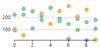
Scatter Chart |
Use the scatter chart to graph the pairs of numerical data and hence to identify the relationship between the two variables. |
| Bubble Chart |
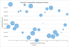
Bubble Chart |
Use the bubble charts to plot three dimensional data. Bubble charts are often used to present financial data. |
| Area Chart |
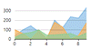
Area Chart |
Use area charts to emphasize the magnitude of trend along with demonstrating the trend. Based on line charts, area charts are distinct because of the filled area between the line segments and the x-axis. |
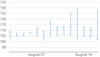
| Step Chart |
Step Chart |
Use step charts to plot the data that shows sudden changes on irregular intervals and remains constant between these intervals. |
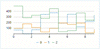
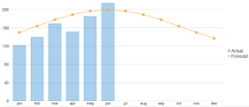
| Combination Chart |
Combination Chart |
Use the combination of two or more different charts in same plot area to compare the different data sets that are related to each other. |
| Chart Type | Chart Snapshot | Use Case |
|---|---|---|
| Candlestick |

Candlestick |
Use candlestick charts to plot high, low, open and close values of stock over a period of time. In these charts, area between open and close values forms body of a candle and, vertical lines between high and low values form the wick and tail respectively. |
| HighLowOpenClose (HLOC) |
HighLowOpenClose (HLOC) |
Similar to candlestick charts, use HLOC charts to show the stock's high, low, open and close values. The only difference between the two is that there is no candlestick body in this case. |
| Trendlines |
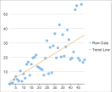
Trendlines |
Trendlines are used to represent trends in data and to examine problems of prediction. Trendlines are commonly used with price charts or financial charts. |
| Chart Type | Chart Snapshot | Use Case |
|---|---|---|
| Funnel Chart |
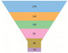
Funnel Chart |
Use funnel chart to demonstrate the gradual reduction in data as it moves through various stages of a linear process. These charts also help in identifying the problem areas in such process. |
| Sunburst Chart |
Sunburst Chart |
Sunburst, also known as a multi-level pie chart, is ideal for visualizing multi-level hierarchical data depicted by concentric circles. |
| TreeMap Chart |
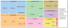
TreeMap Chart |
TreeMaps are the data visualization tools that display the hierarchical data as a set of nested rectangles, while displaying the quantities for each category through area size of the corresponding rectangles. |
| FlexRadar Chart |
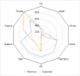
FlexRadar Chart |
Radar charts are radial charts that help in visualizing comparison of two or more groups of values against various features or characteristics. |
| Chart Type | Chart Snapshot | Use Case |
|---|---|---|
| Combination Chart |
Combination Chart |
Combination charts are the combination of two or more chart types in a single plot area, for instance, a bar and a line chart laid in a single plot. |
| Chart Type | Chart Snapshot | Use Case |
|---|---|---|
| BoxWhisker |
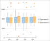
BoxWhisker |
Box-and-Whisker charts are the statistical charts that display the distribution of numerical data through quartiles, means and outliers. |
| ErrorBar |
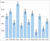
ErrorBar |
Error bars are the charts that indicate the estimated error or uncertainty in the measured data to give an idea about how precise that data is. |
| Histogram Charts |

Histogram Charts |
Statistical charts help in presenting the statistical data in graphical format and make it easier to understand and interpret. |
| RangedHistogram |

RangedHistogram |
Ranged histogram is a modern Excel-like histogram chart that helps visualize frequency distribution on Y-axis, against ranged X-axis. |
| Waterfall |
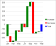
Waterfall |
Waterfall charts are the statistical charts that demonstrate the cumulative effect of increasing and decreasing intermediate values on an initial value to result in a final value. |