The Expander control allows you to change the direction in which you want it to expand. You can set the expansion direction for the Expander control using ExpandDirection property of the C1Expander class. The ExpandDirection property accepts values from the ExpandDirection enumeration that specifies the direction in which the Expander control expands. It allows you to expand the Expander control in up, down, right or left direction.
By default, the control expands downwards as the ExpandDirection property is set to Down. However, when you change the expansion direction of the expander, it also changes the header's orientation to the content area of the control as shown in the image below.
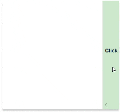
The following code illustrates the use of ExpandDirection property to expand the Expander control in left direction.
| Index.razor |
Copy Code
|
|---|---|
<C1Expander Header="@("Click")" ExpandDirection="@ExpandDirection.Left" HeaderStyle="@("background-color: rgba(0,128,0,0.2);height:334px;")" Style="@("overflow:hidden;width:25%;box-shadow:0px 5px 5px rgba(0,0,0,0.2)")"> <C1Calendar FirstDayOfWeek="@DayOfWeek.Monday"></C1Calendar> </C1Expander> |
|