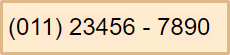
The MaskedTextBox control has a simple layout which makes it easy to style. You can apply styles on the MaskedTextBox control to customize its appearance using the Style property and display the MaskedTextBox control as per your requirement. In the following example, we changed the width, height, background and border color, font size and weight of the MaskedTextBox control to style and change the appearance of the control.
The following code demonstrates the use of the Style property to change the appearance of the MaskedTextBox control:
| Index.razor |
Copy Code
|
|---|---|
@using C1.Blazor.Core @using C1.Blazor.Input <C1MaskedTextBox Mask="(999) 00000 - 0000" Style="_c1Style"></C1MaskedTextBox> @code { readonly C1Style _c1Style = new C1Style() { Width = 230, Height = 55, BackgroundColor = C1Color.BlanchedAlmond, BorderColor = C1Color.BurlyWood, BorderWidth = 3, FontSize = 24, FontWeight = "Arial" }; } |
|